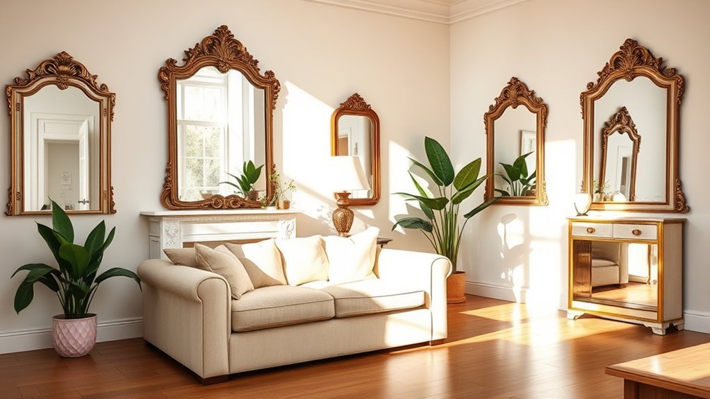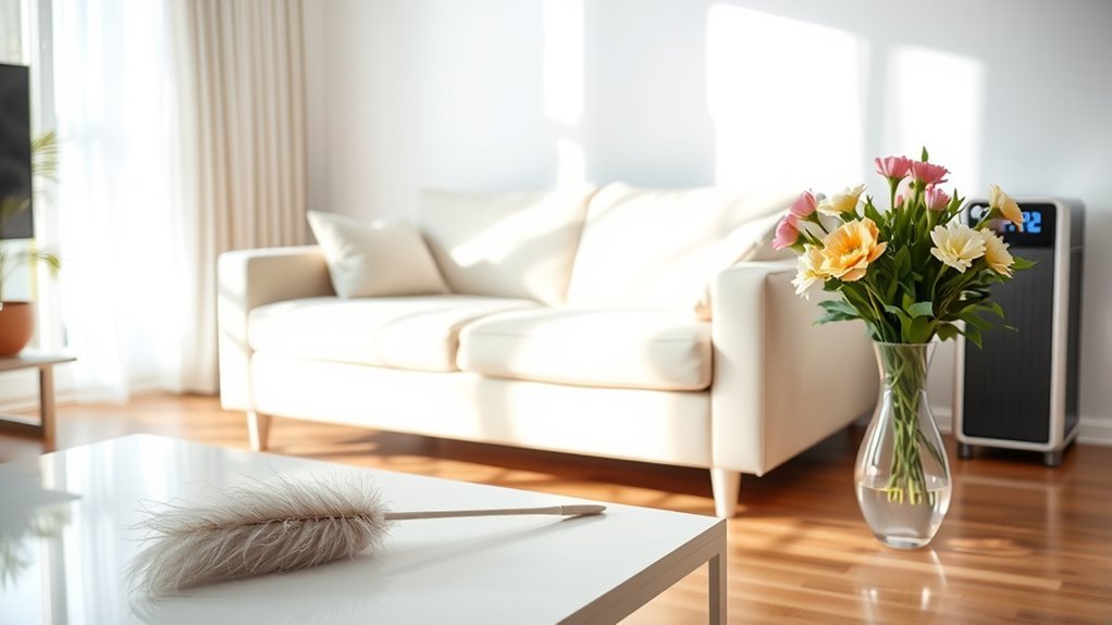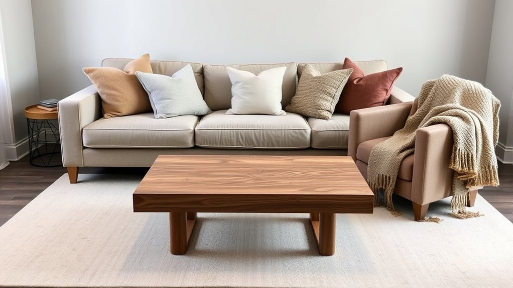
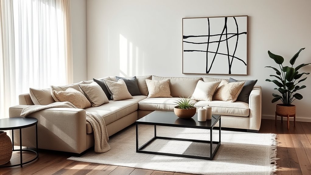
To create contrast in a neutral living room, build layers instead of relying on one dramatic color. Start with a clear base neutral, add lighter and darker supporting tones, then bring in texture, wood, metal, art, and one or two accent colors. The goal is a room that still feels calm, but no longer feels flat.
Quick Answer
Create contrast in a neutral living room by mixing light and dark neutrals, repeating one accent color, layering different textures, and using rugs, artwork, pillows, wood, metal, and lighting to add depth. Keep the palette simple so the room feels intentional, not busy.
Key Takeaways
- Use value contrast first: pair pale walls or upholstery with darker frames, tables, lamps, or accent chairs.
- Keep undertones consistent. Warm neutrals pair best with cream, camel, taupe, brass, and warm wood; cool neutrals pair well with charcoal, black, stone, chrome, and blue-gray.
- Texture is the easiest way to make neutrals feel rich: mix linen, boucle, leather, wool, wood, stone, ceramic, glass, and metal.
- Repeat accent colors at least three times through pillows, art, books, vases, or a rug so the contrast looks planned.
At a Glance
| Time Required | 1 afternoon for styling updates; 1 weekend if you are testing paint, choosing a rug, or rearranging furniture |
| Difficulty | Easy to moderate |
| Tools Needed | Paint or fabric samples, tape measure, phone camera, natural-light check, pillow inserts, rug pad, and optional picture-hanging tools |
| Cost | $0–$100 for rearranging and accessories; $150–$800+ for a rug, lighting, artwork, or larger furniture swaps |
Choose a Dominant Neutral Color for Your Living Room
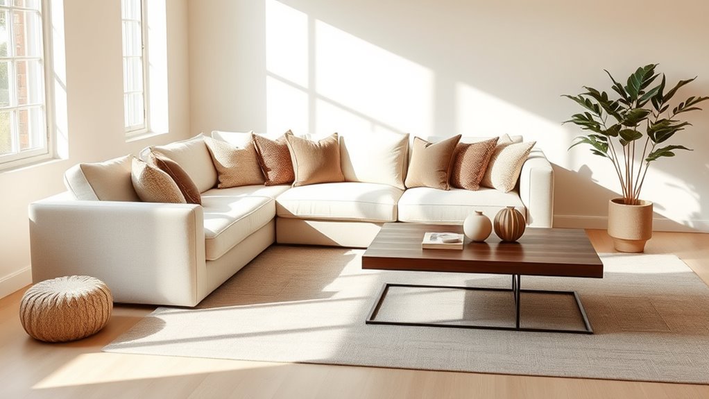
Your dominant neutral is the backdrop for everything else in the room. It might be soft white walls, a warm beige sectional, a greige rug, a charcoal sofa, or pale gray built-ins. Choose this color first because every accent, wood tone, metal finish, and fabric will react to it.
The most important detail is the undertone. A warm neutral has hints of cream, yellow, red, brown, or taupe. A cool neutral has hints of blue, green, gray, or violet. Warm neutrals often feel cozy with camel leather, walnut, brass, terracotta, and olive. Cool neutrals often feel crisp with black, chrome, marble, blue-gray, and cool white.
Before committing, test your dominant neutral beside the pieces that will stay in the room: flooring, trim, sofa fabric, stone, wood furniture, and curtains. Paint and fabric can shift throughout the day, so check samples in morning light, afternoon light, evening light, and lamp light. For more on why light and undertones matter, see Architectural Digest’s guide to neutral paint colors and Better Homes & Gardens’ color-pairing mistakes guide.
Warning: Do not buy a sofa, rug, or gallons of paint from a tiny swatch alone. Test the color next to your flooring, curtains, and largest furniture pieces first, because undertones become more obvious at full scale.
Incorporate Secondary Neutrals for Added Depth
Once the main neutral is set, add secondary neutrals that are clearly lighter or darker. This is where contrast begins. If everything in the room is a similar beige, gray, or white, the space can look washed out even if every item is beautiful on its own.
A simple formula is 70-20-10: use about 70% dominant neutral, 20% secondary neutral, and 10% accent color or high-contrast detail. Treat this as a flexible guideline, not a strict rule. Living rooms feel more natural when the proportions are balanced but not mathematically perfect. Current neutral-room guidance also emphasizes tone, undertone, contrast, texture, and materiality, as discussed in Livingetc’s neutral color rules.
Try these combinations:
- Warm white walls: add a taupe sofa, walnut coffee table, black picture frames, and brass lighting.
- Beige sofa: add cream curtains, a charcoal side table, brown leather, and muted rust or olive accents.
- Cool gray sofa: add white walls, black metal, pale oak, blue-gray pillows, and stone accessories.
- Greige room: add ivory textiles, espresso wood, matte black hardware, and a soft green or clay accent.
A neutral room gets its contrast from value, texture, shape, and repetition before it ever needs a bold color.
Experiment With Textures for Visual Interest
Texture keeps a neutral living room from feeling flat. Instead of adding more colors, add more surface variation. A room with linen curtains, a wool rug, a boucle chair, a smooth leather ottoman, a ceramic lamp, a wood table, and a metal picture frame can feel layered even if the palette stays beige, white, gray, and brown.
Designers often rely on texture to create depth in quiet palettes. Homes & Gardens describes texture as a key way to shape how a room looks and feels, especially when color is restrained. You can apply the same idea at home by mixing soft, rough, smooth, matte, reflective, and natural materials. Read more in Homes & Gardens’ guide to texture in interior design.
Recommended Products
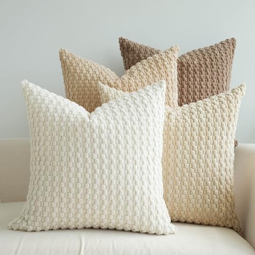
HANDPICKED FABRIC: Made of ultra-soft fabric, bringing you cozy feeling with soft tactile and a fun, stylish look to a couch, lounge chair, or bed

QUALITY MATERIAL: The pillow cover is composed of a soft and comfy corduroy which is a kind of polyester fabric, features a cute and elegant boho stripe design. Our pillow covers are of good workmanship, they are tightly sewn without loose threads.
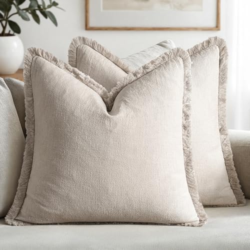
【Exquisite Farmhouse Linen Material】MIULEE's decorative linen pillow covers feature a natural ramie linen blend. The high-quality stone washed linen adds rustic charm, with its textured wrinkles ideal for farmhouse interiors. It gracefully ages with each wash, enhancing its personality and comfort. The linen fabric ensures durability and breathability, providing a soft touch that's suitable for year-round use
Layer Different Textures Together
Start with the pieces people touch most: the sofa, rug, throws, pillows, curtains, and accent chairs. Then add hard textures through wood, stone, metal, glass, or ceramic. The contrast between soft and hard materials makes the room feel finished.
| Texture Type | Best Use |
|---|---|
| Soft linen or cotton | Curtains, slipcovers, and relaxed pillows |
| Chunky knit or boucle | Throws, accent chairs, ottomans, and cozy layers |
| Smooth leather | Ottomans, side chairs, poufs, and rich contrast |
| Wood grain | Coffee tables, shelves, frames, trays, and warmth |
| Stone, ceramic, or plaster | Lamps, vases, bowls, fireplace decor, and sculptural weight |
| Metal or glass | Lighting, frames, side tables, and reflective highlights |
Use Natural Materials Wisely
Natural materials are especially helpful in neutral spaces because they add built-in variation. Wood has grain, stone has veining, jute has texture, linen has slubs, and clay has an imperfect handmade look. These details create contrast without adding loud color.
Use woven baskets for storage, a jute or wool rug under the seating area, a stone or ceramic table lamp, and wood frames around artwork. If the room feels too pale, choose medium or dark wood. If the room feels too heavy, choose pale oak, whitewashed wood, glass, or light stone.
Pro Tip: Repeat the same texture at least three times. For example, use black metal on a floor lamp, picture frame, and side table leg, or repeat woven texture through a basket, shade, and rug.
Use Area Rugs to Add Color
A rug is one of the easiest ways to add contrast because it covers a large surface without changing the walls or furniture. In a neutral living room, a rug can introduce color, pattern, texture, and a clear seating zone at the same time.
For a calm look, choose a rug with muted contrast: ivory and taupe, beige and charcoal, cream and rust, gray and blue, or tan and olive. For a bolder look, choose a patterned rug with one accent color you can repeat elsewhere in the room. A rug with rust, navy, sage, black, or terracotta can make a neutral sofa feel intentional instead of plain.
Size matters. In most living rooms, at least the front legs of the sofa and chairs should sit on the rug. A rug that is too small can make the room feel disconnected, while a larger rug visually anchors the furniture and makes the contrast feel more polished.
Recommended Products

WASHABLE FOR EASY CARE: This machine washable area rug makes everyday cleaning simple. Machine wash when needed, spot clean spills, or use a robot vacuum for easy daily maintenance.

The Malibu Collection is an indoor/outdoor area rug featuring geometric patterns in airy, neutral palettes, with playfully fringed edges; from renowned interior designer Amber Lewis in collaboration with Loloi

Non Slip 5x7 Area Rugs: Pauwer neutral area rug's rubber backing locks onto hardwood and tile floor firmly. No more unexpected sliding or bunching underfoot. This bedroom rug gives you a firmer, safer foothold in every high-traffic area of your home
Introduce Pops of Color With Decorative Accessories
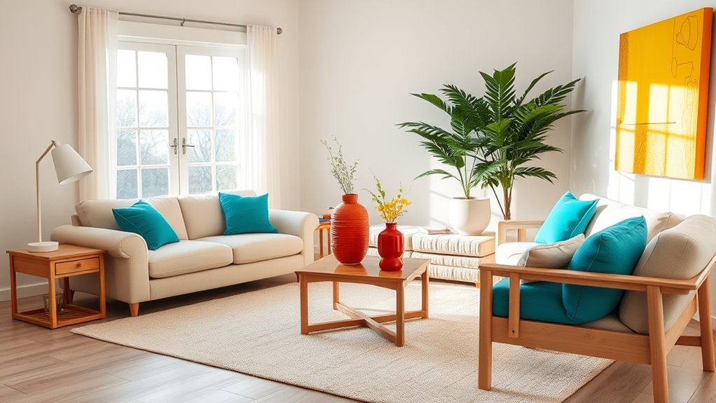
Decorative accessories are the safest place to experiment with color because they are easy to change. Start with one accent color, then repeat it in three to five places: a pillow, a vase, a book cover, a lamp shade, artwork, or a small object on the coffee table.
Good accent colors for neutral living rooms include:
- Olive or sage: soft, earthy, and easy with beige, cream, gray, and wood.
- Rust or terracotta: warm and grounded, especially with tan, taupe, camel, and brass.
- Navy or slate blue: crisp and classic with white, gray, greige, and black.
- Chocolate brown: rich and subtle when you want contrast without bright color.
- Black: strong, graphic, and useful for frames, lighting, hardware, and small tables.
Recommended Products

Material: Made of High quality durable linen blend, comfortable to touch and lay on. Quality fabric, hide your old pillow patterns perfectly. This material does not pilling or shedding, and holding up well after long time of use

PREMIUM MATERIAL: The front side is made of thicked Boucle fabric, back side is made of canvas. Thick and durable enough for long-term use

【Superior Corduroy Fabric】Our pillow covers are crafted from high - quality corduroy, celebrated for its softness and durability. This fabric withstands regular use, ensuring long - lasting comfort.
Colorful Throw Pillows
Throw pillows can change the room quickly, but they work best when the mix looks intentional. Use different sizes, shapes, and textures instead of buying a matching set. For example, pair two 22-inch linen pillows with one lumbar pillow in velvet, leather, boucle, or a patterned fabric.
If the sofa is beige, try olive, rust, chocolate, or black-and-cream pillows. If the sofa is gray, try ivory, navy, charcoal, or muted green. If the sofa is white, bring in a darker pillow, a textured throw, and a patterned accent to prevent the seating area from disappearing into the walls.
Vibrant Artwork Selection
Artwork is a strong way to add contrast because it brings color, shape, and personality to a neutral backdrop. One oversized piece above the sofa can create a focal point, while a gallery wall can add rhythm and movement.
Choose art that repeats at least one color already in the room. If your rug has muted rust, choose artwork with a small rust detail. If your pillows include navy, repeat navy in a print or frame. This repetition keeps the room from looking random.
Note: Contrast does not have to mean bright color. A black frame on a white wall, a dark wood table on a cream rug, or a sculptural ceramic lamp beside a soft linen sofa can create just as much impact.
How to Balance Warm and Cool Colors?
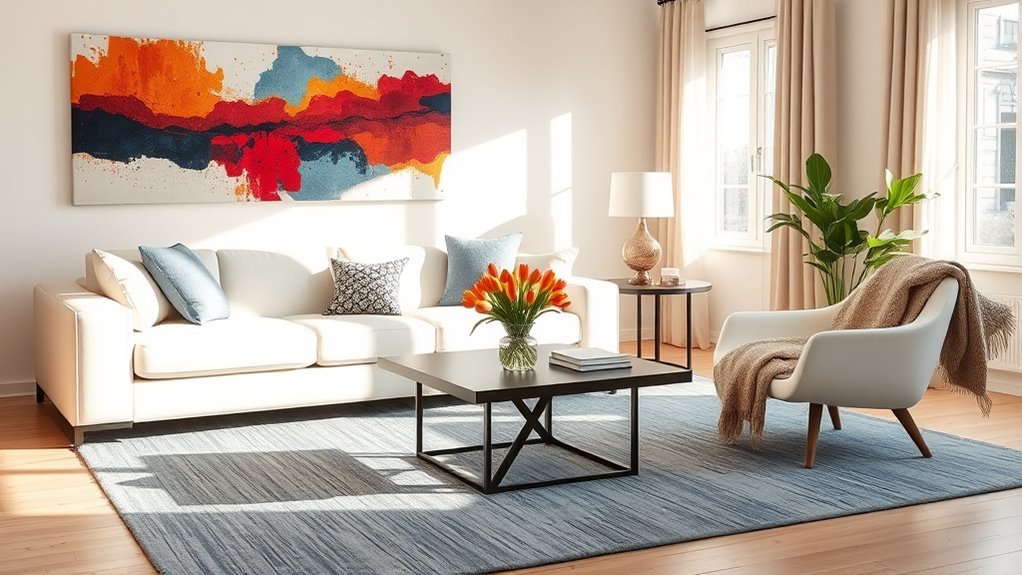
Balancing warm and cool colors is about choosing a lead undertone, then using the opposite temperature in smaller amounts. A room can include both warm and cool tones, but one should usually feel dominant.
If your room is mostly warm, use cool contrast through black frames, blue-gray pillows, a cool stone lamp, or a charcoal side table. If your room is mostly cool, add warmth through walnut, oak, camel leather, brass, cream textiles, or a warm beige rug.
Metal finishes can help bridge the gap. Brass and bronze warm up gray or white rooms. Black, chrome, and nickel can sharpen beige or cream rooms. Mixed metals can work, but repeat each finish at least twice so the mix looks deliberate.
How Natural Light Affects Your Color Choices?
Natural light changes how neutrals read. A color that looks soft in the store can look yellow, blue, green, pink, or dull once it is next to your own flooring and furniture. That is why light testing is one of the most important steps in a neutral room.
Use this simple process:
- Place paint, fabric, rug, and wood samples near the largest furniture pieces.
- Check them in morning, afternoon, evening, and lamp light.
- Take phone photos from the doorway so you can see the room as a whole.
- Remove any sample that looks too yellow, too blue, too flat, or too harsh next to your fixed finishes.
- Choose accents only after the main neutral looks right in the actual room.
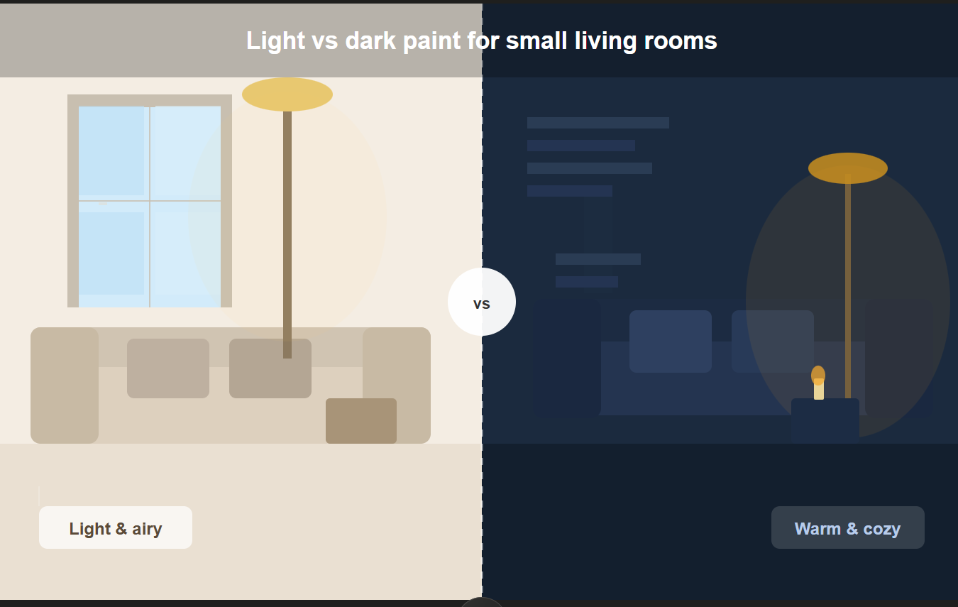
In bright rooms, very pale neutrals can appear brighter than expected, so you may need more texture or deeper contrast. In darker rooms, mid-tone neutrals, warm woods, and layered lamps can feel richer than trying to force a stark white palette.
Personalize Your Space With Unique Accents and Art
Personal accents make a neutral room feel collected rather than staged. Use items with meaning: family photographs, travel pieces, handmade pottery, vintage books, framed textiles, inherited furniture, or artwork you genuinely like.
The key is editing. Too many small accessories can make the room feel cluttered, while a few larger pieces create stronger contrast. Try one sculptural bowl on the coffee table, two large framed prints instead of six tiny ones, or a pair of meaningful objects on a bookshelf with negative space around them.
The 3-5-7 rule can help when styling shelves, coffee tables, mantels, and pillows. It simply means grouping decor in odd numbers, usually three, five, or seven. Vary the height, shape, and texture within the group so the arrangement feels balanced but not stiff. For example, style a coffee table with three items: a stack of books, a ceramic bowl, and a small vase with branches.
Common Mistakes That Make Neutral Living Rooms Look Flat
Even a well-furnished neutral room can feel unfinished if the contrast is too weak. Watch for these common mistakes:
- Everything is the same value: Add darker frames, a deeper table, black hardware, or a patterned rug.
- Too many undertones compete: Choose either warm or cool as the lead, then use the other in smaller accents.
- The rug is too small: Size up so the seating group feels connected.
- Accessories are too tiny: Use fewer, larger pieces for cleaner visual impact.
- There is no pattern: Add a subtle stripe, plaid, botanical print, or vintage rug pattern.
- Lighting is too flat: Add table lamps, floor lamps, picture lights, or shaded lamps to create pools of light.
- Accent colors appear only once: Repeat the accent color in at least three places.
Budget-Friendly Ways to Add Contrast
You do not have to replace every large piece to create contrast. Start with low-cost changes that shift the room’s value, texture, and rhythm.
- Swap pillow covers instead of buying new inserts.
- Add a darker throw blanket to a pale sofa.
- Frame existing art or photos in black, walnut, brass, or white frames.
- Use books, bowls, trays, and ceramics to repeat an accent color.
- Move a lamp from another room to add warm light.
- Add branches, greenery, or dried stems for height and organic texture.
- Paint a thrifted side table black, espresso, cream, or olive.
- Layer a smaller patterned rug over a larger jute or sisal rug.
Frequently Asked Questions
How do you add color to a neutral living room?
Choose one main accent color and repeat it three to five times through pillows, artwork, books, vases, flowers, a throw, or a rug. For a calm neutral room, muted accents such as olive, rust, navy, terracotta, chocolate, or slate blue usually blend more naturally than bright primary colors.
What is the 3-5-7 rule of decorating?
The 3-5-7 rule is a styling guideline that uses odd-numbered groupings to make decor feel more natural and visually interesting. Use it for coffee tables, shelves, mantels, and pillows. For example, group three objects of different heights on a tray or style five pillows in varied sizes and textures.
What is the 2/3 rule for living rooms?
The 2/3 rule is a proportion guideline. In a neutral living room, it often means keeping about two-thirds of the room calm and neutral while using the remaining third for contrast through darker tones, pattern, accent colors, wood, metal, or artwork. It is not a strict formula, but it helps prevent the room from feeling either too plain or too busy.
What is the 70-20-10 rule in decorating?
The 70-20-10 rule means using about 70% dominant color, 20% secondary color, and 10% accent color. For a neutral living room, that might mean 70% warm white and beige, 20% taupe or wood, and 10% black, olive, rust, or navy accents. Use it as a guide, not a rigid rule.
How do you add contrast without using bright colors?
Use light and dark neutrals, black frames, wood grain, sculptural lamps, textured pillows, patterned rugs, leather, stone, ceramic, and mixed metal finishes. A cream sofa with a charcoal table, walnut frame, boucle chair, and black lamp can feel high-contrast without adding any bright color.
What accent colors work best with beige, gray, and white living rooms?
Beige works well with olive, rust, camel, chocolate, black, and warm brass. Gray works well with navy, charcoal, ivory, sage, black, and cool metals. White works with almost any accent, but it looks more layered when you add texture, wood, black details, and one repeated color.
Conclusion
A neutral living room does not need loud color to feel interesting. The strongest contrast comes from a smart mix of light and dark values, warm and cool balance, layered textures, natural materials, artwork, lighting, and repeated accents. Start with the neutral you already love, then add depth one layer at a time. When the undertones, textures, and focal points work together, the room feels calm, personal, and complete.
Sources
- Architectural Digest: A Complete Guide to Choosing Neutral Paint Colors — supports undertone, lighting, and neutral-palette selection guidance.
- Better Homes & Gardens: Color-Pairing Mistakes — supports advice about lighting, undertones, finishes, and testing larger samples.
- Livingetc: Color Rules for Neutral Rooms — supports tone, contrast, undertone, and proportional planning in neutral rooms.
- Homes & Gardens: The Power of Texture in Interior Design — supports texture layering as a way to add depth to restrained palettes.
- Livingetc: The 3-5-7 Rule in Decorating — supports the explanation of odd-number styling groups for shelves, coffee tables, pillows, and accessories.