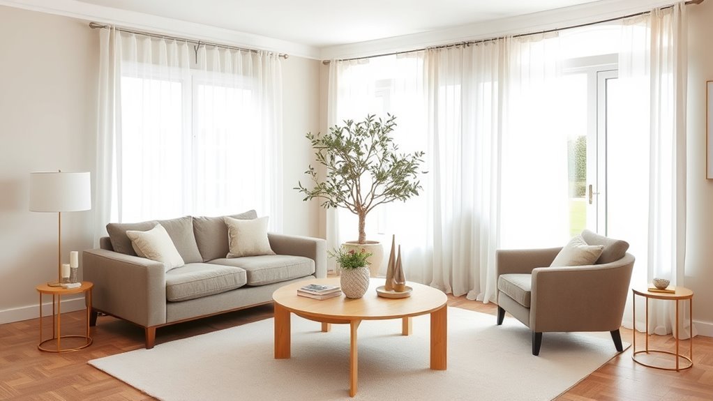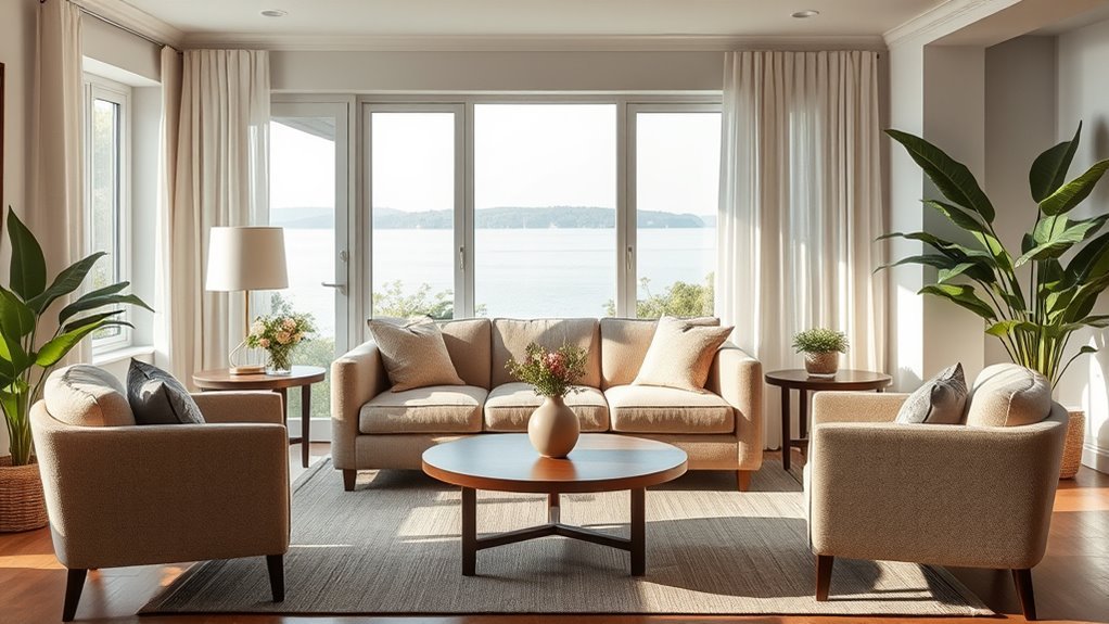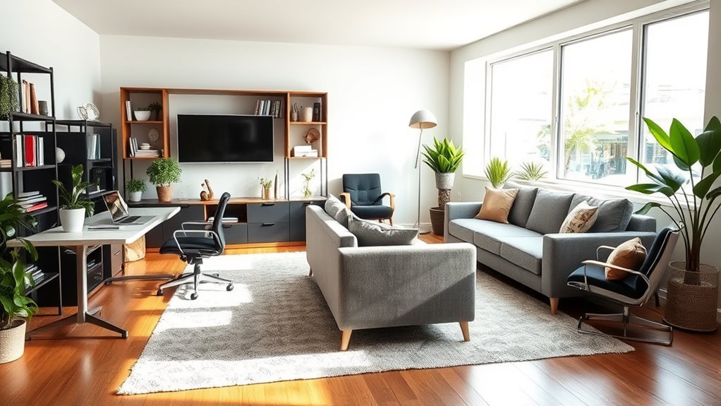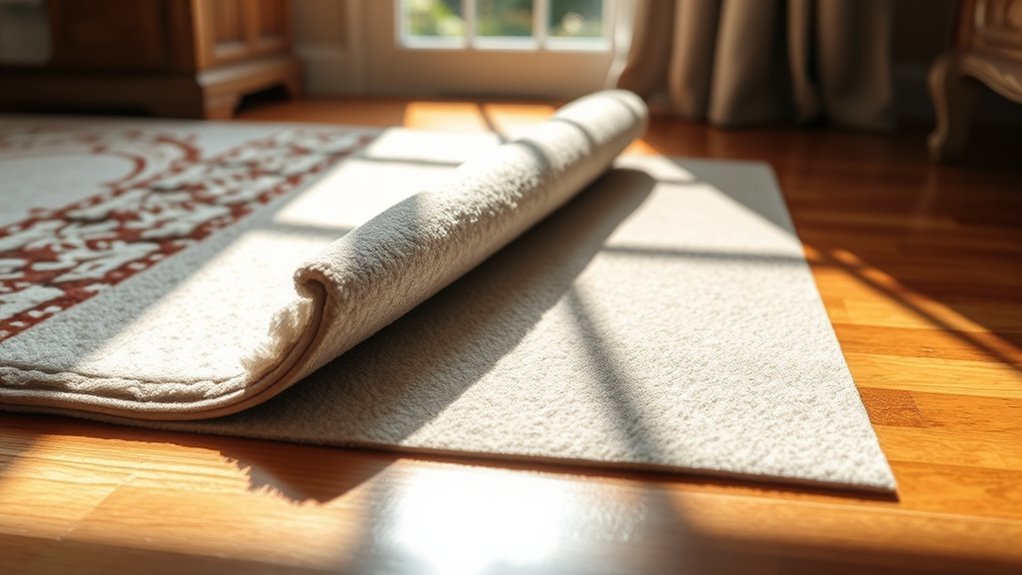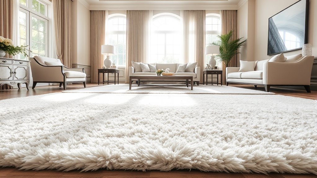
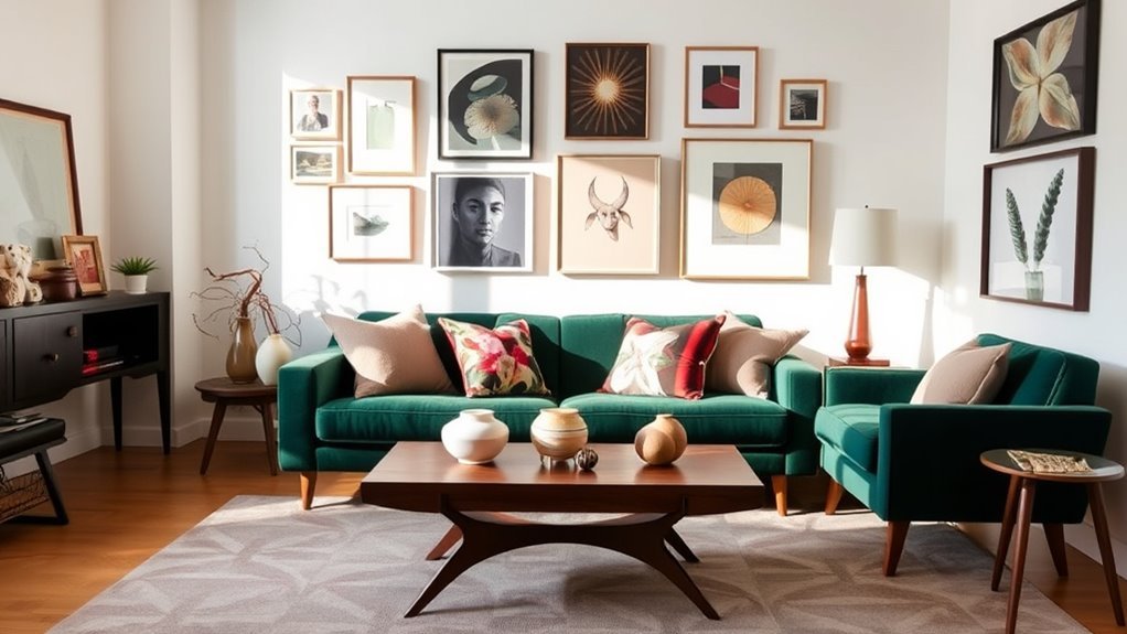
Mixing patterns in your living room starts with one simple idea: every print needs a reason to belong. Instead of choosing random florals, stripes, checks, geometrics, and solids, build the room around a shared color palette, one standout fabric, and a mix of large, medium, and small-scale patterns. When those pieces repeat color, vary scale, and leave enough visual breathing room, the room feels layered instead of chaotic.
Quick Answer
To mix patterns in a living room without clashing, choose one color palette, start with one bold “hero” pattern, then add smaller patterns that repeat at least one color from it. Balance busy prints with solid colors, vary the scale of each pattern, and test everything together in the room’s natural and evening light.
Key Takeaways
- Use one main color palette so different patterns feel connected.
- Pick one large-scale showstopper pattern, then support it with medium and small prints.
- Repeat at least one color across every patterned fabric, rug, curtain, or pillow.
- Use solid colors, natural textures, and negative space to calm the room down.
- Step back often; pattern mixing works best when the whole room feels balanced from a distance.
At a Glance
| Time Required | 30–60 minutes to plan; longer if you are ordering fabric samples or testing rugs and curtains. |
| Difficulty | Beginner to intermediate. |
| Tools Needed | Fabric swatches, paint chips, photos of your room, a tape measure, and your existing rug, sofa, curtain, or pillow colors. |
| Cost | Free if restyling what you own; low to moderate if adding pillows, throws, curtains, or a rug. |
Understanding the Basics of Mixing Patterns
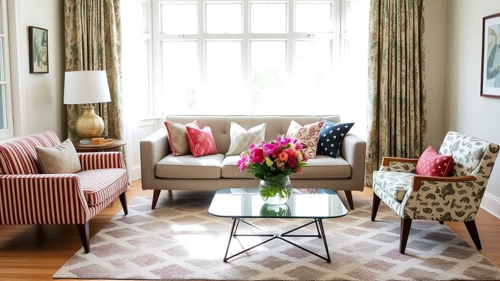
When you begin mixing patterns in your living room, the goal is not to make every print match. The goal is to make every print relate. Florals, stripes, checks, ikat, animal print, plaid, and geometrics can all work together when they share color, vary in scale, and leave space for the eye to rest.
Start by looking at what already dominates the room. A patterned rug, colorful artwork, striped chair, floral curtain, or bold sofa can become the starting point for the whole scheme. If your room is mostly neutral, choose one new fabric or rug to act as the style direction.
Pattern mixing usually works best when you use:
- One hero pattern that grabs attention.
- One or two supporting patterns that repeat the hero pattern’s colors.
- Several solid pieces that give the room calm, open space.
- Texture such as linen, velvet, boucle, rattan, wood, wool, or leather to add depth without adding another busy print.
Picking a Cohesive Color Palette
Mixing patterns can be exciting, but without a cohesive color palette, your living room may feel scattered. Start with two or three colors that already appear in your room. Then choose one neutral to calm everything down, such as ivory, oatmeal, taupe, charcoal, camel, soft gray, or warm white.
A simple palette might look like this:
- Dominant color: the color used most often, usually in the sofa, rug, wall color, or largest furniture pieces.
- Secondary color: the color that repeats in curtains, chairs, pillows, art, or a patterned rug.
- Accent color: the smallest but most energetic color, often used in pillows, lamps, vases, or artwork.
The color wheel is useful here because it helps you spot combinations that naturally relate, such as analogous colors, complementary colors, and monochromatic schemes. You do not have to follow it rigidly, but it can keep bold choices from feeling random.
Note: Before buying anything new, photograph your room in daylight and at night. Colors that look calm in a store can look harsh under your lamps, and subtle patterns can disappear in low light.
Choosing Your Showstopper Fabric for Mixing Patterns
Your showstopper fabric is the print that sets the mood for the room. It may be a bold floral pillow, a patterned rug, a dramatic curtain fabric, a large-scale geometric chair, or a colorful vintage textile. This piece should contain most of the colors you want to repeat elsewhere.
Choose your showstopper before making paint, rug, or curtain decisions. A strong fabric can guide your palette better than a random paint chip because it already shows how colors, contrast, and pattern can work together.
A good showstopper usually has at least two of these qualities:
- A large-scale pattern that can be seen from across the room.
- A color palette you can repeat in smaller accents.
- A style direction, such as traditional, cottage, modern, coastal, bohemian, vintage, or tailored.
- Enough contrast to stand out against your sofa, walls, or rug.
Recommended Products

Size Reference-- Measuring 1 yard/91.4cm long and 46 inches/117cm wide, the colorful fish scale mesh fabric is easy to cut for your daily use and crafting needs.


Size: 1 Yard Fabric Length 36" Width 59". If you purchase 6 pieces of 1-yard fabric, you will receive 6 separate 1-yard cuts,instead of one continuous 6-yard whole piece
How to Balance Bold and Subtle Patterns in Your Space
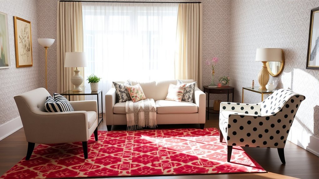
To create a harmonious living room, pair bold patterns with quieter ones that share at least one color. A large floral can sit beside a fine stripe, a block print can work with a small check, and a geometric rug can support softer pillows when the colors repeat.
Recommended Products

COORDINATED SET OF 4: Includes 2 patterned and 2 solid blue pillow covers in one coordinated set. Each cover measures 18 x 18 inches, making it easy to mix and match on your couch, sofa or bed. Covers only; pillow inserts are not included

[Standard Size]18x18 inch/45x45cm. Package contains 4 pieces blue pillow covers,the insert is not include.

Material: polyester blend, blue pillow covers are comfortable,soft touch, light weight durable, Grade A, High Class
Pairing Scale and Color
Scale is one of the easiest ways to stop patterns from clashing. If every print is the same size, they compete. If one is large, one is medium, and one is small, they create rhythm.
| Pattern Scale | Best Use | Example |
|---|---|---|
| Large scale | Hero print or main focal point | Oversized floral curtains or a bold patterned rug |
| Medium scale | Secondary pattern | Plaid chair, block-print pillow, or striped ottoman |
| Small scale | Quiet supporting detail | Tiny check, pinstripe, small dot, or mini geometric pillow |
Using Solid Anchors
Solid colors are the pause between patterns. A neutral sofa, plain lampshade, solid rug border, simple curtain panel, or leather chair can make the patterned pieces look intentional instead of busy.
| Solid Anchor | Purpose |
|---|---|
| Neutral sofa | Creates a calm visual foundation for patterned pillows and throws. |
| Solid-colored rug | Balances patterned curtains, chairs, or wallpaper. |
| Plain curtains | Softens a busy rug or patterned upholstery. |
| Solid pillows | Break up patterned pillows so the sofa does not feel crowded. |
Layering Textures Effectively
Texture adds interest without adding another print. If your room already has a floral rug, striped pillows, and patterned curtains, add texture through a chunky knit throw, linen lampshade, woven basket, velvet pillow, wood table, or leather ottoman.
Rich materials like velvet, wool, linen, rattan, and aged wood create depth while keeping the pattern mix under control. This is especially helpful in neutral rooms, where texture can make the space feel finished even with fewer colors.
Pro Tip: Put every fabric sample, paint chip, and rug photo on one tray or board. If one pattern jumps out for the wrong reason, remove it or repeat one of its colors elsewhere so it feels connected.
A Simple Step-by-Step Formula for Mixing Patterns
Use this formula when you want the room to feel layered but not overwhelming:
- Choose one hero pattern. This is the boldest fabric, rug, curtain, or artwork in the room.
- Pull two or three colors from it. Use these colors as your palette for the rest of the room.
- Add one medium-scale pattern. Try a stripe, plaid, block print, or geometric that repeats one hero color.
- Add one small-scale pattern. Use a tiny check, dot, pinstripe, or subtle texture print.
- Ground the mix with solids. Add plain pieces in your neutral, dominant color, or accent color.
- Check the room from across the space. If your eye has nowhere to rest, remove one pattern or add a larger solid area.
Using Solid Colors for Visual Balance
While mixing patterns adds energy, solid colors provide the balance that makes the mix livable. Solids give the eye a break and help your strongest patterns stand out.
Use solid colors on the largest surfaces if you are new to pattern mixing. A solid sofa, plain wall color, simple rug, or neutral curtains gives you freedom to experiment with patterned pillows, throws, lampshades, and accent chairs. If you already have a patterned rug or wallpaper, keep more of the upholstery solid.
A helpful rule of thumb is to let about two-thirds of the room feel calm and one-third feel lively. This does not need to be exact. It simply reminds you not to cover every surface with a competing print.
Understanding Scale: Layering Patterns Effectively
Scale is the difference between a pattern that reads from across the room and one you notice only up close. A room with only tiny patterns can look fussy. A room with only large patterns can feel loud. A mix of both feels more natural.
Scale Matters in Mixing
Start with one large pattern, then add medium and small prints around it. For example, use a large floral on curtains, a medium stripe on pillows, and a small check on a throw. Or use a bold geometric rug, a medium botanical pillow, and a tiny pinstripe chair.
| Scale Type | Living Room Example |
|---|---|
| Large Scale | Oversized floral rug or dramatic curtain fabric |
| Medium Scale | Plaid chair, striped ottoman, or block-print pillow |
| Small Scale | Tiny geometric pillow, small dot, mini check, or pinstripe |
Balance Bold and Subtle
Bold patterns need quiet partners. If your hero pattern is colorful and high contrast, choose supporting patterns with fewer colors or softer lines. If your hero pattern is subtle, you can add a stronger stripe, plaid, or geometric for energy.
The safest mix is one bold pattern, one structured pattern, one small pattern, and at least two solid areas. For example: a floral pillow, a striped pillow, a small check throw, a solid sofa, and a plain rug.
Layering Textures and Patterns
Layer texture the same way you layer pattern: vary the weight. A smooth linen sofa, nubby wool rug, velvet pillow, woven basket, and wood coffee table can make the room feel rich without adding more prints. Texture is also a smart fix when a patterned room feels flat but you do not want another color.
Where to Use Patterns in a Living Room
Pattern placement matters as much as pattern choice. Use bigger patterns where you want attention and smaller patterns where you want detail.
| Living Room Element | Best Pattern Approach |
|---|---|
| Rug | Use as the hero pattern if the rest of the room is mostly solid. |
| Sofa | Keep solid for flexibility, or use a subtle texture if you change pillows seasonally. |
| Accent chair | Great spot for a medium or bold pattern because it is contained. |
| Curtains | Use large or medium patterns if walls and sofa are quiet. |
| Throw pillows | Best place to experiment with small, seasonal, or high-contrast prints. |
| Throws and blankets | Use texture, stripes, checks, or subtle patterns to connect colors. |
Incorporating Vintage Fabrics: Tips for Adding Texture and Character
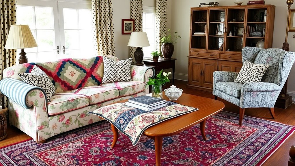
Incorporating vintage fabrics into your living room can add texture, history, and personality that newer pieces sometimes lack. A vintage textile can become your showstopper fabric, especially if it includes colors you can repeat in pillows, art, books, lamps, or a rug.
Use delicate vintage fabrics thoughtfully. A fragile textile may work better as a framed piece, pillow front, lampshade, or low-use accent than as everyday seat upholstery. If the fabric is sturdy, it can add beautiful contrast against clean-lined contemporary furniture.
To mix vintage fabrics with modern patterns, repeat one color from the vintage piece, then pair it with simpler patterns such as stripes, checks, or small geometrics. This keeps the room from feeling like a period set while still celebrating the fabric’s character.
Recommended Products

Vintage Pillow Cover:Made of soft flannel fabric with single-sided HD printing. Each pillow cover measures 18x18 inches (45 x45cm) and fits most standard throw pillows (Pillow insert not included).

PREMIUM COTTON FABRIC: Crafted from 100% cotton and woven in Belgium, these tapestry pillow covers offer a refined woven texture, lasting durability, and an elegant appearance. The quality fabric makes them ideal for stylish everyday home décor.

Soft Flannelette Fabric: Sized at 18x18 inches, this pillow cover is made from flannelette material with a smooth, soft, and comfortable texture that feels gentle to the touch.
Avoiding Common Mistakes in Pattern Mixing
Mixing patterns can elevate your living room, but a few common mistakes can make the design feel unsettled. Avoid these pitfalls:
- Using too many hero patterns. Choose one main pattern and let the others support it.
- Skipping a color palette. Every pattern should repeat at least one color from the room.
- Forgetting solid colors. Solids create visual breaks between busy prints.
- Using only one pattern scale. Mix large, medium, and small patterns for balance.
- Ignoring the room’s lighting. Test patterns in daylight and evening light before committing.
- Buying everything at once. Build the mix slowly so you can edit as the room changes.
Troubleshooting Patterns That Do Not Feel Right
If your pattern mix feels off, the solution is usually simple. Use the guide below before replacing everything.
| Problem | Likely Cause | Fix |
|---|---|---|
| The room feels too busy. | Too many bold prints or not enough solids. | Remove one pattern, add a solid pillow, or choose a calmer rug or throw. |
| The patterns clash. | The colors do not repeat. | Choose one shared color and repeat it at least three times in the room. |
| The room feels flat. | Patterns are too similar or colors are too low contrast. | Add one larger-scale pattern or a richer texture such as velvet, wool, or wood. |
| Everything feels too matchy. | All prints came from the same set or collection. | Add a different pattern type, such as a stripe with a floral or a check with a botanical. |
Frequently Asked Questions
How do you mix patterns without clashing?
Mix patterns without clashing by repeating color, varying scale, and balancing busy prints with solids. Start with one hero pattern, then add a medium-scale pattern and a smaller pattern that share at least one color. If the room feels loud, remove one print or add a solid anchor.
What is the 3-5-7 rule of decorating?
The 3-5-7 rule is a styling guideline that uses odd-numbered groupings, such as three pillows, five shelf objects, or seven small accents. Odd numbers often feel more relaxed and natural than perfectly even groupings, but the rule is flexible. Use it as a starting point, not a strict requirement.
What is the 70/20/10 rule in interior design?
The 70/20/10 rule is a color-distribution variation: about 70% dominant color, 20% secondary color, and 10% accent color. Many decorators also use the similar 60/30/10 rule. Both are helpful guidelines for balancing color, but they do not need to be measured exactly.
What is the 2/3 rule for living rooms?
The 2/3 rule is a simple way to keep a living room balanced: let roughly two-thirds of the room feel calm through solids, neutrals, or subtle textures, and use the remaining third for bolder patterns or accent colors. It is a visual guideline, not a fixed formula.
Can you mix floral, striped, and geometric patterns in one living room?
Yes. Florals, stripes, and geometrics can work beautifully together when they share a color palette and appear in different scales. For example, use a large floral curtain, a medium stripe pillow, and a small geometric accent in the same two or three colors.
Conclusion
Mixing patterns in your living room does not have to feel risky. Start with a cohesive color palette, choose one showstopper pattern, vary the scale of each supporting print, and use solid colors as visual breaks. When you repeat colors, balance bold and subtle patterns, and add texture where the room needs depth, clashing patterns can become a layered, personal, and stylish design choice.
Sources
- Architectural Digest: Color Wheel for Interior Design — supports color-wheel and palette guidance.
- Better Homes & Gardens: How to Mix Patterns — supports hero pattern, scale, color, and pattern-mixing best practices.
- Southern Living: Pattern-Mixing Mistakes — supports avoiding too many hero patterns and balancing scale.
- W3C WAI: Alt Decision Tree — supports meaningful image alt text guidance.
- Schema.org: Article — supports Article structured data.
- Schema.org: HowTo and Schema.org: FAQPage — support HowTo and FAQPage structured data.