The 60-30-10 color rule is a simple way to build a living room palette that feels balanced instead of random. Use one dominant color for the largest visual area, a secondary color for contrast and depth, and a small accent color for personality. The rule is not a strict formula, but it gives you a clear starting point when you are choosing paint, furniture, rugs, curtains, pillows, and decor.
Quick Answer
The 60-30-10 color rule means using about 60% dominant color, 30% secondary color, and 10% accent color in your living room. In practice, that usually means walls or large furniture for the main color, upholstery or rugs for the secondary color, and pillows, artwork, lamps, or vases for the accent.
Key Takeaways
- Use the rule as a guide, not a measuring tape. The room should feel balanced, not mathematically perfect.
- Your 60% color usually comes from walls, large upholstery, flooring, or the largest repeated surface.
- Your 30% color should support the main color while adding contrast, warmth, or depth.
- Your 10% accent color works best in easy-to-change decor such as pillows, throws, artwork, lamps, trays, and flowers.
- Always test colors in your actual room because daylight, bulbs, flooring, and nearby finishes can change how a color looks.
At a Glance
| Time Required | 30 minutes to plan a palette; 1–3 days to test paint or fabric samples in different lighting. |
| Difficulty | Beginner-friendly. The hardest part is testing undertones before committing. |
| Tools Needed | Paint chips, fabric swatches, rug or flooring samples, a color wheel, phone camera, and a small list of existing room finishes. |
| Cost | Free if you use existing decor; low-cost if you update only accents; higher if you repaint or replace large furniture. |
What Is the 60-30-10 Color Rule for Living Rooms?
The 60-30-10 color rule is a decorating guideline that divides your living room palette into three roles:
- 60% dominant color: the main color that visually anchors the room.
- 30% secondary color: the supporting color that adds contrast, warmth, or depth.
- 10% accent color: the small pop of color that adds energy and personality.
In a living room, the dominant color often appears on the walls, sectional, large rug, built-ins, or flooring. The secondary color may show up in curtains, chairs, a coffee table, a rug pattern, or larger textiles. The accent color usually works best in smaller pieces such as throw pillows, artwork, lampshades, vases, books, trays, flowers, or a single statement chair.
This guideline is popular because it gives color a clear job. Instead of choosing several beautiful colors and hoping they work together, you decide which color leads, which color supports, and which color adds the finishing touch.
Note: The 60-30-10 rule is a design shortcut, not a law. A room can still look beautiful with a 70-20-10 palette, a two-color palette, or a layered tonal palette if the colors feel intentional.
How to Apply the 60-30-10 Rule for a Balanced Look
To apply the rule well, start with what already exists in the room. Flooring, fireplace stone, wood tones, window frames, a large sofa, or an expensive rug may already be part of your palette. Work with those fixed elements first, then choose the colors you can control.
Step 1: List Fixed Colors First
Before choosing paint or decor, look at the colors that are difficult or expensive to change. These may include:
- Wood flooring or tile
- Stone fireplace surrounds
- Large sofas or sectionals
- Built-in cabinets
- Exposed beams
- Window frames
- Large rugs
- Open-plan kitchen cabinets or countertops visible from the living room
If your room already has warm oak floors, a cool blue-gray wall may look colder than expected. If you have a navy sofa, navy may already be part of your 30% or even your 60%, depending on the size of the furniture and how much visual space it takes.
Step 2: Select the Dominant Color
Your dominant color should create the overall mood of the living room. It usually covers the largest visual area, so it needs to be a color you can live with every day.
Common dominant color choices include:
- Warm white or cream for a bright, relaxed room
- Greige, beige, or taupe for a soft neutral base
- Light gray or warm gray for a calm, modern backdrop
- Soft blue or sage green for a gentle, nature-inspired feel
- Deep green, charcoal, or navy for a dramatic, cozy room
Neutral colors are flexible, but they are not automatically safe. A white can look stark, a gray can turn blue, and a beige can turn yellow depending on the light and nearby finishes. Test samples before committing.
Step 3: Choose the Secondary Color
The secondary color should make up roughly 30% of the palette. This color is usually noticeable but not overpowering. It often appears in sofas, accent chairs, curtains, rugs, ottomans, or large patterned textiles.
Good secondary colors usually do one of three things:
- Create contrast: navy against warm white, olive against cream, charcoal against pale beige.
- Add warmth: camel leather, walnut wood, rust, terracotta, brass, or warm taupe.
- Add softness: muted blue, sage, dusty rose, pale mushroom, or oatmeal.
If your dominant color is bold, choose a quieter secondary color. If your dominant color is neutral, the secondary color can carry more personality.
Step 4: Add the Accent Color
Your accent color is the final 10%. This is where you can be more playful because accents are easy to update seasonally or when your taste changes.
Use accent color in:
- Throw pillows
- Blankets
- Artwork
- Lampshades
- Vases
- Coffee-table books
- Candles
- Planters
- Small stools
- Decorative trays
One strong accent color is usually easier to control than three competing accent colors. For example, a warm white living room with camel furniture and forest-green accents will usually feel calmer than the same room with green, red, purple, and yellow accents scattered everywhere.
Pro Tip: Pull your accent color from something already in the room, such as a rug, artwork, patterned pillow, or book cover. This makes the accent feel connected instead of random.
How to Estimate 60-30-10 Without Measuring Everything
You do not need to calculate the exact square footage of every wall, sofa, and pillow. Instead, judge the room by visual weight. Ask yourself what color you notice first, what color you notice second, and what color appears only in small moments.
A simple living room breakdown might look like this:
| Color Role | Where It Might Appear | Example |
|---|---|---|
| 60% Dominant | Walls, large sofa, large rug, built-ins | Warm white walls |
| 30% Secondary | Curtains, chairs, rug pattern, wood tones | Camel leather and walnut |
| 10% Accent | Pillows, art, vases, lamps, flowers | Olive green |
If the room feels flat, your 30% or 10% color may be too close to the dominant color. If the room feels chaotic, you may have too many accent colors competing for attention.
Examples of Successful 60-30-10 Color Combinations
The best color combination depends on your light, furniture, flooring, and style. These examples show how the rule can work for different living-room moods:
- Calm coastal: warm white walls (60%), sandy beige upholstery and woven textures (30%), soft blue accents (10%).
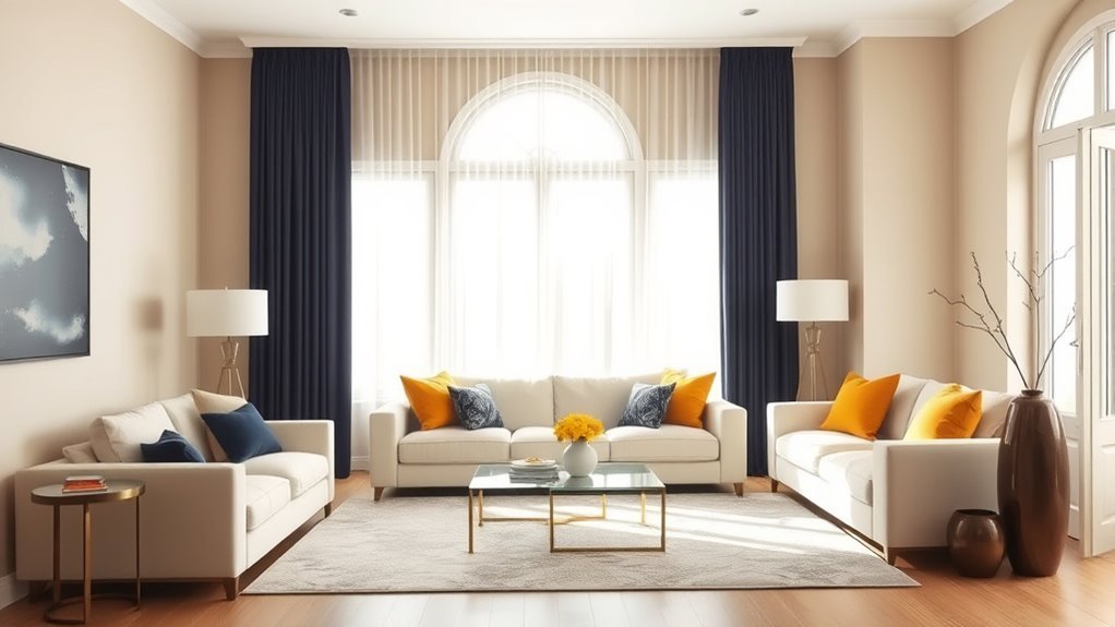
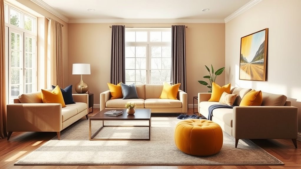
- Classic contrast: light gray walls (60%), navy sofa and curtains (30%), mustard-yellow pillows and artwork (10%).
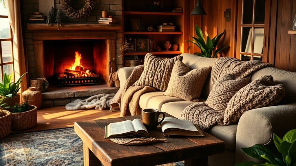
- Earthy and cozy: beige walls (60%), olive chairs and wood furniture (30%), rust or terracotta accents (10%).
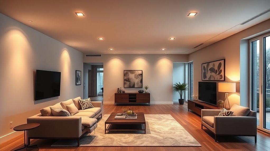
- Modern organic: creamy walls (60%), walnut wood and taupe textiles (30%), black accents (10%).
- Moody traditional: deep green walls or built-ins (60%), warm brown leather and patterned rug (30%), brass accents (10%).
- Soft monochromatic: pale blue walls (60%), medium blue upholstery (30%), navy accessories (10%).
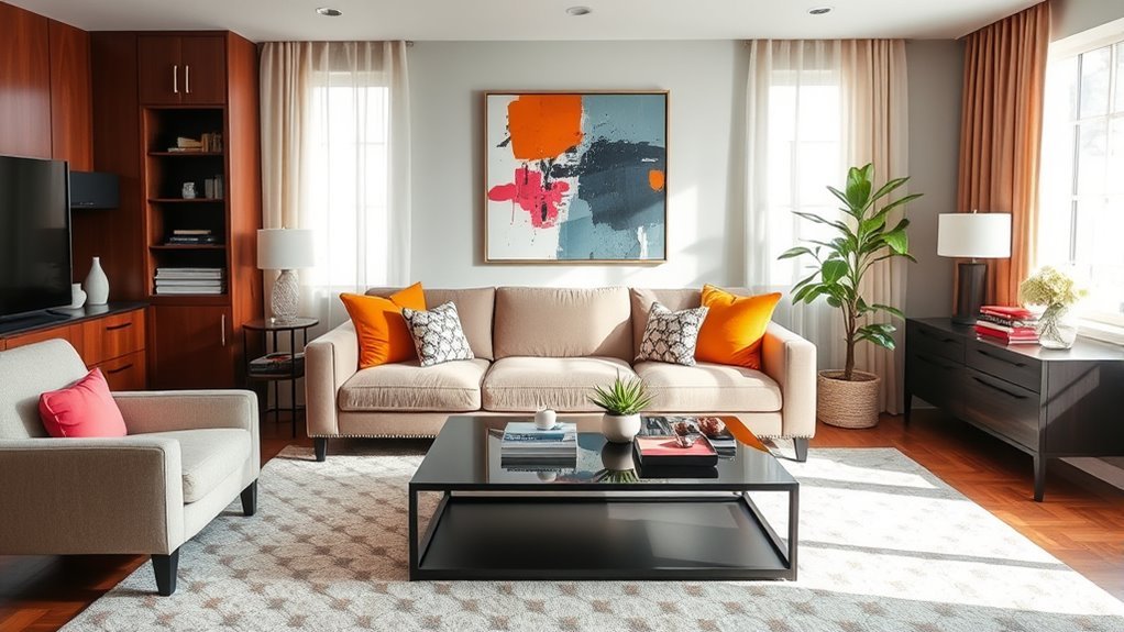
- Bright eclectic: white walls (60%), rustic brown furniture (30%), turquoise decor and art details (10%).
For a beginner-friendly palette, keep the dominant color neutral and use the secondary and accent colors to add style. For a bolder room, make the dominant color dramatic and keep the remaining colors quieter.
How to Select Your Main, Secondary, and Accent Colors for a Cohesive Look
A cohesive palette usually starts with one item you love. That might be a rug, painting, patterned chair, fabric swatch, or even the view outside your windows. Use that piece as your color clue, then assign each color a role.
Choosing Your Dominant Color
Choose a dominant color that supports the mood you want most of the time. In a living room, this often means calm, welcoming, and easy to layer.
Use these questions to narrow your choice:
- Do you want the room to feel bright and airy, or cozy and enveloping?
- Does the room get strong natural light or very little daylight?
- Are your floors warm, cool, dark, or light?
- Will the wall color touch white trim, wood trim, stone, or built-ins?
- Do you prefer high contrast or soft tonal layering?
If the room is small or dark, a pale color is not your only option. A deep color can look intentional and cozy when paired with good lighting, mirrors, warm metals, and lighter textiles.
Determining the Secondary Shade
The secondary shade should be strong enough to be noticed but calm enough to repeat. This is why muted colors often work well: sage, dusty blue, mushroom, camel, oatmeal, charcoal, navy, olive, rust, and muted terracotta can add depth without overwhelming the room.
If you are buying a sofa, curtains, or a rug, bring your dominant-color sample with you. If you are choosing paint after furniture, bring fabric or rug swatches to the paint store. Colors that look good separately can clash when their undertones sit side by side.
Adding Vibrant Accent Hues
Accent hues should feel intentional. A small amount of saturated color can make a room feel finished, but too many unrelated accents can make the palette look accidental.
Strong accent choices include:
- Mustard yellow with gray, navy, or olive
- Terracotta with cream, beige, sage, or walnut
- Deep red with taupe, brown, or charcoal
- Turquoise with white, tan, or rustic wood
- Black with cream, camel, and warm wood
- Brass or gold with deep green, navy, or warm white
Accent color does not have to mean bright color. Black, brass, cream, walnut, or even greenery can function as the 10% accent if they create the final layer of contrast.
Using the Color Wheel With the 60-30-10 Color Rule
A color wheel can help you choose colors that relate to each other. Use it as a guide, then soften the colors for real-life interiors. Fully saturated color-wheel colors can look too intense on walls or large furniture, so most living rooms work better with toned-down versions.
| Color Scheme | How It Works | Living Room Example |
|---|---|---|
| Monochromatic | Uses light, medium, and dark versions of one color. | Pale blue walls, denim sofa, navy pillows. |
| Analogous | Uses neighboring colors on the wheel. | Sage, olive, and soft yellow-green. |
| Complementary | Uses colors opposite each other for contrast. | Blue sofa with muted orange or rust accents. |
| Triadic | Uses three evenly spaced hues. | Soft blue, muted red, and warm yellow in controlled amounts. |
The color wheel helps you see relationships, but it does not replace testing. A palette also depends on saturation, undertone, lightness, texture, and the actual materials in the room. Research on color harmony also notes that harmony is not only about hue relationships; saturation and intensity affect how balanced a palette feels.
Warning: Do not rely on hue alone when text needs to be readable, such as framed quotes, labels, signs, or a digital mood board. Light-dark contrast matters more than color name. For digital text, WCAG guidance recommends at least 4.5:1 contrast for normal text.
How Lighting Affects Your 60-30-10 Palette
Lighting can change the way your colors appear. A beige that looks soft in the store can turn yellow at home. A gray can shift blue. A white can look crisp in one room and sterile in another.
Before painting a whole room or ordering expensive upholstery, test your palette this way:
- Put samples near fixed finishes. Compare paint or fabric against flooring, trim, stone, cabinets, and existing furniture.
- Check the sample in morning, afternoon, and evening light. Natural light and artificial bulbs can reveal different undertones.
- Test more than one wall. A color can look different on a bright wall than it does in a shadowed corner.
- View the whole palette together. Lay out paint, fabric, rug, metal, and wood samples at the same time.
- Take a photo. A photo can help you notice which color is dominating or clashing.
If one color looks wrong only at night, the issue may be your bulb temperature rather than the paint itself. Warm bulbs can make creams, beiges, reds, oranges, and yellows feel richer. Cool bulbs can sharpen blues, grays, whites, and greens.
When Should You Break the 60-30-10 Rule?
Break the 60-30-10 rule when the room looks better without it. The goal is balance, not obedience to a formula.
Good reasons to adjust the rule include:
- You want a two-color palette. A black-and-white, blue-and-white, or cream-and-walnut room may not need a separate accent color.
- You prefer a tonal look. A room with layered shades of beige, taupe, cream, and brown may feel more elegant without a bright accent.
- You already have a bold piece. A large red rug, navy sectional, or patterned wallpaper may need quieter supporting colors.
- The room is open-plan. You may need one shared dominant color across the kitchen, dining, and living spaces, then smaller secondary colors in each zone.
- The room is very small. Too many color shifts can make a small living room feel busy.
- You love maximalism. A layered, colorful room can still work if you repeat colors intentionally and vary pattern scale.
Try 70-20-10 for a calmer room, 50-40-10 for stronger contrast, or 80-15-5 for a nearly neutral room with one tiny accent.
Monochromatic Looks With the 60-30-10 Rule
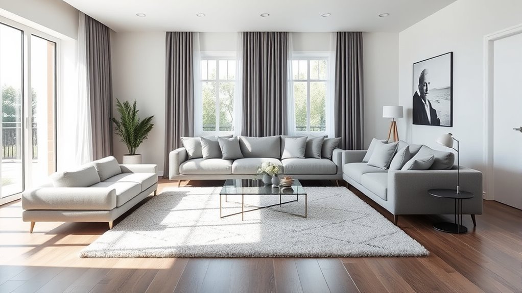
A monochromatic color scheme uses different versions of the same hue. This works beautifully with the 60-30-10 rule because the palette stays calm while still having depth.
For example:
- 60%: pale blue walls
- 30%: medium blue sofa or curtains
- 10%: navy pillows, artwork, or ceramic decor
You can do the same with green, beige, gray, brown, terracotta, or even pink. The key is to vary lightness and texture. If every piece is the same shade and finish, the room can look flat.
In a monochromatic room, texture becomes especially important. Mix linen, velvet, wool, wood, metal, glass, woven baskets, boucle, leather, or ceramic so the palette has movement even when the colors are quiet.
Using Patterns With the 60-30-10 Rule
Patterns can make the rule feel more natural because one patterned piece may contain all three colors. A rug might include cream, navy, and rust. A floral pillow might include sage, blush, and ivory. Artwork might give you the entire palette in one place.
To keep patterns from becoming chaotic:
- Choose one large-scale pattern, such as a rug or curtains.
- Add one medium-scale pattern, such as a pillow or chair fabric.
- Balance with solids so the eye has a place to rest.
- Repeat at least one color from the pattern elsewhere in the room.
- Keep the accent color small if the pattern is already bold.
If a patterned rug is the star, it may act as your 30% color story. Pull the 10% accent from the smallest color in the rug for a polished look.
Small Living Room and Open-Plan Tips
For Small Living Rooms
In a small living room, the 60% dominant color has a big impact. A calm base can make the room feel less crowded, but that does not always mean white. Warm beige, soft gray-green, pale taupe, mushroom, or a muted blue can also work.
Use these adjustments:
- Keep the dominant and secondary colors close in value for a softer look.
- Use the accent color in fewer, stronger moments.
- Choose furniture legs, glass, mirrors, and lighter textiles to reduce visual weight.
- Repeat the wall color in curtains or shelves to reduce choppiness.
For Open-Plan Living Rooms
In an open-plan space, your living room may connect to the kitchen, dining area, or entry. The palette needs to flow across zones.
Try this approach:
- Use one dominant neutral across the connected spaces.
- Let each zone have its own secondary color in furniture or textiles.
- Repeat one accent color in small amounts across the whole open area.
- Make sure visible kitchen cabinet, countertop, and hardware colors fit the living-room palette.
For example, an open-plan home might use warm white walls throughout, walnut and black in the kitchen, camel leather in the living room, and olive accents repeated in art, pillows, and plants.
Common Mistakes to Avoid With the 60-30-10 Rule
The 60-30-10 rule is simple, but a few mistakes can make a palette feel off.
- Using too many accent colors: One or two accents usually feel more polished than several unrelated pops of color.
- Ignoring undertones: A cool gray sofa may clash with a warm beige wall if the undertones fight.
- Forgetting the floor: Flooring takes up a large visual area and may already be part of your 60% or 30%.
- Choosing colors only from a screen: Phone and computer screens do not show paint, fabric, or wood accurately.
- Skipping sample testing: Light can change the way paint and fabric look throughout the day.
- Making every color equally strong: If the dominant, secondary, and accent colors are all bold, the room may feel restless.
- Forcing a trend: A trendy color only works if it fits your room, lighting, and taste.
Expert Tips for Mastering the 60-30-10 Color Rule
Use these tips to make the rule look natural instead of formulaic:
- Start with one anchor piece. A rug, sofa, painting, or curtain fabric can guide the whole palette.
- Repeat each color at least twice. A single accent pillow can look random; a pillow plus artwork plus vase looks intentional.
- Vary texture within the same color. Cream walls, linen curtains, boucle chairs, and ceramic lamps can all be cream without looking flat.
- Balance warm and cool tones. A cool blue room may need warm wood, brass, rattan, or cream to feel inviting.
- Use black carefully. Small black accents can sharpen a soft palette and make the room feel grounded.
- Edit before buying more. If the room feels busy, remove one accent color before adding anything new.
A balanced living room palette is not about using exactly three colors. It is about giving each color a clear role so the room feels intentional.
Frequently Asked Questions
What is the 60-30-10 color rule in interior design?
The 60-30-10 color rule is a decorating guideline that uses 60% dominant color, 30% secondary color, and 10% accent color. In a living room, that might mean walls as the dominant color, furniture or curtains as the secondary color, and pillows or artwork as the accent.
What color is replacing grey in living rooms?
No single color is replacing grey everywhere. Many designers are moving toward warmer neutrals such as greige, taupe, mushroom, cream, camel, and soft terracotta. Deep navy, olive, brown, and muted green are also popular for adding depth. If you still love grey, choose a warmer grey and pair it with wood, texture, and warm accents.
How many colors should be in a living room?
Most living rooms look best with three to five main colors, including neutrals, wood tones, metals, and accent colors. The 60-30-10 rule works well because it keeps the palette focused while still allowing contrast and personality.
What is the 70-20-10 rule in decorating?
The 70-20-10 rule is a calmer variation of the 60-30-10 rule. It uses 70% dominant color, 20% secondary color, and 10% accent color. It works well when you want a quieter room with less contrast.
Can I use more than one accent color?
Yes, but keep the accents related. For example, rust and terracotta can work together because they are similar. Navy and teal can also work together. If the accents are unrelated, repeat each one in small amounts so they look intentional.
Does wood count as one of the 60-30-10 colors?
Yes. Wood has color, undertone, and visual weight. Light oak, walnut, cherry, and weathered gray wood all affect the palette. In many living rooms, wood tones function as part of the secondary color.
Should the 60% color always be on the walls?
No. Walls are often the largest surface, but the 60% color can also come from a large sectional, a big rug, built-ins, flooring, or repeated textiles. Choose the color that visually dominates the room.
Conclusion
The 60-30-10 color rule is one of the easiest ways to make a living room palette feel balanced. Start with a dominant color for the largest surfaces, add a secondary color for depth, and finish with a small accent color for personality. Then test everything in your real room, with your real light, next to your real furniture and finishes.
For example, soft gray walls at 60%, a navy sofa and curtains at 30%, and mustard-yellow pillows and artwork at 10% can create a living room that feels calm, structured, and lively. But the best palette is the one that works with your space and feels good to live with every day.
Sources
- Adobe Color Wheel — supports color harmony types, palette building, and contrast-checking concepts.
- Architectural Digest: Color Wheel for Interior Design — supports practical color-wheel use in interiors.
- Better Homes & Gardens: How to Use the Color Wheel — supports monochromatic, analogous, complementary, and triadic room palettes.
- House Beautiful: 60-30-10 Color Rule — supports the rule as a flexible designer guideline.
- W3C WCAG 2.2 Contrast Minimum — supports readable light-dark contrast guidance for text and digital mood-board use.
- Shamoi et al.: Towards a Universal Understanding of Color Harmony — supports the point that color harmony depends on hue relationships as well as saturation and intensity.