Mixing warm and cool tones in your living room works best when you stop treating them as opposites and start using them as partners. Warm tones like camel, rust, cream, brass, oak, and terracotta can make a cool room feel softer, while cool tones like blue, green, gray, black, and silver can keep a warm room from feeling heavy.
Quick Answer
To mix warm and cool tones in a living room, choose one temperature to dominate, then repeat the opposite temperature in smaller accents. Start with your walls, flooring, sofa, and wood tones, add a neutral bridge color, layer textures, and use warm 2700–3000K lighting to make the palette feel cohesive.
Key Takeaways
- Pick a dominant temperature first: mostly warm with cool accents, or mostly cool with warm accents.
- Use undertones to connect colors. Warm grays, creamy whites, cognac leather, brass, oak, and terracotta can bridge cool blues, greens, and charcoals.
- Repeat each accent color at least two or three times so the room feels intentional rather than mismatched.
- Lighting matters. Lower Kelvin bulbs feel warmer, while higher Kelvin bulbs feel cooler, according to the U.S. Department of Energy.
At a Glance
| Time Required | 30–60 minutes to plan; a weekend if you are buying decor or testing paint samples |
| Difficulty | Easy to moderate |
| Tools Needed | Phone camera, paint or fabric samples, measuring tape, natural light check, warm-white bulbs or dimmable lamps |
| Cost | $0 if rearranging existing pieces; $25–$150+ for pillows, throws, lamps, bulbs, or sample pots |
Why Understanding Warm and Cool Tones Is Essential for Color Mixing
Warm and cool tones change the way a living room feels. Warm colors usually include reds, oranges, yellows, creams, tans, browns, warm woods, brass, and gold. Cool colors usually include blues, greens, violets, grays with blue undertones, black, chrome, nickel, and silver.
The goal is not to split the room into “warm” and “cool” sides. A better approach is to let one temperature lead and use the other for contrast. For example, a cool blue-gray sofa can feel welcoming with a warm oak coffee table, rust pillows, and a cream throw. A warm beige room can feel fresher with sage green art, black frames, and a cool gray rug.
Color can also affect perceived comfort. A study published in PLOS ONE found that warm and cool illumination influenced how participants perceived temperature, which supports the idea that color and light can shift how a space feels even when the physical temperature stays the same.
Note: “Warm” and “cool” are about visual temperature and undertone, not actual heat. In lighting, the naming can feel counterintuitive: lower Kelvin bulbs look warmer, while higher Kelvin bulbs look cooler.
Start With Your Existing Elements
Before buying anything, take inventory of what is already in your living room. Most rooms already have a dominant temperature because of the flooring, walls, sofa, large rug, built-ins, stone fireplace, wood furniture, or metal finishes.
Look at each fixed or expensive element and label it warm, cool, or neutral:
- Walls: Cream, beige, tan, and taupe usually read warm; blue, green, cool white, and blue-gray usually read cool.
- Floors: Honey oak, walnut, terracotta, and warm brown floors add warmth; gray tile, concrete, slate, or very dark espresso floors can read cooler.
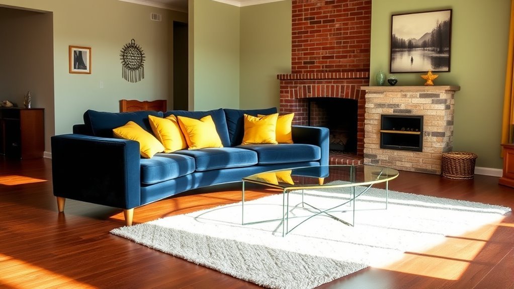
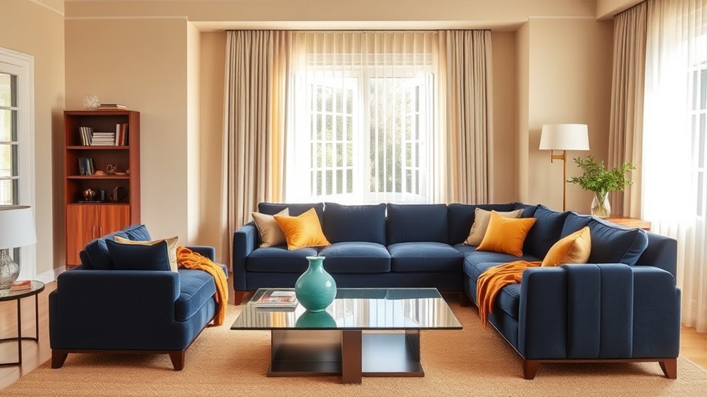
- Sofa and chairs: Charcoal, navy, gray, and blue-green upholstery lean cool; camel, ivory, rust, tan, and brown lean warm.
- Metals: Brass, bronze, and gold add warmth; chrome, polished nickel, blackened steel, and silver add coolness or contrast.
- Decor: Rugs, pillows, artwork, curtains, vases, and lamps are the easiest places to adjust the balance.
Take a photo of the room in daylight and another photo at night with the lamps on. This makes undertones easier to spot because colors often shift under different lighting.
How to Mix Warm and Cool Tones in Your Living Room Palette
Once you know what you already have, choose a simple palette structure. A helpful version of the 70-20-10 rule is:
- 70% dominant temperature: Your main walls, sofa, flooring, or large rug.
- 20% balancing temperature: Secondary furniture, curtains, accent chairs, or a large piece of art.
- 10% accent pop: Pillows, throws, lamps, books, vases, or small decor.
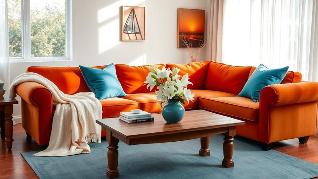
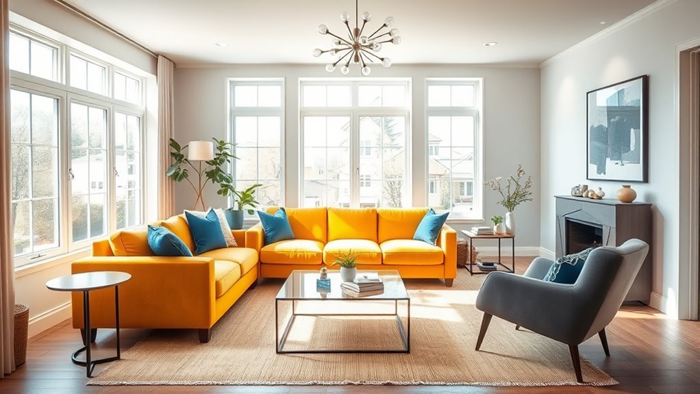
For a cool-led room, try cool walls or upholstery with warm wood, leather, brass, rust, ochre, or cream accents. For a warm-led room, try beige, ivory, oak, or camel with cool accents like sage, navy, charcoal, black, or blue-gray.
Pro Tip: Repeat your accent temperature in at least three places. A rust pillow, a terracotta vase, and warm-toned art will look intentional beside a cool sofa. One lonely warm accent can look accidental.
Understand Undertones Before You Buy
Undertone is the subtle color hiding underneath the main color. This is why two gray paints can look completely different: one may have a blue undertone and feel cool, while another may have a beige or brown undertone and feel warm.
Interior designers often use undertones to connect warm and cool palettes. Real Simple notes that warm and cool tones can exist inside many colors, including gray, and that a balanced room usually combines both rather than separating them.
Use these easy pairings as a starting point:
- Cool blue + warm cognac: Great for a relaxed living room with a blue sofa, leather chair, or warm wood table.
- Warm beige + cool black: Adds structure and keeps a beige room from feeling flat.
- Cool gray + brass: Warms up gray walls or gray upholstery without changing the whole palette.
- Terracotta + sage green: A soft earthy mix that feels warm but still fresh.
- Cream + navy: Classic, high contrast, and easier to live with than stark white and black.
Utilize Warm Colors as Accent Pieces Effectively
Warm accents are especially useful when your room already has cool walls, a gray sofa, blue upholstery, black furniture, or silver-toned metal. The key is to choose accents that feel connected, not random.
Choose Strategic Accents
Use warm accents where the eye naturally lands: the sofa, coffee table, fireplace mantel, bookshelf, side table, or main artwork. Good warm accent options include:
- Rust, clay, ochre, mustard, camel, cream, or cinnamon throw pillows
- A warm wood coffee table or side table
- Brass or bronze picture frames, lamps, or candleholders
- Artwork that includes both warm and cool hues
- A woven basket, jute rug, or natural fiber shade
If your sofa is cool-toned, a warm throw or pillow can create immediate contrast. If your walls are cool, warm wood furniture can keep the room from feeling stark.
Incorporate Textured Elements
Texture is one of the easiest ways to make warm and cool tones feel comfortable together. Pair smooth cool surfaces, such as metal, glass, marble, or blue-gray upholstery, with tactile warm materials like wool, boucle, linen, rattan, leather, jute, wood, or velvet.
For example, a cool gray sectional feels less flat with a chunky cream throw, a walnut table, and brass lamp. A warm tan sofa feels more tailored with a cool charcoal rug, black metal frames, and sage green pillows.
Layer Textures to Enhance Color Combinations
Layering textures prevents a mixed-temperature palette from looking like a paint chart. It gives the room depth and makes the contrast feel natural.
- Natural wood or stone: Warm wood grounds cool colors, while cool stone can sharpen a warm palette.
- Soft fabrics: Cotton, linen, velvet, wool, and boucle soften hard contrasts.
- Mixed metals: Brass and bronze can warm up chrome, nickel, black, or silver finishes.
- Decorative accents: Woven baskets, ceramic vases, knitted blankets, and patterned pillows add tactile variety.
Try not to rely on color alone. A blue velvet pillow, a brass lamp, a wood tray, and a cream wool rug can do more for the room than adding another paint color.
Use Lighting to Balance Warm and Cool Tones
Lighting can make or break a warm-and-cool palette. The U.S. Department of Energy explains that lower color temperatures, around 2700–3000K, are considered warm, while higher Kelvin temperatures, around 3600–5500K, are considered cool. For most living rooms, warm-white bulbs in the 2700–3000K range are usually the safest choice because they soften cool colors and flatter skin tones.
Use more than one light source so the room has depth:
- Ambient lighting: Ceiling fixtures, recessed lights, or a large shade for general light.
- Task lighting: Reading lamps near chairs or sofas.
- Accent lighting: Picture lights, sconces, or small lamps on shelves and consoles.
Also check color rendering. DOE notes that the Color Rendering Index, or CRI, measures how accurately a light source renders color, and CRI 80 or higher is considered acceptable for most indoor residential use.
Warning: Do not choose paint, curtains, or a large rug from a screen image alone. Test samples in your actual room during morning light, afternoon light, and evening lamp light before committing.
Add Dimension With Contrasting Furniture and Decor
Contrasting furniture keeps the room from looking one-note. If the biggest pieces are cool, bring in warm furniture. If the biggest pieces are warm, add cool contrast.
Here are a few balanced combinations that work well in living rooms:
- Cool walls + warm furniture: Blue-gray walls, cream curtains, a walnut coffee table, and rust pillows.
- Warm walls + cool accents: Beige walls, a tan sofa, black frames, a charcoal rug, and sage green ceramics.
- Warm wood floors + cool upholstery: Oak flooring, a navy sofa, brass lighting, and cream textiles.
- Cool gray sofa + earthy accents: Gray upholstery, cognac leather, terracotta art, and a natural jute rug.
The most common mistake is grouping all the warm pieces on one side and all the cool pieces on the other. Instead, spread both temperatures around the room so the eye moves comfortably from one area to the next.
How Natural Light Changes Warm and Cool Tones
Natural light changes color throughout the day, so the same paint, sofa, or rug can look different from morning to evening. A north-facing room often receives cooler, softer light, so warm accents can make it feel more comfortable. A south-facing room often gets stronger, warmer light, so cool tones can keep it balanced. East-facing rooms may feel bright in the morning and cooler later in the day, while west-facing rooms can feel warmer in the afternoon and evening.
Before changing the whole palette, move a few warm and cool samples around the room. Check them near the window, near the sofa, under a lamp, and beside your flooring. The best color is the one that works with your room’s real light, not just the one that looks good in a store.
How to Ensure Your Space Feels Cohesive and Inviting
A cohesive living room usually has a clear base, a repeated accent, and enough neutral space for the eye to rest. Start with a neutral bridge color such as warm white, cream, greige, taupe, mushroom, soft gray, charcoal, or natural wood. Then repeat your warm and cool accents in small, balanced doses.
Use this quick checklist before you finish the room:
- Does one temperature clearly dominate?
- Does the opposite temperature appear in at least two or three places?
- Do the undertones of the walls, sofa, rug, and curtains work together?
- Does the room look good in both daylight and lamp light?
- Is there enough texture to keep the palette from feeling flat?
- Do your largest pieces feel connected to your smallest accents?
If the room still feels off, remove one accent color before adding another. Most mixed palettes fail because they include too many unrelated tones, not because warm and cool colors cannot work together.
Common Mistakes When Mixing Warm and Cool Tones
- Using a perfect 50/50 split: Equal amounts of warm and cool can feel visually busy. Let one lead.
- Ignoring undertones: A cool white wall can clash with a very yellow beige sofa if there is no bridge color.
- Buying everything new: Often, the fix is as simple as changing pillow covers, bulbs, frames, or a throw.
- Forgetting metals: Hardware, lamps, picture frames, and curtain rods all affect the temperature of the room.
- Using only overhead lighting: A single harsh ceiling light can flatten both warm and cool colors.
- Skipping samples: Paint, fabric, and wood tones shift under real light, so test before committing.
Frequently Asked Questions
How do you mix warm colors in a living room?
Mix warm colors by varying their depth and texture. Pair soft warm neutrals like cream, tan, or greige with richer accents like rust, ochre, camel, terracotta, or walnut. Add a few cool details, such as black frames or sage green decor, so the room does not feel overly heavy.
What is the 70-20-10 rule in decorating?
The 70-20-10 rule is a simple palette guideline: use about 70% dominant color or temperature, 20% secondary contrast, and 10% accent. It does not guarantee harmony, but it helps beginners avoid a room where every color competes equally.
What colors make warm colors?
Warm colors usually come from the red, orange, and yellow side of the color family. In home decor, warm colors also include cream, beige, camel, tan, chocolate brown, warm wood, brass, bronze, rust, clay, and terracotta.
What colors make warm gray?
Warm gray usually has beige, brown, taupe, yellow, or subtle red undertones. Greige is a common warm-gray option because it blends gray with beige. If a gray looks blue, purple, or steel-like beside your furniture, it is probably a cool gray.
Can you mix warm and cool wood tones?
Yes. Keep one wood tone dominant, then repeat the secondary wood tone at least once. For example, warm oak floors can work with a cooler dark walnut table if you repeat the darker tone in frames, legs, shelving, or decor.
Should living room lighting be warm or cool?
Most living rooms feel best with warm-white lighting around 2700–3000K because it creates a softer atmosphere and flatters warm and cool decor. Cooler light can work for task areas, but it may feel harsh if it is the only light source in a relaxing room.
Conclusion
Mixing warm and cool tones is less about following a strict rule and more about creating balance. Let one temperature lead, use the other for contrast, repeat accents around the room, and check every choice under your real lighting. With warm woods, cool upholstery, layered textures, and thoughtful lighting, your living room can feel cohesive, comfortable, and full of depth.
Sources
- U.S. Department of Energy — Lighting Principles and Terms — supports Kelvin color temperature, warm/cool lighting ranges, CRI, and lighting terminology.
- U.S. Department of Energy — Lighting Choices to Save You Money — supports LED efficiency and lighting product guidance.
- PLOS ONE / NCBI — Effect of Illumination on Perceived Temperature — supports the relationship between warm/cool illumination and perceived warmth or coolness.
- Real Simple — Warm and Cool Colors Guide — supports undertone and balanced warm/cool decorating guidance from interior designers.
- Livingetc — Warm vs. Cool Colors in Interiors — supports current interior design guidance on undertones, natural light, and mixing warm and cool colors.