Negative space in a living room is the intentional open space around furniture, decor, walls, windows, and walkways. It is not wasted space. Used well, it makes the room feel calmer, easier to move through, and more visually balanced because your eye can understand what matters: the sofa, fireplace, artwork, view, rug, or sculptural chair. The goal is not to make the room bare. The goal is to edit the layout so every piece has a purpose and enough room to be noticed.
Quick Answer
Negative space in a living room is the empty or open area around furniture, decor, and architectural features. It helps the room feel balanced, uncluttered, and easier to navigate. Use it by clearing pathways, spacing out focal pieces, simplifying surfaces, and leaving some walls or corners intentionally unfilled.
Key Takeaways
- Negative space is the open area around the “positive” elements in the room, such as furniture, art, lamps, plants, and architectural details.
- A good living room needs both filled areas and open areas; too much furniture can make even beautiful pieces feel lost.
- Start by choosing one or two focal points, then leave clear space around them so the room feels intentional.
- Keep main walkways open, simplify surfaces, and use closed storage to reduce visual clutter.
- Negative space works in minimalist, traditional, colorful, and maximalist rooms. It is about balance, not emptiness.
At a Glance
| Time Required | 30 minutes for a quick edit; 1–2 hours for a full room reset |
| Difficulty | Easy to moderate |
| Tools Needed | Tape measure, boxes for decluttering, painter’s tape, phone camera, optional floor plan app |
| Cost | $0 if you rearrange and edit; optional cost for storage, lighting, or smaller-scale furniture |
What Is Negative Space in a Living Room?
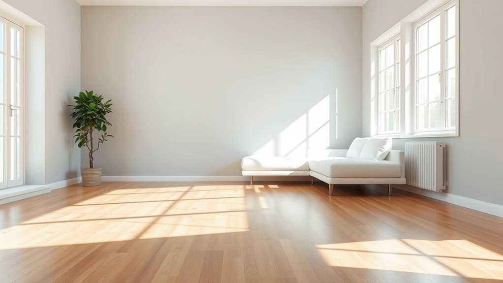
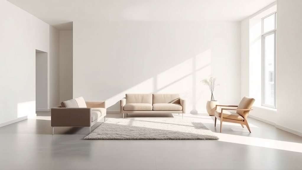
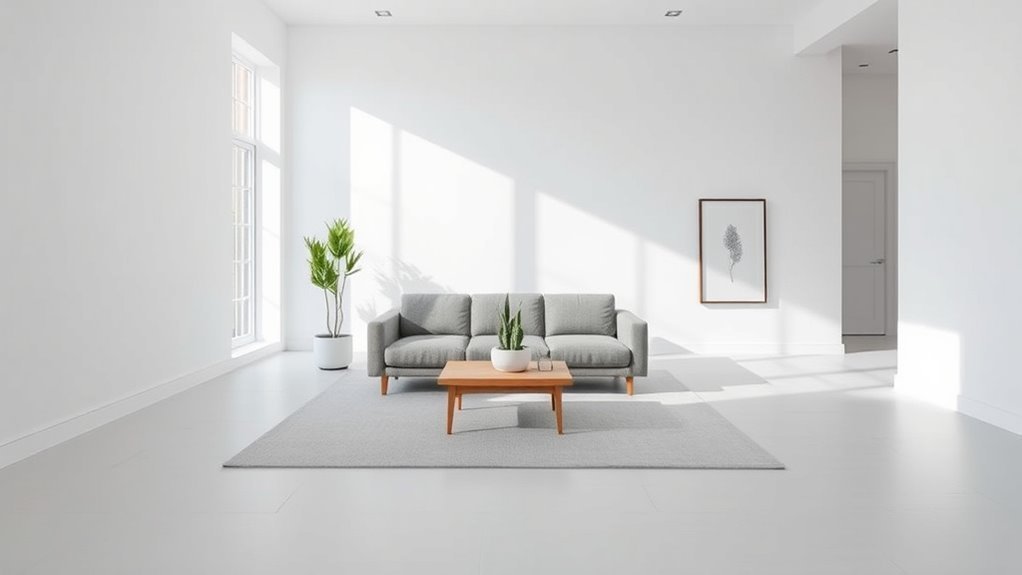
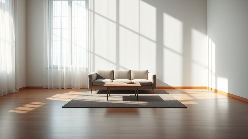
In design, negative space, also called white space, is the empty area around a positive shape. In a living room, the positive shapes are the sofa, chairs, coffee table, rug, lamps, artwork, shelves, plants, windows, and fireplace. The negative space is what surrounds those pieces: open floor, blank wall, breathing room between furniture, and the quiet area around a focal point.
The Interaction Design Foundation describes negative space as the empty area around a positive shape and explains that it helps define boundaries and balance a composition. That same principle applies to interiors. A sofa looks more intentional when it is not crowded by too many side tables, pillows, baskets, and accessories. A fireplace feels stronger when the wall around it is not overloaded. A sculptural chair becomes a focal point when it has enough room around it to be seen.
Note: Negative space does not have to be white, empty, or minimalist. A patterned rug, colorful wall, or richly layered room can still have negative space if the layout gives the eye places to rest.
Why Negative Space Matters in a Living Room
Negative space matters because it affects how a room looks, feels, and functions. When every wall, surface, and corner is filled, the eye has no clear place to land. Even expensive furniture can look accidental if it is competing with too many nearby objects. Open space creates contrast, and contrast helps important pieces stand out.
In a living room, negative space can:
- Make a sofa, fireplace, artwork, or view feel like a true focal point.
- Create calmer transitions between seating, storage, and walkways.
- Help small rooms feel less cramped.
- Make large rooms feel more deliberate instead of overfilled.
- Reduce visual clutter on shelves, tables, and walls.
- Improve everyday movement through the space.
Designers often describe negative space as “breathing room” because it gives furniture and decor enough separation to feel chosen rather than squeezed in. Current interior design guidance also emphasizes that negative space is useful in traditional, contemporary, and even maximalist homes, not just sparse minimalist rooms.
What Negative Space Looks Like in a Living Room
Negative space is easiest to spot when you look at the room in zones. It may be the open floor between the coffee table and media console, the blank wall around one large artwork, the space between two accent chairs, or the clear area around a window. It may also be the top of a console table with only one lamp and one bowl instead of six small objects.
Here are practical examples:
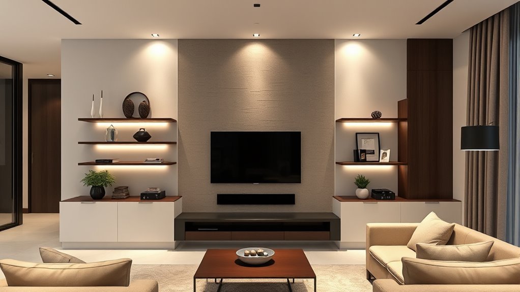
- A fireplace wall: One large mirror or artwork above the mantel, with fewer small accessories competing around it.
- A sofa wall: A sofa with open wall space on either side instead of art, shelves, and plants filling every inch.
- A reading corner: A chair, small table, and lamp with open floor around them so the corner feels inviting, not stuffed.
- A coffee table: One tray, one book stack, or one vase, leaving part of the surface empty.
- A window area: Low furniture or simple curtains that allow light, trim, and the view to remain visible.
The best negative space feels intentional. It should make the room look edited, not unfinished.
Practical Tips for Using Negative Space
Start with editing before you buy anything new. Negative space usually comes from removing, rearranging, or simplifying rather than adding more decor. Walk into the room from the main entry and notice what your eye sees first. If everything competes for attention, choose one primary focal point and let the rest of the room support it.
- Choose the focal point. This might be a fireplace, sofa, picture window, media wall, large artwork, or statement chair.
- Clear the space around it. Remove small items that weaken the focal point, such as extra frames, duplicate lamps, or too many tabletop accessories.
- Open the main walkway. Make sure people can move from the entry to the seating area without weaving around furniture.
- Simplify surfaces. Edit coffee tables, side tables, shelves, and mantels until each surface has a clear purpose.
- Use closed storage. Baskets, cabinets, drawers, and boxes hide visual clutter better than clear bins or open piles.
- Check the room from a distance. Stand in the doorway or take a phone photo. Clutter is easier to see in a photo than when you are standing inside the room.
Pro Tip: Remove 20% of the small decor first, then reassess. If the room suddenly feels calmer but not empty, you have found the right direction.
How Negative Space Enhances Functionality
Negative space is not only about looks. It also makes the living room easier to use. A room with open paths, visible surfaces, and well-spaced seating supports conversation, cleaning, play, reading, and entertaining without constant rearranging.
Improved Movement Flow
Clear floor space helps people move naturally between the entry, sofa, chairs, storage, and exits. If guests have to turn sideways to pass a coffee table or step around an ottoman, the room needs more functional negative space. For accessibility-minded planning, aim to keep the main route as close to 36 inches wide as your layout allows. The U.S. Access Board uses 36 inches as the minimum continuous clear width for accessible routes, though private homes are not always required to follow ADA standards.
Warning: Do not create “decorative” negative space by blocking real walking paths. A beautiful layout still needs safe routes around tables, cords, stools, and sharp furniture corners.
Enhanced Visual Clarity
Visual clarity means the room is easy to understand at a glance. You can tell where to sit, where to place a drink, where the focal point is, and how to move through the room. Negative space supports that clarity by reducing competition. Instead of ten small objects fighting for attention, one lamp, one artwork, or one textured chair can become memorable.
How Much Space Should You Leave?
There is no single measurement that works for every living room, but these starting points help you decide whether the room feels crowded or balanced:
- Main walkway: Aim for 30–36 inches when possible, with 36 inches as the better accessibility-minded target.
- Sofa to coffee table: Leave enough space to walk and sit comfortably while still reaching the table; 14–18 inches is a common starting range.
- Between seating pieces: Keep chairs close enough for conversation but not so close that knees, tables, and arms collide.
- Around statement furniture: Give sculptural chairs, large plants, and special tables extra room so their shape can be appreciated.
- On walls: Do not cover every blank area. One strong piece of art often looks better than several small pieces competing for attention.
- On shelves: Mix filled shelves with open pockets. A shelf that is 70–80% full often feels more intentional than one packed edge to edge.
Use these as flexible guidelines, not strict rules. A compact apartment, a family room with toys, and a formal living room will each need a different balance of open and filled space.
Using Color to Make Negative Space Stand Out
Color can make negative space feel calm, bold, warm, or dramatic. Light neutral walls often make open areas feel airy, while deep paint colors can turn blank wall space into a rich backdrop for a sofa, mirror, or artwork. The key is contrast. A walnut console against a pale wall, a cream sofa on a darker rug, or a colorful chair surrounded by quieter tones all use negative space to draw attention.
Try these color strategies:
- Use tone-on-tone storage in small rooms so cabinets and baskets visually recede.
- Let bold patterns breathe by pairing them with quieter walls, rugs, or curtains.
- Repeat one accent color in a few places instead of scattering many unrelated colors around the room.
- Use blank wall space deliberately so art, trim, windows, and lighting feel stronger.
Furniture Arrangement Strategies for Maximizing Negative Space
Furniture arrangement is where negative space becomes most noticeable. A room can have beautiful pieces and still feel wrong if the layout is crowded or lopsided. Instead of pushing every piece against the wall or filling each corner, arrange furniture around function and flow.
Use these strategies:
- Float furniture when possible. Pulling a sofa or chair slightly away from the wall can make the seating area feel more intentional.
- Anchor the room with a rug. A rug can define the positive space of the seating area while leaving open floor around it.
- Limit single-use extras. Too many poufs, stools, side tables, and accent chairs can make the room harder to use.
- Balance visual weight. If one side has a bulky sectional, balance it with open space, a slim chair, or vertical art rather than another heavy piece.
- Leave some corners empty. Not every corner needs a plant, basket, lamp, or pedestal.
In a small living room, negative space often comes from choosing fewer, better-scaled pieces. In a large living room, it comes from creating zones with open transitions between them. In an open-plan room, it helps separate living, dining, and work areas without adding walls.
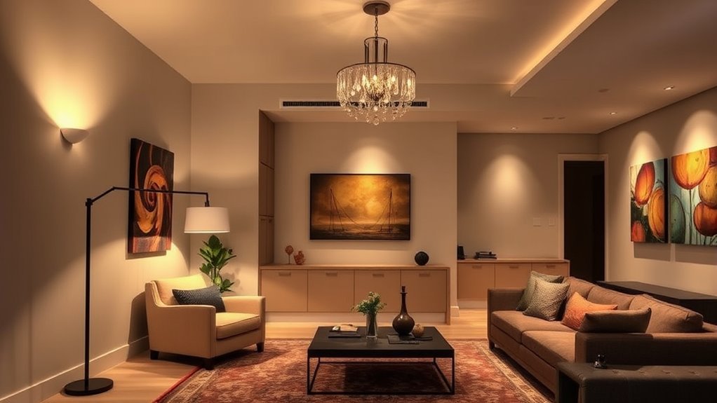
The Role of Lighting in Highlighting Negative Space
Lighting can make negative space feel warm and intentional instead of bare. Natural light highlights open floor and wall areas during the day. In the evening, lamps, sconces, picture lights, and dimmers help shape what the eye notices first. Ambient lighting provides general illumination, task lighting supports reading or activities, and accent lighting highlights art, plants, shelves, or architectural details.
To use lighting with negative space:
- Keep windows clear enough for daylight to reach the room.
- Use floor lamps or sconces to define a reading corner without adding bulky furniture.
- Add picture lighting or a focused lamp near one artwork instead of filling the whole wall.
- Use dimmers so open areas feel soft at night rather than flat or shadowy.
- Avoid placing lamps in every empty spot; light the areas that support the room’s function and focal points.
How to Keep Negative Space From Looking Empty
The biggest mistake is removing so much that the room loses warmth. Negative space should make the remaining pieces feel stronger, not make the room feel unfinished. If an area looks too bare, add texture before adding clutter. A woven shade, linen curtain, wood table, plaster lamp, wool rug, or large plant can add depth while still preserving openness.
Ask three questions before adding something to an empty space:
- Does this improve how the room works?
- Does this support the focal point?
- Would the room feel better if this area stayed quiet?
If the answer is no, leave the space open. Empty areas can be part of the design.
Common Mistakes to Avoid When Designing With Negative Space
Negative space works best when it feels deliberate. Avoid these common mistakes:
- Overcrowding the room: Too many chairs, tables, baskets, and accessories remove the visual rest the room needs.
- Leaving only awkward gaps: Random slivers of space between furniture do not feel intentional. Open areas should support flow or focus.
- Ignoring scale: Oversized furniture can consume the room, while too many small pieces can make it feel busy.
- Filling every wall: Blank wall space can frame art, windows, millwork, or a fireplace.
- Using open storage for clutter: Open shelves are beautiful when edited, but messy when used as overflow storage.
- Forgetting lighting: A dark empty corner may look neglected, while a softly lit one can feel calm and purposeful.
- Going too sparse: Negative space should create balance, not make the room feel cold or unused.
Frequently Asked Questions
How do you fill negative space in a living room?
You do not always need to fill it. First decide whether the open area improves balance, flow, or focus. If it feels truly unfinished, add one purposeful element such as a large plant, floor lamp, textured chair, oversized artwork, or closed storage piece instead of several small accessories.
What is negative space in a room?
Negative space is the open area around and between furniture, decor, and architectural features. In a living room, it includes blank wall space, open floor, gaps between furniture, clear tabletops, and the quiet area around focal points.
What does negative space look like?
Negative space can look like a clear walkway, a simple wall around one artwork, open floor around a chair, a coffee table that is not fully covered, or shelves with a few empty pockets. It looks intentional when it helps the room feel balanced and easy to understand.
Is negative space the same as minimalism?
No. Minimalism often uses a lot of negative space, but negative space can work in any style. Traditional, colorful, vintage, and maximalist living rooms still need open areas so patterns, textures, and statement pieces have room to stand out.
How do you use negative space in a small living room?
Choose fewer furniture pieces, keep the main walkway open, use closed storage, and avoid filling every wall or surface. In a small room, negative space may be modest, but even a clear path, simple coffee table, and uncluttered window area can make the room feel larger.
What are common negative space mistakes?
Common mistakes include overcrowding furniture, using too many small accessories, blocking walkways, choosing oversized pieces, filling every wall, and removing so much that the room feels cold. The goal is balance: enough openness to create calm, but enough texture and function to feel lived-in.
Conclusion
Negative space can transform a living room because it changes how every other element is seen. By clearing pathways, editing surfaces, spacing furniture thoughtfully, and giving focal points room to breathe, you create a space that feels calmer, more functional, and more intentional. The best results come from balance. Keep the pieces that matter, remove what competes, and let the open areas become part of the design.
Sources
- Interaction Design Foundation — The Key Elements & Principles of Visual Design — supports the definition of negative/white space and its role in balance.
- Homes & Gardens — Why Negative Space Matters in Your Living Room — supports current designer guidance on restraint, flow, and focal points.
- Homes & Gardens — 7 Ways Designers Use Negative Space — supports the point that negative space works beyond minimalist interiors.
- Real Simple — Negative Space Designer Tips — supports practical layout advice, traffic flow, and avoiding overfilling.
- U.S. Access Board — Chapter 4: Accessible Routes — supports the accessibility-minded 36-inch clear-route reference.