Choosing living room wall art is easier when you measure the furniture first. Instead of guessing, use the sofa, fireplace, mantel, or blank wall as your anchor, then choose artwork that feels visually connected to that feature. The goal is simple: the art should look intentional, balanced, and easy to view from both standing and seated positions.
Quick Answer
For most living rooms, choose wall art that is about two-thirds to three-fourths the width of the sofa, mantel, or furniture below it. For a 7-foot sofa, that means about 56 to 63 inches wide. Hang the artwork so its center is around 57 to 60 inches from the floor, or 6 to 12 inches above furniture.
Key Takeaways
- Above a sofa, artwork usually looks best at about two-thirds to three-fourths of the sofa width.
- For a 7-foot sofa, aim for one large piece or a grouped arrangement around 56 to 63 inches wide.
- Use 57 to 60 inches from the floor to the center of the artwork as a starting point, not a fixed law.
- Keep art 6 to 12 inches above sofas, consoles, and mantels so the pieces feel connected.
- For gallery walls, plan the whole grouping as one large shape and keep frame spacing consistent.
At a Glance
| Time Required | 20 to 45 minutes for one piece; 1 to 2 hours for a gallery wall |
| Difficulty | Easy for lightweight art; moderate for large, heavy, or glass-framed pieces |
| Tools Needed | Tape measure, pencil, painter’s tape, level, paper templates, stud finder, and picture-hanging hardware rated for the artwork weight |
| Cost | Usually $5 to $40 for hanging supplies, depending on wall type, artwork weight, and whether anchors or cleats are needed |
Understanding Ideal Wall Art Sizes for Your Living Room
The easiest way to choose the right wall art size is to measure the object below it. In a living room, that anchor is usually a sofa, fireplace, console table, media cabinet, or large blank wall. Once you know that width, choose art that fills enough space to feel intentional without crowding the room.
| Where the Art Goes | Best Starting Size | Example |
|---|---|---|
| Above a sofa | About 2/3 to 3/4 of the sofa width | For a 7-foot sofa, choose art around 56 to 63 inches wide. |
| Above a fireplace | About 2/3 to 3/4 of the mantel, firebox, or main fireplace opening | If the fireplace opening is 48 inches wide, try art around 32 to 36 inches wide. |
| On a blank wall | About 50% to 75% of the available wall width | On a 96-inch wall, try a 48- to 72-inch-wide piece or gallery grouping. |
| Small accent wall | One vertical piece or a tight pair | Use narrow art to add height without making the wall feel crowded. |
These are starting points, not strict rules. A bold abstract canvas can be slightly larger because it reads as one simple shape, while a busy gallery wall may need more breathing room. If the wall already has sconces, tall plants, built-ins, or curtains, size the artwork to the open space that remains.
How to Measure Before You Hang Art
Before you buy or hang anything, take a few measurements. This prevents the most common problem: artwork that looks too small, too high, or disconnected from the furniture below it.
- Measure the anchor. Measure the sofa, mantel, fireplace opening, console, or blank wall area where the art will sit.
- Choose the target width. Multiply the anchor width by 0.66 and 0.75 to get a strong size range. For example, 84 inches × 0.66 = about 56 inches, and 84 inches × 0.75 = 63 inches.
- Find the visual center. For open walls, start with the artwork center around 57 to 60 inches from the floor, a common gallery-style eye-level range supported by professional hanging guidance from Architectural Digest and Livingetc.
- Adjust above furniture. When art hangs above a sofa, console, or mantel, place the bottom edge about 6 to 12 inches above the furniture so the two pieces feel connected.
- Mock it up first. Use painter’s tape or paper templates to test the size and placement before putting holes in the wall.
Pro Tip: For gallery walls, tape paper cutouts of each frame to the wall first. Live with the layout for a day, then adjust spacing before you hang anything permanently.
How to Hang Art Above Sofas for Maximum Impact
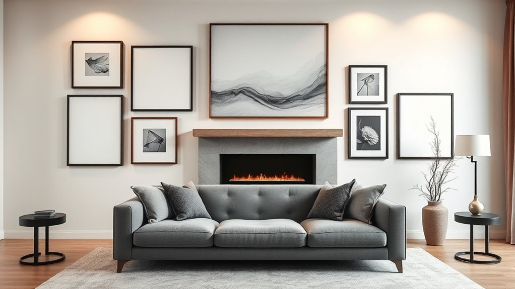
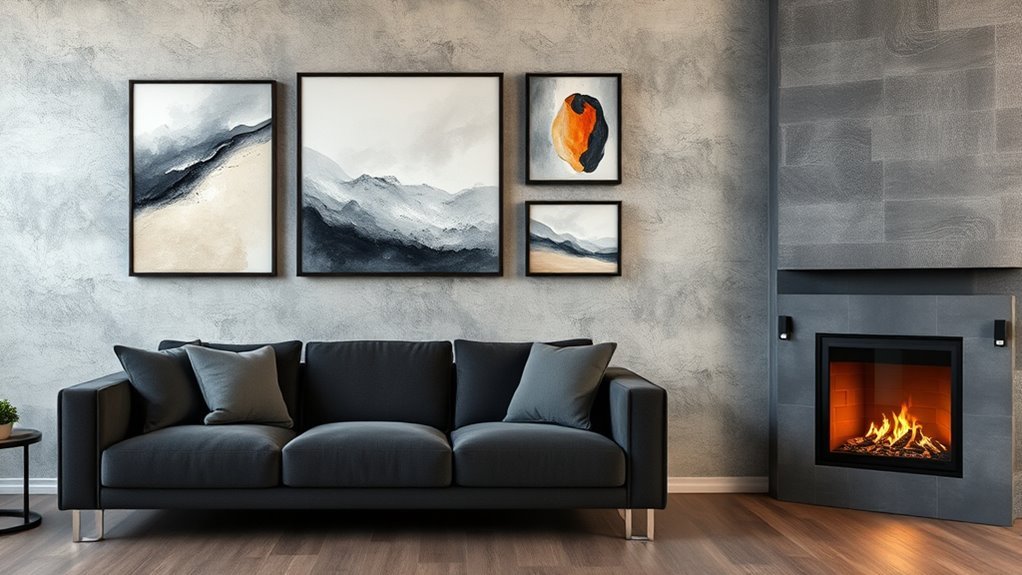
Art above a sofa should feel like part of the seating area, not a separate object floating near the ceiling. For a 7-foot-wide sofa, a single large piece or a grouped arrangement around 56 to 63 inches wide usually creates the strongest balance. Smaller art can still work, but it should be grouped with other pieces, sconces, shelves, or plants so the whole arrangement has enough visual weight.
Keep the bottom edge of the frame about 6 to 12 inches above the sofa back. If your sofa has a very tall back, oversized pillows, or a nearby lamp, use the lower end of that range carefully so the art does not feel cramped. If the wall is empty and the sofa is low, the center of the artwork can sit closer to the 57- to 60-inch eye-level range.
| Art Choice | Best Placement | When It Works Best |
|---|---|---|
| One large piece | Centered over the sofa | Clean, modern rooms or strong focal walls |
| Two or three matching pieces | Evenly spaced as one group | Symmetrical layouts and long sofas |
| Organic gallery wall | Balanced around a central piece | Collected, layered, personal rooms |
| Small artwork | Grouped with shelves, lamps, or other frames | Apartments, reading corners, or casual spaces |
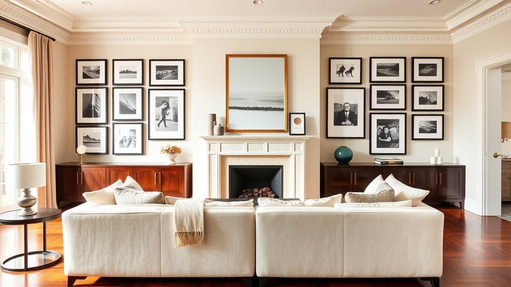
Fun Ideas for Gallery Walls Above Your Fireplace
A gallery wall above a fireplace can turn the mantel area into a natural focal point. Start with the width of the fireplace opening, mantel, or surround, then build an arrangement that feels related to that architectural shape. The artwork does not need to match the fireplace exactly, but it should not look tiny compared with the firebox or too wide for the mantel.
For a balanced fireplace gallery wall, mix one larger anchor piece with smaller frames, mirrors, or personal photos. Keep the overall shape simple: a rectangle, soft arch, or slightly asymmetrical cluster. Consistent spacing matters more than perfect matching. Current expert guidance from House Beautiful recommends keeping frame spacing consistent and avoiding layouts that float too high or look too sparse.
Warning: Be careful with valuable art, delicate paper, antique frames, and mirrors above a working fireplace. Heat, soot, smoke, and moisture can damage artwork over time. Use secure hardware, avoid placing heavy glass frames where they could fall, and choose heat-tolerant placement when the fireplace is used often.
Balancing Art With Your Furniture Arrangement
Wall art should respond to the furniture below it. If your sofa, coffee table, and rug form a long horizontal line, a wide canvas or triptych will usually feel natural. If the room has tall windows, bookcases, or a narrow wall beside the fireplace, vertical art can add height and keep the room from feeling too heavy at the bottom.
Think of smaller artworks as one larger visual unit. Three 16-by-20-inch frames hung in a row can read like one long piece. A cluster of family photos can fill the same role as a large canvas if the outside edges form a clean shape. This is why gallery walls often work best when you plan the outer boundary first, then arrange the smaller frames inside it.
Note: Center artwork over the furniture, not always the wall. If the sofa is off-center because of a doorway, window, or floor lamp, the artwork should usually align with the sofa so the seating area feels complete.
Arranging Different Sized Art for Visual Interest
Mixing large and small pieces gives a living room more character, but the arrangement needs structure. Start with the biggest piece first. Place it near the center or slightly off-center, then build around it with medium and small pieces. This creates a visual hierarchy, so the eye has a clear place to land.
- Use one anchor piece. A larger canvas, mirror, or framed print can set the scale for the whole wall.
- Keep spacing consistent. For many gallery walls, 2 to 4 inches between frames looks intentional. Real Simple recommends about 2 inches between frames and no more than 6 inches for most layouts.
- Repeat one element. Use a repeated color, frame finish, mat style, or subject matter to keep the wall from looking random.
- Balance vertical and horizontal pieces. Mix orientations so the wall has movement without feeling chaotic.
- Step back often. Check the arrangement from the entry, sofa, and main walkway before making final marks.
A gallery wall should read as one intentional composition first, and as individual frames second.
Personalizing Your Space: Choosing Art That Reflects You
The best living room wall art does more than fill a blank spot. It adds memory, color, texture, and personality to the room. Once the size and placement are right, choose art that feels connected to your life and the mood you want in the space.
Selecting Meaningful Artwork Themes
Choose themes that you will enjoy seeing every day. Nature prints can make a room feel calm. Travel photography can bring back memories. Abstract art can add energy and color. Family photos, sketches, textiles, or collected pieces can make the room feel personal rather than staged.
- Nature: Landscapes, botanicals, coastal scenes, or forest photography create a relaxed mood.
- Travel: City prints, maps, or photos from meaningful trips add story.
- Abstract art: Shapes and color fields can tie together rugs, pillows, and upholstery.
- Family photos: Use consistent frames or mats so personal images feel polished.
- Textiles and objects: Small woven pieces, plates, or sculptural wall objects can add depth to a gallery wall.
Incorporating Personal Color Palettes
Look at the colors already in your living room before choosing art. A simple method is to repeat one or two colors from the rug, pillows, curtains, or accent chairs. If the room is neutral, art can introduce the strongest color in the space. If the room is already colorful, choose art with a calmer palette or plenty of white space so the wall does not feel busy.
The 60-30-10 color idea can help: let about 60% of the room be the dominant color, 30% a secondary color, and 10% an accent. Wall art often works beautifully as that 10% accent because it can add contrast without requiring new furniture.
Balancing Art and Space
Balance does not mean everything must be centered or matching. It means the wall feels visually steady. A large piece on one side of a sofa can be balanced by a tall lamp, plant, or pair of smaller frames on the other side. A dark painting can be balanced by a dark coffee table, fireplace screen, or pillow across the room.
When in doubt, take a quick photo of the wall on your phone. It is often easier to spot awkward gaps, crooked lines, or undersized art in a photo than when standing directly in front of the wall.
Choosing the Right Hardware and Wall Type
The right size and placement will not matter if the artwork is not safely secured. Always check the frame weight, wall type, and hardware rating before hanging. Architectural Digest recommends choosing supplies based on the item’s weight and whether the wall is drywall, plaster, tile, glass, or brick. The Spruce also recommends choosing a hanger with a capacity that comfortably exceeds the artwork’s actual weight and following the manufacturer’s stated limit.
- Lightweight art: Small nails, sawtooth hangers, or adhesive strips may work if the wall surface and product instructions allow it.
- Medium-weight frames: Use picture hangers or wall anchors rated for more than the frame weight.
- Heavy art or mirrors: Use studs, heavy-duty anchors, French cleats, or professional installation.
- Renters: Adhesive strips can work for lightweight pieces on smooth walls, but they are not ideal for heavy, valuable, textured, or fragile surfaces.
- Glass-covered frames: Treat them as heavier and more fragile than open canvas or lightweight prints.
Common Living Room Wall Art Mistakes to Avoid
Most wall art mistakes come from scale, height, or spacing. Fix those three things first, and the room will usually feel more polished right away.
- Choosing art that is too small. Tiny art above a large sofa can look accidental. Group small pieces or choose one larger work.
- Hanging art too high. Use the center-height guideline and adjust lower above furniture when needed.
- Ignoring the furniture below. Art should relate to the sofa, console, fireplace, or seating group.
- Using uneven gallery-wall spacing. Organic layouts still need consistent gaps between frames.
- Forgetting the frame weight. Heavy pieces need hardware rated for the job.
- Buying before measuring. Measure the wall and furniture first, then shop.
Frequently Asked Questions
What is a good size for living room art?
A good size depends on the furniture or wall below it. Above a sofa, choose art that is about two-thirds to three-fourths of the sofa width. On a blank wall, art or a gallery grouping often looks best when it fills about 50% to 75% of the available wall width.
What is the 70/30 rule in wall art?
In home decorating, the 70/30 idea is often used as a loose visual-balance guideline. For wall art, it means the artwork or gallery grouping may fill roughly 70% of the visual space while leaving about 30% as breathing room. It is not a strict art rule, but it can help prevent tiny art from looking lost on a large wall.
What is the 2/3 rule for hanging art?
The 2/3 rule means artwork should be about two-thirds the width of the furniture or architectural feature below it. For example, art above an 84-inch sofa should be at least about 56 inches wide. You can go up to about three-fourths of the sofa width for a fuller look.
How high should living room wall art be hung?
For art on an open wall, start with the center of the artwork around 57 to 60 inches from the floor. Above a sofa, console, or mantel, place the bottom edge about 6 to 12 inches above the furniture so the art feels connected to it.
Should art be centered over the sofa or centered on the wall?
In most living rooms, center the art over the sofa or furniture group rather than the full wall. The artwork should belong to the seating area. If the sofa is off-center because of windows, doorways, or lamps, centering the art over the sofa usually looks more intentional.
How far apart should frames be in a gallery wall?
A spacing range of about 2 to 4 inches works well for many living room gallery walls. Smaller frames often look better closer together, while larger frames can handle slightly wider spacing. The most important rule is consistency.
Conclusion
The right living room wall art size comes down to proportion, height, and connection. Measure the sofa, fireplace, mantel, or wall first, then choose artwork that fills enough space to feel deliberate. For most living rooms, two-thirds to three-fourths of the furniture width is a strong starting point, with the artwork centered around eye level or placed 6 to 12 inches above furniture. Once the scale is right, choose pieces that reflect your color palette, memories, and style so your walls feel personal instead of simply decorated.
Sources
- Architectural Digest — hanging height, measuring method, and hardware by wall type and artwork weight.
- Livingetc — 57- to 60-inch center-height guidance and 6- to 12-inch spacing above furniture.
- Real Simple — gallery-wall planning, frame spacing, and furniture spacing guidance.
- House Beautiful — current designer guidance on gallery-wall scale, spacing, cohesion, and common mistakes.
- The Spruce — picture-hanger capacity, wall-material considerations, and heavy-art safety guidance.
