A gallery wall can turn a blank wall into a personal story made from art, photos, and meaningful objects. The best displays look collected, not crowded, because each piece has a clear role. In this guide, you’ll learn how to plan your layout, choose a cohesive color palette, hang art at eye level, and avoid the mistakes that make gallery walls feel messy.
Quick Answer
A gallery wall is a curated group of framed art, photos, prints, and personal objects arranged together on one wall. Start with a clear theme, measure your space, plan the layout on the floor, and keep about 2-3 inches between pieces. Hang the center of the arrangement near eye level so the display feels balanced and easy to view.
Key Takeaways
- Choose a clear color palette so different pieces feel connected.
- Plan your layout on the floor before you put holes in the wall.
- Use one large piece as an anchor, then build around it with smaller frames.
- Keep about 2-3 inches between frames for a clean, balanced look.
- Update your gallery wall over time so it keeps reflecting your life and style.
How to Create a Stunning Gallery Wall
Creating a stunning gallery wall starts with a plan, not a hammer. Measure your wall, note nearby furniture, and decide how much space you want the display to fill. This helps your gallery wall feel intentional instead of crowded.
Estimated total time: 1-3 hours, depending on the number of pieces and how much measuring you need.
Before You Begin
Gather everything before you start so you can test the full arrangement at once. You’ll need:
- Artwork, photos, prints, or meaningful objects
- Frames in sizes that suit your wall
- Measuring tape and painter’s tape
- Pencil, level, and picture-hanging hardware
- Paper templates or a phone photo of your floor layout
Pick a cohesive color palette that fits your room. You might use soft neutrals, black-and-white photos, warm wood tones, or bold colors repeated across several pieces. Mix frame styles carefully, such as simple black frames with a few ornate gold ones, to add depth without losing focus.
Pro tip: Repeat one color, material, or frame finish at least three times to make the whole wall feel connected.
Start with your largest artwork as the anchor. Place it slightly off-center or near an outer edge, then balance it with a second large piece across the layout. Fill gaps with smaller frames while keeping about 2-3 inches between pieces for visual breathing room.
Steps to Hang a Gallery Wall
- Measure your wall. Mark the height and width of the area you want to fill.
- Choose your theme. Pick a color palette, subject, or mood that ties your pieces together.
- Lay everything on the floor. Test several layouts before you hang anything.
- Start with the largest piece. Use it as the anchor, then build outward.
- Space each piece evenly. Keep about 2-3 inches between most frames.
- Hang the center at eye level. Aim for the midpoint of the display near 57 inches from the floor.
- Check the full wall. Step back, adjust anything that feels heavy, and tighten the spacing where needed.
Essential Elements for a Cohesive Gallery Wall Design
Every strong gallery wall needs a few shared elements. A clear color palette unifies your artwork, while varied frame styles create texture and interest. Good spacing gives each piece enough room to stand out.
You can also add unframed items, such as textiles, small mirrors, or flat keepsakes. These details give the wall more character and make the display feel personal. Refreshing a few pieces over time keeps your gallery wall meaningful.
| Element | Purpose | Example |
|---|---|---|
| Color Palette | Unifies pieces for a cohesive look | Soft pastels or bold hues |
| Frame Styles | Adds depth and visual interest | Modern with ornate frames |
| Space Between Frames | Gives each piece room to stand out | 2-3 inches |
| Unframed Items | Adds character and personal meaning | Textiles, mirrors, keepsakes |
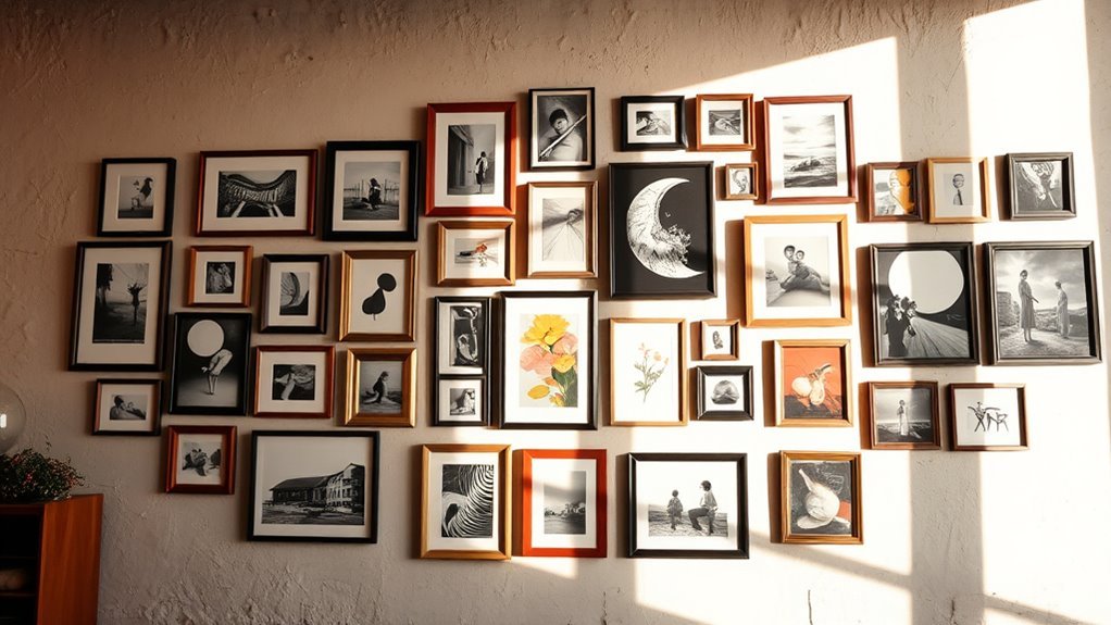
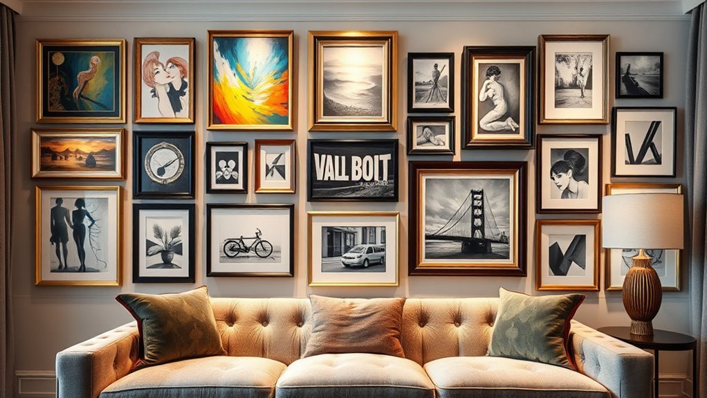
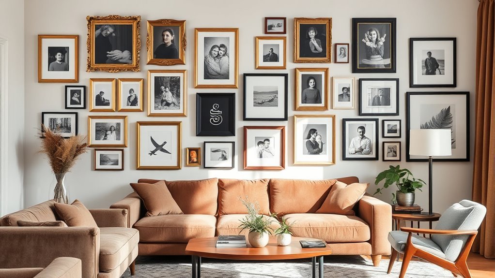
Real-Life Gallery Wall Examples for Inspiration
A gallery wall works best when it reflects your personal style. You can blend art, photographs, and meaningful objects into one display that feels collected over time. The right mix turns a plain wall into a focal point.
In a reading nook, you might pair family photos with small landscape prints and a soft textile. In a home office, you could use abstract art, black frames, and one bold print to create a sharper look. In a hallway, a grid of travel photos can add rhythm without making the space feel busy.
Asymmetrical arrangements often feel relaxed and natural. Mix vertical and horizontal pieces, then balance visual weight across the wall. Personal touches, such as a postcard, handwritten note, or small woven piece, can add meaning that store-bought art alone can’t provide.
Plan and Arrange Your Gallery Wall Like a Pro
To plan your gallery wall like a pro, treat the wall as one full composition. Measure the display area, then outline that same space on the floor with tape. This lets you adjust the arrangement before you hang the first piece.
Begin with the largest piece as your anchor. Place it off-center or in an outer corner, then balance it with the second largest piece across the layout. This creates movement and keeps the wall from feeling too stiff.
Aim for about three inches between each piece. Mix vertical and horizontal frames to create an organic flow, but avoid perfect symmetry unless you want a formal grid. Take a photo of your floor layout so you can follow it while hanging.
Note: The 57-inch rule works best for open walls, but you may need to adjust it above sofas, consoles, or beds.
Avoid These Common Gallery Wall Mistakes
Small mistakes can make a gallery wall feel scattered. You can avoid most problems by checking height, spacing, and balance before you hang everything. Focus on these common issues:
- Hang at eye level: Keep the midpoint of your arrangement near 57 inches high for a natural viewing height.
- Plan your layout: Test the arrangement on the floor with tape or paper before you hang any pieces.
- Mix frame styles with purpose: Use variety for depth, but repeat colors or finishes so the wall still feels cohesive.
- Avoid overcrowding: Leave about 2-3 inches between most frames so each piece has room to breathe.
- Balance visual weight: Spread large, dark, or bold pieces across the layout instead of grouping them all on one side.
How to Choose the Right Gallery Wall Layout
Your layout should match the mood of the room. A clean grid suits formal spaces, home offices, and modern rooms. A looser salon-style layout works well in living rooms, stairways, and creative spaces.
Choose a grid if your frames are the same size and style. Choose an organic layout if your pieces vary in size, color, or material. For narrow walls, stack smaller pieces vertically to draw the eye upward.
Frequently Asked Questions
What Is Considered a Gallery Wall?
A gallery wall is a grouped art display made from framed pieces, photos, prints, and personal objects. The pieces work together through color, theme, spacing, or frame style. A strong gallery wall tells a clear visual story rather than filling space at random.
What Are the Rules for a Gallery Wall?
Start with a clear layout, keep spacing consistent, and hang the center near eye level. Use a shared color palette or repeated frame finish to connect different pieces. You can break the rules once the wall still feels balanced.
Are Gallery Walls Still a Thing?
Yes, gallery walls remain a flexible way to add personality to a home. The look works because you can adapt it to modern, traditional, eclectic, or minimalist spaces. Keep yours current by using pieces that feel personal instead of copying a trend exactly.
Are Gallery Walls Out of Style in 2026?
Gallery walls aren’t out of style in 2026. They still work when you use thoughtful spacing, personal pieces, and a clear color story. The most timeless versions feel collected, balanced, and true to your home.
How Far Apart Should Frames Be on a Gallery Wall?
Most gallery walls look best with about 2-3 inches between frames. Use the same spacing across the layout to create order. If your pieces are very large, you can increase the gap slightly so the wall does not feel crowded.
Conclusion
A strong gallery wall starts with a clear plan, a balanced layout, and pieces that mean something to you. Choose your anchor piece first, test the arrangement on the floor, and keep your spacing consistent. Let the wall grow over time as you collect new art, photos, and keepsakes. With a little planning, your gallery wall can become one of the most personal features in your home.