
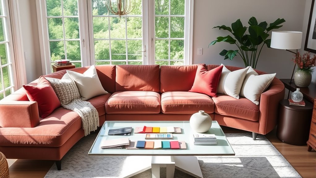
Learning how to make mismatched furniture look cohesive turns a random collection of hand-me-downs, thrift finds, and new buys into a warm, personal living room. The goal is not to make every piece match like a showroom catalog. Instead, you want to give the eye clear clues—repeating colors, balanced shapes, shared textures, proper scale, and smart placement—so every sofa, chair, and table feels chosen on purpose.
Quick Answer
To make mismatched furniture look cohesive, follow a 60-30-10 color palette, repeat at least two materials or shapes three times, and distribute heavy and light pieces evenly around the room. Anchor your seating on an 8×10 or 9×12-foot rug, keep seat heights within 2 to 4 inches, and connect styles with pillows, lamps, and art.
At a Glance
| Time Required | 1–3 hours to edit and rearrange; longer if you are buying a rug, curtains, or art |
| Difficulty | Easy to moderate |
| Tools Needed | Tape measure, painter’s tape, phone camera, color swatches, rug pad, furniture anchors for tall or top-heavy pieces |
| Cost | $0 if rearranging; $30–$300+ for pillows, throws, lamps, frames, curtains, or a rug |
Start by Editing the Room Before Buying Anything
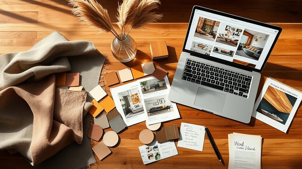
Before you shop for new decor, stand at the main doorway and take a visual inventory of what you already own. Notice which pieces feel bulky, which colors repeat, which furniture styles compete, and which items feel completely unrelated. Editing first stops you from buying extra accessories that add clutter instead of cohesion.
- Photograph the room from each doorway: A phone photo flattens the view into two dimensions, making it much easier to spot lopsided furniture placement or colors that clash.
- Clear out small visual noise: Temporarily remove tiny tabletop knickknacks, mismatched throw blankets, and small accessories that do not repeat any color, shape, or material in the room.
- Audit your fixed and largest elements: Note the undertones of your flooring, wall paint, sofa upholstery, and largest wood piece. Your room palette must work with these permanent surfaces.
- Group related finishes together: Identify shared threads you already have, such as warm oak wood, matte black metal, woven rattan baskets, or cream textiles.
- Pick one or two bridge items: Choose an existing rug, framed art print, patterned pillow, or curtains that already contain two or more colors from your mismatched furniture.
A mismatched living room almost always looks calmer the moment you remove small clutter that fights your main furniture pieces. Once the room is stripped down to essentials, you can see what is actually missing.
How to Choose a Color Palette for a Cohesive Living Room
A controlled color palette is the fastest way to make unrelated furniture pieces look like they belong together. Interior designers rely on the 60-30-10 color rule to divide a room into a dominant base color (60%), a secondary bridge color (30%), and one or two accent colors (10%).
- Base color (60% of the room): Use this hue for the largest visual surfaces, including walls, sofa upholstery, curtains, and a large area rug. Reliable base colors include warm white, cream, beige, taupe, soft gray, charcoal, navy, or olive.
- Bridge color (30% of the room): This secondary shade connects your mismatched pieces by appearing on accent chairs, painted side tables, textiles, or drapery. For example, a muted terracotta or sage green can link a tan leather chair to a gray fabric sofa.
- Accent colors (10% of the room): Use bolder tones sparingly in throw pillows, art prints, book spines, ceramic vases, or lampshades to add personality without visual chaos.
If your seating and tables are already colorful, wrap the room in a quiet neutral base to calm the mix down. Conversely, if your furniture is mostly neutral but varies wildly in shape or era, repeat a stronger bridge color across three or four spots to build a clear visual thread.
Note: Cohesion does not mean every item must match the exact same shade. A room looks far more natural when you mix light, medium, and dark tints of your bridge color alongside neutral foundations.
Achieve Balance by Distributing Visual Weight
Visual weight measures how heavy an object appears to the eye based on its size, color, mass, and texture. According to the core principles of visual design, balancing dark, solid, or oversized elements against lighter forms prevents one side of a room from feeling like it is tipping over.
Dark upholstery, rolled arms, skirted bases that hide the floor, tall backs, and bold patterns carry heavy visual weight. Pale fabrics, exposed legs, glass tops, slim metal frames, and armless silhouettes feel much lighter. Instead of clustering all heavy pieces along one wall, distribute them across opposite sides of the seating zone.
Visual Weight Distribution Techniques
You can use asymmetrical balance to pair completely different furniture styles as long as both sides of the room carry similar visual presence. Keep proportions comfortable by relating furniture scale to human proportions and room architecture.
- Counterbalance tall pieces: Place a tall wood bookcase on one wall opposite a large vertical mirror, a floor-to-ceiling curtain panel, or a tall arched floor lamp across the room.
- Pair one bulky sofa with two lighter chairs: Instead of buying a matching loveseat, balance a deep sofa with two open-leg accent chairs placed side by side.
- Match seat and table heights: Mismatched chairs and sofas look cohesive when their seat heights sit within 2 to 4 inches of one another. Keep coffee table tops within 1 to 2 inches of your sofa seat height, and align side tables with the height of adjacent chair arms.
- Let exposed legs show floor space: If your sofa sits directly on the floor, choose a coffee table and accent chair with raised legs so light passes underneath.
- Echo dark finishes across the room: Balance a heavy brown leather sofa on the left wall with dark-framed artwork and a walnut side table on the right wall.
Balancing Color and Shape
Silhouette and geometry matter just as much as color when blending different styles. A living room packed exclusively with sharp, boxy rectangles feels rigid, while a room filled only with soft, curved upholstery can look shapeless.
Aim for a deliberate contrast of straight lines and soft curves. Pair a structured, square-armed sofa with a round wood coffee table, or soften a boxy mid-century armchair with a curved drum side table and a round floor cushion. Once you introduce a distinct geometry—such as an arched mirror or a circular table—repeat that shape at least once more in a lampshade, tray, or pillow pattern.
Layering Textures for Depth
Surface texture gives unrelated furniture pieces a shared tactile mood, even when their eras differ. A sleek leather armchair, a nubby bouclé pillow, a chunky wool rug, and a distressed oak table harmonize naturally when their colors stay within your palette.
- Drape soft textiles over rigid frames: Use a knitted wool throw or linen cushion to soften angular wood or metal chairs.
- Add organic weaves to formal pieces: Place a seagrass basket or cane tray near a tufted traditional sofa to make it feel casual and approachable.
- Reflect light near dark wood: Set a glass vase, polished brass lamp, or mirrored tray on a heavy vintage dresser or coffee table to lift the visual weight.
- Ground shiny surfaces with matte finishes: Pair glass or chrome tables with matte stoneware pottery, raw linen curtains, or flat-weave wool rugs.
Introduce Variety With Different Textures and Fabrics
Mixing upholstery fabrics makes a living room look curated over time rather than bought in a single weekend. To keep different textiles from competing, limit your room to three or four distinct fabric textures within your chosen color scheme.
Recommended Products
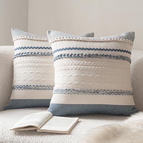
Fabric and Packaging: Pack of 2 (Pillow Inserts are not included), cotton and linen blend fabric, this pillowcase is handcrafted from high-quality thick fabric, featuring a unique texture and natural touch, breathable, durable, and resistant to deformation, providing a comfortable support for the body

【Package】2 Pillow covers Only! pillow inserts are Not included!!!

18 x 18 Pillow Inserts (Set of 4) – Standard fit for 18 x 18 pillow covers and protectors. Each insert features 500g / 1.1 lb of filling (15% more than standard inserts) for a fuller, fluffier appearance. For added fullness, use with covers one size smaller. Perfect for living room, bedroom, or patio décor.
Layering Textures Effectively
Start with your largest upholstered piece—usually the sofa—and choose contrasting textures for the surrounding chairs and pillows. If your sofa has a smooth, tight weave like performance microfiber or cotton twill, bring in tactile accent pieces.
- Velvet cushions or accent chairs catch the light and add rich depth next to flat-weave fabrics.
- Linen or cotton slub curtains diffuse daylight and keep formal furniture feeling airy.
- Full-grain leather seating introduces structured warmth and pairs effortlessly with fabric sofas.
- Bouclé, chenille, or sheepskin accents soften sharp metal or wooden furniture edges.
- Jute, sisal, and rattan weaves supply earthy structure that bridges modern and traditional pieces.
Choosing Complementary Fabrics
When mixing patterned fabrics across mismatched seating, vary the pattern scale while keeping the colors consistent. Combine one large-scale print, one medium-scale geometric or stripe, and one small-scale micro-pattern or solid texture.
For example, if you place a large-scale botanical print pillow on a solid linen sofa, pair it with a medium-width striped pillow on an adjacent armchair and a subtle herringbone throw blanket. As long as all three patterns share your bridge color—such as navy, olive, or rust—they will read as a coordinated collection.
Balancing Visual Weight With Fabric
Heavy upholstery materials like dark leather, plush velvet, and thick tweed absorb light and make furniture look larger. Offset those dense textiles with breathable, light-reflecting surfaces such as pale linen, cotton canvas, open cane webbing, glass, or blond wood so the room stays balanced year-round.
Pro Tip: If two adjacent furniture pieces clash in style or material, place a shared bridge texture directly on or between them—such as matching lumbar pillows on two different armchairs or a woven wood tray on a glass coffee table.
Use Focal Points to Draw Attention and Unify the Space
Every cohesive living room needs a single focal point where the eye lands first upon entering. Without a clear anchor, visitors notice the differences between your mismatched furniture pieces before they take in the room as a whole.
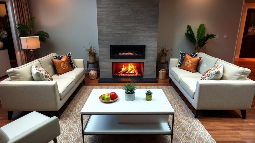
Your focal point might be a fireplace mantel, a large piece of wall art (hung with its center at gallery eye level, roughly 57 to 60 inches from the floor), a picture window, a styled media console, or a statement pendant light. Arrange your main sofa and chairs so they orient toward this feature rather than lining every wall like a waiting room.
Once your focal point is set, pull two colors and one material from it and echo them across your seating zone. If a large canvas above the sofa features charcoal, warm cream, and ochre in a black wood frame, repeat black metal in a side lamp, cream in your rug, and ochre in a throw pillow on your mismatched armchair.
A mismatched room feels cohesive when the eye can follow a pattern: a repeated color, a repeated shape, a repeated finish, or a clear focal point.
How to Make Mismatched Furniture Look Cohesive by Repeating Elements
Knowing how to make mismatched furniture look cohesive comes down to the rule of three repetitions. Whenever a color, wood tone, metal finish, or silhouette appears only once in a room, it looks like an accident; when it appears three times across different zones, it looks like a design plan.
- Repeat color in a triangle: Pull a hue from your rug or artwork and place it in three spots that form a rough triangle around the room, such as sofa pillows, a chair throw, and books on a side table.
- Repeat hardware and metal finishes: Limit metals to one dominant finish (such as matte black or aged brass) and one accent metal. Echo your main metal on lamp bases, curtain rods, and picture frames.
- Repeat geometric motifs: Echo round, arched, fluted, or tapered-leg details across at least two or three pieces.
- Repeat era cues: If you own one ornate antique wooden side chair, add at least one more vintage piece—like an antique brass mirror or a distressed ceramic lamp—so the chair does not feel stranded.
- Repeat visual scale: Pair oversized, deep-seated sofas with generously scaled floor lamps, large 22-inch throw pillows, and substantial coffee tables rather than delicate, spindly accessories.
Choose Grounding Elements to Anchor Your Room
Grounding elements are the large, unifying foundations that physically or visually connect separate furniture pieces. In most living rooms, the strongest grounding tools are the area rug, window treatments, coffee table, and ambient lighting.
A large area rug acts like a picture frame on the floor, binding a modern sofa, a vintage armchair, and an industrial coffee table into a single zone. Likewise, hanging identical curtains on every window—mounted 4 to 6 inches above the window frame and extending right to the floor—builds a continuous vertical backdrop behind varied furniture profiles.
Lighting temperature also plays a major role in unifying mixed materials. Install warm white bulbs between 2,700 K and 3,000 K with a Color Rendering Index (CRI) of 80 or higher in every lamp and overhead fixture. Matching your bulb temperature prevents warm oak tables and cream fabrics from looking yellow in one corner and icy blue in another.
Recommended Products

PET FRIENDLY & NON-SLIP BACKING: 8x10 area rugs featuring simple of colors while promising a luxurious feel underfoot. The blend of a hexagon pattern and a stylish design. Non-slip TPR backing makes the covering for bringing your space together. Make the most of your time at home with our pet-friendly and easy-to-clean area rugs. Elevate the floors of your home with this show-stopping and detailed rug

Ultra-Soft Low Pile Rug: Gent drizz living room rugs 8x10 made of Upgraded durable low pile faux wool fibers, 0.25'' thick, featuring a soft fuzzy density surface, soft and pliable to the touch, providing great comfort for your bare feet. The low pile makes it easy for your Large area rug to clean and is perfect for homes with kids and pets

Trendy Modern Rug: Our area rug is designed in today's popular minimalist style, featuring adaptable printed patterns that seamlessly blend into a wide range of interior aesthetics. This neutral rug adds understated elegance with a strong feeling of individuality to your living room, bedroom, dining room, nursery or playroom.
Accessorize With Neutrals to Tie Bold Colors Together
When your major furniture pieces already feature bold colors or busy upholstery patterns, neutral accessories provide essential visual breathing room. Shades of warm white, ivory, oatmeal, camel, taupe, charcoal, and matte black act as a quiet buffer between strong pieces.
- Solid textured pillows in cream bouclé, oatmeal linen, or camel leather
- Woven storage baskets in natural seagrass, water hyacinth, or jute
- Floor-length linen or cotton drapes in off-white or warm gray
- Large wooden or stone trays to corral remotes, candles, and coasters
- Matte ceramic, travertine, or clear glass vases filled with fresh greenery or dried branches
- White or cream linen drum lampshades that unify mismatched vintage lamp bases
- Chunky knit neutral throws draped over colorful chair backs to tone down bright fabric
For example, if you are combining a forest-green velvet armchair with a rust-colored sofa, adding a cream wool rug, natural linen curtains, and black-framed sketches gives the eye a neutral resting place between the saturated upholstery.
Embrace Change by Mixing Old and New Furniture
Blending antique or thrift-store pieces with contemporary furniture works best when you follow the 80/20 style rule. Let one primary style—such as clean-lined modern or relaxed transitional—make up roughly 80% of the room, and use the remaining 20% for contrasting vintage, rustic, or heirloom pieces.
Use this pairing guide to connect older and newer pieces seamlessly:
| If You Have This Older Piece | Pair It With This Newer Piece | Why It Works |
|---|---|---|
| Antique carved wooden chair | Minimalist black metal floor lamp | Sharp modern lines keep ornate woodwork from looking stuffy when black repeats elsewhere. |
| Vintage distressed wood coffee table | Tailored track-arm fabric sofa | Aged wood patina warms up crisp contemporary upholstery. |
| Classic rolled-arm upholstered sofa | Geometric metal or stone drum side table | A clean, sculptural silhouette relaxes traditional seating and updates the profile. |
| Traditional dark wood bookcase | Abstract contemporary art and ceramic lamps | Modern artwork bridges the dark timber to lighter walls and newer seating. |
| Mid-century teak sideboard | Plush bouclé accent chair and round mirror | Curved textures soften angular vintage cabinetry while echoing warm undertones. |
Never divide your room into an “old side” and a “new side.” Interlock eras right next to each other—such as placing a modern ceramic lamp directly on top of an antique wooden side table—so the combination looks intentional.
How to Use Rugs and Furniture Placement to Define Spaces
Proper rug sizing and spacing measurements turn separate chairs and sofas into a unified conversation zone. As noted in The Spruce’s living room rug sizing guidelines, a rug that is too small—like a 5×7-foot rug floating strictly under the coffee table—pushes mismatched furniture visually apart.
- Choose an 8×10 or 9×12-foot rug: In most living rooms, an 8×10 or 9×12 rug provides enough surface area to connect your seating while leaving 12 to 18 inches of bare floor visible around the room edges.
- Keep at least the front legs on the rug: Following Better Homes & Gardens area rug styling standards, place either all four legs of every sofa and armchair on the rug, or rest at least the front two legs of each major seating piece on the rug border.
- Set the coffee table 14 to 18 inches from the sofa: This distance is close enough to set down a drink comfortably while leaving enough legroom to walk through.
- Maintain 30 to 36-inch main walkways: Keep primary traffic paths clear around the perimeter of your seating group, and leave at least 18 to 24 inches between smaller pieces.
- Pull furniture 3 to 12 inches off the walls: Floating seating slightly inward creates breathing room and makes mixed silhouettes feel grouped together within 8 to 10 feet for easy conversation.
- Test with painter’s tape first: Outline proposed rug corners and furniture footprints on the floor with painter’s tape before lifting heavy items or ordering a rug.
Warning: Always secure tall, heavy, or top-heavy furniture—including bookcases, armoires, dressers, and TV stands—directly to wall studs using anti-tip brackets from the U.S. Consumer Product Safety Commission Anchor It! campaign. Review official CPSC furniture and TV safety guidelines and place heavier items on bottom shelves, especially in homes with children or pets.
Recommended Products

【Easy-Care Machine Washable Rug】 Designed for active households, this low-maintenance boho rug combines style with practicality. Conveniently machine washable (cold gentle cycle recommended), and do not add bleach. Maintain its vibrant print between washes with routine vacuuming or spot cleaning. Minor shipping creases naturally relax within days when laid flat – no extra effort needed.

Soft & Durable: This 8x10 area rug low-pile combines soft faux wool fibers with a 0.25-inch height for comfort. Tight weaving reduces shedding and edge fraying, making it perfect for high-traffic areas like living rooms, bedrooms, and entryways
PET FRIENDLY & NON-SLIP BACKING-9x12 area rugs featuring simple of colors while promising a luxurious feel underfoot. The blend of a hexagon pattern and a stylish design. Non-slip TPR backing makes the covering for bringing your space together. Make the most of your time at home with our pet-friendly and easy-to-clean area rugs. Elevate the floors of your home with this show-stopping and detailed rug
How to Fix a Room That Still Looks Chaotic
If your living room still feels disjointed after rearranging the layout, run through this targeted troubleshooting checklist before spending money on replacement furniture.
Problem: Too Many Colors
When five or six unrelated colors compete for attention, strip away small colorful decor first. Drape a neutral slipcover or oversized cream throw over the loudest chair, then repeat your single bridge color in exactly three spots—such as sofa cushions, wall art, and a ceramic vase.
Problem: Too Many Wood Tones
Use the rule of three wood tones—one light, one medium, and one dark shade—and match their undertones rather than their exact stain names. Warm woods with yellow, orange, or red undertones (honey oak, cherry, pine, teak) harmonize easily together, while cool woods with gray or ashy undertones (weathered oak, ash,银-toned walnut) belong with cooler neutrals. If a dark wood coffee table clashes with medium wood floors, place a woven rug underneath to create a visual buffer, and add a mixed-tone piece like burl wood or walnut to bridge the gap.
Problem: One Piece Looks Out of Place
An “orphan” piece stands out because nothing else in the room shares its color, material, or era. Give that piece a partner across the room: echo a black leather chair with black metal picture frames, pair a rattan side table with a woven plant basket, or link a navy sofa to a navy-and-cream throw pillow on an opposite armchair.
Problem: The Room Feels Heavy
Too many dark, skirted, or boxy furniture pieces make a room feel cramped and bottom-heavy. Lighten the space by hanging a large mirror opposite a window, swapping a solid wood coffee table for glass or an open-shelf frame, adding pale linen curtains, and pulling the sofa a few inches away from the wall.
Problem: The Room Feels Flat
When furniture shares similar heights and neutral fabrics, the room can look one-dimensional. Vary your vertical heights by adding a 60-inch floor lamp, a tall indoor tree like a ficus or olive tree, vertical wall art, and contrasting tactile accents like ribbed ceramics, stacked hardcover books, and velvet cushions.
Key Takeaways
- Follow the 60-30-10 color rule: 60% dominant neutral base, 30% secondary bridge color, and 10% accent color.
- Use the 80/20 style mix (80% main style, 20% contrasting era) and limit wood finishes to three tones with matching warm or cool undertones.
- Keep adjacent seat heights within 2 to 4 inches, set coffee tables 14 to 18 inches from the sofa, and maintain 30 to 36-inch walkways.
- Anchor seating on an 8×10 or 9×12-foot rug so at least the front legs of every major sofa and chair sit on the rug surface.
- Unify different wood stains and fabrics by installing warm white 2,700 K to 3,000 K light bulbs across all room lamps.
Frequently Asked Questions
How do you make mismatched furniture look cohesive?
You make mismatched furniture look cohesive by following a 60-30-10 color palette, repeating key materials or shapes at least three times, and balancing visual weight across the room. Anchor all seating on an appropriately sized rug, keep seat heights within 2 to 4 inches, and tie pieces together with pillows, throws, lamps, and wall art.
Does living room furniture have to match?
No, living room furniture does not have to match, and designers generally avoid matching showroom sets because they can make a room look flat. Mixing two or three styles feels much more personal and inviting as long as you repeat shared details like color, wood undertone, metal finish, or silhouette.
Can you mix different wood tones in one living room?
Yes, you can mix up to three different wood tones—light, medium, and dark—by matching their warm or cool undertones. Start with your largest wood surface (such as flooring) as the dominant tone, separate clashing wood legs from wood floors with an area rug, and use a mottled wood like walnut or burl to bridge tones.
How many furniture styles can you mix in one room?
Two or three furniture styles are easiest to blend in a single living room using the 80/20 rule. Let one foundational style cover roughly 80% of the space, and use the remaining 20% for a contrasting accent style—such as pairing a contemporary sofa and media console with vintage wood side tables.
What is the easiest budget fix for mismatched furniture?
The easiest budget fix is decluttering smallunrelated knickknacks and repeating one bridge color across throw pillows, blankets, and framed art. Swapping mismatched lampshades for identical white linen shades and installing matching 2,700 K warm white bulbs also unifies a room for under $50.
What rug size works best with mismatched living room furniture?
An 8×10-foot or 9×12-foot area rug works best for most living rooms because it is wide enough to connect every seating piece into one zone. Aim to place all furniture legs on the rug, or make sure at least the front two legs of the sofa and armchairs rest on the rug edge.
How do you mix leather and fabric furniture in the same living room?
You can mix leather and fabric furniture by trading textures between pieces so neither material sits isolated. Place a linen or bouclé lumbar pillow on your leather armchair, add a cognac leather tray or tan-trimmed cushion to your fabric sofa, and anchor both pieces on the same woven wool or jute rug.
Conclusion
Mismatched furniture brings character and warmth to a home once you give the room a clear visual structure. Start today by taking a doorway photo, clearing out small clutter that does not fit a 60-30-10 color palette, and pulling your seating onto a shared rug with 14 to 18 inches around the coffee table. With balanced visual weight and three repeated finishes, your collected pieces will look deliberate, comfortable, and cohesive.
Sources
- Virtual Design & Construction Institute (VDCI) — Color Harmonies in Interior Design: Supports the 60-30-10 proportional color rule for dominant, secondary, and accent shades.
- Interaction Design Foundation — The Key Elements & Principles of Visual Design: Supports visual design principles including unity, balance, contrast, scale, dominance, color, and texture.
- Encyclopaedia Britannica — Interior Design: Concepts of Design: Supports scale and proportion guidelines relating furniture dimensions to human proportions and architecture.
- U.S. Department of Energy — Purchasing Energy-Efficient Light Bulbs: Supports using 2,700 K to 3,000 K warm white light bulbs with 80+ CRI to complement interior wood finishes and fabrics.
- The Spruce — Choosing the Right Living Room Area Rug: Supports practical rug sizing and furniture-leg placement guidance.
- Better Homes & Gardens — Area Rug Buying and Styling Guidance: Supports anchoring living room seating on an area rug for visual cohesion.
- U.S. Consumer Product Safety Commission — Anchor It: Supports the safety warning on anchoring tall furniture and TVs to prevent tip-over injuries.
- U.S. Consumer Product Safety Commission — AnchorIt.gov Safety Education Center: Supports federal safety recommendations for securing top-heavy furniture and storing heavy items on low shelves.
- Google Search Central — Article Structured Data: Reference for article structured data documentation.
- Schema.org — HowTo: Reference for instructional structured data definitions.


[…] How to Make a Living Room Feel Cohesive When Furniture Doesn’t Match: Step-by-Step Guide […]