Visual balance in interior design is all about arranging elements so no single feature steals the spotlight. It’s important because it creates harmony, allows for easy movement, and enhances your overall well-being in a space. You can achieve balance through smart choices with color, shape, and height. Mix larger furniture with smaller accents and maintain negative space for a calm effect. Explore more about how to enhance your space’s visual balance and create inviting environments.
What Is Visual Balance in Interior Design?
Visual balance in interior design is like the backbone of a well-composed space. It refers to the thoughtful distribution of visual weight, ensuring that no single element overwhelms the others. By creating balance, you cultivate a harmonious feeling, allowing your eye to roam freely. Consider how different colors, shapes, and textures interact; darker shades and larger objects naturally carry more weight, while lighter tones and smaller items lighten the load. Strategically arranging furniture and using negative space can enhance this equilibrium, drawing attention to focal points without causing distraction. Layering textures adds depth, enriching the overall aesthetic. When you master visual balance, you not only elevate your space’s style but also foster emotional well-being and tranquility.
Why Is Visual Balance Important for Your Space?
Creating a space that feels both inviting and functional hinges on the importance of visual balance. When you achieve visual harmony, you simplify your environment, making it easier to relax and enjoy. Balance in interior design not only enhances the functionality of a space but also fosters emotional well-being. By effectively distributing visual weight through color, texture, and arrangement, you can transform how a room feels—whether spacious or intimate. A well-balanced interior reduces stress and promotes a sense of stability, allowing you to connect more deeply with your surroundings. Ultimately, this sense of balance creates inviting spaces that resonate with personal meaning, turning a house into a true home where you can thrive.
Fundamental Elements Influencing Visual Balance in Interior Design
When you think about visual balance, color coordination strategies and the interaction of shapes and textures play a pivotal role in your design choices. By harmonizing colors and blending varied textures, you can create an enchanting atmosphere that draws the eye without overwhelming it. Consider how each element interacts, and you’ll find the perfect equilibrium that enhances your space’s overall appeal.
Color Coordination Strategies
Achieving a harmonious interior relies heavily on effective color coordination strategies, as the right combinations can transform a space’s atmosphere and functionality. By using a cohesive color palette, you can enhance visual balance, creating a serene environment that feels open and inviting. Pairing bold colors with neutral tones establishes a visual weight that guides the eye, while strategically placed contrast draws attention to focal points. Remember, layering shades of the same color adds depth without overwhelming the senses.
| Color Type | Emotional Impact | Pairing Suggestions |
|---|---|---|
| Warm Colors | Comfort and Energy | Neutrals for Balance |
| Cool Colors | Calmness and Tranquility | Bold Accents for Contrast |
| Earthy Tones | Stability and Warmth | Soft Hues for Cohesion |
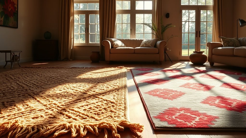
Shape and Texture Interaction
While the interplay of shapes and textures might seem like mere decoration, it fundamentally influences the visual balance in interior design. By combining diverse elements, you can create a space that feels harmonious and inviting. Consider these tips:
- Mix soft curves with sharp lines to create visual contrast.
- Pair smooth fabrics with rough surfaces for depth and interest.
- Balance larger items with smaller, lighter elements to distribute visual weight.
- Incorporate geometric and organic forms for a dynamic aesthetic.
- Use various textures to guide the eye through the room, promoting a calming rhythm.
When you thoughtfully interact with shape and texture, you not only enhance the visual appeal but also foster a liberated sense of balance within your space.
The Role of Color in Achieving Visual Balance
When you think about color in your space, consider how it shapes the visual weight and overall harmony. By balancing bold hues with neutral shades, you can create an enchanting atmosphere that feels both lively and grounded. Plus, the emotional responses elicited by your color choices can transform a room from merely functional to truly inviting.
Color Coordination Strategies
Color coordination is essential for creating visual balance in interior design, as it directly influences the mood and atmosphere of a space. To achieve this harmony, consider these strategies:
- Use a cohesive color palette to unify different elements, reducing visual chaos.
- Balance bold hues with neutral tones to maintain equilibrium and avoid overwhelming the senses.
- Layer textures with varied colors for depth, ensuring color distribution remains even.
- Strategically place accent colors to draw attention to focal points while preserving overall balance.
- Experiment with light and dark shades, recognizing that dark colors carry more visual weight.
Balancing Bold and Neutral
Achieving visual balance in a space often hinges on the interplay between bold and neutral colors. Balancing bold and neutral creates visual harmony, where bold hues attract the eye while neutral colors provide a calming backdrop. Dark shades carry more visual weight and should be paired with lighter neutrals to maintain equilibrium in your design. A predominant neutral color can anchor the room, with strategically placed bold accents injecting interest without overwhelming the senses. Aim for a 70-30 split, where neutrals dominate, crafting a well-balanced room that feels inviting. Incorporating textured neutrals alongside bold shades enhances depth, ensuring the overall visual weight remains engaging and balanced, allowing you to experience true liberation in your space.
Emotional Impact of Colors
Visual balance is not only about aesthetics; it’s also deeply tied to how colors can shape your emotions and experiences in a space. By understanding color relationships, you can create an environment that feels harmonious and inviting. Here are some pivotal aspects to reflect upon:
- Warm colors like red and yellow energize and excite.
- Cool hues such as blue and green foster calmness and tranquility.
- A mix of bold and neutral tones enhances visual harmony.
- Dark shades can create visual weight, while lighter tones offer openness.
- Coordinated colors lead to a balanced environment that nurtures positive feelings.
With the strategic use of color, you can profoundly impact your space’s emotional atmosphere, crafting a sanctuary that liberates your spirit.
Tips for Achieving Visual Balance
To create a harmonious space, it’s essential to balance larger furniture pieces with smaller accents, ensuring that visual weight is evenly distributed throughout the room. Pairing these elements not only establishes scale but also enriches your design narrative. Introduce height variation by incorporating tall plants or sculptures, adding layers of interest. Remember to maintain negative space; open areas enhance calmness and flow, making your space feel inviting. Use color coordination wisely—offset darker tones with lighter shades to achieve balance without overwhelming the senses. Regularly assess your layout and adjust as needed to prevent overcrowding, ensuring each element finds its purposeful place. With these tips, you’ll create a beautifully balanced sanctuary that liberates and inspires.
How Different Types of Visual Balance Affect Your Space?
How does the type of visual balance you choose shape the overall feel of your space? Each approach influences your environment uniquely, creating distinct atmospheres. Consider these types:
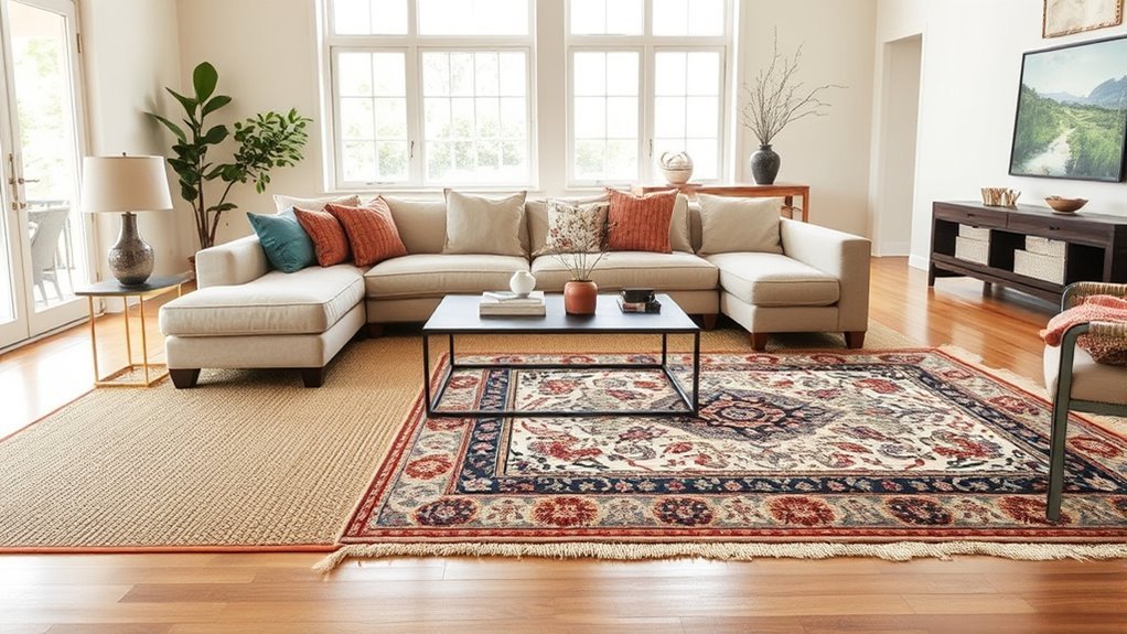
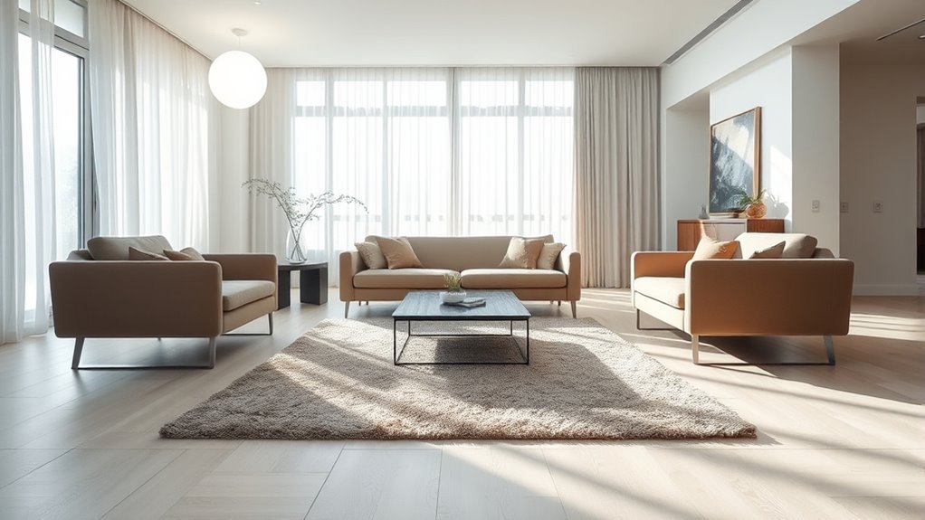
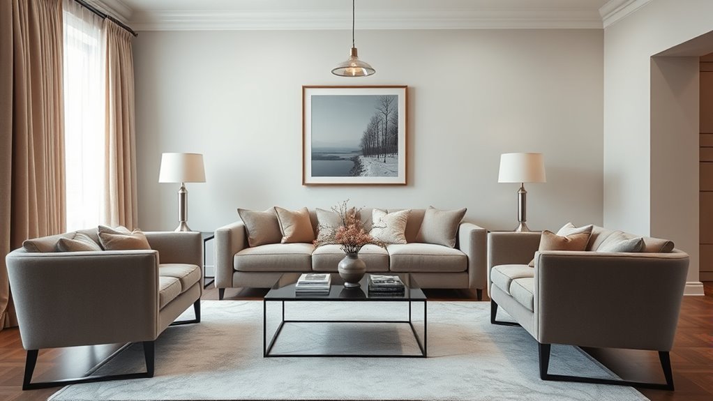
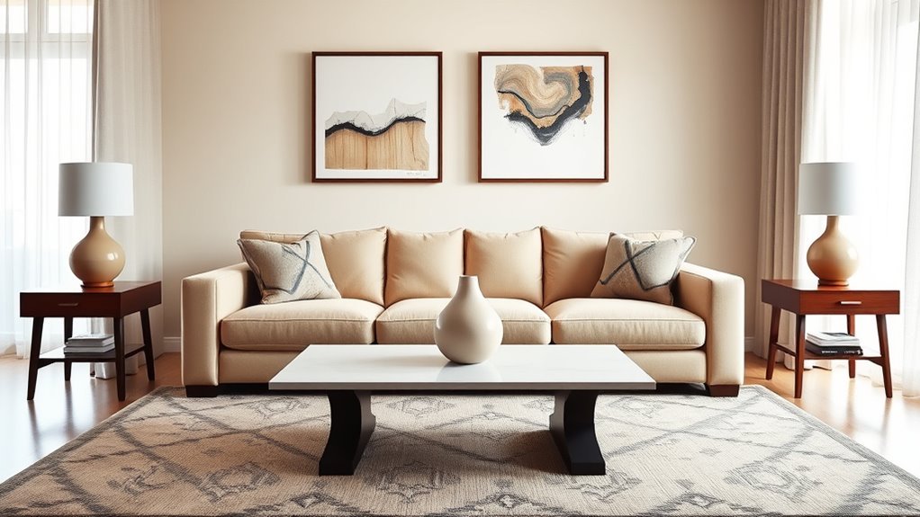
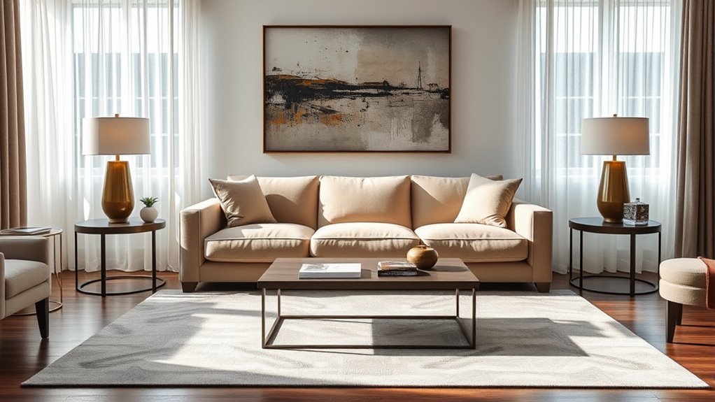
- Symmetrical balance: Evokes stability and order with mirrored elements, perfect for traditional settings.
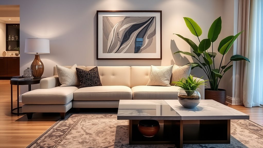
- Asymmetrical balance: Generates visual interest by juxtaposing dissimilar items of similar visual weight, adding dynamism.
- Radial balance: Centers around a focal point, fostering sociability in spaces like dining areas.
- Visual weight: Influenced by color, size, and texture, it determines how elements interact within the room.
- Negative space: Essential for allowing main features to breathe, enhancing flow and focus.
Avoid These Common Mistakes for Better Balance
While creating a beautifully balanced space can be rewarding, it’s easy to fall into common traps that disrupt harmony. Overcrowding your area with furniture and decor can stifle the flow, so embrace negative space for that airy feel. Pay attention to scale and proportion; mismatched furniture sizes can throw off your room’s vibe, making it feel chaotic. Establishing a clear focal point is essential—it guides the eye and instills a sense of order. Furthermore, avoid mixing too many styles; a cohesive approach is key to maintaining visual clarity. Finally, remember that aesthetics must align with functionality; a stunning design is meaningless if it doesn’t serve its purpose effectively. Prioritize balance to create a liberating environment.
Real-Life Examples of Visual Balance in Interior Design
Achieving visual balance in interior design isn’t just about avoiding mistakes; it’s about understanding how different elements work together to create harmony. Here are some real-life examples that illustrate both symmetrical and asymmetrical balance:
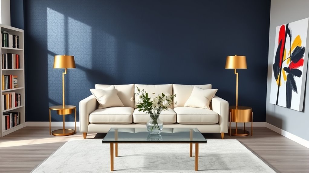
- Symmetrical balance in traditional living rooms with identical sofas flanking a central coffee table.
- Asymmetrical balance in contemporary spaces featuring a large sectional sofa paired with smaller accent chairs.
- Radial balance in dining areas with a round table surrounded by chairs, enhancing sociability.
- Effective color use, like bold artwork against neutral walls, creating visual weight balance.
- Personal decor, such as family photos on one side of a shelf balanced by plants on the other, adds emotional weight while maintaining visual equilibrium.
These examples show how space creates and nurtures a harmonious atmosphere.
Evaluating and Enhancing Visual Balance in Your Home
To create a visually balanced home, start by evaluating the arrangement of your furniture and decor with a critical eye. Assess whether elements are arranged around a central focal point, creating a harmonious flow. Your space needs breathing room; incorporate empty space to allow focal points to stand out and prevent clutter. Consider both symmetrical and asymmetrical arrangements: matching lamps on either side of a sofa can evoke stability, while a large artwork paired with varied decor adds dynamic interest. Also, pay attention to color coordination; balancing bold hues with neutrals fosters visual harmony. Regularly assess the scale and proportion of your pieces, ensuring they contribute to an inviting atmosphere that feels liberating and balanced.
Frequently Asked Questions
What Does Visual Balance Mean?
Visual balance means achieving spatial harmony through symmetrical arrangements or asymmetrical elements. It involves thoughtful color distribution and strategic focal points, creating an inviting atmosphere that liberates your creativity and enhances your overall well-being.
What Are Four Types of Visual Balance?
You’ll explore symmetrical arrangements for stability, asymmetrical layouts for dynamic interest, color distribution to enhance mood, and texture harmony to create inviting spaces. Focal points guide your eye, bringing balance and liberation to your design.
What Are the Three Types of Balance in Interior Design?
In design, balance is key; you’ll find three types: symmetrical balance for order, asymmetrical balance for dynamic energy, and radial balance for intimacy. Hierarchical and dynamic balances also play roles in creating engaging spaces.
What Is the Principle of Visual Balance in Design?
Visual balance in design creates harmony through symmetrical spaces and asymmetrical design. You’ll achieve color harmony and scale proportion by mixing texture variety, ensuring your environment feels stable, inviting, and liberating for your senses.
Conclusion
In the dance of interior design, visual balance is your rhythm, guiding everything from furniture placement to color choices. When you harmonize these elements, your space transforms into a symphony of comfort and beauty. Avoid the pitfalls of imbalance, and let your home sing with style. By embracing these tips and recognizing the delicate interplay of design, you’ll create an inviting atmosphere that feels just right—like a perfectly tailored suit that fits you like a glove.