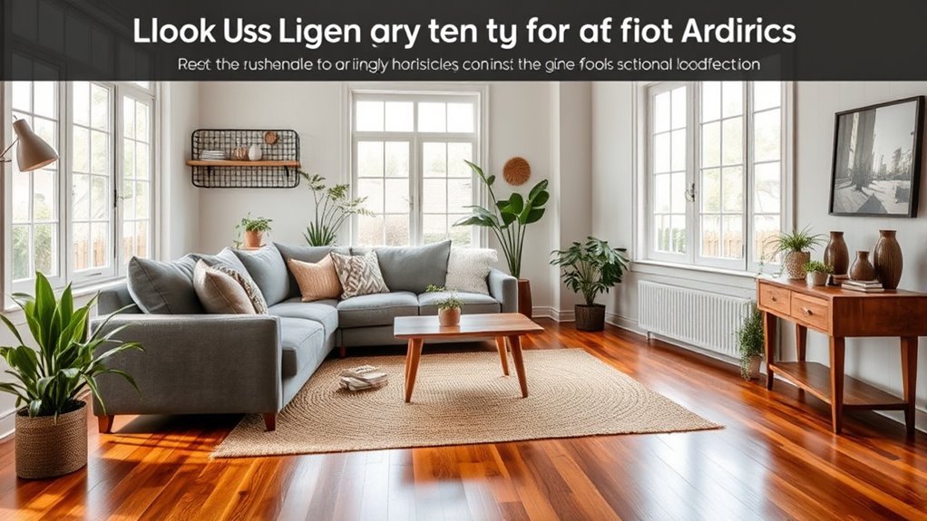
A room can look expensive and still feel “off” if the visual weight feels uneven. One side may seem too heavy, a bold color may pull too much focus, or clutter may make the whole space feel tense. Visual balance in interior design helps you arrange color, shape, scale, texture, furniture, and empty space so your room feels calm, useful, and inviting.
Quick Answer
Visual balance in interior design means arranging elements so no single feature overwhelms the room. You create it by spreading visual weight through furniture size, color, shape, texture, height, and negative space. A balanced room feels easier to use, calmer to live in, and more pleasing to look at.
Key Takeaways
- Visual balance helps a room feel stable, calm, and easy to move through.
- Large, dark, bright, or textured items carry more visual weight than small or light ones.
- Symmetrical, asymmetrical, and radial balance each create a different mood.
- Negative space gives your main pieces room to stand out without clutter.
- Color, scale, texture, and height work together to shape how balanced a room feels.
What Is Visual Balance in Interior Design?
Visual balance in interior design means arranging elements so the room feels steady and complete. It focuses on the distribution of visual weight, which is how strongly each item attracts your eye.
Large furniture, dark colors, bold patterns, and rough textures often feel heavier. Small accents, pale colors, glass, slim legs, and open space usually feel lighter. When you balance those elements, your eye can move through the room without getting stuck on one overpowering feature.
You can create balance through furniture placement, color choices, height variation, lighting, and negative space. The goal isn’t perfect matching. The goal is a room that feels natural, stable, and easy to enjoy.
Why Is Visual Balance Important for Your Space?
Visual balance matters because it shapes how your room feels and how well it works. A balanced room helps you relax because no single item feels too loud, heavy, or out of place.
Balance also supports better movement. When furniture, decor, and open space work together, you can walk through the room without dodging clutter or awkward layouts.
A visually balanced space can also make your home feel more personal. Your favorite artwork, plants, books, or family photos can stand out without making the room feel busy.
What Elements Influence Visual Balance in Interior Design?
Several design elements affect visual balance. The most important ones include color, size, shape, texture, height, lighting, and empty space.
Each element adds or removes visual weight. When you understand how they work together, you can adjust a room without buying new furniture or starting over.
Color Coordination Strategies
Color changes visual balance fast because your eye notices contrast first. Dark, bright, and saturated colors feel heavier than pale or muted colors.
A cohesive color palette helps the room feel calm and connected. You can pair bold colors with neutral tones, then repeat accent colors in small doses across the space.
| Color Type | Emotional Impact | Pairing Suggestions |
|---|---|---|
| Warm Colors | Comfort and Energy | Neutrals for Balance |
| Cool Colors | Calmness and Tranquility | Bold Accents for Contrast |
| Earthy Tones | Stability and Warmth | Soft Hues for Cohesion |
Shape and Texture Interaction
Shapes and textures influence balance even when the colors stay simple. Curved shapes often feel softer, while sharp lines can feel more structured and strong.
Texture adds depth and weight. A chunky knit throw, stone table, or ribbed cabinet has more visual pull than a smooth, flat surface.
- Mix soft curves with straight lines to create contrast.
- Pair smooth fabrics with rough surfaces for depth.
- Balance large items with smaller, lighter accents.
- Combine geometric forms with organic shapes for movement.
- Repeat textures in small ways so the room feels connected.
How Does Color Help Create Visual Balance?
Color helps you control where the eye goes first. A bold color can create a focal point, while a neutral backdrop can help the room feel grounded.
You don’t need every color to match. You need the colors to share a clear relationship, such as a shared undertone, repeated accent, or balanced contrast.
Using Color to Control Visual Weight
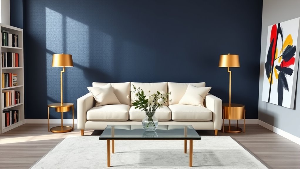
Dark colors usually feel heavier than light colors. A dark sofa, rug, wall, or cabinet can anchor a room, but too many dark pieces may make the space feel crowded.
Light colors create a sense of openness. Use them to soften heavy furniture, brighten tight rooms, or balance darker focal points.
- Use one main color family to reduce visual clutter.
- Repeat accent colors in small items across the room.
- Balance strong colors with quiet neutrals.
- Use contrast to guide attention toward one focal point.
- Layer light and dark shades to add depth.
Balancing Bold and Neutral
A balanced room often uses more neutral color than bold color. A helpful starting point is a 70-30 mix, with neutrals covering most surfaces and bold colors used as accents.
This ratio doesn’t need to be exact. Use it as a guide when a room feels too loud or too plain.
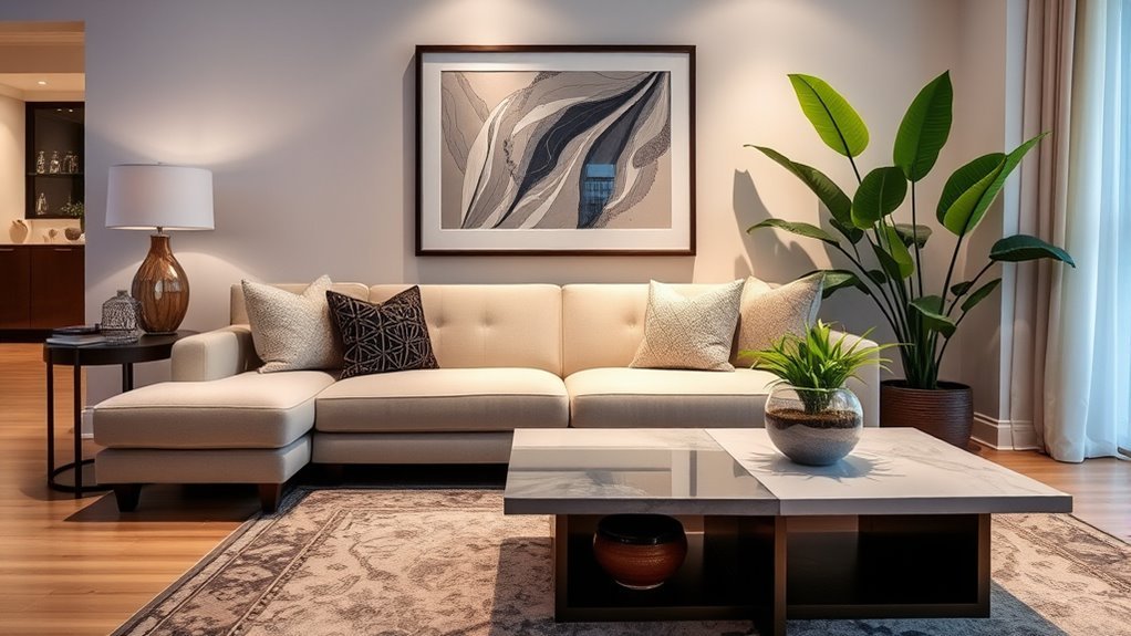
For example, neutral walls and a neutral sofa can support bold pillows, artwork, or a rug. The bold pieces add energy, while the neutral pieces keep the room calm.
Emotional Impact of Colors
Colors can change the mood of a room. Warm colors such as red, orange, and yellow often feel lively and cozy, while blues and greens often feel calm.
Use mood as part of your balance plan. A bedroom may need softer contrast, while a dining room or entryway may handle more energy.
- Warm colors can make a space feel cozy and active.
- Cool colors can help a room feel calm and open.
- Neutral colors can give bold accents a stable base.
- Dark shades can anchor a room when used with care.
- Soft, repeated colors can make separate areas feel connected.
How Can You Achieve Visual Balance at Home?
Start by looking at the room from the main entrance. Notice which side feels heavier, which area feels empty, and where your eye lands first.
Then adjust one element at a time. Small changes can have a strong effect, especially when you move lamps, art, plants, or accent chairs.
- Pair large furniture with smaller accents to balance scale.
- Add tall plants, floor lamps, or shelves to vary height.
- Leave negative space around major pieces so they can breathe.
- Repeat colors or materials to connect separate parts of the room.
- Use mirrors or lighter fabrics to offset dark or bulky furniture.
Pro tip: Take a photo of your room, then check whether one side looks much heavier than the other.
How Do Different Types of Visual Balance Affect Your Space?
The type of balance you choose changes the mood of the room. Some rooms need order and symmetry, while others feel better with a more relaxed layout.
Most homes use a mix of balance types. You may use symmetry around a bed, asymmetry in a living room, and radial balance around a dining table.
- Symmetrical balance: Matching elements on both sides create order, calm, and formality.
- Asymmetrical balance: Different items with similar visual weight create movement and interest.
- Radial balance: Items arranged around a center point create focus and connection.
- Visual weight: Color, size, texture, and shape affect how heavy each element feels.
- Negative space: Open areas help important features stand out.
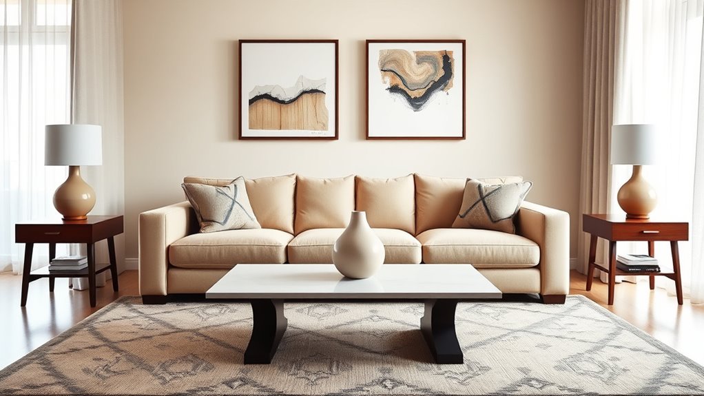
Symmetrical Balance
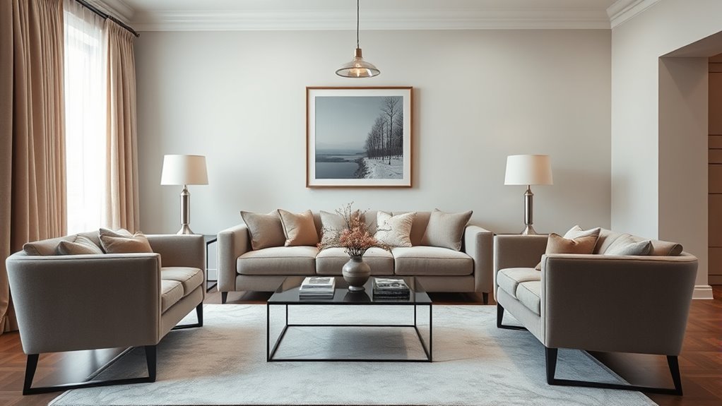
Symmetrical balance uses matching or near-matching elements on both sides of a center point. Think of two nightstands beside a bed or two chairs facing a fireplace.
This approach works well when you want a space to feel calm, classic, or formal. It can also help small rooms feel more organized.
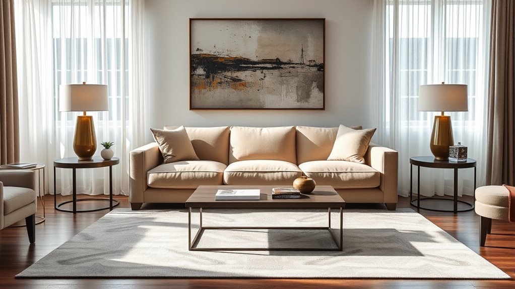
Asymmetrical Balance
Asymmetrical balance uses different elements that feel equal in weight. For example, a large sofa on one side of a room may balance two smaller chairs and a tall lamp on the other.
This style feels more relaxed and modern than perfect symmetry. It works best when you repeat colors, materials, or shapes to tie the layout together.
Radial Balance
Radial balance places items around a central point. A round dining table with chairs around it is a clear example.
This type of balance draws people toward the center of the room. It works well in dining rooms, entryways, and seating areas built around a coffee table.
What Common Mistakes Disrupt Visual Balance?
Small design choices can quickly make a room feel unbalanced. The most common issue is overcrowding, which leaves too little negative space.
Scale also matters. A tiny rug under large furniture, a small lamp beside a bulky sofa, or oversized decor on a slim shelf can throw off the whole room.
- Using too much furniture for the room size.
- Choosing rugs, lamps, or art that don’t match the scale of nearby pieces.
- Letting one bold color dominate without repeating it elsewhere.
- Mixing too many styles without a shared color or material.
- Ignoring function and creating paths that feel tight or awkward.
Note: Balance doesn’t mean every side must match, but each area should feel intentional.
What Are Real-Life Examples of Visual Balance in Interior Design?
Visual balance becomes easier to understand when you picture real rooms. Each example shows how different elements can share visual weight.
- Two matching sofas facing each other create symmetry in a traditional living room.
- A large sectional can balance smaller accent chairs when colors and textures repeat.
- A round dining table creates radial balance when chairs surround it evenly.
- Bold artwork can balance neutral walls when the color repeats in pillows or decor.
- Family photos on one shelf can balance plants or books on the opposite side.
These examples work because the eye finds a clear relationship between the pieces. The room feels planned, even when the items don’t match exactly.
How Can You Evaluate and Improve Visual Balance in Your Home?
To evaluate visual balance, stand back and study your room as a whole. Ask what catches your eye first, what feels too heavy, and what area feels empty.
Next, check your focal point. A fireplace, sofa, bed, window, or artwork can guide the room, but the surrounding pieces should support it.
Adjust your layout by moving one item at a time. Try shifting a chair, lowering artwork, adding a lamp, or clearing a surface before you buy anything new.
Quick Room Balance Checklist
Use this simple checklist when a room feels unfinished. It helps you spot the issue before you make bigger changes.
- Check whether one side of the room feels much heavier.
- Confirm that the main focal point stands out clearly.
- Leave open space around large furniture and decor.
- Repeat at least one color, texture, or material across the room.
- Match furniture scale to the size of the room.
Frequently Asked Questions
What Does Visual Balance Mean?
Visual balance means arranging furniture, decor, color, and space so no area feels too heavy or too empty. It helps a room feel calm, stable, and easy to use.
What Are Four Types of Visual Balance?
Four useful types include symmetrical balance, asymmetrical balance, radial balance, and balance through visual weight. Designers also use color, scale, texture, and negative space to support those types.
What Are the Three Types of Balance in Interior Design?
The three main types are symmetrical, asymmetrical, and radial balance. Symmetry feels ordered, asymmetry feels dynamic, and radial balance creates focus around a center point.
What Is the Principle of Visual Balance in Design?
The principle of visual balance means every element should relate to the rest of the room. You can achieve it by adjusting color, size, shape, texture, height, and open space.
Can a Small Room Still Have Visual Balance?
Yes, a small room can feel balanced when you control scale and clutter. Choose furniture that fits the room, keep walkways clear, and repeat colors to create a calm flow.
How Do You Fix a Room That Feels Unbalanced?
Start by removing clutter, then check whether one side feels heavier than the other. Move furniture, add height, repeat accent colors, or use negative space to restore balance.
Conclusion
Visual balance gives your room a sense of calm, order, and purpose. Start with the area that feels most awkward, then adjust color, scale, height, texture, and negative space. You don’t need a perfect match on every side. When each piece has a clear role, your home feels more comfortable, useful, and personal.