Balancing patterns with solids in your living room is less about following strict decorating rules and more about giving the eye a clear place to focus. Start with one anchor pattern, pull two or three solid colors from it, vary the scale of any additional prints, and use texture to keep the room layered instead of busy.
Quick Answer
To balance patterns with solids in a living room, choose one dominant pattern first, then repeat its colors through solid upholstery, curtains, pillows, or decor. Add one or two smaller-scale patterns for depth, keep the rest mostly solid, and use texture so the room feels warm rather than flat.
Key Takeaways
- Let one bold pattern lead the room, such as a rug, curtain fabric, wallpaper, or patterned chair.
- Use solid colors pulled from that pattern so the room feels connected, not random.
- Mix large, medium, and small pattern scales instead of repeating several prints of the same size.
- Add texture through woven, nubby, velvet, linen, leather, or wood surfaces to create depth without adding more visual noise.
- Edit before you buy more: if every piece competes for attention, add solids or remove one pattern.
At a Glance
| Time Required | 30–60 minutes to plan a palette; one afternoon to restyle pillows, throws, art, and small decor. |
| Difficulty | Beginner to intermediate. The hardest part is editing, not adding more pieces. |
| Tools Needed | Fabric swatches, paint chips, phone photos of the room, tape measure, and your main patterned item. |
| Cost | Free if you rearrange what you own; low to moderate if you add pillows, throws, lampshades, or art. |
Start With a Neutral Base for Your Living Room
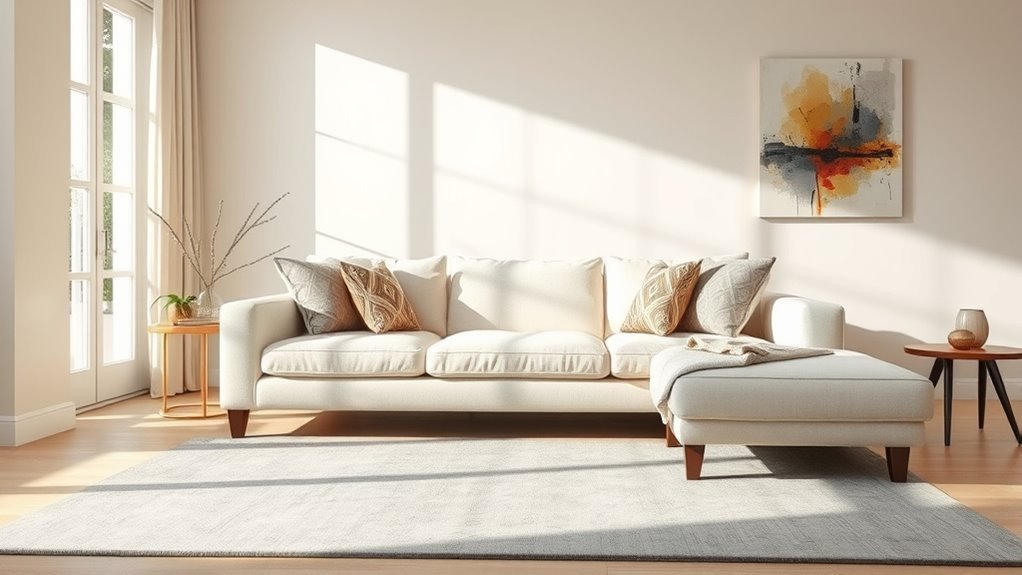
A neutral base gives your patterned pieces room to breathe. That does not mean the room has to be plain white or beige. A neutral base can be warm ivory, oatmeal, soft gray, taupe, greige, camel, charcoal, or even muted olive if it behaves quietly in the room.
Use your largest surfaces to create calm first: the sofa, walls, large curtains, or main storage pieces. Then layer patterns on smaller or more intentional pieces, such as a rug, accent chair, pillows, curtains, or artwork. This makes the room feel designed instead of crowded.
Note: Neutral does not have to mean colorless. A muted green sofa, navy built-ins, or warm tan walls can act as a “solid base” if the color is repeated elsewhere and does not fight the main pattern.
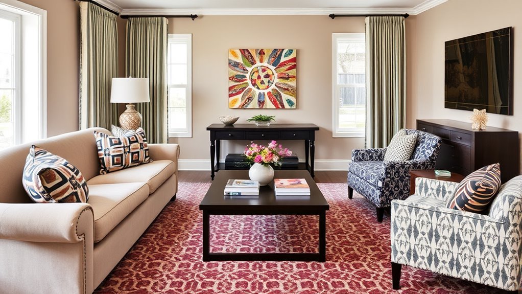
Select a Dominant Pattern as Your Focal Point
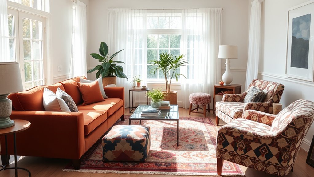
Choose one pattern to be the visual anchor. This is the print that sets the mood for the room. It might be a vintage rug, floral curtains, a striped sofa, patterned wallpaper, a large piece of art, or an upholstered chair.
Once you pick the anchor pattern, let it make the next decisions easier. Look closely at its colors, shapes, and energy level. A high-contrast geometric rug may call for quieter solids and clean-lined furniture. A soft floral curtain may pair better with linen, velvet, wood, and one smaller stripe.
| Anchor Pattern Choice | Best Solid Pairings |
|---|---|
| Bold patterned rug | Solid sofa, simple curtains, pillows that repeat one or two rug colors |
| Patterned sofa or chair | Solid rug, solid curtains, textured pillows, simple wood or metal accents |
| Floral curtains | Solid upholstery, small stripe or check, natural woven textures |
| Geometric wallpaper | Solid furniture, simple rug, one small organic pattern for softness |
Choose Solid Colors That Enhance Your Dominant Pattern
The easiest way to choose solids is to pull them directly from your anchor pattern. Pick one main solid, one supporting solid, and one small accent color. This keeps the room cohesive without making everything match.
For example, if your rug includes rust, cream, navy, and sage, you might use a cream sofa, navy pillows, a sage throw, and a small rust accent in artwork or a lampshade. The room will feel layered because the colors repeat, but it will not feel chaotic because the biggest pieces stay solid.
Pro Tip: Before buying anything, take a photo of your anchor pattern in natural light. Use the photo while shopping so you can match undertones instead of guessing from memory.
Mix Patterns With Different Scales for Visual Interest
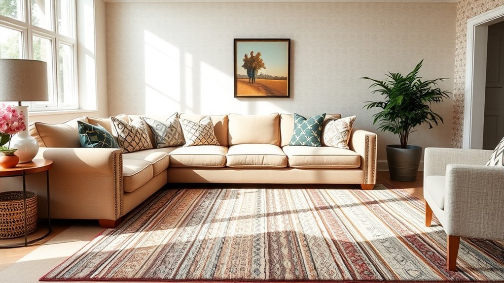
When several patterns are the same size, they compete. The room feels busy because the eye cannot tell which print matters most. A better approach is to vary scale: one large pattern, one medium pattern, and one small pattern.
- Large-scale pattern: rug, curtains, wallpaper, or a statement chair.
- Medium-scale pattern: pillows, ottoman, lampshade, or a smaller accent rug.
- Small-scale pattern: trim, small check, pinstripe, delicate floral, or textured weave.
If you are new to mixing prints, stop at two patterns and one texture. For example, use a large floral curtain, a small striped pillow, and a solid velvet sofa. Once that feels balanced, you can add another small pattern if the room still has enough solid resting places.
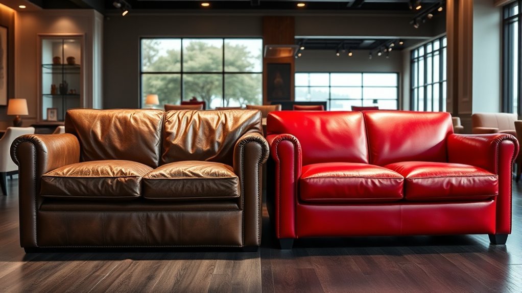
Use Textures to Make Your Design Pop
Texture is the bridge between patterns and solids. It gives solid pieces character so they do not look flat beside busy prints. A solid boucle chair, linen curtain, ribbed ceramic lamp, leather ottoman, or woven basket can add depth without adding another pattern.
| Texture Type | How It Helps |
|---|---|
| Chunky knits | Adds warmth and softness to solid seating |
| Velvet | Adds depth and a subtle light-catching effect |
| Leather | Grounds busy patterns with a smooth, durable surface |
| Boucle | Creates cozy visual texture while staying neutral |
| Woven fibers | Adds natural contrast through baskets, shades, rugs, or trays |
Think of texture as a “quiet pattern.” It keeps the room interesting while still giving your stronger prints enough space to shine.
Add Smaller Patterns for Depth
Smaller patterns are best used as supporting characters. They add movement and detail, but they should not steal attention from the anchor pattern. Try small checks, narrow stripes, subtle animal prints, tiny florals, block prints, or embroidered trims.
A balanced living room usually has one pattern that leads, one or two patterns that support, and enough solids to let the whole design breathe.
- Use small-scale patterns on pillows, throws, lampshades, or a single accent chair.
- Repeat at least one color from the dominant pattern.
- Keep the background color of smaller prints similar to one of your solids.
- Avoid using three high-contrast patterns in the same small seating area.
Use Simple Ratios Without Letting Them Rule the Room
Decorating ratios can help when you feel stuck, but they are guidelines rather than laws. Use them to check balance, not to restrict your style.
A beginner-friendly approach is to keep about two-thirds of the room visually calm and one-third more expressive. In practice, that might mean a solid sofa, solid walls, and solid curtains, balanced by a patterned rug, patterned pillows, and textured accessories.
The 70/20/10 idea works similarly for color: use a dominant color for the largest surfaces, a secondary color for supporting pieces, and an accent color in small doses. If your dominant pattern already has several colors, keep the solids tighter so the room still feels intentional.
Avoid Common Pattern and Solid Mistakes
If your room feels “off,” the problem is usually not the pattern itself. It is often the balance around it. Here are the most common mistakes and how to fix them:
- Too many same-size prints: Swap one print for a solid or a textured solid.
- No color repetition: Repeat one color from your anchor pattern at least three times in the room.
- All solids, no texture: Add woven, nubby, ribbed, matte, glossy, or natural materials.
- Every piece is a focal point: Choose the one item that should lead, then quiet the pieces around it.
- Patterns only on pillows: Consider one larger patterned element, such as a rug or curtains, so the design feels intentional.
Warning: Do not judge patterns under store lighting alone. Fabric, paint, and rug colors can shift dramatically in your own room, especially near north-facing windows or warm evening lamps.
Balance Patterns in a Small Living Room
Small living rooms can still handle pattern. The key is controlling where the pattern appears. Instead of filling every surface, choose one confident patterned item and surround it with calmer solids.
A patterned rug can make a small room feel finished, especially when the sofa and curtains stay solid. Patterned curtains can also work beautifully if the rug is simple and the upholstery is quiet. If you rent, use removable pillow covers, throws, peel-and-stick wallpaper panels, framed fabric, or a patterned lampshade for low-commitment style.
Trust Your Instincts and Experiment With Your Space
Your living room should feel like you, not like a showroom. After you understand the basics, give yourself room to experiment. Move pillows around. Fold a patterned throw over the sofa. Test a solid lampshade beside a printed chair. Take photos from across the room, because photos often reveal balance problems faster than standing in the space.
Embrace Your Creative Vision
Start with what you love and build around it. If you already own a patterned rug or a favorite chair, let that be the anchor. If your room is mostly solid right now, choose one patterned piece that reflects the mood you want: relaxed, tailored, playful, elegant, rustic, modern, or collected.
- Pick one dominant pattern and let it guide the palette.
- Repeat colors from that pattern through solids and accessories.
- Use texture when you want depth without adding another print.
- Edit the room every time you add a new pattern.
Test Various Combinations
Before making a major purchase, create a simple sample board. Place fabric swatches, rug photos, paint chips, and wood or metal finishes together. If the colors repeat and the pattern scales vary, you are probably on the right track.
Then test the combination in the actual room. Place samples near the sofa, window, rug, and lamps you already own. Look at them in morning light, afternoon light, and evening light. A mix that looks perfect online may feel too cool, too warm, or too high-contrast once it is in your space.
Frequently Asked Questions
How do you mix patterns in a living room without making it look busy?
Choose one main pattern, repeat its colors through solid pieces, and vary the scale of any extra prints. A safe mix is one large pattern, one small pattern, and several solids or textured solids.
What is the 3-5-7 rule in decorating?
The 3-5-7 rule is best treated as a styling shortcut, not a strict design standard. It usually means decorating with odd-numbered groupings because groups of three, five, or seven can feel more natural and layered than perfectly even sets.
What is the 70/20/10 rule in interior design?
The 70/20/10 rule is a loose color-balancing method. Use one dominant color for about 70% of the room, a secondary color for about 20%, and an accent color for about 10%. It works well when your patterns share the same palette.
What is the 2/3 rule for living rooms?
For pattern mixing, the 2/3 rule can be used as a simple visual guideline: keep roughly two-thirds of the room calmer with solids or quiet textures, and let about one-third carry stronger pattern, color, or contrast.
Can you mix florals, stripes, and geometric patterns together?
Yes. Florals, stripes, and geometrics can work together when they share at least one color and vary in scale. For example, pair large floral curtains with a narrow striped pillow and a simple geometric rug in a related palette.
Should the sofa be solid if the rug is patterned?
Usually, yes. A solid sofa is the easiest way to balance a patterned rug, especially in a small or medium living room. You can still add patterned pillows, but keep them smaller in scale and connected to the rug colors.
Conclusion
Balancing patterns with solids comes down to focus, repetition, and restraint. Let one pattern lead, repeat its colors in solid pieces, vary the scale of supporting prints, and use texture to keep the room rich without making it noisy. When in doubt, remove one pattern, add one solid, and look at the room from across the space. The best mix feels collected, comfortable, and personal.
Sources
- Homes & Gardens — Principles of Interior Design — supports balance, rhythm, emphasis, proportion, scale, and harmony as practical interior design concepts.
- Good Housekeeping — How Designers Mix Textiles and Textures — supports current expert guidance on layering texture, pattern scale, and cohesive palettes.
- W3C Web Accessibility Initiative — Images Tutorial — supports the use of descriptive image alt text for accessibility.
- Schema.org — Article — supports Article structured data.
- Schema.org — HowTo — supports HowTo structured data for step-based instructions.
- Schema.org — FAQPage — supports FAQPage structured data for the existing FAQ section.