A neutral color palette in a living room uses grounded shades such as warm white, cream, beige, taupe, greige, mushroom, soft gray, charcoal, and natural brown. The goal is not to make the room plain; it is to create a calm, flexible foundation that lets texture, furniture shape, wood tones, artwork, lighting, and accent colors stand out.
Quick Answer
A neutral color palette for a living room combines soft, low-saturation colors like white, beige, gray, taupe, cream, greige, and brown. The best neutral rooms layer warm or cool undertones, natural textures, good lighting, and a few darker or colorful accents so the space feels calm, finished, and personal.
Key Takeaways
- Neutral living rooms work best when you choose one dominant neutral, then layer lighter, darker, warmer, and cooler versions around it.
- Undertones matter: beige, cream, tan, and taupe usually feel warmer, while white, gray, stone, and charcoal can feel cooler or more modern.
- Lighting can change how a neutral looks, so test paint samples in morning, afternoon, evening, and lamplight before committing.
- Texture keeps neutral rooms from looking flat. Mix linen, wool, jute, wood, stone, ceramics, leather, metal, and greenery.
- Use contrast carefully. Pale-on-pale rooms can be beautiful, but they still need enough dark accents for readability, depth, and visual comfort.
At a Glance
| Time Required | 30–60 minutes to plan; 1–3 days to test paint samples in changing light |
| Difficulty | Easy to moderate, depending on lighting and existing furniture colors |
| Tools Needed | Paint swatches, sample pots or peel-and-stick samples, fabric samples, flooring sample, lamp bulbs, painter’s tape |
| Cost | Low if restyling with textiles and decor; higher if repainting, replacing rugs, or buying large furniture |
Understanding Neutral Color Palettes in Living Room Design
When you choose a neutral color palette for your living room, you are choosing the room’s visual foundation. Neutral shades like beige, gray, cream, taupe, white, greige, and soft brown create a flexible backdrop for sofas, rugs, curtains, artwork, and seasonal accents. Benjamin Moore describes neutral paint colors as “incredibly versatile and surprisingly complex,” and recommends testing them in the room because subtle neutrals can shift noticeably under different lighting conditions.
True neutrals include black, white, and gray. Near-neutrals include colors that look neutral at first glance but carry a subtle undertone, such as a beige with yellow undertones, a greige with green undertones, or a white with a creamy warmth. These undertones are what make one neutral feel cozy, another feel crisp, and another feel muddy or dull in the wrong room.
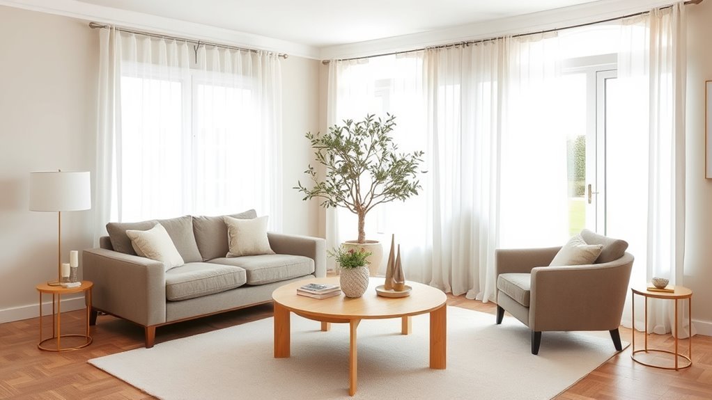
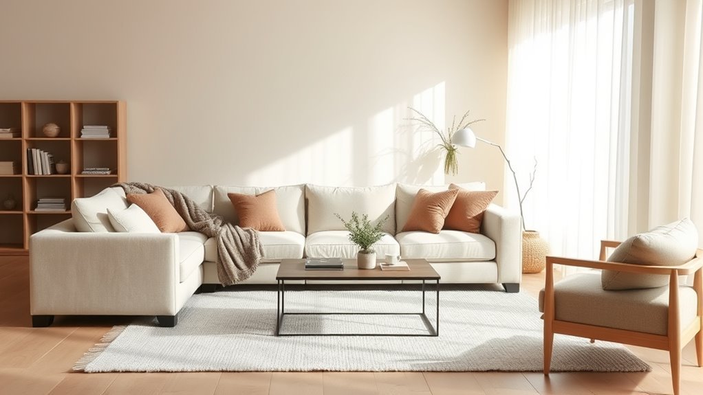
A successful neutral living room is rarely one flat color. It usually combines several related tones: a lighter wall color, a mid-tone sofa or rug, a darker wood or metal accent, and soft texture through pillows, throws, curtains, and upholstery. This layering keeps the room calm without making it feel empty.
The best neutral living rooms are not colorless. They are layered, balanced, and full of quiet contrast.
Why Use Neutral Colors in Your Living Room?
Neutral colors are popular in living rooms because they are adaptable. A neutral base can work with modern, Scandinavian, farmhouse, coastal, traditional, organic, minimalist, or transitional decor. It also makes it easier to update the room over time because you can change pillows, artwork, lamps, or accent chairs without repainting the entire space.
Versatile Design Opportunities
A neutral color palette gives your living room room to evolve. Warm neutrals such as cream, camel, tan, and taupe can make a space feel soft and inviting. Cooler neutrals such as pale gray, stone, white, and charcoal can make a room feel cleaner, quieter, or more contemporary. Mixed neutrals, such as greige and mushroom, bridge both sides and often work well with changing decor styles.
Neutral colors also help statement pieces stand out. A sculptural coffee table, vintage rug, oversized artwork, colorful books, or deep green accent chair will usually look more intentional against a calm neutral background than against a busy wall color.
Calming Atmosphere Creation
A living room often needs to do several jobs: hosting guests, watching TV, reading, relaxing, and gathering with family. Neutral colors help because they are visually quieter than high-saturation colors. Soft whites, creams, beiges, and muted grays can reduce visual clutter and create a more restful backdrop.
That said, “neutral” does not automatically mean “calm.” A stark white room with cold bulbs can feel harsh. A beige room with no contrast can feel dull. The calming effect comes from the full combination: undertone, lighting, texture, furniture scale, contrast, and personal comfort.
Note: Before choosing a neutral, look at the largest fixed elements in the room: flooring, fireplace stone, built-ins, window trim, and any large sofa or sectional you plan to keep. Your wall color should coordinate with those undertones first.
What Are the Key Elements of a Neutral Color Palette?
A strong neutral palette has more than one shade. It includes a dominant neutral, supporting neutrals, contrast, texture, and accent colors. The balance between those elements determines whether the room feels warm, airy, dramatic, rustic, or polished.
Versatile Color Combinations
Use these combinations as starting points for a living room:
- Warm white, cream, and camel: Soft, bright, and cozy. Works well with oak, brass, linen, and woven shades.
- Greige, ivory, and walnut: Balanced and timeless. Works well with mixed wood tones and black accents.
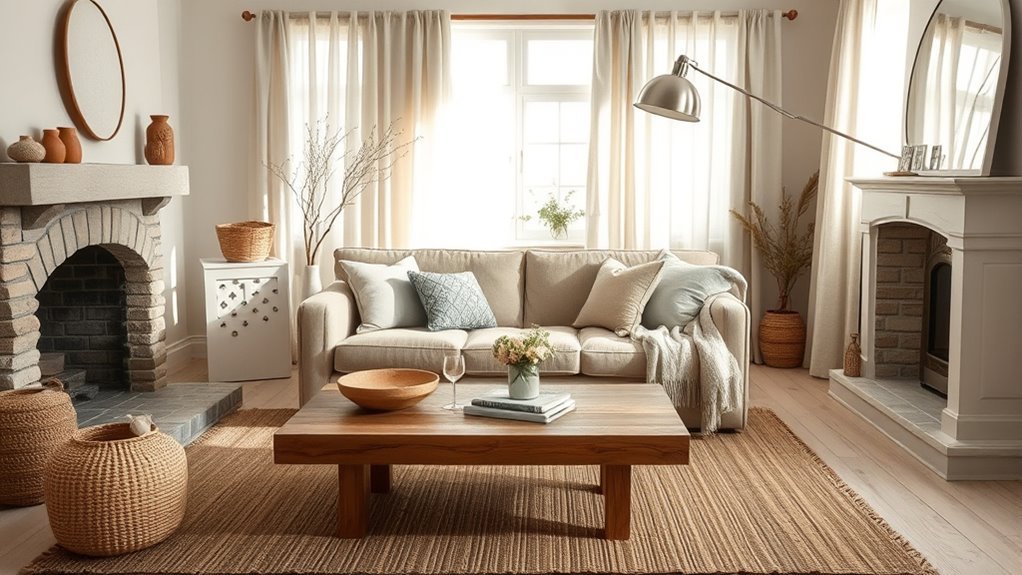
- Taupe, mushroom, and stone: Earthy and sophisticated. Works well with wool rugs, ceramics, and soft leather.
- White, pale gray, and charcoal: Crisp and modern. Works well with black frames, chrome, glass, and minimal furniture.
- Beige, olive, and natural brown: Organic and relaxed. Works well with plants, rattan, terracotta, and textured fabrics.
Subtle Undertones Impact
Undertones are the hidden warmth or coolness inside a neutral color. Beige may lean yellow, pink, peach, or green. Gray may lean blue, purple, green, or brown. White may look crisp, creamy, or slightly gray. These small differences matter because they become more obvious once the color covers an entire wall.
Benjamin Moore recommends choosing neutral paint by looking at the undertone that matches your design goal: warm neutrals with yellow, red, or orange undertones can feel cozier, while cooler undertones like blue, green, or purple can feel more open and airy. The same source also notes that lighting plays a critical role in how neutrals appear, which is why wall testing is essential.
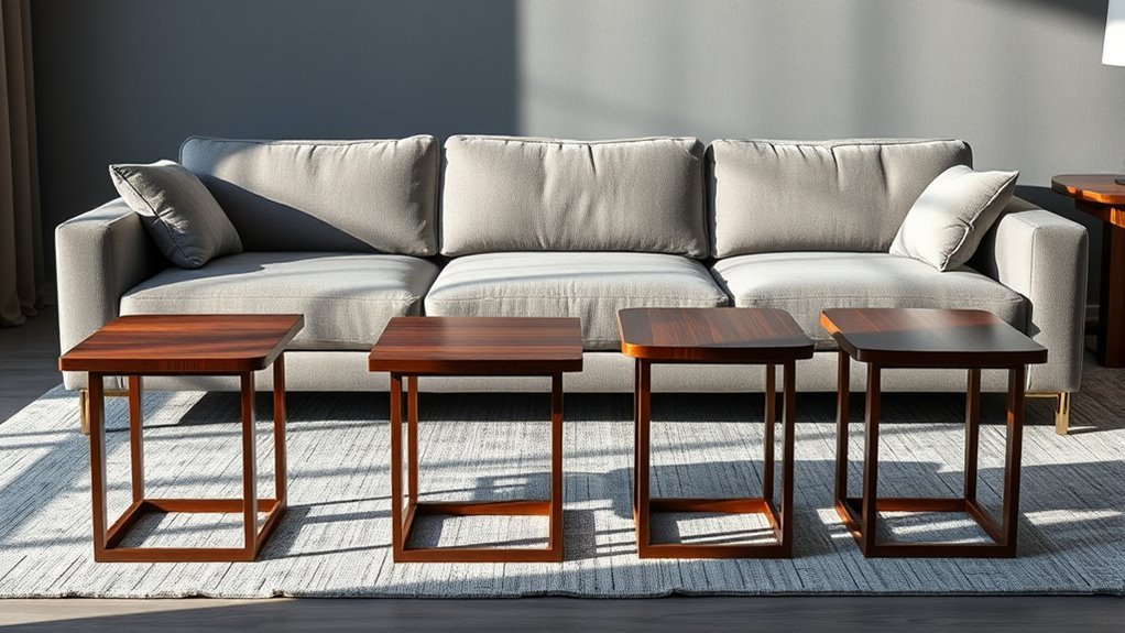
Layered Textures Enhance Aesthetics
Texture is what keeps a neutral living room from feeling flat. When the colors are quiet, the surfaces need to do more visual work. Combine matte, woven, smooth, nubby, glossy, rough, and soft finishes to make the room feel intentional.
- Plush rugs: Wool, faux sheepskin, or high-pile rugs soften the floor and add comfort.
- Smooth textiles: Linen curtains, cotton slipcovers, velvet pillows, or boucle chairs create tactile contrast.
- Natural materials: Wood, stone, rattan, cane, jute, and leather add organic warmth.
- Diverse finishes: Mix matte ceramics, glossy lamps, aged brass, black metal, and glass to avoid sameness.
Top Neutral Color Choices for Living Rooms
The best neutral color for your living room depends on the room’s light, flooring, furniture, and mood. Instead of starting with random paint names, start with the family of neutral that fits the space.
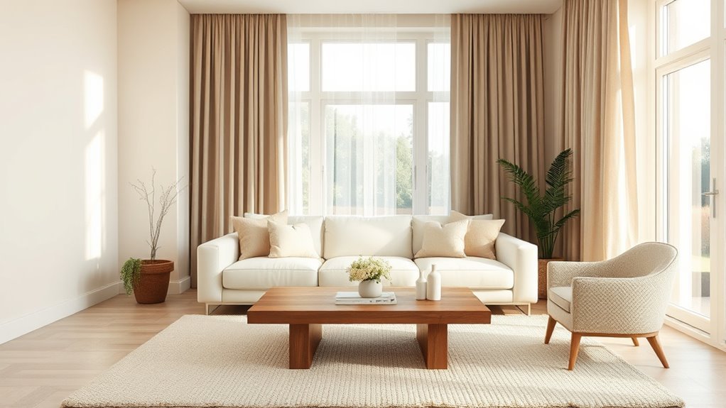
- Warm white: Best for rooms that need brightness without feeling cold. Works with cream upholstery, oak, brass, and natural textures.
- Cream: Best for cozy, traditional, cottage, or soft modern living rooms. Pairs well with warm woods and layered textiles.
- Beige: Best for relaxed, classic rooms. Choose a beige that matches your flooring undertone so it does not turn too yellow, pink, or gray.
- Greige: Best when you want a balance between beige and gray. It works well in transitional rooms and with mixed warm/cool decor.
- Taupe: Best for a more sophisticated, earthy look. It pairs beautifully with black, ivory, walnut, olive, and stone.
- Soft gray: Best for cool, modern, or airy rooms. Avoid overly blue grays in rooms that already receive cool light.
- Charcoal or soft black: Best as an accent on built-ins, fireplace walls, doors, frames, or furniture rather than as the only neutral in a small dark room.
Choose Neutrals Based on Light Direction
Natural light can change the way a neutral color reads. The U.S. Department of Energy explains that window orientation affects the quality and amount of daylight in a home: north-facing windows tend to admit more even light with little glare, south-facing windows bring more winter sunlight, and east- and west-facing windows bring stronger morning or evening light.
- North-facing living rooms: These often feel cooler and flatter. Try warm whites, creamy beiges, greige, or mushroom instead of icy gray.
- South-facing living rooms: These usually get warmer, brighter light. Soft white, taupe, pale gray, and balanced greige can work well.
- East-facing living rooms: Morning light may feel bright and fresh, while afternoon light can look cooler. Test warm neutrals to keep the room from feeling dull later in the day.
- West-facing living rooms: Afternoon and evening light can be warm and intense. Balanced neutrals, muted taupes, and soft grays can help control the glow.
Pro Tip: Paint large sample boards instead of judging a neutral from a tiny chip. Move each sample beside the sofa, flooring, fireplace, curtains, and trim so you can see whether the undertone stays attractive in every part of the room.
Practical Tips for Mixing Textures in Neutral Spaces
Mixing textures in neutral spaces can elevate the overall design, creating a visually engaging environment without relying on bright color. The easiest method is to repeat each neutral two or three times in different materials. For example, a cream wall color might repeat in linen curtains and a wool pillow, while a darker brown might repeat in the coffee table, picture frames, and woven basket.
- Layer rugs: Pair a jute or sisal rug with a softer wool or vintage-style rug on top. This adds warmth and makes the seating area feel grounded.
- Showcase materials: Use open shelving, a coffee table, or a fireplace mantel to display wood, stone, ceramic, glass, and books.
- Incorporate metallics: Brass, bronze, chrome, nickel, or black metal can add definition. Choose one dominant metal and repeat it at least twice.
- Balance surfaces: If your sofa is smooth, add nubby pillows. If your rug is flat-woven, add a plush throw. If your walls are matte, add a glossy lamp or mirror.
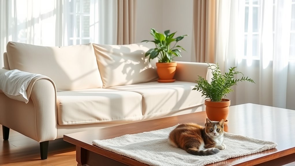
- Add organic contrast: Plants, branches, natural wood, and handmade ceramics make a neutral room feel less staged.
Incorporating Accent Colors in Neutral Spaces
Accent colors bring personality to a neutral living room without taking over the space. The safest approach is to choose one or two accent colors and repeat them in small, intentional places such as pillows, artwork, books, vases, lampshades, or a throw blanket.
Nature-inspired colors work especially well with neutral palettes. Try olive, sage, moss, rust, terracotta, clay, ochre, navy, burgundy, plum, or muted blue. For a softer look, use dusty rose, pale blue, or muted green. For a bolder look, use black, deep brown, oxblood, or dark olive.
To keep the room cohesive, match the accent color’s undertone to the neutral base. Warm neutrals usually pair well with rust, olive, camel, clay, and brass. Cool neutrals usually pair well with navy, slate blue, charcoal, silver, and crisp black. Greige and taupe can often bridge both sides.
Designing a Cohesive Look With Neutral Schemes
Maintaining a harmonious balance in your living room is key when working with a neutral color palette. A simple formula is 60% dominant neutral, 30% supporting neutral, and 10% accent or contrast. This is not a strict rule, but it helps prevent the room from feeling scattered.
- Select a dominant neutral: Choose the main wall color, sofa color, or rug color first. This sets the emotional tone of the room.
- Add a supporting neutral: Use a second neutral in curtains, chairs, built-ins, or large textiles. It should be clearly related but not identical.
- Include dark contrast: Add black, charcoal, espresso, bronze, or deep wood tones through frames, legs, hardware, lamps, or side tables.
- Repeat materials: Repeat wood, metal, and textile colors throughout the room so nothing feels random.
- Use accent colors sparingly: Add color through pieces that are easy to change when seasons or tastes shift.
How to Test Neutral Paint Before You Commit
Neutral paint is especially sensitive to lighting, so testing is not optional. Benjamin Moore recommends painting samples on the wall before buying and testing colors from morning to evening under natural and artificial lighting conditions.
- Choose three to five samples: Pick options in the same family, such as warm whites, greiges, or taupes.
- Paint large sample boards: Use boards or peel-and-stick samples so you can move them around the room.
- Check fixed finishes: Hold each sample beside flooring, trim, fireplace stone, countertops, built-ins, and large furniture.
- View at different times: Look in morning light, midday light, evening light, and at night with lamps on.
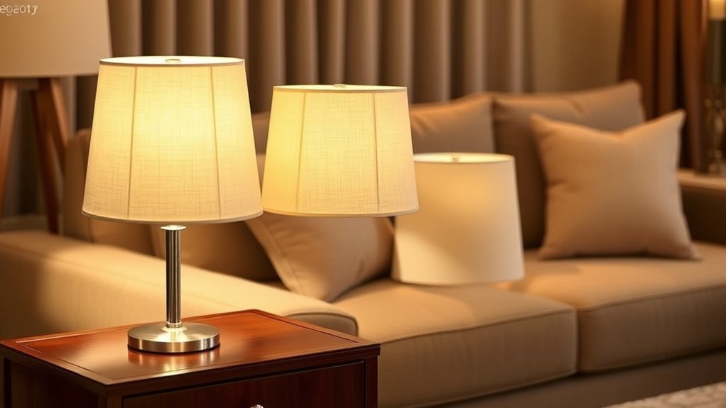
- Test with bulbs on: Warm bulbs can make cream and beige look richer, while cooler bulbs can make gray and white look sharper.
- Choose the finish last: Matte or flat finishes hide wall imperfections, eggshell is practical for many living rooms, and satin can be easier to wipe but may show wall flaws.
How to Avoid Common Mistakes With Neutral Colors
While embracing a neutral color palette can create a serene atmosphere in your living room, it is important to avoid common pitfalls that make neutral rooms feel unfinished.
- Using only one neutral: One beige or one gray across every surface can feel flat. Add light, mid-tone, and dark neutrals.
- Ignoring undertones: A pink-beige wall may clash with yellow oak floors. A blue-gray wall may feel cold beside warm cream upholstery.
- Skipping sample testing: A neutral that looks perfect online may look green, purple, yellow, or washed out in your room.
- Forgetting texture: Neutral rooms need tactile variety through rugs, curtains, pillows, wood, stone, and woven materials.
- Choosing no contrast: Pale walls, pale furniture, and pale decor can blur together. Add black, brown, charcoal, bronze, or deeper wood tones.
- Overloading accent colors: Too many accents can defeat the calm neutral effect. Repeat one or two colors intentionally.
Warning: Very pale neutral schemes still need enough contrast to be readable and comfortable. For web and visual accessibility, the W3C’s WCAG guidance uses a minimum contrast ratio of 4.5:1 for normal text and 3:1 for large text. Apply the same principle visually in your room: use enough dark accents so labels, framed prints, decorative signs, and functional items do not disappear into the background.
Transform Your Living Room With a Neutral Palette
A neutral color palette can transform your living room into a calm, flexible, and polished space. The key is to layer tones instead of relying on one shade. Start with the fixed elements, choose a dominant neutral, test it in the room’s real light, then build depth with texture and contrast.
- Layer tones: Combine warm whites with earthy browns, soft grays with charcoal, or greige with cream and walnut.
- Incorporate textures: Use wood, stone, linen, wool, leather, jute, ceramics, and metal to keep the room visually rich.
- Plan the lighting: The U.S. Department of Energy notes that light quality is as important as quantity in indoor lighting design. Use a mix of ambient, task, and accent lighting so the room works during the day and at night.
- Add accent details: Bring in personality through artwork, pillows, books, plants, trays, and throws.
- Review the whole room: Step back and check whether your room has a light neutral, a mid-tone neutral, a dark contrast, a natural texture, and one accent color.
Frequently Asked Questions
What are neutral colors for living rooms?
Neutral colors for living rooms include white, cream, beige, taupe, greige, gray, mushroom, brown, charcoal, and black. Some neutrals are warm, such as cream and camel, while others are cool, such as pale gray and crisp white. The best choice depends on your room’s light, flooring, furniture, and mood.
What is a good neutral color palette?
A good neutral color palette includes a dominant neutral, a supporting neutral, a darker contrast, and a small accent color. For example, warm white walls, a greige sofa, walnut furniture, black frames, and olive pillows create a balanced palette that feels calm but not flat.
What is a neutral color palette?
A neutral color palette is a group of low-saturation colors that can act as a flexible background for furniture and decor. It often includes shades of white, beige, gray, taupe, brown, cream, and black. In interior design, neutral palettes work best when they include texture, undertone control, and contrast.
What is the 3 color rule in interior design?
The 3 color rule is a simple decorating guideline that uses one dominant color, one secondary color, and one accent color. In a neutral living room, that might mean cream walls, taupe upholstery, and black or olive accents. You can also apply the 60-30-10 idea: 60% main color, 30% supporting color, and 10% accent.
How do I make a neutral living room look less boring?
Add texture, contrast, and repetition. Use a mix of linen, wool, jute, wood, stone, metal, ceramics, and plants. Then repeat a few tones throughout the room, such as black in frames and lamps, warm wood in tables and shelves, and cream in pillows and curtains.
Should a neutral living room be warm or cool?
It depends on the room. Warm neutrals are usually better for cozy, shaded, or north-facing rooms. Cool neutrals can work well in bright, modern, or south-facing spaces. If you are unsure, choose a balanced neutral such as greige, mushroom, or soft taupe and test it in the room before painting.
Conclusion
Incorporating a neutral color palette in your living room can create a space that feels calm, flexible, and timeless. The secret is not choosing beige and stopping there. A finished neutral room uses undertones carefully, layers texture, tests paint in real light, adds enough contrast, and brings in accent colors with intention. Start with the room’s fixed finishes, build a balanced palette around them, and your living room will feel warm, cohesive, and easy to update over time.
Sources
- Benjamin Moore — Neutral Paint Ideas — supports guidance on neutral paint versatility, undertones, lighting sensitivity, living room use, and sample testing.
- U.S. Department of Energy — Daylighting — supports guidance on window direction, natural light, and how daylight enters a room.
- U.S. Department of Energy — Lighting Design — supports guidance on light quality, task lighting, daylighting, and light-colored wall surfaces.
- W3C Web Accessibility Initiative — Contrast Minimum — supports the caution about contrast and readability in pale neutral schemes.