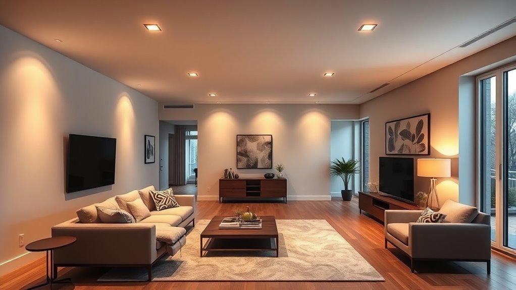
Color drenching is one of the simplest ways to make a room feel intentional, cozy, and high-impact without adding more furniture or decor. Instead of using one color for walls and another for trim, ceiling, doors, or built-ins, this technique wraps the room in one main hue so the eye moves smoothly through the space.
Quick Answer
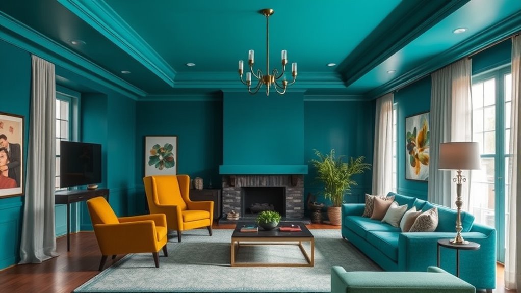
Color drenching means painting a room’s walls, ceiling, trim, doors, and sometimes built-ins in the same color or closely related tones. It works by reducing visual breaks, highlighting architectural details, and creating a wrapped, cohesive look that can feel calm, dramatic, cozy, or expansive depending on the color and finish you choose.
Key Takeaways
- Color drenching works best when the color is tested in the room’s real lighting before you commit.
- Using different sheens in the same color keeps the room from looking flat.
- Small rooms, powder rooms, bedrooms, dining rooms, libraries, hallways, and built-in-heavy spaces are especially strong candidates.
- Ventilation matters when painting because paints and related products can release VOCs while drying.
- If a fully saturated room feels too bold, tonal drenching or gradient layering gives a softer version of the same idea.
What Is Color Drenching and How Does It Work?
Color drenching is an interior design technique where one color is carried across most or all major surfaces in a room. That can include walls, ceilings, baseboards, crown molding, doors, cabinetry, radiators, bookcases, and even furniture if you want a more immersive effect.
The reason it works is simple: fewer color changes mean fewer visual stops. White trim, a white ceiling, or contrasting doors can break up a room into separate pieces. When those breaks disappear, the room often feels more unified. In small rooms, this can make the boundaries feel less obvious. In rooms with millwork, paneling, arched openings, or built-ins, the same-color treatment can make those details feel custom instead of busy.
This does not mean every surface must use the exact same paint finish. In fact, color drenching usually looks better when you vary the sheen. A soft matte or eggshell on the walls, a flatter finish on the ceiling, and a satin or semi-gloss on trim can keep the color consistent while adding depth and durability.
At a Glance
| Time Required | 1 weekend for a small room; 2–4 days for larger rooms with trim, doors, or built-ins |
| Difficulty | Beginner to intermediate, depending on trim detail and surface condition |
| Tools Needed | Paint samples, primer, painter’s tape, drop cloths, angled brush, roller, tray, sanding block, caulk, ladder, and cleaning supplies |
| Cost | Usually the cost of primer, paint, and supplies; expect more paint than a standard wall-only project because ceilings and trim are included |
Top Benefits of Color Drenching for Your Home’s Aesthetic
When done thoughtfully, color drenching can make a room feel polished, layered, and more personal. It is especially useful when you want a strong design statement without adding patterned wallpaper, extra furniture, or lots of accessories.
Dramatic Visual Impact
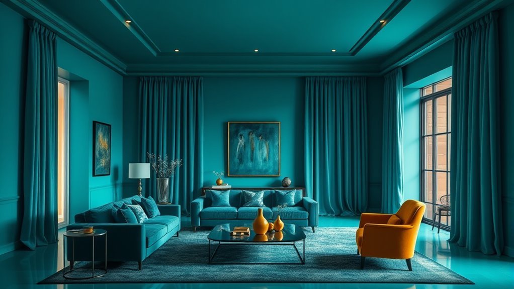
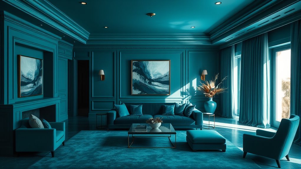
Color drenching creates instant mood. A deep blue dining room feels intimate. A muddy green bedroom feels restful. A warm terracotta hallway feels inviting. Because the color continues across trim and ceiling, the result feels more deliberate than a single accent wall.
| Element | Effect | Example |
|---|---|---|
| Walls | Sets the main mood | Deep blue living room |
| Trim and doors | Makes the color feel custom | Satin finish on baseboards and door frames |
| Ceiling | Removes the visual stop overhead | Matte ceiling in the wall color |
| Built-ins | Creates a seamless architectural look | Bookcases painted to match the walls |
Enhanced Spatial Perception
A unified hue can help reduce visual clutter. This is why color drenching often works well in tight powder rooms, short hallways, and compact bedrooms. Instead of chopping the room into wall color, ceiling color, trim color, and door color, one palette lets the architecture read as a whole.
That said, color drenching does not automatically make every room look larger. A very dark color in a room with little natural light may feel cozy and cocooning rather than airy. That can be beautiful, but it should be the goal rather than a surprise.
High-End Look With Fewer Decor Decisions
Color drenching can also simplify decorating. When the room already has a strong color envelope, you can use fewer accessories and still get a finished look. Natural wood, stone, woven textures, linen, brass, black accents, or creamy upholstery can stand out beautifully against a saturated background.
The best color-drenched rooms do not rely on color alone. They balance one strong hue with texture, lighting, sheen, and breathing room.
How to Color Drench a Room Step by Step
Maximizing the benefits of color drenching takes more than choosing a bold paint color. The finish, prep work, lighting, and painting order all affect the final result.
Warning: Paints, paint strippers, varnishes, and related products can release VOCs indoors. Follow the product label, increase ventilation, use fans safely, and choose low- or zero-VOC paint when possible. If your home was built before 1978, test for lead paint before sanding or disturbing old painted surfaces.
1. Choose the Right Room
Start with a room where an immersive look makes sense. Powder rooms, bedrooms, dining rooms, libraries, mudrooms, hallways, and small offices are excellent places to begin. If you are nervous, start with a smaller room before committing to a large open-plan area.
2. Pick a Color That Matches the Mood
Ask what you want the room to feel like. For a restful space, try muted greens, smoky blues, soft plums, warm taupes, or earthy browns. For energy, consider ochre, coral, tomato red, or a strong teal. For drama, try deep navy, aubergine, forest green, charcoal, or oxblood.
Color can influence how a room feels, but the effect depends on context, lighting, culture, and personal association. Do not choose a color only because it is “supposed” to be calming or energizing. Choose the color that feels right in your actual space.
3. Test Large Samples in Real Light
Paint sample boards or large swatches on at least two walls. Look at them in morning light, afternoon light, evening lamplight, and on cloudy days. If the color turns muddy, harsh, too cold, or too intense, adjust before buying gallons of paint.
Pro Tip: Test the same color in the finishes you plan to use. A satin trim finish can look slightly brighter or deeper than a matte wall finish even when the paint color is identical.
4. Choose Finishes by Surface
For most rooms, use a matte or eggshell finish on walls, a flat or matte finish on the ceiling, and satin or semi-gloss on trim, doors, and cabinets. Glossier finishes are easier to wipe down but can highlight dents, brush marks, and uneven surfaces.
- Walls: Matte, washable matte, or eggshell for a soft look.
- Ceiling: Flat or matte to reduce glare and hide imperfections.
- Trim and doors: Satin or semi-gloss for durability.
- Cabinetry and built-ins: Satin, semi-gloss, or a cabinet-grade enamel.
- Bathrooms and kitchens: Choose moisture-tolerant, washable paint recommended for those rooms.
5. Prep, Prime, and Paint in the Right Order
Clean surfaces first, patch holes, caulk gaps, sand rough areas, and prime where needed. Primer is especially important when covering glossy trim, stained wood, patched walls, or a much darker or lighter previous color.
- Remove switch plates, outlet covers, curtains, and small hardware.
- Protect floors and furniture with drop cloths.
- Clean walls, trim, and doors so paint adheres properly.
- Patch, sand, caulk, and prime problem areas.
- Paint the ceiling first.
- Paint the walls next.
- Paint trim, doors, cabinetry, and built-ins last.
- Let each coat dry according to the label before recoating.
Best Rooms for Color Drenching: Where to Apply This Trend
Color drenching can work in almost any room, but it is especially effective in spaces where you want mood, continuity, or architectural emphasis.
Bedrooms
Bedrooms are ideal for color drenching because the enveloping effect can feel restful and cocoon-like. Muted blues, greens, mauves, taupes, and warm browns are strong choices if you want the room to feel calm rather than loud.
Powder Rooms and Bathrooms
Powder rooms are one of the easiest places to go bold. Because they are small and used briefly, rich colors can feel exciting instead of overwhelming. In bathrooms, coordinate the wall color with tile undertones, metal finishes, and vanity color so the room feels intentional.
Hallways and Pass-Through Areas
Hallways often lack strong architectural identity. Color drenching can turn them into a designed transition instead of a blank passage. It can also reduce the choppy look created by multiple doors, frames, and trim lines.
Dining Rooms, Libraries, and Offices
Dining rooms, libraries, and offices benefit from a wrapped, focused mood. Deep colors can feel intimate and sophisticated, while mid-tone colors can create personality without making the room too dark.
Kitchens and Mudrooms
Kitchens and mudrooms can look especially custom when cabinetry, trim, and walls share the same color family. Use durable, washable finishes on high-touch surfaces, and make sure the color works with countertops, flooring, backsplash, and appliance finishes.
Best Colors for Color Drenching
The best color for color drenching depends on the room’s natural light, the mood you want, and the fixed finishes already in the space. These color families are reliable starting points:
- Soft greens: calming, natural, and easy to live with in bedrooms, bathrooms, and offices.
- Deep blues: classic, dramatic, and strong for dining rooms, studies, and powder rooms.
- Warm neutrals: beige, taupe, mushroom, and clay tones create a quieter version of the trend.
- Earthy reds and terracottas: warm, cozy, and inviting in hallways or dining spaces.
- Charcoal and near-black: dramatic and elegant, especially with warm lighting and natural textures.
- Plum, aubergine, and burgundy: rich and enveloping for rooms where you want depth.
Note: If your room faces north or gets little daylight, test warm or slightly muted versions of your chosen color. Cool colors can look flatter or grayer in low natural light.
Tonal Drenching and Gradient Layering
If full color drenching feels too intense, try tonal drenching. This uses related shades from the same color family instead of one exact color everywhere. For example, you might use a mid-tone blue on the walls, a deeper blue on built-ins, and a softer blue on the ceiling.
This newer approach, often called gradient layering, keeps the cohesive feel of color drenching while adding gentle contrast. It is especially useful in rooms with paneling, fireplaces, coffered ceilings, wainscoting, or built-ins because each architectural layer can receive a slightly different tone.
Avoid These Common Mistakes in Color Drenching
Color drenching can transform a space dramatically, but small mistakes can make the finished room feel heavy, flat, or unfinished.
Skipping Samples
Never choose a color from a tiny chip alone. Large samples show how the color behaves with your flooring, furniture, daylight, and lamps.
Using One Flat Finish Everywhere
One finish across every surface can look dull and may not hold up on trim or doors. Vary the sheen while keeping the color consistent.
Ignoring Undertones
A green with yellow undertones will feel very different from a green with blue undertones. Compare the paint to your flooring, countertops, tile, stone, and upholstery before committing.
Forgetting About Lighting
A beautiful color can look completely different under warm bulbs, cool bulbs, or dim lighting. Plan your lamps and bulbs along with the paint color.
Painting Over Problem Surfaces Too Fast
Glossy trim, stained wood, patched drywall, and peeling paint need prep. Skipping cleaning, sanding, caulking, or primer can lead to uneven coverage and poor adhesion.
When Not to Use Color Drenching
Color drenching is powerful, but it is not always the right answer. Avoid or soften the technique when:
- You are not ready for a strong color commitment.
- The room has beautiful natural wood trim you do not want to paint.
- Your rental agreement does not allow major paint changes.
- The walls or trim are damaged and would be highlighted by a glossier finish.
- The room already has busy tile, bold flooring, patterned wallpaper, or many competing finishes.
- You plan to sell soon and need a more neutral presentation.
In those cases, try a single color on walls and trim only, a tonal version of the look, or a smaller color-drenched space such as a powder room, closet, or hallway.
Troubleshooting Color Drenching Problems
The Room Feels Too Dark
Add warmer bulbs, mirrors, lighter textiles, pale art mats, or reflective accents. You can also repaint the ceiling one shade lighter while keeping the drenched effect.
The Color Looks Flat
Add contrast through sheen, texture, and materials. Linen, velvet, wood, stone, metal, and woven shades can make a single-color room feel layered.
The Trim Looks Different From the Walls
This is usually a sheen effect. Satin and semi-gloss reflect more light, so the same color may look slightly brighter or deeper on trim. This is normal and often desirable.
The Space Feels Overwhelming
Break the intensity with artwork, curtains, rugs, or furniture in softer neutrals. If needed, shift to tonal drenching by repainting the ceiling or built-ins in a related lighter shade.
Where Did Color Drenching Come From and Why Does It Matter?
Color drenching feels very current, but the idea of wrapping rooms in strong color is not new. Historic interiors often used saturated wall colors, painted millwork, patterned ceilings, and coordinated textiles to create atmosphere. What feels modern today is the cleaner, more monochromatic version: one color family used across walls, ceiling, trim, and architectural details.
The trend matters because it challenges the default assumption that ceilings and trim must always be white. In the right room, painting those surfaces can make the architecture feel more intentional, reduce visual clutter, and create a stronger emotional connection to the space.
Frequently Asked Questions
Is color drenching a good idea?
Yes, color drenching is a good idea when you want a cohesive, immersive, and high-impact room. It works especially well in bedrooms, powder rooms, dining rooms, libraries, hallways, and rooms with architectural details. It may not be ideal if you prefer high contrast, have natural wood trim you want to preserve, or are not ready for a bold color commitment.
What are some common color drenching mistakes?
The most common mistakes are skipping paint samples, ignoring undertones, using one flat finish everywhere, forgetting how lighting changes color, and failing to prep trim or glossy surfaces. Testing large samples and choosing the right sheen for each surface prevents most problems.
What is the best color for color drenching?
The best color depends on the room and the mood you want. Soft greens, smoky blues, warm taupes, clay tones, deep navy, burgundy, plum, charcoal, and earthy browns all work well. Always test the color in your room before committing because lighting and surrounding materials can change how it looks.
What is the 3 color rule in interior design?
The 3 color rule is a decorating guideline that uses a dominant color, a secondary color, and an accent color. Color drenching bends this rule by making one color dominant across the room, then using texture, sheen, furniture, art, metal finishes, and small accents to add contrast.
Should the ceiling be painted the same color as the walls?
For full color drenching, yes. Painting the ceiling the same color removes the visual break between wall and ceiling. Use a flat or matte ceiling finish to reduce glare. If the room feels too intense, use a shade slightly lighter than the wall color for a softer tonal effect.
Do walls and trim need the same paint finish?
No. Walls and trim can be the same color but different finishes. Many rooms look best with matte or eggshell walls and satin or semi-gloss trim. The color stays cohesive, while the sheen adds dimension and makes high-touch areas easier to clean.
Conclusion
Color drenching is a bold but practical way to make a room feel cohesive, personal, and thoughtfully designed. The key is balance: choose a color you genuinely enjoy, test it in real lighting, vary the finishes, prepare the surfaces properly, and add texture so the room feels layered rather than flat. Whether you choose a deep jewel tone, an earthy neutral, or a soft tonal palette, color drenching can turn an ordinary room into a space with real atmosphere.
Sources
- U.S. Environmental Protection Agency: Volatile Organic Compounds’ Impact on Indoor Air Quality — supports VOC, paint-product, and ventilation guidance.
- Architectural Digest: Interior Paint Buying Guide — supports paint type, finish, sheen, and interior paint selection guidance.
- The Spruce: Painting Walls and Trim the Same Color — supports same-color wall, trim, and ceiling design guidance.
- Good Housekeeping: Gradient Layering Paint Trend — supports tonal drenching and gradient layering as a current variation.
- Annual Review of Psychology: Color Psychology: Effects of Perceiving Color on Psychological Functioning in Humans — supports cautious, context-aware language around color and mood.