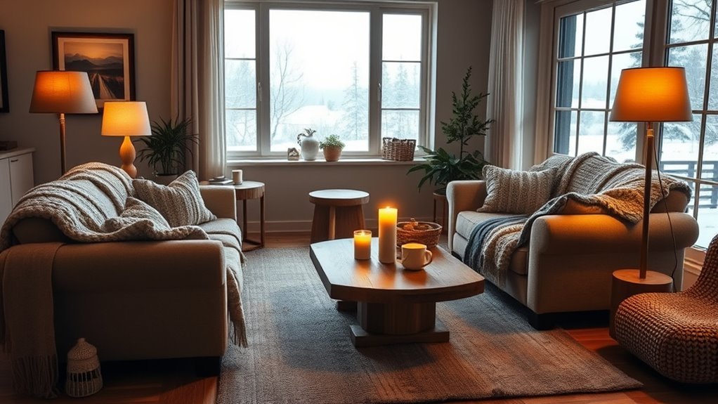
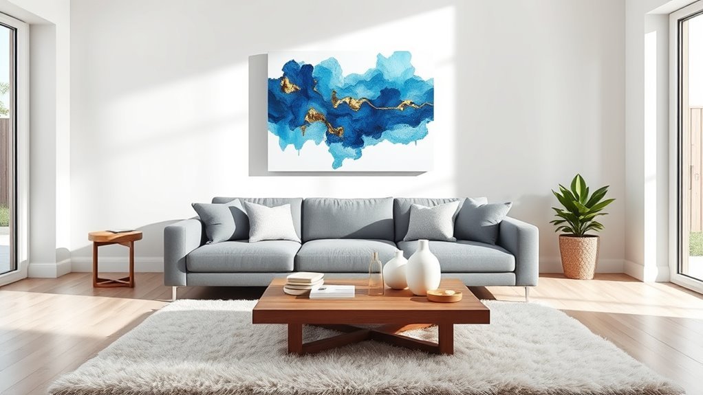
Choosing wall art for your living room is easier when you treat it like a design decision, not a guessing game. Start with your wall size, furniture width, color palette, and the mood you want the room to create. Then choose one large statement piece, a balanced pair, or a gallery wall that feels connected to the furniture below it.
Quick Answer
To choose living room wall art, measure the wall and nearby furniture first. Aim for artwork that is about two-thirds to three-quarters the width of the sofa, console, or mantel below it. Pick colors that repeat or intentionally contrast with your decor, hang the center near eye level, and use safe, weight-rated hardware.
Key Takeaways
- For art above a sofa, sideboard, or mantel, choose a piece or grouping that is roughly two-thirds to three-quarters as wide as the furniture.
- Hang the center of the artwork or gallery wall near eye level, usually around 57–60 inches from the floor, then adjust for seated viewing and furniture height.
- Use your room’s existing colors as a guide, but do not match everything too perfectly. Contrast often makes art feel more collected and personal.
- Protect art from direct sunlight, strong heat, and glare. LED lighting and careful fixture angles help artwork look better and last longer.
At a Glance
| Time Required | 20–45 minutes to measure, plan, and test placement before buying or hanging |
| Difficulty | Easy for small art; moderate for gallery walls or heavy framed pieces |
| Tools Needed | Tape measure, pencil, painter’s tape, level, paper templates, stud finder, and weight-rated hooks or anchors |
| Cost | $20–$150 for prints or thrifted finds; $150+ for framed, original, oversized, or custom pieces |
How to Assess Your Space for the Perfect Art Fit
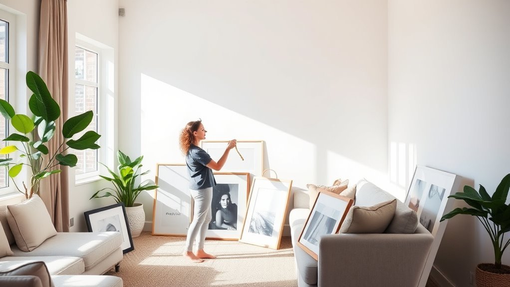
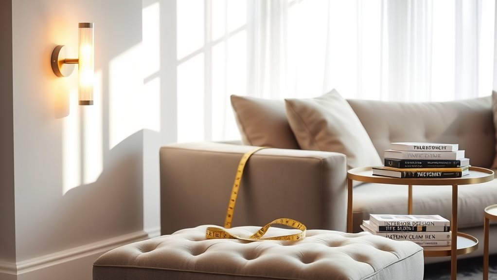
Before you shop for artwork, measure the wall area you want to fill. Write down the wall width, the furniture width, and the distance between the top of the furniture and the ceiling. This gives you a clear size range instead of relying on a guess.
For art above a sofa, console, or sideboard, a helpful rule of thumb is to make the art or art grouping about two-thirds the width of the furniture below it. You can go slightly larger for a dramatic look, but avoid pieces that are wider than the furniture because they can feel top-heavy.
- Measure the furniture below the art, not just the empty wall.
- Multiply the furniture width by 0.66 to find a good minimum art width.
- Use painter’s tape to outline the art size on the wall before buying.
- Leave enough blank wall around the art so it feels intentional, not squeezed in.
- For gallery walls, treat the full arrangement as one large piece.
Pro Tip: Cut paper templates to the size of each frame and tape them to the wall. Live with the layout for a day before making holes. This is especially useful for gallery walls and oversized art.
Determine the Size and Style of Art That Fits Your Room
The right wall art should feel connected to your living room’s scale, furniture, and mood. A small print floating above a large sectional can look lost. A huge canvas on a narrow wall can feel cramped. Start with proportion, then choose the style.
Recommended Products
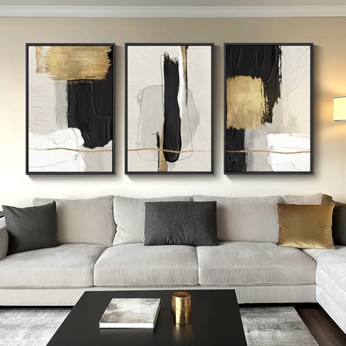
[Framed Wall art]: A set of 3 large contemporary minimalist black white and gold abstract wall art each 24x36 inches, 3 pieces totaling 36" H x 72" W. The sturdy 1.38-inch solid wood frames feature a sleek black finish that complements a variety of home decor styles

【Canvas Wall Art Size】 This is a modern canvas print measuring 29" H x 58" W.(73cm*147cm) For the best look, please measure your wall space before buying to make sure this size is just right for your decorating expectations.

【Framed Wall Art】Large framed pastel grunge forest tree landscape wall arts, encased in robust wood-colored frames, each measuring 24x36 inches (totaling 36"H x 72"W). These nature-inspired abstract artwork pieces enhance any space with a sense of tranquility and modern charm, adding a touch of vintage elegance with their minimalist design.
Assess Wall Dimensions Carefully
For a small wall, choose one medium piece, a pair of vertical prints, or a tight group of smaller frames. For a large wall, use one oversized artwork, a wide diptych, a grid, or a gallery wall. Keep the overall shape of the arrangement close to the shape of the wall or furniture below it.
If your living room has tall ceilings, resist the urge to hang art too high. The goal is not to center the art between the floor and ceiling. The goal is to connect it visually to the furniture and the people using the room.
Choose Art Size Wisely
Use these simple sizing targets:
- Above a sofa: choose art that is about two-thirds to three-quarters of the sofa width.
- Above a console: choose art that is narrower than the console, with breathing room on both sides.
- Above a mantel: keep the art visually connected to the mantel, usually with 4–8 inches of space above it.
- On a blank wall: choose a piece large enough to be seen from the main seating area.
- For a gallery wall: measure the total outside edge of the arrangement, not just each frame.
Match Style With Decor
Your artwork does not need to match your sofa, rug, and pillows exactly. In fact, rooms often look more interesting when the art introduces a little contrast. The key is to repeat at least one element: color, shape, frame finish, subject, texture, or mood.
For a calm room, consider landscapes, soft abstracts, black-and-white photography, or tonal textile art. For a bold room, try large-scale abstracts, graphic prints, portraits, or sculptural wall pieces. For a cozy room, look for warmer colors, natural textures, wood frames, and art with personal meaning.
Choosing Wall Art to Match Your Theme and Color Scheme
Look around your living room and choose two or three colors that already appear in the space. These might come from the rug, curtains, pillows, wood tones, fireplace stone, or accent chair. Your art can repeat those colors for harmony or introduce one bold contrast color for energy.
If your room is neutral, wall art is a simple way to add personality without repainting or buying new furniture. A beige, white, or gray room can handle a rich landscape, a colorful abstract, or a warm vintage-style print. If your room already has strong color, choose art with a quieter palette or one shared accent color to keep the room from feeling busy.
The best living room art does two jobs at once: it fits the scale of the room and tells guests something about your taste.
Recommended Products

【Vintage Framed Wall Art Decor】This framed Vintage Framed Wall Art features a playful “Couch Club” ticket-style typography design, blending retro aesthetics with minimalist modern appeal. The nostalgic muted green background and distressed print effect create a cozy, lived-in vibe, making it a stylish Canvas Wall Decor Painting for casual, laid-back home interiors and personality-filled wall spaces.

[Wireless Picture Light Battery Operated]: The 3-pack magnetic picture light is easy to install and use, powered by 3 AA batteries (not included) and built-in magnet in light body,bring you a different experience.

[Framed Wall Art]: A set of 4 boho vintage framed floral wall art prints with simple and rustic patterns, each measuring 12x16 inches. Each painting with a sturdy frame
Master Art Placement and Arrangement Techniques
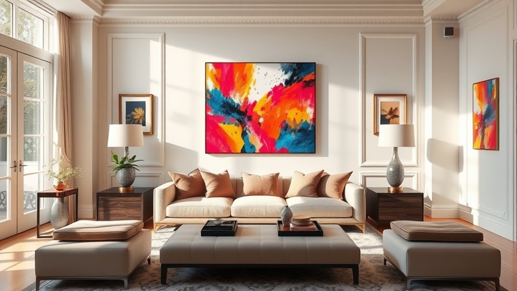
Once you have the right piece, placement matters. A strong artwork can look awkward if it is hung too high, too low, or too far from the furniture below it. A common starting point is to hang the center of the art or gallery wall around 57–60 inches from the floor, which keeps it near eye level for many viewers.
When art sits above a sofa, bed, console, or mantel, use the furniture as your anchor. Many designers recommend leaving about 6–12 inches between the bottom of the artwork and the furniture. Use the lower end of that range when you want the art to feel closely connected to the furniture, and the higher end when you need head clearance or have decor on the surface below.
- Center the artwork over the furniture, not always on the full wall.
- Keep 2–4 inches between small gallery wall frames.
- Use 3–6 inches between larger frames so the arrangement can breathe.
- Keep the top and bottom edges of a gallery wall visually balanced.
- Use a level, but trust your eye if floors, ceilings, or old walls are uneven.
Warning: Heavy frames, mirrors, sculptures, and art above sofas or beds need weight-rated hardware. Use a stud when possible, or choose wall anchors rated for more than the artwork’s weight. Adhesive strips are best for lightweight pieces only.
Types of Wall Art That Complement Your Space
Wall art is not limited to framed prints. The best choice depends on your budget, style, room size, and how formal or relaxed you want the living room to feel.
Recommended Products

UNIQUE PEACOCK WALL ART FOR ROOM DECORATION: These Peacock Feather Pictures adding Blue and Green colours to your home décor. Whether you want to put them in your living room, office, kitchen, hallway, or near the TV, they will complement your space with a subtle sense of art and joy.

【ADAPTS TO ANY SPACE】Elevate your living space with this collection of vintage wall art set, perfect for rustic room decor. Cottagecore art pictures bring a touch of timeless charm to your home. Embrace the trendy now prints that add a contemporary flair to the vintage decor.

Eclectic Decor: Elevate your living space with gallery wall art set, a perfect blend of retro wall art prints and modern abstract wall art. It is designed for those who cherish uniqueness in their home, featuring an array of pieces with fun wall art
Original Paintings and Prints
Original paintings bring one-of-a-kind texture and character to a room. They work well when you want the art to be the main focal point. Limited-edition prints offer a similar collected feel at a lower price, while open-edition prints are the most budget-friendly option for filling large walls.
If you are decorating slowly, start with one piece you truly love instead of buying a full set all at once. A room often feels more personal when the art looks collected over time.
Fine Art Photography Options
Fine art photography is a strong choice for modern, minimalist, coastal, industrial, and transitional living rooms. Black-and-white photography adds contrast without adding too much color. Landscape photography can make a small room feel more open. Architectural photography brings structure and sharp lines to a clean space.
For the best effect, choose a frame that matches the mood of the photo. Thin black frames feel crisp and modern. Natural wood frames feel warm and relaxed. Brass or antique gold frames add polish.
Unique Wall Sculptures and Tapestries
Wall sculptures, baskets, woven panels, and tapestries add depth that flat framed art cannot. These are useful in rooms that already have many rectangular shapes, such as sofas, windows, bookcases, and media consoles.
- Choose metal wall sculpture for a modern or dramatic look.
- Use woven baskets or textile art to soften a room with hard surfaces.
- Try a large tapestry on an expansive wall to add color, pattern, and warmth.
- Mix one sculptural piece into a gallery wall for a more collected feel.
- Use natural textures when you want the room to feel calm and grounded.
How to Use Lighting to Make Your Art Shine
Good lighting helps wall art become a focal point, but too much light can damage sensitive pieces over time. The Canadian Conservation Institute explains that visible light, ultraviolet radiation, and infrared radiation can affect cultural objects, and that UV and IR are not needed for seeing artwork. At home, that means you should avoid direct sunlight and harsh heat on valuable or delicate pieces.
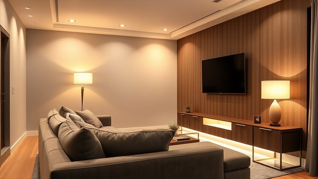
Use LED bulbs where possible because they create less heat than many older bulb types. For a cozy living room, warm white bulbs around 2700K–3000K usually feel inviting. For a cleaner, more neutral look, 3500K–4100K can work well, especially with modern art.
For ceiling-mounted accent lights, lighting professionals often recommend adjusting the beam angle to reduce glare. If the art is behind glass, stand where people will sit and look for reflections before you finalize the light placement.
- Picture lights create an intimate, classic look above single framed pieces.
- Track lighting works well if you change your art often.
- Wall washers create an even glow across a large art wall.
- Recessed lights can look clean, but they need the right angle to avoid glare.
Note: Avoid placing valuable prints, textiles, photographs, or original works in direct sunlight. Fading and light damage are often cumulative, so a sunny wall may be better for replaceable decor than for sentimental or expensive art.
Create a Cohesive Atmosphere With Finishing Touches
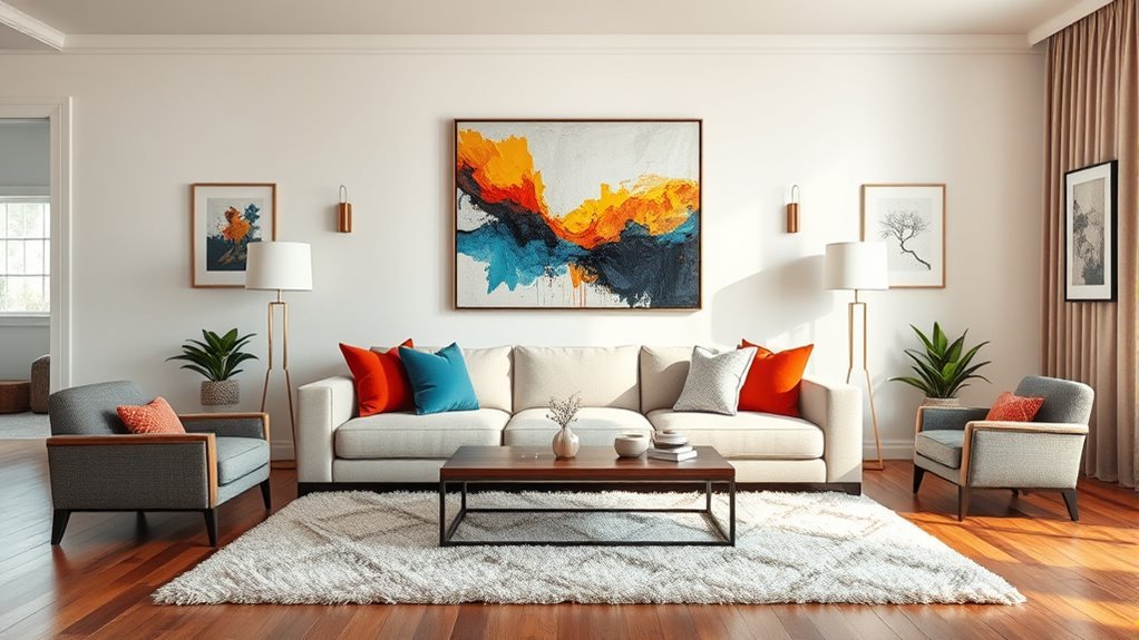
After the art is chosen and hung, use small finishing touches to make it feel connected to the rest of the room. Repeat a frame finish in a lamp, coffee table, curtain rod, or side table. Pull one art color into a pillow, throw, vase, or book stack. Add a plant or sculptural object nearby to soften the edges.
Do not over-coordinate. A living room can feel flat if every piece of art matches the rug and pillows exactly. Aim for a shared mood rather than a perfect match.
- Use similar frames for a clean, formal gallery wall.
- Mix frame finishes for a collected, eclectic look.
- Repeat one or two colors from the artwork elsewhere in the room.
- Use mirrors carefully; they should reflect something attractive, not clutter or glare.
- Leave some walls blank so your favorite art has room to stand out.
Common Wall Art Mistakes to Avoid
A few simple mistakes can make even beautiful art feel wrong for the room. Check for these before you hang anything permanently:
- Choosing art that is too small: If it looks lonely above the sofa, size up or create a grouping.
- Hanging art too high: Keep the center near eye level and connect the piece to the furniture below.
- Matching too literally: Art should coordinate with the room, not look like it came with the sofa.
- Ignoring glare: Test lighting and window reflections before choosing glass or glossy frames.
- Using weak hardware: Match the hook, anchor, or strip to the real weight of the piece.
- Buying everything at once: A slower, collected approach often creates a more personal room.
Frequently Asked Questions
How do you pick living room wall art?
Pick living room wall art by measuring the wall and furniture first, then choosing a piece that fits the room’s scale, color palette, and mood. Look for art that repeats one or two colors from the room or adds intentional contrast. Most of all, choose something you enjoy seeing every day.
What is the rule for wall art in a living room?
A helpful rule is to choose art that is about two-thirds to three-quarters the width of the furniture below it and hang the center of the piece near eye level. Above furniture, keep the bottom of the frame about 6–12 inches above the sofa, console, or mantel.
What is the 2/3 rule for living room wall art?
The 2/3 rule means the artwork or full gallery wall arrangement should be at least about two-thirds as wide as the furniture below it. For example, if your sofa is 90 inches wide, a 60-inch-wide artwork or grouping will usually feel balanced.
What is the 70/30 rule in art and decor?
In decorating, the 70/30 idea means using one dominant style, color, or mood for about 70% of the room and a contrasting accent for about 30%. For wall art, that might mean mostly calm neutral pieces with one bold focal artwork, or mostly modern decor with a few vintage frames.
Should living room art match the sofa?
Living room art does not need to match the sofa exactly. It should feel related to the room through color, mood, scale, frame finish, or subject. A little contrast often looks more natural and collected than a perfect match.
Is one large piece better than a gallery wall?
One large piece is better when you want a clean focal point and a calmer look. A gallery wall is better when you want personality, variety, or a way to combine smaller pieces. For either option, make sure the total size fits the furniture and wall.
Conclusion
The best wall art for your living room fits your wall, relates to your furniture, supports your color palette, and feels personal to you. Start with measurements, choose the mood you want, test the size with painter’s tape, and hang the piece securely at a comfortable viewing height. With the right scale, placement, and lighting, your living room can feel more finished, welcoming, and truly yours.
Sources
- Better Homes & Gardens — How to Arrange Art for a Flawless Wall Display — supports art scale, sofa width, and placement guidance.
- The Spruce — How High Art Should Hang Above Furniture — supports the 6–12 inch furniture spacing and eye-level placement guidance.
- Canadian Conservation Institute — Agent of Deterioration: Light, Ultraviolet and Infrared — supports the advice about light exposure, UV, IR, and art preservation.
- Architectural Digest — 8 Tips for Lighting Art — supports art lighting options, glare reduction, LEDs, and avoiding direct sunlight.
- W3C Web Accessibility Initiative — Alt Decision Tree — supports meaningful alt text for informative images.