
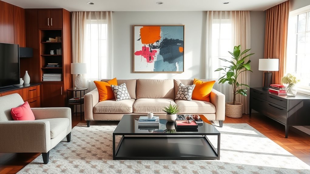
A relaxing living room color scheme starts with one calm base color, then builds comfort through soft contrast, natural textures, balanced light, and a few carefully chosen accents. Instead of chasing a single “perfect” shade, aim for a palette that feels restful in your room’s real lighting and works with the furniture, flooring, and finishes you already have.
Quick Answer
For a relaxing living room color scheme, choose a soft base color such as warm white, pale gray, sage green, muted blue, beige, or greige. Add low-contrast neutrals, natural wood or woven textures, and one gentle accent color. Test samples in morning, afternoon, and evening light before committing.
Key Takeaways
- Soft blues, greens, warm whites, greiges, beiges, and pale grays usually create the calmest starting point.
- Keep contrast gentle: pair your base color with related neutrals instead of sharp black-and-white combinations.
- Use accents sparingly in pillows, art, throws, ceramics, or flowers so the room feels layered, not busy.
- Natural light helps the room feel open, but glare control matters just as much as brightness.
- Always test paint and fabric swatches in the room before buying gallons of paint or large furniture pieces.
At a Glance
| Time Required | 1–2 hours to plan the palette, plus 24–48 hours to test samples in changing light |
| Difficulty | Easy to moderate |
| Tools Needed | Paint swatches, peel-and-stick samples, painter’s tape, fabric samples, phone camera, notebook, and existing room photos |
| Cost | Low for samples and styling edits; higher if repainting, replacing window treatments, or buying new furniture |
Understanding the Impact of Color on Relaxation
Color can change the way a room feels, but it should not be treated like a guaranteed mood cure. Research on color and psychological functioning is still developing, and personal preference, culture, lighting, and context all matter. That said, many people find soft blues, muted greens, warm whites, pale grays, taupes, and gentle earth tones visually restful because they have low intensity and are easy for the eye to settle on.
For a living room, the goal is not to make every surface pale or plain. The goal is to reduce visual noise. A calm palette usually uses a limited number of colors, keeps contrast soft, and repeats materials so the room feels connected from one corner to the next.
Note: If a color makes you feel tense, cold, or bored, skip it even if it appears on every “calming colors” list. Your own response matters more than a trend.
Choosing a Base Color for a Relaxing Living Room
Your base color is the shade that covers the largest visual area: usually the walls, large sofa, rug, or built-ins. Choose this first, then build the rest of the room around it.
Good base colors for a relaxing living room include:
- Soft blue-gray: calm, airy, and especially helpful when you want the room to feel cooler and quieter.
- Muted sage or eucalyptus green: natural, gentle, and easy to pair with cream, linen, oak, walnut, or rattan.
- Warm white or ivory: bright but soft, ideal for small rooms or spaces with warm wood floors.
- Greige: a balanced gray-beige that feels flexible, warm, and less stark than cool gray.
- Clay beige or mushroom taupe: earthy and cozy without becoming dark or heavy.
- Pale lavender-gray: quiet and slightly romantic when used in a low-chroma, dusty version.
Pay close attention to undertones. A gray with a blue undertone can feel crisp and cool, while a gray with a beige undertone feels warmer. A white with a yellow undertone can feel creamy, while a white with a blue undertone can look sharper. The most relaxing choice is usually the one that works with your flooring, trim, sofa, and natural light rather than fighting them.
Best Relaxing Living Room Color Palettes
Use these palette formulas as starting points, then adjust the depth and warmth to suit your room.
| Soft Blue + Warm White + Natural Oak | Best for airy, coastal, transitional, or cottage-style rooms. |
| Sage Green + Cream + Tan Leather | Best for a calm, organic room with warmth and depth. |
| Greige + Ivory + Muted Clay | Best for cozy neutral rooms that still need a little color. |
| Pale Gray + Linen Beige + Dusty Blue | Best for a refined room that feels quiet but not flat. |
| Warm White + Mushroom Taupe + Olive | Best for small living rooms, low-light rooms, and natural-material styling. |
Recommended Products

PREMIUM FILLING & MATERIAL: 18x18 pillow insert is filled with 500g/1.1lb filling (20% more than other). The textured woven fabric cover is breathable and soft for ultimate comfort.

Long-lasting Durability: 100% Virgin Filling and 110 GSM Brushed Fabric combining aesthetics and practicality for long-lasting use. 18x18 pillow insert is filled with 500g/1.1lb filling (20% more than other).

QUALITY MATERIAL: The pillow cover is composed of a soft and comfy corduroy which is a kind of polyester fabric, features a cute and elegant boho stripe design. Our pillow covers are of good workmanship, they are tightly sewn without loose threads.
How to Use Neutral Tones for a Cozy Feel
Neutral colors are the backbone of a relaxing living room because they give the eye a place to rest. The trick is to use several related neutrals instead of one flat shade everywhere. Try warm white walls, a beige or greige sofa, oatmeal curtains, a natural jute or wool rug, and wood furniture in a similar undertone.
Keep contrast gentle. A black coffee table against a white rug can look dramatic, but it may feel too sharp for a restful space. Instead, try walnut, weathered oak, charcoal linen, warm bronze, or soft stone finishes for depth without harshness.
Recommended Products

HIGH-END CHENILLE FABRIC Crafted from thick, dense chenille fabric with a rich, plush surface, these pillow covers offer a substantial feel and beautifully textured appearance. The fuller fabric creates a refined, high-quality look while remaining exceptionally soft to the touch.
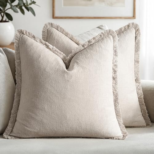
【Exquisite Farmhouse Linen Material】MIULEE's decorative linen pillow covers feature a natural ramie linen blend. The high-quality stone washed linen adds rustic charm, with its textured wrinkles ideal for farmhouse interiors. It gracefully ages with each wash, enhancing its personality and comfort. The linen fabric ensures durability and breathability, providing a soft touch that's suitable for year-round use

Chic Design: Designed with modern elements and corduroy inspired fabrics, these Cozoomy decorative pillow covers will add a touch of comfy to your home. Enjoy a cozy home with Cozoomy throw pillow covers!
Embrace Earthy Color Palettes
Earthy colors make a living room feel grounded. Beige, taupe, mushroom, soft brown, olive, clay, sand, and muted terracotta can add warmth without overwhelming the room. These shades work especially well with wood, stone, woven baskets, linen, cotton, wool, and handmade ceramics.
Use this simple guide when choosing earthy colors:
| Color | Best Use |
| Beige | Walls, sofas, curtains, and rugs when you want warmth. |
| Taupe | Accent chairs, throws, and wall colors that need quiet depth. |
| Soft Brown | Wood furniture, leather, baskets, frames, and side tables. |
| Soft Green | Walls, pillows, art, plants, or ceramics for a natural note. |
Layer Textures for Warmth
A neutral room can feel cold if every surface is smooth. Add comfort with texture: a chunky knit throw, linen curtains, boucle or cotton pillows, a wool rug, woven baskets, matte ceramics, wood grain, and a few books or handmade pieces. These details help a simple palette feel lived-in and cozy.
Use at least three texture families: one soft, one natural, and one smooth. For example, pair a linen sofa with a wool rug and a ceramic lamp. Or pair velvet pillows with a rattan tray and a wood coffee table.
Selecting Accent Colors to Enhance Comfort
Accent colors should support the room, not compete with it. A simple rule is 80/15/5: use about 80% base colors, 15% secondary neutrals, and 5% accent color. That keeps the room calm while still giving it personality.
Comforting accent colors include:
- Dusty blue: relaxed and classic with warm white, beige, and oak.
- Sage or olive green: natural and grounding with cream, taupe, and brown.
- Muted plum: cozy and elegant with greige, mushroom, and soft gray.
- Peachy pink: warm and gentle with ivory, tan, and pale gray.
- Clay or terracotta: earthy and inviting when used in small doses.
Bring accents in through easy-to-change pieces: pillows, throws, artwork, vases, lampshades, books, trays, and seasonal flowers. Avoid using several bold accent colors at once unless the rest of the room is extremely simple.
Pro Tip: Repeat your accent color at least three times in the room. For example, use dusty blue in a pillow, a piece of art, and a small vase so the color looks intentional.
Using Natural Light Effectively
Natural light can make a living room feel more open and pleasant, but brightness alone is not the goal. Harsh glare, overheated windows, and washed-out colors can make the room less comfortable. The best approach is to let daylight in while controlling glare and privacy with the right window treatments. The U.S. Department of Energy notes that window attachments can help improve comfort, control daylight and glare, reduce drafts, provide privacy, and regulate temperature.
Maximize Window Light Without Glare
Start by arranging furniture so windows are not blocked. Keep tall bookcases, bulky chairs, and dark drapes from cutting off the light source. Place mirrors where they reflect brightness without bouncing glare directly into your eyes or onto the television.
If your living room is dark, choose warm whites, light greige, pale sage, or soft beige instead of deep colors on every wall. If your room gets strong afternoon sun, slightly muted colors usually hold up better than very bright whites, which can feel stark in intense light.
Choose Light-Filtering Treatments
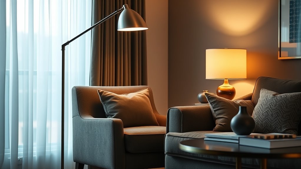
Sheer curtains, woven shades, Roman shades, and lined drapes can soften daylight and help the color palette feel more even. For the calmest effect, choose window treatments close to your wall color or rug color. This keeps the room from feeling chopped up.
For privacy and flexibility, layer two treatments: a light-filtering shade for daytime and a lined curtain for evening. This gives you control without making the room feel heavy.
Accessorizing With Textures and Natural Elements
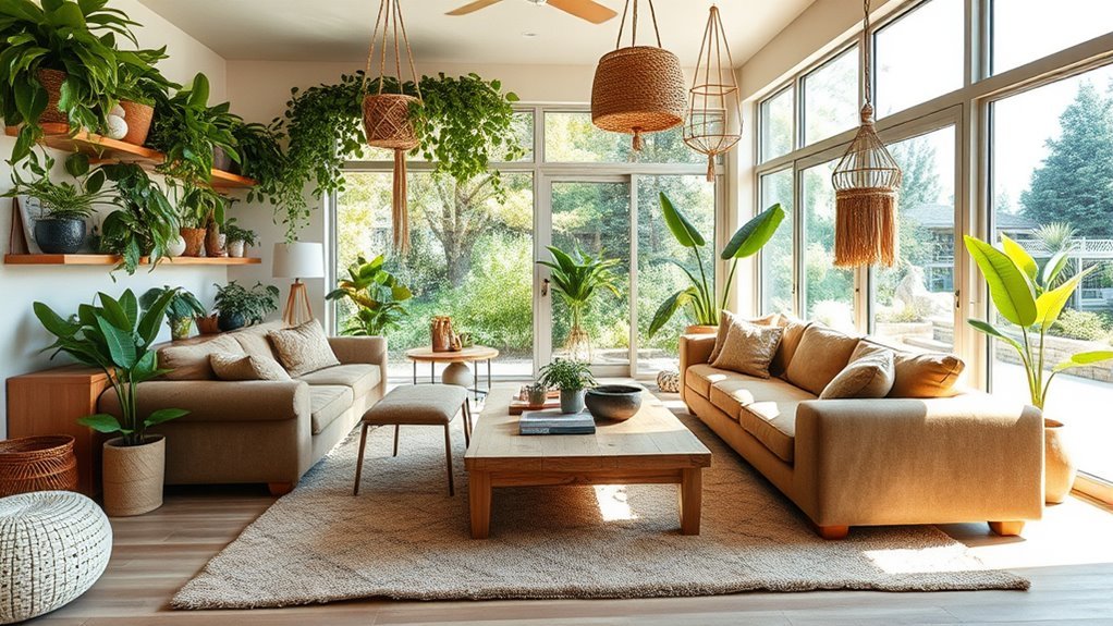
Natural elements help a relaxing living room feel warm and human. Use wood, stone, woven fibers, linen, cotton, wool, leather, clay, and greenery to add depth to soft colors. A pale room with no texture can feel unfinished, while a simple room with layered natural materials feels calm and complete.
Houseplants can be beautiful in a relaxing living room, but do not rely on them to clean the air. The EPA’s indoor air quality guidance says there is currently no evidence that a reasonable number of houseplants removes significant pollutants in homes and offices. Use plants because they add life, shape, and a natural feeling. For actual indoor air quality, focus on source control, ventilation, and appropriate filtration.
Warning: Do not overwater houseplants in the name of “freshening” the room. Damp soil can encourage unwanted microorganisms and may bother people with allergies or sensitivities.
Recommended Products

[COLOR & DESIGN]: SAFAVIEH's Natural Fiber area rug features a chunky, loop-woven jute texture in a soft grey and neutral tone; actual color may appear darker or lighter than shown, depending on lighting and screen settings.

Cotton Craftsmanship:Crafted from 100% natural cotton rope, this macrame curtain features detailed hand-knotting, diamond patterns, and artisan weaving techniques. The handmade fiber design creates rich texture, warmth, and a natural boho aesthetic for your living space.

Testing Your Color Scheme Before Committing
Paint and fabric colors change throughout the day. A shade that looks soft in the store may look green, purple, yellow, or flat in your living room. Testing prevents expensive mistakes.
Use this simple testing process:
- Choose three to five contenders. Include one lighter option, one warmer option, and one slightly deeper option.
- Use large samples. Paint large poster boards or use peel-and-stick samples instead of tiny chips.
- Move samples around the room. Check them near windows, in corners, beside trim, and behind the sofa.
- Look at them morning, afternoon, and evening. Include both natural light and lamp light.
- Compare with fixed finishes. Hold samples next to flooring, stone, tile, wood, rugs, and upholstery.
- Photograph the room. Photos can reveal undertones and contrast that your eye may miss in the moment.
The most relaxing color is not always the palest one. It is the one that looks balanced with your room’s light, furniture, flooring, and daily habits.
How to Maintain a Relaxing Atmosphere
Once the color scheme is set, maintain the calm feeling through lighting, layout, and editing. Keep surfaces clear enough that your eye can move through the room without stopping at piles, cords, or too many small objects. Use baskets, closed storage, trays, and side tables to make daily cleanup easier.
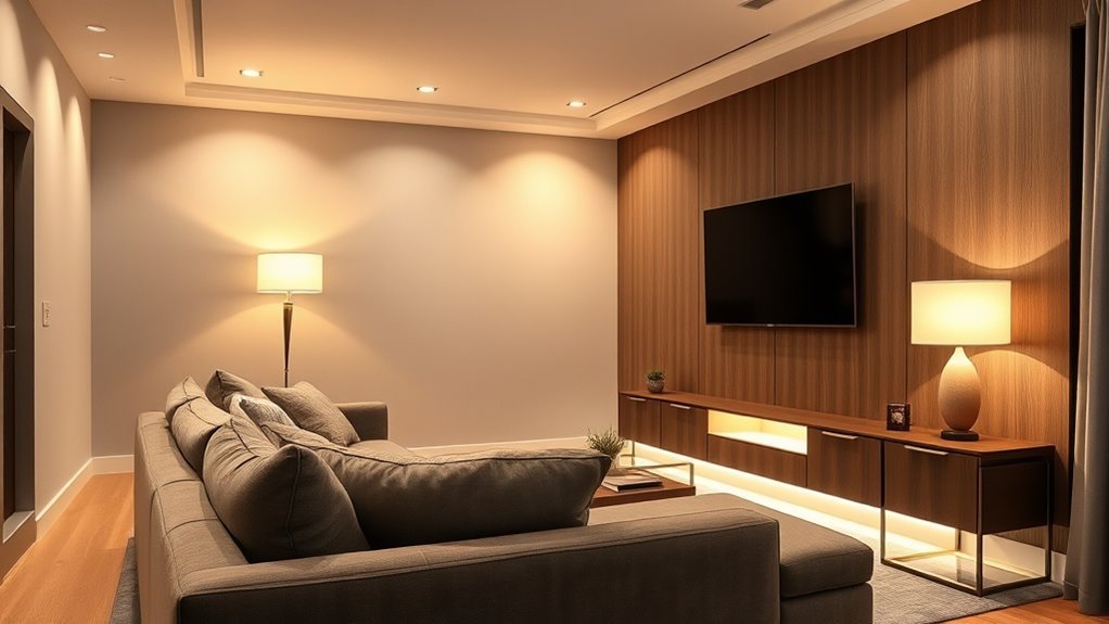
Layer lighting so the room can shift from daytime to evening. A good mix includes ambient lighting, a reading lamp, and one or two soft accent lights. Warm white bulbs often feel cozier at night than cool, bluish bulbs. During the day, use window treatments to bring in light without glare.
Skip the fixed rule that every room should be around 72 degrees Fahrenheit. The ASHRAE thermal comfort standard explains that comfort depends on temperature, radiant heat, humidity, air speed, activity, and clothing. For a living room, adjust the thermostat, airflow, blankets, and window coverings until the space feels comfortable for the season.
Common Mistakes That Make a Living Room Feel Less Calm
Even beautiful colors can feel stressful when the room has too much contrast, clutter, or visual competition. Watch for these common mistakes:
- Choosing a color from a tiny chip only: small samples hide undertones.
- Using too many accent colors: the room starts to feel busy instead of layered.
- Ignoring the floor color: walls and floors cover a huge visual area and must work together.
- Picking cool gray for a dark room: it can feel flat or chilly without enough warmth.
- Using only overhead lighting: it creates harsh shadows and removes the cozy evening mood.
- Buying everything in the same neutral: a beige-on-beige room needs texture and tonal variation.
- Forgetting real life: a relaxing room still needs storage, durable fabrics, and comfortable seating.
Frequently Asked Questions
What colors are good for calm living rooms?
Soft neutrals, warm whites, greiges, pale grays, muted blues, sage greens, taupes, and gentle earth tones are all good choices for calm living rooms. Choose low-saturation shades rather than bright, high-energy colors.
What is the most relaxing wall color for a living room?
There is no single best wall color for every room. Warm white, greige, soft blue-gray, sage green, and pale taupe are reliable options because they are gentle and flexible. The best choice is the one that still looks calm beside your flooring, sofa, trim, and natural light.
How many colors should a relaxing living room have?
Use three to five colors: one main base color, one or two supporting neutrals, one natural material tone, and one soft accent. This keeps the room layered without making it feel visually crowded.
Can dark colors be relaxing in a living room?
Yes, dark colors can be relaxing when they are muted and balanced with soft lighting, warm textures, and lighter accents. Deep olive, charcoal blue, mushroom brown, and muted plum can feel cozy, especially in rooms used mostly at night.
Should the sofa be lighter or darker than the walls?
Either can work. For the calmest effect, keep the sofa and wall colors close in value, then add texture through pillows, throws, and rugs. A very dark sofa against very light walls creates stronger contrast and a more dramatic look.
Conclusion
A relaxing living room color scheme is built in layers: a soft base color, quiet neutrals, natural textures, controlled light, and a few accents that make the room feel personal. Soft blues, muted greens, warm whites, greiges, taupes, and earthy tones are all strong starting points, but the right palette is the one that feels peaceful in your actual space. Test before committing, soften harsh contrast, and let comfort guide the final choice.
Sources
- Frontiers in Psychology: Color and psychological functioning — supports cautious, context-aware color psychology wording.
- U.S. Department of Energy: Energy Efficient Window Coverings — supports window treatment guidance for comfort, glare control, daylight, privacy, and temperature regulation.
- U.S. EPA: Improving Indoor Air Quality — supports ventilation, air-cleaning, and houseplant air-quality corrections.
- Journal of Exposure Science & Environmental Epidemiology: Potted plants do not improve indoor air quality — supports the correction that houseplants should not be presented as meaningful air purifiers in normal homes.
- Journal of Physiological Anthropology: Interaction with indoor plants and stress — supports limited wording about plants and restorative indoor experiences.
- ASHRAE Standard 55: Thermal Environmental Conditions for Human Occupancy — supports replacing a fixed temperature claim with broader comfort guidance.


[…] spaces: If you cherish cozy evenings with loved ones, let the fireplace lead and arrange seating for […]