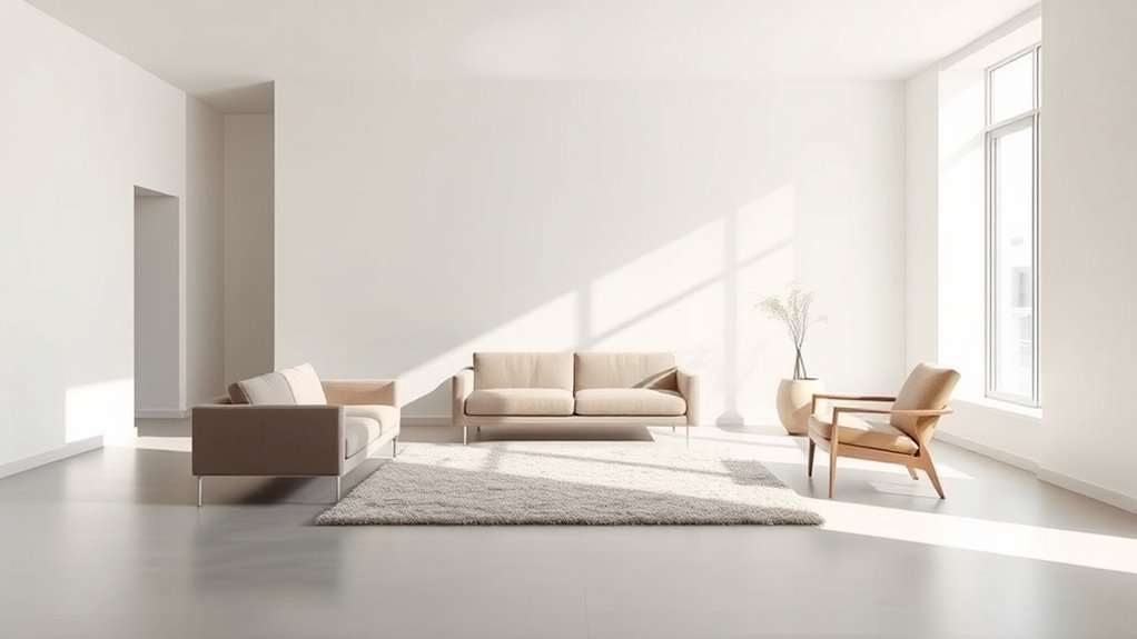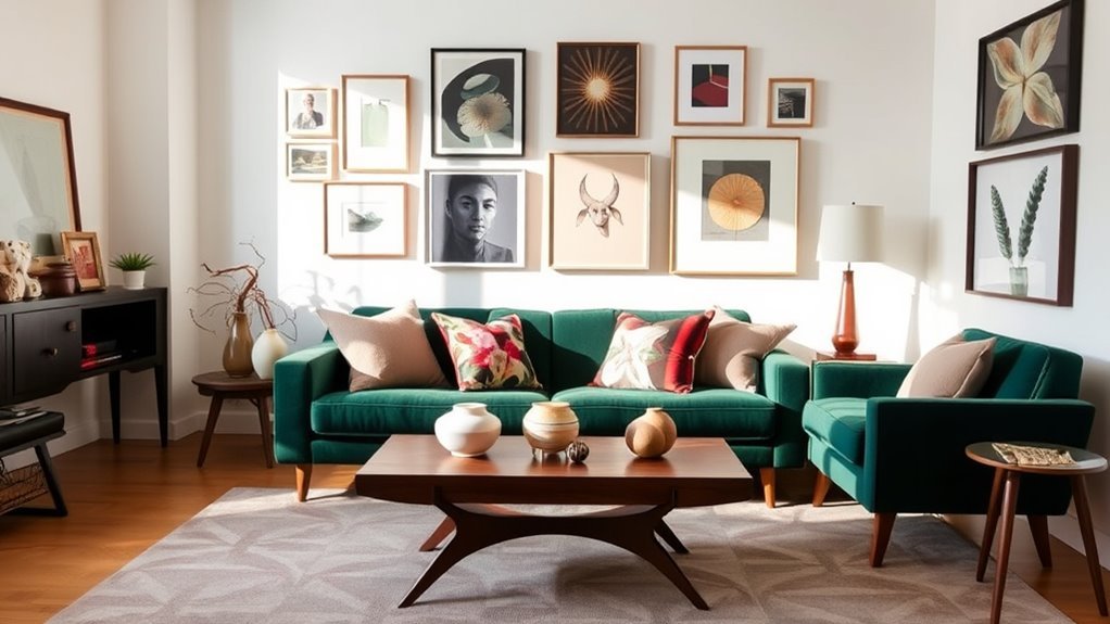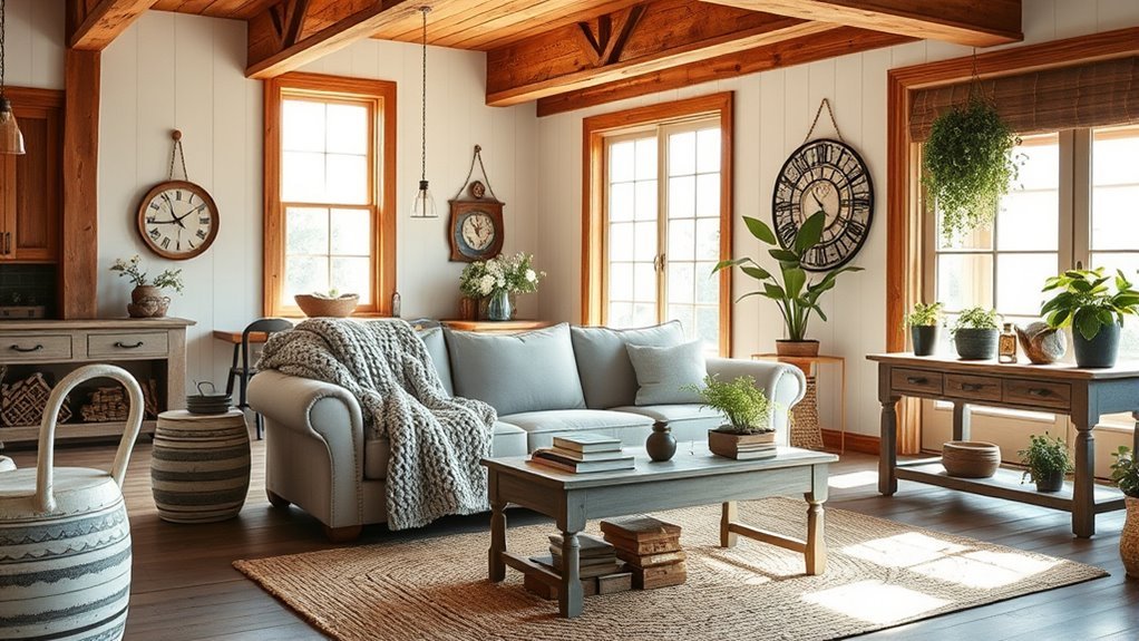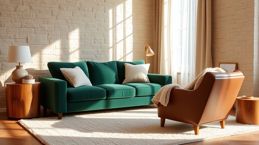
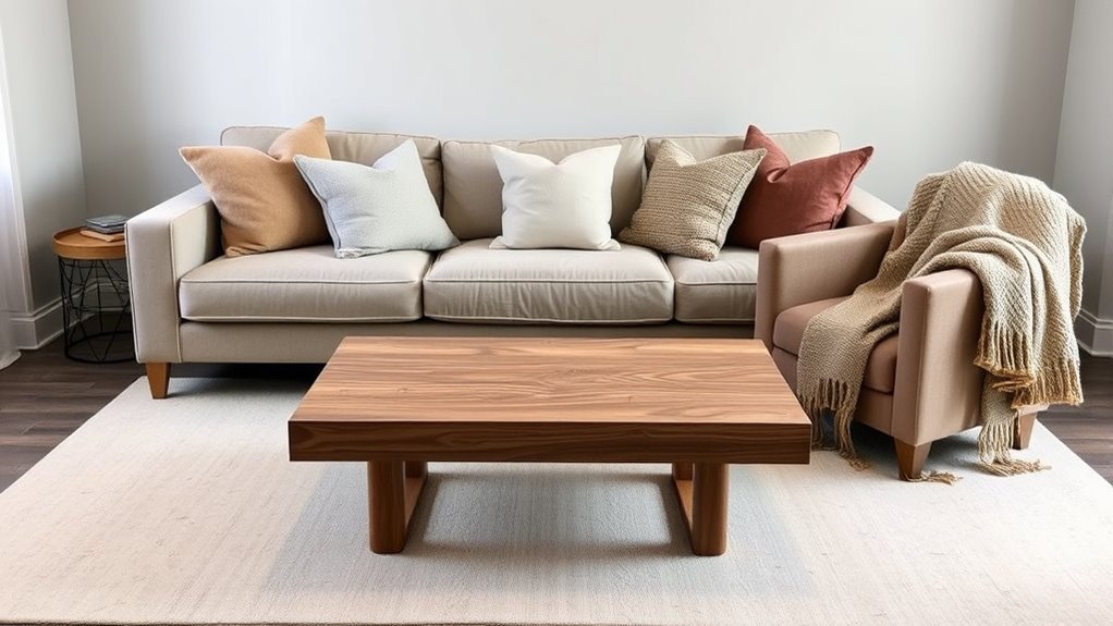
Choosing between warm and cool neutrals for your living room is less about following a trend and more about matching the room’s light, furniture, flooring, and mood. Warm neutrals such as cream, beige, tan, and greige can make a space feel softer and more welcoming, while cool neutrals such as soft gray, blue-gray, and green-gray can create a cleaner, calmer look. The best choice is the one that still looks good in your room in the morning, afternoon, and evening.
Quick Answer
Use warm neutrals when your living room feels dark, cold, or needs a cozy feel. Use cool neutrals when the room gets strong warm light or you want a crisp, airy look. For most living rooms, the safest choice is a balanced neutral with a subtle warm or cool undertone tested in your actual lighting.
Key Takeaways
- Warm neutrals, including cream, beige, tan, taupe, and warm greige, usually make a living room feel softer, cozier, and more traditional.
- Cool neutrals, including soft gray, blue-gray, stone, and green-gray, usually feel calmer, cleaner, and more modern.
- Room direction matters: north-facing rooms often need warmth, while bright south-facing rooms can usually handle cooler neutrals.
- Light Reflectance Value, or LRV, helps you judge brightness, but it does not tell the whole story. Undertone, finish, furnishings, and lighting all matter.
- Always test large paint samples on at least two walls before choosing a neutral for the whole room.
At a Glance
| Time Required | 30–60 minutes to narrow choices, plus 1–2 days to view paint samples in changing light |
| Difficulty | Easy, as long as you test samples before painting |
| Tools Needed | Paint chips, peel-and-stick samples or sample pots, painter’s tape, white paper, and your room’s normal light bulbs |
| Cost | Usually the cost of 2–4 samples before buying full paint |
Understanding Warm vs. Cool Neutrals
A neutral color is not automatically plain or colorless. Most neutrals have an undertone, which is the subtle color that shows through once the paint is on the wall. That undertone is what makes one beige feel creamy and another feel pink, green, gray, or muddy.
Warm neutrals usually have yellow, red, orange, brown, or pink undertones. Common examples include cream, ivory, beige, camel, tan, mushroom, taupe, warm white, and many greige shades. These colors work well when you want the living room to feel relaxed, layered, and welcoming.
Cool neutrals usually have blue, green, violet, or gray undertones. Common examples include soft gray, blue-gray, green-gray, stone, pewter, and cool white. These colors work well when you want the room to feel airy, crisp, quiet, or contemporary.
Balanced neutrals sit between warm and cool. They are often the safest choice when your living room has mixed lighting, wood floors, gray upholstery, or both warm and cool accents.
Benefits of Warm Neutrals for Cozy Spaces
Warm neutrals are a strong choice when your living room feels chilly, shadowed, or too stark. They can soften a room with gray furniture, black accents, stone fireplaces, or cool daylight. Shades such as warm white, cream, beige, and warm greige also pair naturally with wood floors, woven textures, leather, brass, bronze, linen, and warm-toned rugs.
When Warm Neutrals Work Best
Choose a warm neutral if your living room:
- Faces north or gets limited direct sunlight.
- Has cool gray sofas, black window frames, or stone surfaces that need softening.
- Includes warm woods such as oak, walnut, maple, pine, or teak.
- Needs to feel cozy for evenings, family gatherings, or relaxed conversation.
- Looks flat or cold with bright white paint.
A paint color such as Sherwin-Williams Accessible Beige SW 7036 is a useful example of a warm-leaning neutral that can bridge beige, gray, and natural wood tones. A soft off-white such as Farrow & Ball Slipper Satin can also work when you want a gentle neutral without a strong cool blue undertone.
Best Pairings for Warm Neutrals
Warm neutrals look best when they are layered, not left alone. Pair them with:
- Wood: oak, walnut, rattan, cane, and reclaimed wood.
- Metals: brass, bronze, aged nickel, black iron, and warm gold.
- Textiles: linen, wool, boucle, jute, cotton, velvet, and leather.
- Accent colors: olive green, terracotta, rust, muted blue, warm charcoal, chocolate brown, and clay pink.
Pro Tip: If a warm neutral starts to look yellow, pair it with cooler accents such as blue-gray pillows, black picture frames, or a muted green rug. This keeps the room cozy without making it feel heavy.
How Cool Neutrals Enhance Serenity
Cool neutrals are best when you want a living room that feels calm, clean, and visually lighter. Soft gray, blue-gray, and green-gray can make a bright room feel more restful, especially when the space already receives strong warm daylight. Cool neutrals also work well with modern furniture, white oak, polished nickel, chrome, black accents, marble, glass, and minimal decor.
When Cool Neutrals Work Best
Choose a cool neutral if your living room:
- Gets strong southern or western light that makes warm colors look too yellow, peach, or beige.
- Has modern furniture, clean lines, or a minimalist style.
- Uses blue, green, black, chrome, marble, or crisp white accents.
- Feels too warm, orange, or visually busy with beige walls.
- Needs a more open and airy look.
Cool neutrals do not have to feel cold. The trick is to balance them with texture. Add woven shades, warm wood, layered curtains, soft rugs, plants, and natural fabrics so the room still feels comfortable.
Best Pairings for Cool Neutrals
Cool neutrals pair well with:
- Wood: white oak, ash, driftwood, pale maple, and espresso-stained wood.
- Metals: polished nickel, chrome, matte black, pewter, and brushed steel.
- Textiles: wool, cotton, linen, velvet, and chunky knits to prevent a flat look.
- Accent colors: navy, sage, eucalyptus, soft black, dusty blue, lavender-gray, crisp white, and muted blush.
How Room Direction Affects Neutral Paint
Room orientation is one of the biggest reasons the same neutral looks beautiful in one house and wrong in another. Farrow & Ball’s guidance on how light affects colour notes that the quality of light, time of day, time of year, and room aspect can all change how a color is perceived.
North-Facing Living Rooms
North-facing rooms often receive cooler, flatter light. Warm whites, creams, soft beige, warm greige, and yellow-based neutrals can help the room feel less cold. If you prefer drama, you can also lean into the lower light with a deep neutral such as charcoal, mushroom, cocoa, or deep olive for a cocooning effect.
South-Facing Living Rooms
South-facing rooms usually get warmer, stronger light for much of the day. They can handle cooler neutrals, pale grays, blue-grays, and green-grays better than darker rooms can. If a beige looks too yellow or peach, try a balanced greige or soft cool neutral instead.
East-Facing Living Rooms
East-facing rooms are brighter and warmer in the morning, then cooler later in the day. If you use the living room mostly in the evening, avoid neutrals that turn too gray or icy after sunset. A balanced warm greige, mushroom, or soft taupe is often safer than a very cool gray.
West-Facing Living Rooms
West-facing rooms can look muted in the morning and golden later in the day. Warm neutrals may glow beautifully in late afternoon, but they can also turn too yellow or orange. Test warm and cool samples side by side to see which one holds up when the room gets strong evening light.
Note: Artificial lighting matters too. Warm bulbs can make walls look creamier or yellower, while cool white bulbs can make the same neutral look grayer or bluer. Test paint samples with the bulbs you actually use at night.
How LRV Impacts Neutral Colors
Light Reflectance Value, or LRV, tells you how much visible light a color reflects. A higher LRV usually looks brighter, while a lower LRV usually looks deeper. Paint brands often publish LRV on color pages; for example, Benjamin Moore lists White Dove OC-17 with an LRV of 83.16.
LRV is helpful, but it should not be the only factor in your decision. A high-LRV cool white can still feel icy in a north-facing room, while a mid-LRV warm greige can feel more comfortable. For a living room, use LRV this way:
- Higher LRV neutrals: helpful for darker rooms, small rooms, and spaces where you want more brightness.
- Mid-range LRV neutrals: useful when you want softness, depth, and less glare.
- Lower LRV neutrals: best for moody, cozy, high-contrast, or larger rooms that can handle depth.
Warning: Do not choose a neutral from an online image alone. Screens can distort undertones, and the same paint can look different depending on daylight, bulbs, flooring, and nearby furniture.
How Paint Finish Changes the Look
Finish can change how a neutral reads on the wall. A flat or matte finish softens light and can make walls feel calmer, but it may be harder to clean depending on the paint line. Eggshell and satin finishes reflect a bit more light, which can make a living room feel brighter and easier to wipe down. Glossier finishes can highlight wall imperfections and may create more glare, so they are usually better for trim, doors, or built-ins than large living room walls.
For most living rooms, matte, washable matte, or eggshell is the safest wall finish. Use satin or semi-gloss on trim if you want subtle contrast and durability.
Recommended Products

ACRYLIC PAINT & PRIMER (2 in 1) – PRO matte black paint with 35%+ high-performance binder delivers strong adhesion, smooth coverage and a rich charcoal-black, low-sheen finish on properly prepared surfaces.

PROFESSIONALLY RECYCLED PAINTS: Lower cost alternative to virgin paint, without sacrificing quality. One quart of Recolor Chalk Finish, Chalkboard covers about 100 square feet. This is chalk, latex paint with a very matte chalkboard finish. Can be used to turn any wall into a chalkboard and give an old piece of furniture a new life—produced in the USA!

COLORS CRAFTED BY ANNIE SLOAN: A timeless off-white, that works with everything. Old White is a sophisticated and understated neutral that will give your walls a soft, chalky, traditional look and feel.
Step-by-Step: Choosing the Right Neutral for Your Living Room
- Decide the mood first. Choose warm neutrals for cozy, relaxed, traditional, earthy, or family-friendly rooms. Choose cool neutrals for crisp, calm, airy, modern, or minimalist rooms.
- Check your fixed finishes. Look at flooring, fireplace stone, tile, large rugs, built-ins, and sofa fabric. Your wall color should work with these pieces, not fight them.
- Identify the undertone. Hold the paint chip against a clean white sheet of paper. Beige may reveal yellow, pink, green, or gray. Gray may reveal blue, green, violet, or brown.
- Consider room direction. Warm up cool northern light, balance strong southern light, and test carefully in east- and west-facing rooms because the light changes dramatically.
- Compare LRV. If the room feels dark, test at least one lighter neutral. If the room feels glaring or washed out, test a slightly deeper neutral.
- Paint or place large samples. Test samples on two different walls, not just one. A color beside a window may look different from the same color behind a sofa.
- Check the samples morning, afternoon, and night. View them with curtains open, curtains closed, lamps on, and overhead lights on.
- Choose the neutral that works with your real furniture. The best neutral is not the one that looks best on the chip. It is the one that makes your sofa, floors, curtains, and art look intentional.
Recommended Products

Core Color Matching: Paint color sample cards include 83 standard colors to support paint color sample cards, color matching cards for painting, and paint chips standard samples, helping users compare shades before selecting a final finish for floor paint, hardware, and other project needs

Easily mix, match, and plan flawless color schemes with this expansive card deck featuring 200 colors

Acrylic paint 1 ounce bottle
Common Mistakes When Choosing Neutrals
- Choosing the brightest white to fix a dark room. In a low-light room, stark white can look cold or shadowy instead of bright.
- Ignoring undertones. A beige with pink undertones may clash with yellow oak. A gray with blue undertones may feel chilly beside cool daylight.
- Testing only one wall. Light changes across the room, so one sample spot is not enough.
- Forgetting the floor. Flooring is a major color surface. Wood, carpet, tile, and stone can pull a neutral warmer or cooler.
- Mixing too many neutrals without contrast. A room with beige walls, beige sofa, beige rug, and beige curtains can look flat unless you add texture, darker accents, or varied undertones.
What to Look for When Picking Your Neutral
Before you commit to a warm or cool neutral, ask five questions:
- Does the room feel naturally cold or naturally warm? Use the paint undertone to balance that feeling.
- What color are the floors? Golden wood usually likes warm or balanced neutrals. Gray floors often need softer greige, taupe, or cool neutrals with warmth added through decor.
- What is the largest fabric in the room? Your sofa, rug, or curtains should look good against the wall color.
- Do you want contrast or calm? For calm, stay close in value. For contrast, use deeper accents, darker trim, or bold artwork.
- Does the sample still look good at night? A living room is often used after sunset, so evening lighting matters as much as daytime light.
The right neutral is not simply warm or cool. It is the neutral that works with your room’s light, undertones, furniture, and daily use.
Recommended Products

PAINT COLOR SAMPLE BOARDS - Organize paint colors while exploring and comparing them effortlessly with this 24-pack paint board set. Each tester board features a blank space on the front for paint-out and a label on the back to identify all the details of the particular color you are testing
![Shabby Chic Chalk Furniture Paint: Luxurious Chalk Finish Craft Paint for Home Decor, DIY, Wood Cabinets - All-in-One Paints with Rustic Matte Finish [Grey Embrace] - (Liter Covers 129 sf)](https://m.media-amazon.com/images/I/41pBf5-RzIL._SL500_.jpg)
INTERIOR DESIGN: The term ‘shabby chic’ boasts ‘the beauty of imperfection’, that’s what shabby chic is all about – restoring furniture while still giving it a distressed, ‘imperfect’ finish.

INTERIOR DESIGN: The term ‘shabby chic’ boasts ‘the beauty of imperfection’, that’s what shabby chic is all about – restoring furniture while still giving it a distressed, ‘imperfect’ finish.
Frequently Asked Questions
Should a living room be a warm or cool color?
A living room can be warm or cool, depending on the mood you want and the light your room receives. Choose warm neutrals for a cozy, welcoming feel. Choose cool neutrals for a calmer, airier, more modern feel. If you are unsure, test balanced greige, taupe, or soft off-white options.
What are good neutral colors for a living room?
Good living room neutrals include warm white, cream, beige, greige, taupe, mushroom, soft gray, stone, blue-gray, green-gray, and off-white. The best option depends on your floor color, sofa fabric, room direction, and lighting. Always test samples before painting the whole room.
When should you use warm vs. cool colors?
Use warm colors when a room feels cold, dark, or too stark. Use cool colors when a room gets strong warm light or you want a crisp, peaceful feel. In mixed-light rooms, use a balanced neutral and bring warmth or coolness through furniture, rugs, art, and lighting.
Are beige and greige warm or cool?
Beige is usually warm, but it can have yellow, pink, green, gray, or orange undertones. Greige can be warm, cool, or balanced depending on whether it leans more beige or more gray. Compare each sample against white paper and your flooring to reveal the undertone.
Can you mix warm and cool neutrals in one living room?
Yes. Mixing warm and cool neutrals can make a living room feel more layered and natural. Use one undertone as the main base, then repeat the other undertone in smaller accents such as pillows, artwork, lamps, metal finishes, or rugs.
What neutral makes a living room look bigger?
A lighter neutral with enough LRV can help a living room feel brighter and more open, but undertone still matters. Soft off-white, pale greige, warm white, and light gray can all work. Avoid high-contrast trim and heavy dark furniture if your main goal is a larger-looking room.
Conclusion
Warm and cool neutrals set very different tones in a living room. Warm neutrals create comfort, softness, and an inviting feel, while cool neutrals create calm, clarity, and an airy look. The smartest choice comes from balancing undertone, LRV, room direction, paint finish, and the colors already in your furniture and floors. Test a few large samples, view them throughout the day, and choose the neutral that makes the whole room feel intentional.
Sources
- Farrow & Ball — How Light Affects Colour — supports room direction, natural light, and artificial light guidance.
- Farrow & Ball — Neutral Groups — supports neutral undertone and whole-room scheme guidance.
- Farrow & Ball — Slipper Satin — supports the off-white neutral example and undertone note.
- Sherwin-Williams — Accessible Beige SW 7036 — supports the warm-leaning neutral paint example.
- Benjamin Moore — White Dove OC-17 — supports the LRV example and paint color reference.