
Color undertones in paint and fabric are the subtle hues that lie beneath the surface color, shaping its overall appearance and feel. Warm undertones, like yellows and oranges, create a cozy atmosphere, while cool undertones, such as blues and greens, evoke tranquility. Recognizing these undertones is essential for achieving design harmony. By exploring examples and tips, you’ll discover how to make informed choices that enhance your space beautifully. Keep exploring to reveal more insights!
Understanding Color Undertones in Paint and Fabric
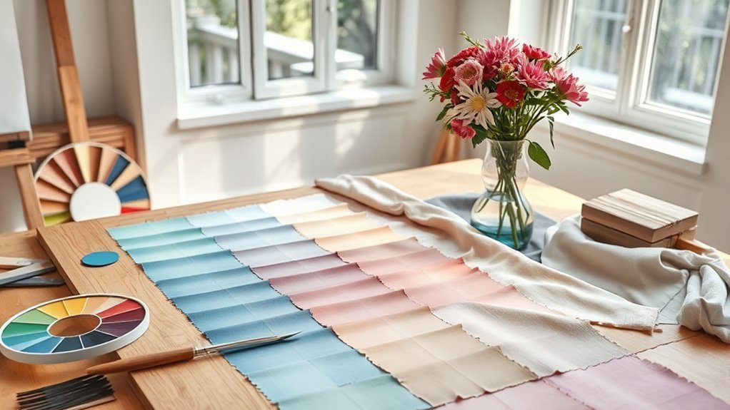
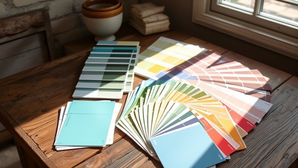
When you start exploring the world of paint and fabric, you’ll quickly discover that color isn’t just about what meets the eye; it’s about the subtle undertones that lie beneath. These color undertones—whether warm, like sunny yellows and fiery oranges, or cool, such as serene blues and revitalizing greens—significantly affect the mood of your space. They create environments that can feel cozy or invigorating, depending on your choices. Achieving color harmony hinges on understanding these undertones, as mismatched colors can disrupt the aesthetic flow. To truly grasp their nature, view paints and fabrics alongside pure colors on a color wheel. Remember, lighting can shift these perceptions, so always test samples in the actual light of your intended space for the best results.
How to Identify Warm and Cool Undertones?
Understanding how to identify warm and cool undertones can transform your approach to color selection in paint and fabric. Warm undertones, with their vibrant hues of orange, yellow, or red, invite a cozy ambiance, while cool undertones sway towards green, blue, or purple, creating a serene environment. To discern these tones, place colors side by side; for instance, compare a warm beige against a pure white to see if it reveals yellow or pink undertones. A color wheel can also guide you through the intricate dance of color temperature. Remember, testing colors in natural light versus incandescent light is crucial, as it alters perception. Choose harmonizing undertones for a cohesive, liberated look that speaks to your soul.
How Lighting Affects Your Color Choices?
When you choose colors for your space, remember that lighting plays a vital role in how those hues reveal themselves. Natural light shifts throughout the day, enhancing different undertones, while artificial lighting can create warmth or sterility that alters your perception. To maintain consistency in your color choices, you should always test samples in the actual lighting conditions of your room.
Natural Light Variations
As the sun moves across the sky, the shifting natural light can dramatically alter your perception of color in any space. Understanding these nuances is essential for making liberated design choices.
- Morning light often enhances warm undertones, creating an inviting warmth in your room.
- Afternoon light, with its cooler blue undertones, can invigorate colors, making them pop and feel vibrant.
- Golden southern light softens tones, fostering a creamy allure that emphasizes warmth.
Artificial Light Impact
While you might be drawn to a stunning paint color in the store, the moment you bring it home, artificial lighting can dramatically shift its appearance. Incandescent bulbs may bathe your walls in a warm glow, accentuating rich yellow or red undertones, while cool LED lights can transform those hues into cooler, more vibrant shades of blue or green. To truly capture the essence of your chosen color, it’s essential to evaluate samples under the same artificial lighting you’ll use in your space. This approach helps you avoid mismatched undertones and creates a cohesive aesthetic. Experimenting in various artificial lighting conditions empowers you to make informed choices, ensuring your space resonates with the vibrancy and warmth you envision.
Consistency in Lighting Temperature
The lighting temperature you choose can greatly influence how colors appear in your space, shaping your overall design aesthetic. Different light sources can evoke unique feelings and moods, so consider this:
- Incandescent Light: It warms up colors, wrapping your room in a cozy embrace.
- Fluorescent Light: This creates a cooler, clinical atmosphere, potentially dulling vibrant hues.
- LED Light: Depending on its temperature, it can either enhance warm tones or lean toward cooler shades.
To maintain consistent color perception, always evaluate paint colors under the exact lighting conditions of your room. Observe swatches at different times of day to guarantee your selected colors harmonize beautifully, liberating your space from unexpected shifts and disappointments. Let light be your guide!
Essential Tips for Selecting Paint Colors That Complement Undertones

Choosing the right paint colors that harmonize with existing undertones can transform your space into a cohesive sanctuary. Start by comparing paint colors side-by-side; this helps you accurately gauge their undertones. Create sample boards with swatches to visualize interactions in different lighting. Remember, warm light can amplify cozy hues, while cool tones can calm your environment. Test samples under various light conditions, as colors shift dramatically with light changes. Pay attention to neutrals; their undertones can either enhance or clash with your chosen palette. Finally, think about the mood you want to evoke—warm undertones invite warmth and intimacy, while cool undertones foster tranquility. Your space should reflect your essence, so choose wisely!
Avoid These Common Mistakes When Selecting Undertones
Selecting paint colors that align with your vision can be exhilarating, but many stumble when it comes to understanding undertones. To help you avoid common pitfalls, consider these mistakes:
- Isolated Choices: Don’t select colors without comparing them on a color wheel; visuals can dramatically shift your perception of undertones.
- Ignoring Lighting: Always test colors in different lighting conditions, as natural and artificial light can change how undertones reveal themselves.
- Disregarding Existing Decor: Your base color should harmonize with current materials; mismatched undertones can disrupt the atmosphere.
Testing samples on walls or boards is essential for grasping how undertones will interact. Embrace the journey, and let every choice resonate with your unique style!
Examples of Color Undertones and Their Influence on Interior Design
Understanding color undertones is essential for creating a cohesive interior design, as they can dramatically shift the mood and perception of a space. For instance, a warm beige with yellow undertones invites sunshine and comfort, perfect for a cozy living room. In contrast, a gray paint with subtle blue undertones introduces sophistication and calm, ideal for a serene bedroom retreat. When choosing fabrics, consider how warm-toned materials, like a soft cream or blush, interact with cooler wall colors. A clash can disrupt your vision. Remember, lighting plays a vital role; the same color can transform under natural light or incandescent bulbs. Always compare neutrals closely, as even the slightest pink or blue undertone can impact harmony in your design.
Frequently Asked Questions
How Do You Know the Undertone of a Paint Color?
To know the undertone of a paint color, compare it with color swatches under various lighting. Observe how shades shift, revealing hidden hues that interact with your space’s decor, ensuring a harmonious atmosphere.
How Do I Know My Color Undertone?
To uncover your color undertone, you’ll want to compare your skin against vibrant hues. Check your veins—are they blue or green? This color matching technique reveals the secret of undertone identification, guiding your choices beautifully.
What Do Cool Undertones Mean in Paint?
Cool undertones in paint mean you’re choosing colors like soft blues or greens, creating a revitalizing vibe. These hues enhance space and light, making your rooms feel tranquil and expansive. Think serene, inviting atmospheres!
How to Tell if a Color Is Warm or Cool Toned?
To tell if a color’s warm or cool toned, observe its color temperature against neutrals. Your visual perception can shift under different lighting, revealing hidden undertones that can transform your space into a harmonious haven.
Conclusion
In the world of paint and fabric, color undertones act like the hidden roots of a tree, anchoring your choices and shaping the overall aesthetic. By understanding and embracing these subtle hues, you can cultivate a harmonious space that reflects your personality. So, as you select your colors, remember: each undertone is a whisper of emotion, guiding you toward a vibrant, balanced environment. Let these nuances bloom, and watch your design flourish like a garden in full color.
Leave a Reply