Last updated: August 19, 2026
To design a living room with mixed lighting color temperatures, start with one warm dominant layer and use a different temperature only where it has a clear job. A practical setup is 2,700K to 3,000K ambient lighting for the main room, 3,000K to 3,500K task lighting for reading, and selective 3,500K to 4,000K lighting at a desk or display zone when you prefer a cleaner, more neutral-looking white. Keep strongly different bulbs out of the same sightline. Also remember that Kelvin describes the appearance of white light, not how bright the bulb is.
Quick Answer
Use 2,700K to 3,000K as the living room base, then add slightly more neutral task lighting only where you read, work, or need detail. The more two light sources are visible at the same time, the closer their color appearance should be. Put warm lamps near seating, aim neutral task lights toward the work surface, and control the layers separately with dimmers, switches, or tunable smart bulbs.
Key Takeaways
- Use 2,700K to 3,000K for the dominant living room lighting.
- Use 3,000K to 3,500K for reading lamps and other close task lights.
- Reserve 3,500K to 4,000K for defined desk, display, or detail-oriented zones rather than the whole lounge.
- Choose one dominant color temperature, then add small functional zones instead of mixing bulbs randomly.
- The more two bulbs share the same sightline or illuminate the same surface, the closer their white appearance should be.
- Do not use a higher Kelvin rating as a shortcut for more brightness; check lumens for light output and CRI for color rendering.
| Lighting Layer | Best Color Temperature | Living Room Placement | Main Purpose |
|---|---|---|---|
| Ambient | 2,700K-3,000K | Ceiling fixture, cove light, floor lamps | Soft general glow |
| Task | 3,000K-3,500K | Reading chair, side table, small desk | Clearer close-up work |
| Accent | 2,700K-4,000K | Artwork, shelves, textured wall | Depth and focal points |
| Tunable smart lighting | Adjustable | Main bulbs or lamps | Day-to-night flexibility |
Quick Mixed-Lighting Plan by Living Room Use
The easiest way to choose mixed lighting is to start with what the room actually does. Keep the dominant light warm, then add a second temperature only where that extra separation improves function or presentation.
| Living Room Use | Main Lighting | Secondary Lighting | Best Approach |
|---|---|---|---|
| Relaxing and TV | 2,700K-3,000K | Usually none needed | Keep the room consistently warm and dimmable |
| Reading corner | 2,700K-3,000K | 3,000K-3,500K | Aim the task lamp at the page rather than across the room |
| Living room + home office | 2,700K-3,000K | 3,500K-4,000K at desk | Control the desk lamp separately so the rest of the room stays warm |
| Artwork or shelving focus | 2,700K-3,000K | Match accent CCT to the displayed finishes | Keep the accent directional and avoid direct glare |
| Day-to-night flexible room | Tunable white | Adjustable | Save coordinated daytime and evening scenes instead of changing every bulb independently |
Recommended Products

Unique & Exquisite Modern Design ✨ This 63-inch black floor lamp boasts a mid-century inspired silhouette with three globe lights artfully arranged on a U-shaped triple metal frame. The elegant minimalist structure blends seamlessly with contemporary, vintage, or industrial decor, adding a touch of sophistication to living rooms, bedrooms, or offices.

【3 Way Light Bulbs】 :Our 3 way LED light bulbs offers 3 brightness settings to match your lighting needs. With a soft white light and a high color rendering index, it effectively illuminates any space with vibrant, natural colors. At 360lm, 720lm, and 1080lm, it is perfect for a variety of settings, from reading to entertaining guests

Stepless Dimmable: This floor lamp can use the remote control to adjust the brightness by stepless from 30% to 100% and color temperature from 3000K to 6000K, for warm white, natural white, and cool white light.
How to Mix Lighting Color Temperatures in a Living Room
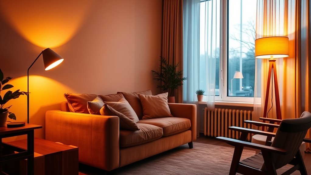
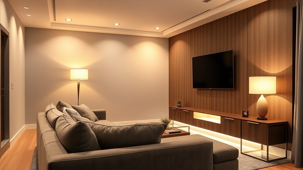
Start with one dominant color temperature for the room, then use other temperatures as controlled layers. In most living rooms, the dominant layer should be warm because the primary activities are usually seating, conversation, entertainment, and relaxation. Use warm ambient light at the ceiling or around the room perimeter, then add slightly more neutral task lighting beside a reading chair, game table, or compact work desk.
Keep fixtures visually related even when their bulbs differ. Matching metal finishes, shade colors, or silhouettes helps the room feel planned instead of patched together. More importantly, separate the lighting layers by switch, dimmer, or smart scene. A reading lamp can then be bright while the rest of the room stays warm and subdued.
Use the sightline rule when deciding how far apart two color temperatures can be: the more two light sources are visible simultaneously or illuminate the same surface, the more similar their white appearance should be. A neutral desk lamp can coexist with warm lamps across the room more easily than a warm and cool bulb placed side by side in the same fixture.
Understanding Color Temperature and Its Impact on Your Living Room
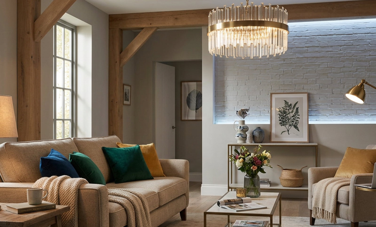
Color temperature, also called correlated color temperature or CCT, describes the color appearance of white light. Lower Kelvin numbers look warmer or more yellow-red, while higher Kelvin numbers look cooler or more blue-white. The U.S. Department of Energy describes 2,700K as warm, 3,000K as a soft warm white, 3,500K as neutral, and approximately 4,100K as cool.
Kelvin is only one part of light quality. Also check CRI, or color rendering index, because it describes how faithfully colors appear compared with a reference source. DOE recommends a minimum CRI of 80 for general interior lighting and describes CRI 90 or higher as excellent color fidelity. That matters around artwork, wood finishes, textiles, food, and faces.
Color Temperature vs. Brightness
Kelvin does not tell you how bright a bulb is. CCT describes whether the white light looks warm or cool, while lumens describe the amount of visible light emitted. If a reading corner looks dim, you may need more lumens, a better lamp position, or a more focused shade rather than a higher color temperature.
This distinction helps prevent a common lighting mistake: replacing a comfortable 3,000K bulb with a much cooler bulb when the real problem is insufficient light output. Choose the Kelvin value for appearance, then choose enough lumens for the activity.
Warm vs. Cool Lighting
Warm lighting, usually around 2,700K to 3,000K, gives a living room a softer appearance and is common in residential settings. Neutral lighting, around 3,500K to 4,000K, looks whiter and can work well in a defined reading, hobby, display, or desk area where you want a cleaner visual separation from the lounge.
Avoid using very cool daylight bulbs as the dominant living room layer unless the room has a specific work-focused purpose or you simply prefer that appearance. If you want the flexibility of both warm and neutral light, keep a warm room base and contain the more neutral light within a defined activity zone.
How Color Temperature Changes the Feel of the Room
Lighting changes how a room is perceived, but color temperature should not be treated as a guaranteed mood or productivity treatment. Warm light can make a seating area appear softer and more intimate, while more neutral light can give a task zone a cleaner visual character. Match the light to the activity and room finishes rather than assuming one Kelvin setting will produce the same reaction for everyone.
| Color Temperature | Typical Appearance | Best Living Room Use |
|---|---|---|
| 2,700K | Soft and warm | Evening lamps, TV zones, relaxed seating |
| 3,000K | Warm but cleaner | General living room lighting and table lamps |
| 3,500K | Balanced and neutral | Reading corners and flexible family rooms |
| 4,000K | Clean and relatively cool | Defined desk, shelf, or detailed task zones |
| 5,000K | Cool and daylight-like | Usually unnecessary as the main lounge lighting |
Choosing Ideal Color Temperature
Choose the ideal color temperature by starting with the room’s main use. For a family room or lounge, use 2,700K or 3,000K for most fixtures. For a living room that doubles as a home office, keep the room lighting warm and add a separately controlled 3,500K to 4,000K desk lamp if you prefer a more neutral-looking work zone.
Then look at the room finishes. Warm woods, cream walls, brass, and natural fabrics often pair naturally with warmer light. Cooler gray palettes, black accents, and crisp modern interiors can visually accommodate more neutral light. Test one bulb at night before buying multiples because daylight, paint undertones, fixture materials, shade opacity, brightness, and surrounding light all affect how a given CCT appears in the finished room.
Pick the Perfect Ambient Light for a Cozy Feel
For ambient light, start between 2,700K and 3,000K. This range creates a warm residential foundation without requiring every secondary light to use exactly the same bulb.
Do not rely on one bright ceiling fixture to do everything. A single overhead light can create glare, strong shadows, and dark corners. Instead, combine the ceiling fixture with lower light sources. Place floor lamps behind or beside seating, use table lamps near conversation areas, and add dimming or separate switching so the ambient layer can drop lower when full output is unnecessary.
Recommended Products

Note: This floor lamp is 53.7 inches tall and offers a maximum brightness of 1,000 lumens, making it best suited for corners and small spaces. The official app download link is provided on the package in the form of QR code. Please make sure to download and use the genuine App for the full experience. It supports 2.4GHz network only. Remote control is not included.

3 Color Temperature Bulb Included: Dimension of this floor lamp is 60” height, diameter and height of lampshade is 10.04” and 7.87”, diameter of base is 8.66”. Includes a 9W LED bulb which has 3 different color adjustable temperature setting: 3000K/5000K/4000K. You can easily change the color temperature to set the overall ambiance of the room.

36W Super Bright & Lighting without Limits: We are proud to introduce this 2025 innovative led floor lamp with 36W super brightness, enough to illuminate the whole room through precise high power and optimized optical design. Now featuring a versatile omnidirectional head with a 350° rotation capability, and its 69-inch height offers limitless lighting angles for any setting. Flip it upward to turn it into a stunning torchiere floor lamp, or angle it for the perfect reading light — the choice is yours with this flexible, all-encompassing lighting solution
How to Use Task Lighting Effectively?
Task lighting should solve a specific visibility problem. In a living room, that usually means reading, writing, playing games, crafting, or working at a small desk. Choose bulbs around 3,000K to 3,500K for most close tasks. Use 4,000K selectively when you prefer a more neutral-looking desk or work zone, but increase lumens or improve lamp placement when the actual problem is insufficient brightness.
- Reading chairs: Place a floor lamp or swing-arm lamp slightly behind the shoulder, then aim it toward the page.
- Side tables: Use shaded table lamps to brighten a small zone without shining directly into someone’s eyes.
- Living room desks: Add an adjustable desk lamp on its own control so the rest of the room can remain warm.
- TV areas: Keep task lamps away from the screen plane to reduce distracting reflections.
Accent Lighting: Enhancing Your Mixed Lighting Design
Accent lighting adds depth by directing attention toward a feature such as artwork, shelving, a textured wall, a plant, an alcove, or an architectural detail. A warm 2,700K accent often works naturally with wood, woven textures, and warm paint. A more neutral accent can suit white shelving, cool-toned stone, or artwork when you prefer a cleaner-looking presentation.
Use accent lights selectively. Too many visible spotlights can make a living room feel busy. Start with one focal point, such as a picture light over art or a small uplight behind a plant. Then judge the result from normal seating positions rather than directly beside the fixture. If the accent creates glare, reduce the output, adjust the beam, or change the fixture position.
Balancing Warm and Cool Tones for Depth and Mood
Mixed lighting works best when every temperature shift has a reason. Warm lights can define the lounge and conversation areas, while neutral lights identify a task or display area. This creates functional contrast without making the room look like bulbs were replaced at random.
Layering Warm and Cool Tones
Use this order when layering different white-light temperatures:
- Set the base: Choose 2,700K to 3,000K for the dominant ambient layer.
- Add task zones: Use 3,000K to 3,500K near reading chairs, game tables, or similar close tasks.
- Use stronger contrast selectively: Keep 3,500K to 4,000K lighting inside a defined desk, display, or work zone rather than spreading it throughout the lounge.
- Control the sightline: Avoid placing obviously warm and cool bare bulbs beside each other or aiming them at the same surface.
- Separate the controls: Put ambient, task, and accent lights on different switches, dimmers, or coordinated smart scenes.
This approach lets you combine warmth and clarity while keeping the temperature changes visually intentional.
Enhancing Depth With Contrast
Contrast can give the room visual depth. A warm lamp beside a sofa can define the seating zone, while a more neutral picture light across the room can draw attention toward art or shelving. The key is distance, direction, and purpose. The more visible two bulbs are at the same time, the more obvious any color-temperature difference becomes.
For example, 2,700K and 3,000K sources are relatively close in appearance compared with a 2,700K lamp and a 5,000K daylight source. If a room already looks mismatched, replace bulbs in the most visually prominent fixtures first. You may not need new fixtures at all; tightening the range of visible light colors may solve the problem.
Selecting the Best Fixtures for Each Lighting Layer
Select fixtures according to beam direction, glare control, adjustability, and the job of each lighting layer before focusing on decorative style.
- Ambient lighting: Choose chandeliers, pendants, flush mounts, or floor lamps with diffused shades. Use 2,700K to 3,000K bulbs for the dominant room layer.
- Task lighting: Choose adjustable table lamps, swing-arm sconces, or floor lamps with focused shades. Use 3,000K to 3,500K for most reading zones.
- Accent lighting: Choose picture lights, small spotlights, shelf lighting, or uplights. Select the color appearance according to the finish or object being highlighted.
- Smart or tunable bulbs: Use them when the same fixture needs to change between daytime and evening settings.
Also check bulb shape and shade opacity. A clear bulb in an open fixture can create a decorative sparkle but may produce uncomfortable glare near seating. Frosted bulbs and diffusing shades generally hide the bright LED source more effectively.
Recommended Products

Modern Fully Dimmable(0-100%) Floor Lamp & Convenient Rotary Switch: Compared with traditional Non-dimmable floor lamps for living room, our floor lamp is fully Stepless Dimmable, which suitable for all the room style and using situation ,find the perfect light for your needs. This standing lamp is very easy to turn on and off. Just simply twist it and then you can adjust the arc floor lamps brightness what you want. 4.1FT rotary switch, which is very convenient for you to adjust it.

120 LED High Brightness: Equipped with 120 high-brightness LED beads, the PACOVY floor lamp delivers a powerful 18W / 1800-lumen output, providing brightness equivalent to a traditional 120W bulb while saving up to 85% energy. This led floor lamp effectively illuminates the entire workspace, making activities such as working, reading, crafting, sewing, beauty treatments, nail art, tattooing, and puzzles easier and more enjoyable

Natural Marble Base: The GOEBLESON arc floor lamp for living room features a natural marble base with an eccentric rod structure. Unlike ordinary plastic or metal bases, the arc floor lamp with remote (lamp weight 13.67lb) is less likely to tip over when placed even on carpet, suitable for families with children and pets. Each marble base is different. These natural marble texture on the base makes each lamp unique
Positioning Lights for Maximum Impact
Position each light according to its job. Put ambient lighting where it can spread across the room without becoming the only source. Keep task lighting close to the activity. Add accent lighting only where it creates a deliberate focal point.
Check sightlines from the sofa and other normal seating positions. Avoid bare bulbs in the direct field of view, strong television reflections, and lighting angles that produce distracting glare. Warm lamps usually work well at lower levels around seating, while neutral task lights are easier to integrate when their light is directed toward the task instead of across the entire room.
Common Mistakes to Avoid With Mixed Lighting
Mixed color temperatures can look intentional, but only when brightness, position, beam direction, and color appearance are coordinated. Avoid these common mistakes:
- Mixing bulbs randomly: Do not place strongly different warm and cool bulbs beside each other without a functional reason.
- Confusing Kelvin with brightness: A higher Kelvin rating changes the appearance of the white light; check lumens when you need more light output.
- Using daylight bulbs everywhere: Very cool light can create a strong visual contrast with typical warm residential lamps.
- Ignoring CRI: Low color fidelity can change how paint, artwork, furniture, textiles, and skin tones appear even when the CCT seems appropriate.
- Overlighting the ceiling: Too much output from one overhead source can create glare and leave the room visually flat.
- Skipping separate controls: Without dimming, switching, or scenes, every lighting layer has to operate together even when its job is different.
Frequently Asked Questions
Can You Mix Warm and Cool Lights in a Living Room?
Yes, but mix them by function rather than at random. Use warm light for the dominant living room atmosphere and slightly more neutral light for reading, work, or display areas. Keep strongly different bulbs out of the same fixture and avoid placing very warm and very cool bare bulbs in the same direct sightline.
What Color Temperature Is Best for a Living Room?
For most living rooms, 2,700K to 3,000K is a practical range for the dominant lighting. It creates the warm white appearance commonly used in residential interiors. Add 3,000K to 3,500K task lamps when a reading or activity area needs its own lighting layer.
Should Living Room Lamps Be 2700K or 3000K?
Choose 2,700K when you prefer a warmer white similar to traditional incandescent lighting. Choose 3,000K when you want a slightly cleaner warm white. Both are common residential choices, so the better option depends on the other fixtures, room finishes, and the appearance you prefer.
Should All Lights in a Living Room Be the Same Color Temperature?
No. They do not have to be identical, but the difference should be intentional. Keeping the main ambient lights in one warm range creates visual consistency, while a reading or desk lamp can use a more neutral temperature if it is clearly serving a separate task. The more two bulbs are visible together or illuminate the same surface, the more noticeable their difference will be.
Does a Higher Kelvin Rating Mean a Brighter Light?
No. Kelvin describes the color appearance of white light, not its light output. Check lumens when comparing brightness. A 3,000K bulb can produce more lumens than a 4,000K bulb, so choose CCT for the appearance you want and lumens for the amount of light you need.
Are Smart Bulbs Good for Mixed Lighting?
Smart and tunable-white bulbs work well when one fixture needs to serve different times of day. Use coordinated scenes rather than setting every bulb to a different temperature. Also test the lights at the dim levels you actually use. The U.S. Department of Energy notes that tunable-white and dim-to-warm products use different approaches and that some designs can render colors differently at very low dim settings.
How Do You Avoid Mismatched Lighting?
Choose one dominant Kelvin range, use temperature changes only for defined task or accent zones, and check the room from normal seating positions. Buy matching bulbs for fixtures that appear together, compare CRI as well as Kelvin, test new bulbs at night, and replace the most noticeable mismatched sources first.
Sources Checked
- University of Florida IFAS: Introduction to LED Lighting
- U.S. Department of Energy: Purchasing Energy-Efficient Light Bulbs
- U.S. Department of Energy: LED Basics
- U.S. Department of Energy: Understanding LED Color-Tunable Products
- ENERGY STAR: Downlights Key Product Criteria
Conclusion
The best way to mix lighting color temperatures in a living room is to give every layer a specific job. Start with a 2,700K to 3,000K warm base, add more neutral lighting only where a reading, work, or display zone benefits from it, and keep strongly different light colors out of the same sightline. If the room still looks wrong, check lumens, CRI, glare, and fixture position before assuming you need a different Kelvin rating. Replace the most noticeable mismatched bulbs first, then use separate controls or coordinated smart scenes to make the room flexible throughout the day.