
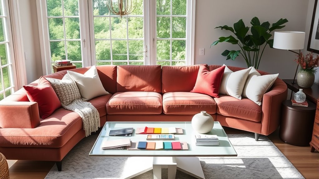
To choose a cohesive color palette for your living room, begin with the mood you want, then work with what the room already has: flooring, sofa fabric, rugs, artwork, wood tones, metal finishes, and natural light. A strong palette usually includes one dominant color, one or two supporting colors, a grounding neutral, and a small accent color that adds personality without making the room feel busy.
Quick Answer
Choose a living room color palette by defining the mood, identifying fixed colors already in the room, selecting one dominant color, adding one or two supporting hues, and finishing with a neutral and an accent. Test every paint and fabric sample in natural and artificial light before committing.
Key Takeaways
- Start with the feeling you want: calm, cozy, bright, dramatic, earthy, or sophisticated.
- Use existing furniture, flooring, rugs, and artwork as color clues instead of choosing paint in isolation.
- The 60-30-10 rule is a helpful starting point, not a strict decorating law.
- Lighting changes color, so test swatches in the room during morning, afternoon, evening, and lamplight.
- Neutrals and textures make bold colors easier to live with and help the palette feel layered.
At a Glance
| Time Required | 1–2 hours to plan the palette, plus 1–3 days to observe paint and fabric samples in changing light. |
| Difficulty | Easy to moderate. The hardest part is narrowing your choices and checking undertones. |
| Tools Needed | Paint chips, peel-and-stick samples or sample pots, fabric swatches, painter’s tape, a notebook, and your existing rug, artwork, or upholstery as inspiration. |
| Cost | Usually $10–$60 for samples. More if you update pillows, curtains, rugs, artwork, or light bulbs. |
Define Your Desired Mood and Atmosphere for Color Selection
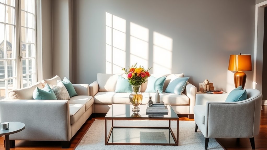
Creating the perfect atmosphere in your living room starts with deciding how you want the space to feel. A room for quiet evenings may call for soft blues, greens, warm whites, mushroom tones, or layered neutrals. A social room can handle warmer hues such as terracotta, ochre, caramel, rust, or lively accent colors. A more polished space may work best with deep navy, charcoal, olive, cream, walnut, and brass.
Instead of choosing colors because they look good on a screen, choose them based on the room’s purpose. Ask yourself: Will this room be used for movie nights, entertaining, reading, family time, or a mix of everything? The answer helps you decide whether your living room color scheme should feel calm, cozy, energetic, dramatic, or refined.
Audit Your Existing Colors Before Buying Paint
Before you pick a wall color, take inventory of the colors that are already staying in the room. These fixed elements often matter more than the paint chip:
- Flooring: Wood, stone, tile, carpet, and rugs all have undertones that can make paint look warmer, cooler, cleaner, or muddier.
- Large furniture: Sofas, sectionals, media cabinets, bookcases, and coffee tables take up major visual space.
- Architectural features: Brick fireplaces, built-ins, trim, beams, and window frames should work with the palette, not fight it.
- Metal finishes: Brass, chrome, black metal, bronze, and nickel can push the room warmer or cooler.
- Artwork and textiles: A rug, painting, patterned pillow, or curtain fabric can give you a ready-made palette.
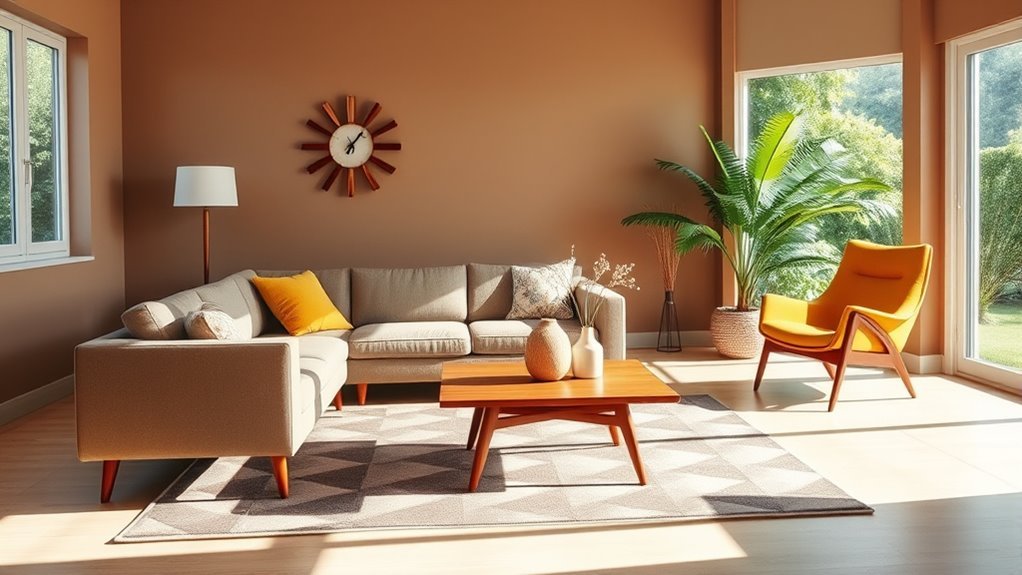
If your sofa, rug, or flooring has strong undertones, use those as your starting point. For example, a camel leather sofa often pairs well with warm whites, olive, navy, rust, black, and natural wood. A cool gray sectional may look cleaner with soft white, slate blue, charcoal, pale oak, or muted green.
Note: The most common palette mistake is choosing paint first. Paint comes in thousands of options, but your sofa, flooring, rug, and built-ins are harder and more expensive to change.
Choose Your Core Colors for a Cohesive Color Palette
With your room’s mood and existing finishes in mind, choose your core colors. A balanced living room palette usually includes four roles: a dominant color, a secondary color, a neutral, and an accent.
Choose a Dominant Color
Your dominant color is the main visual impression of the room. It may appear on the walls, the largest sofa, a large area rug, built-ins, or a repeated neutral. In many living rooms, this color is a warm white, soft beige, greige, pale gray, taupe, sage, cream, or another shade that can handle large surfaces without becoming tiring.
Add One or Two Supporting Colors
Supporting colors add depth and help the room feel designed. These often appear on accent chairs, curtains, rugs, ottomans, painted furniture, lamps, or larger decor. If your dominant color is warm white, a supporting color might be olive green, dusty blue, camel, charcoal, or clay.
Finish With a Neutral and an Accent
A neutral keeps the palette grounded, while an accent adds energy. Neutrals can include white, cream, beige, gray, taupe, brown, black, natural wood, or woven textures. Accent colors work best when they appear in small, repeated moments such as pillows, vases, artwork, books, lampshades, or throws.
Pro Tip: Pull your accent color from artwork, a rug, or patterned fabric already in the room. Repeating that color two or three times makes the palette feel intentional instead of random.
Understand Undertones So Colors Do Not Clash
Undertones are the subtle colors hiding inside neutrals. A white can lean yellow, pink, blue, gray, or green. Beige can lean pink, gold, or gray. Wood can lean orange, red, yellow, ash, or brown. When undertones clash, a room can feel slightly “off” even if every color looks good on its own.
Use these quick checks:
- Warm undertones include cream, ivory, camel, honey wood, brass, terracotta, rust, warm beige, and olive.
- Cool undertones include blue-gray, charcoal, chrome, black, cool white, slate, lavender-gray, and some blue-greens.
- Muted undertones work well when you want a sophisticated palette. Think mushroom, sage, dusty blue, putty, taupe, and soft clay.
You can mix warm and cool tones, but one should usually lead. For example, a warm white room can still use cool blue accents if wood, textiles, or brass add warmth. A cool gray room can feel more inviting with leather, linen, warm lamps, and natural woven textures.
Use Neutrals and Textures to Enhance Color Cohesion
While you might be drawn to vibrant colors, neutrals and textures give the living room a more finished look. Soft grays, warm beiges, creamy whites, natural woods, woven baskets, linen curtains, wool rugs, leather, stone, and metal finishes can all support the palette without adding visual clutter.
Texture is especially useful when your palette is quiet. A room with cream walls, a beige sofa, and oak furniture can still feel rich if you layer boucle, linen, wool, rattan, ceramic, aged brass, and matte black accents. This keeps neutral living rooms from looking flat.
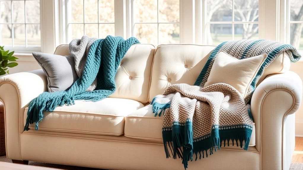
Neutrals also make seasonal updates easier. You can change throw pillows, blankets, stems, candles, or artwork without repainting or replacing major furniture.
Recommended Products
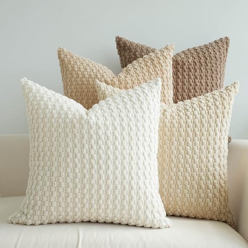
HANDPICKED FABRIC: Made of ultra-soft fabric, bringing you cozy feeling with soft tactile and a fun, stylish look to a couch, lounge chair, or bed

QUALITY MATERIAL: The pillow cover is composed of a soft and comfy corduroy which is a kind of polyester fabric, features a cute and elegant boho stripe design. Our pillow covers are of good workmanship, they are tightly sewn without loose threads.
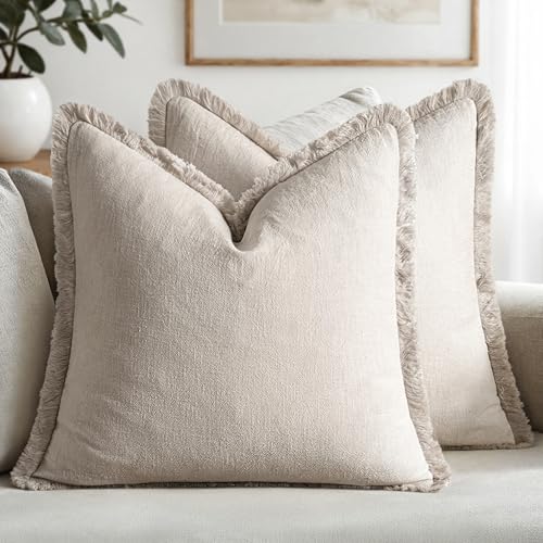
【Exquisite Farmhouse Linen Material】MIULEE's decorative linen pillow covers feature a natural ramie linen blend. The high-quality stone washed linen adds rustic charm, with its textured wrinkles ideal for farmhouse interiors. It gracefully ages with each wash, enhancing its personality and comfort. The linen fabric ensures durability and breathability, providing a soft touch that's suitable for year-round use
How Does Lighting Affect Your Color Choices?
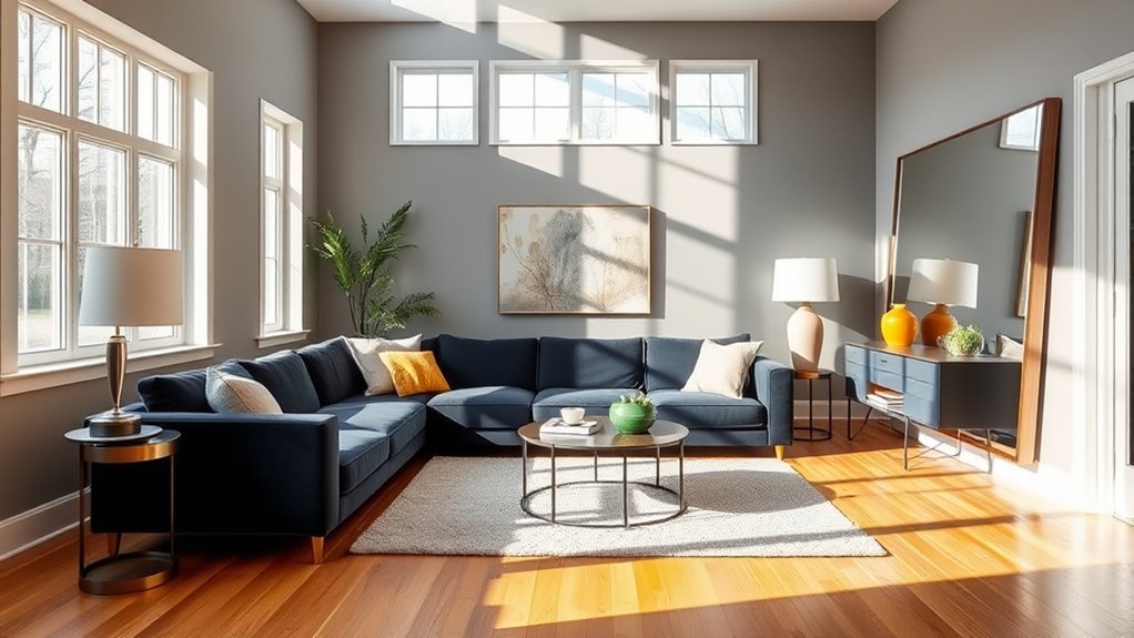
Lighting can completely change how your living room colors appear. The U.S. Department of Energy explains that color temperature is measured in Kelvin: lower color temperatures around 2700–3000K appear warmer, while higher values around 3600–5500K appear cooler. DOE also notes that color rendition affects how accurately a light source reveals colors.
For living rooms, warm white bulbs often feel cozy, while cooler bulbs can make whites, grays, blues, and greens look sharper. The key is consistency. If one lamp uses a warm bulb and another uses a cool bulb, the same sofa, wall, or rug can look different across the room.
| Lighting Type | Effect on Colors | Best Palette Move |
|---|---|---|
| North-facing light | Often cooler and dimmer, depending on location and window exposure. | Try warm whites, creamy neutrals, earthy colors, or richer muted tones. |
| South-facing light | Often brighter and warmer in the Northern Hemisphere. | Most colors can work, but test bold warm hues so they do not become too intense. |
| Warm LED bulbs | Can make whites, beiges, woods, reds, and yellows feel cozier. | Good for relaxed living rooms and evening use. |
| Cool LED bulbs | Can make colors look crisper but may feel harsh in a cozy room. | Use carefully, especially with gray, white, blue, and high-contrast palettes. |
| Direct sunlight | Can make colors look vivid at certain times and may fade some fabrics, rugs, and artwork over time. | Use lined curtains, UV-filtering window treatments, or rotate delicate textiles. |
Warning: Never approve a paint color from a phone photo, online swatch, or store chip alone. Color changes with your wall texture, furniture, flooring, daylight, lamp bulbs, and paint finish.
Use the 60-30-10 Rule for Color Balance
To achieve a balanced living room, use the 60-30-10 rule as a flexible guide. The idea is simple: about 60% of the room is your dominant color, 30% is your secondary color, and 10% is your accent color. These numbers do not need to be exact, but they help prevent a palette from feeling scattered.
Understanding Color Distribution
Here is how the rule often works in a living room:
- 60% dominant color: Walls, large rug, sectional, built-ins, or the main neutral backdrop.
- 30% secondary color: Accent chairs, curtains, smaller furniture, large artwork, or patterned textiles.
- 10% accent color: Pillows, throws, lamps, vases, picture frames, books, or small decor.
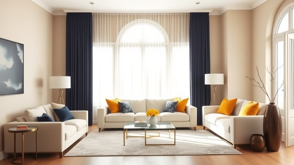
For example, a calm palette might use warm white as the 60%, soft sage as the 30%, and black or brass as the 10%. A cozier palette might use mushroom walls, a camel sofa, and rust accents. A bolder palette might use navy built-ins, cream upholstery, and ochre pillows.
Selecting Primary and Accent Colors
Your primary color does not have to be the wall color. If your living room has a large green sectional, that green may be the dominant color. If your room has a patterned rug, the rug may already contain your dominant, secondary, and accent colors.
Choose accent colors carefully. A strong accent works best when it appears in small doses and repeats at least twice. One red pillow can look accidental; red in a pillow, artwork, and a small vase looks intentional.
When to Adjust the Rule
The 60-30-10 rule is a starting point, not a requirement. You can adjust it for monochromatic rooms, high-contrast spaces, or rooms with a large patterned rug. A mostly neutral room might use 80% warm neutrals, 15% natural wood, and 5% black. A colorful room may use several shades from the same family instead of one obvious accent.
Choose a Palette Type That Fits Your Style
If you are unsure which colors work together, choose one of these simple palette types:
Recommended Products

【Vintage Hydrangea Floral Design & Elegant Home Accent】Transform your space with these 18x18 pillow covers featuring a timeless vintage hydrangea floral design. Inspired by classic botanical patterns, these vintage pillow covers, vintage throw pillow covers and floral pillow covers bring elegant charm to sofas, beds, chairs, and living spaces. The refined hydrangea pattern creates a sophisticated look that complements traditional and modern interiors.

Quality Material: These jacquard pillow covers are made from premium chenille fabric, which is breathable and skin‑friendly, delivering a soft and cozy touch for daily home use, providing a comfortable leaning and lounging experience. They are perfect for your couch, sofa, accent chair, bench, reading nook, bedroom, living room, guest room, patio, sunroom, office and cafe.
Monochromatic Palette
A monochromatic palette uses lighter and darker versions of one color. This can look calm and high-end when you vary texture. For example: pale blue walls, navy pillows, blue-gray curtains, cream upholstery, and natural wood.
Analogous Palette
An analogous palette uses colors next to each other on the color wheel, such as blue, blue-green, and green. This approach feels cohesive because the colors are closely related.
Complementary Palette
A complementary palette uses colors across from each other, such as blue and orange or green and red. In a living room, keep one color muted or use one as a small accent so the room does not feel too loud.
Neutral-Plus-Accent Palette
This is one of the easiest options for living rooms. Start with warm white, cream, beige, taupe, gray, or greige, then add one accent such as olive, navy, rust, black, burgundy, or soft blue. Use wood, woven textures, and metal finishes to add depth.
Test and Refine Your Color Palette in Real Life
Testing and refining your color palette in real life is essential. Paint and fabric can look completely different once they are beside your floors, sofa, trim, curtains, and lamps. The safest approach is to test several options in the room before making a final decision.
Use this simple workflow:
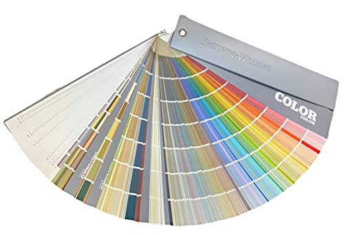
- Choose three to five paint samples in the color family you like.
- Place samples on at least two walls, especially if one wall gets more light than another.
- Check them morning, afternoon, evening, and under lamplight.
- Hold fabric, rug, and wood samples beside the paint. Do not judge the wall color alone.
- Compare undertones against pure white paper. This helps reveal whether a color leans yellow, pink, blue, green, or gray.
- Live with the samples for at least a day or two before committing.
For more detailed sampling advice, Architectural Digest’s paint testing guide recommends viewing samples in the actual space because lighting, furniture, and finish can change how the color reads.
Recommended Products

PERFECT SAMPLES: These 12" x 9" white, styrene panels provide a smooth, warp-free surface for testing up to 5 color samples with paint, stain or other coatings.
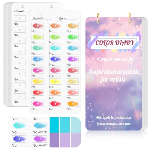
【Note】Compatible with different types of pens. Multiple layers using water-based pens may result in minor surface pilling.
Common Living Room Color Palette Mistakes
Even beautiful colors can fall flat when they are used the wrong way. Watch for these common mistakes:
- Choosing paint before furniture: Start with the hardest-to-change elements, then choose paint.
- Ignoring undertones: A pink-beige wall can clash with a yellow-beige sofa, even though both are “neutral.”
- Using too many accent colors: One or two accents usually feel more polished than five competing ones.
- Forgetting the bulbs: Mixed bulb temperatures can make one side of the room look warm and the other look cool.
- Skipping texture: A neutral room needs texture so it does not feel flat.
- Copying a photo exactly: Inspiration photos do not share your room’s light, layout, flooring, or furniture.
Frequently Asked Questions
What are some common color combinations that work well together?
Reliable living room combinations include warm white with olive and black, beige with rust and cream, navy with camel and brass, sage with warm wood and ivory, charcoal with taupe and linen, and soft blue with white and natural oak. For a calmer space, choose muted tones. For more energy, add one stronger accent color.
How can I incorporate bold colors without overwhelming the space?
Use bold colors in small, repeatable accents first. Try pillows, artwork, lamps, books, vases, or an accent chair before committing to walls or large upholstery. Keep the surrounding colors quieter so the bold color has room to stand out.
What role do seasonal changes play in color selection?
Seasonal light can make colors feel different throughout the year. Winter light may make a room feel cooler or dimmer, while summer light can make colors appear brighter. Choose a year-round base palette, then use seasonal accents such as pillows, throws, stems, and artwork to refresh the room.
Should I consider furniture color when choosing my palette?
Yes. Furniture color is one of the most important parts of a living room palette because sofas, chairs, cabinets, and tables take up a lot of visual space. Choose wall colors and accents that work with your largest furniture pieces instead of treating them as separate decisions.
How can I refresh my color palette without repainting?
Refresh the palette with new pillow covers, a throw blanket, artwork, curtains, lampshades, coffee table books, vases, plants, or an area rug. You can also swap cool bulbs for warmer ones, add natural textures, or repeat one accent color more intentionally.
What is the safest living room color palette?
A safe palette is a warm neutral base, natural wood, one muted color, and one small contrast accent. For example, try warm white walls, a beige or gray sofa, oak furniture, sage or blue accents, and a small amount of black or brass for definition.
How many colors should a living room palette have?
Most living rooms work well with three to five colors: one dominant color, one or two supporting colors, one neutral, and one accent. Wood, metal, stone, greenery, and woven textures can count as part of the palette too.
Conclusion
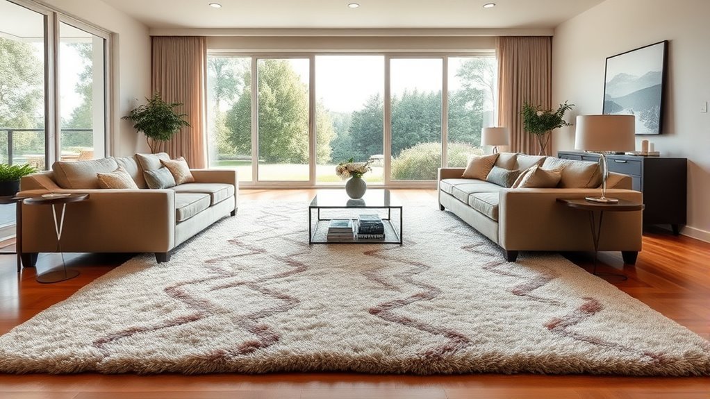
A cohesive living room color palette comes from planning, not guessing. Start with the mood you want, study the colors already in the room, choose a dominant shade, layer in supporting hues, and use a small accent for personality. Then test your paint and fabric choices in real light before committing. When your colors, lighting, furniture, and textures work together, the living room feels more comfortable, intentional, and complete.
Sources
- U.S. Department of Energy — Lighting Principles and Terms — supports color temperature, color rendition, CRI, and lighting-quality guidance.
- U.S. Department of Energy — Lighting Choices to Save You Money — supports LED lighting efficiency and tunable white-light guidance.
- House Beautiful — 60-30-10 Color Rule — supports the 60-30-10 design guideline and its flexible use.
- Architectural Digest — The Right Way to Test Out Paint — supports testing paint samples in the actual room and checking them throughout the day.
- Livingetc — North-Facing Room Color Guidance — supports the importance of room orientation, natural light, artificial lighting, and sampling.




[…] How to Choose a Cohesive Color Palette for a Living Room: Step-by-Step Guide […]