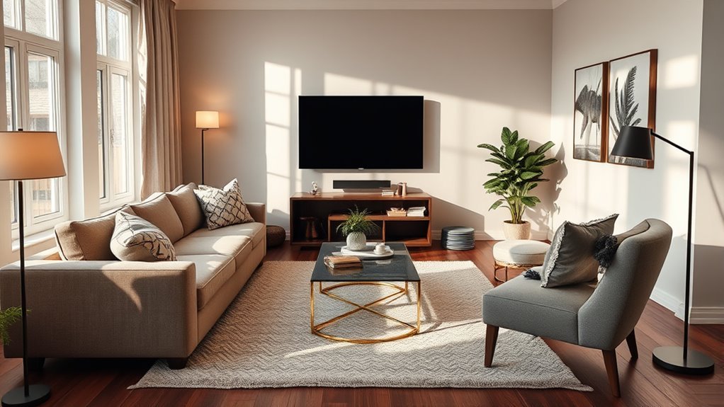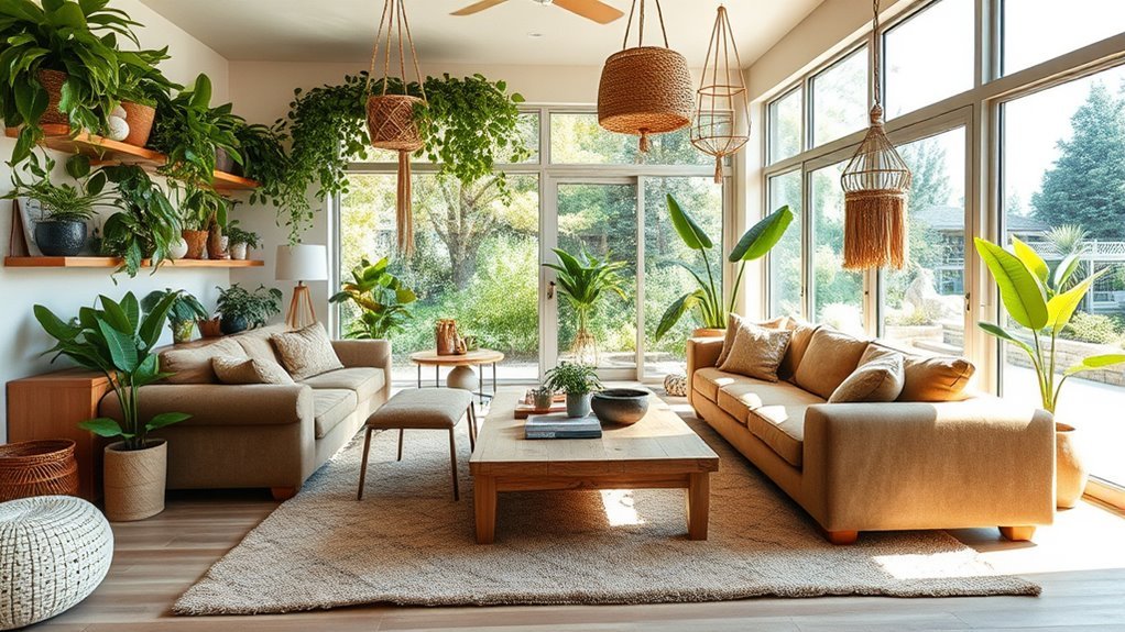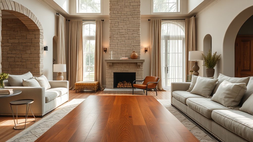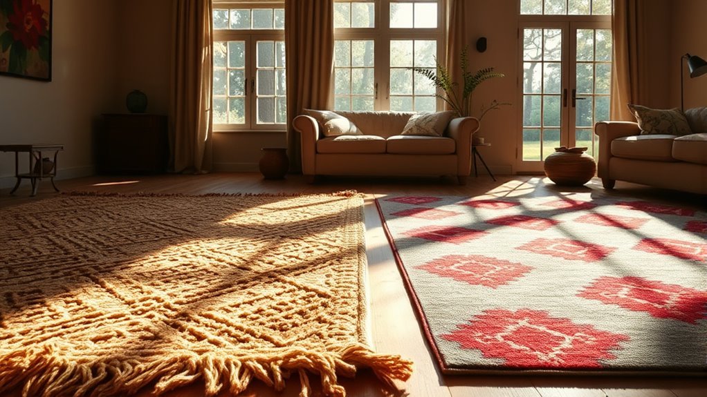
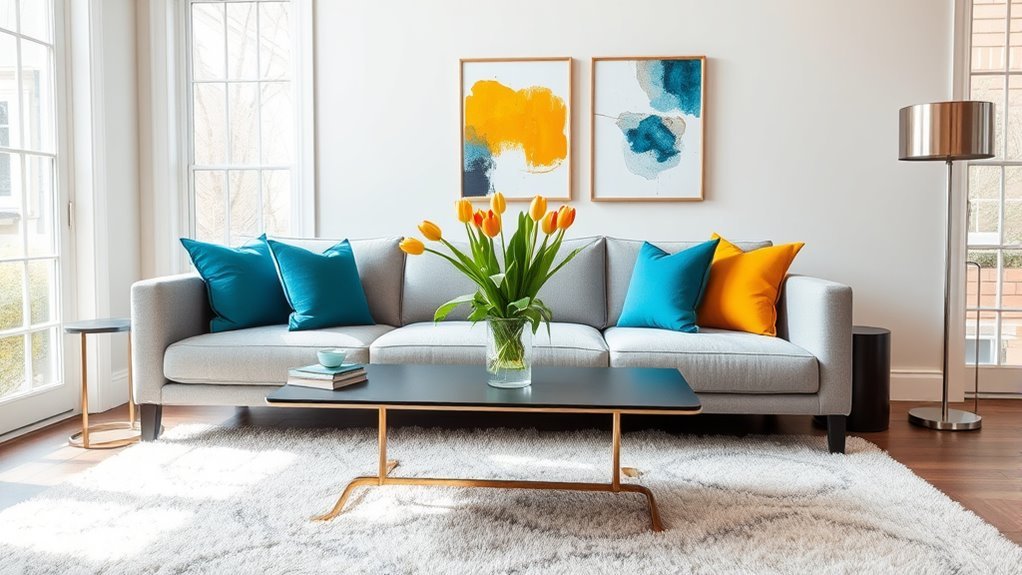
Accent colors make a living room feel intentional instead of unfinished. Start with the sofa, rug, flooring, wall color, wood tones, and other finishes that are already staying in the room. Then choose one dominant backdrop, one supporting color, and one main accent that repeats in a few purposeful places. The 60-30-10 rule is a useful starting point, but undertones, natural light, and the colors already in your room matter more than following an exact percentage.
Last updated: August 19, 2026
Quick Answer
To incorporate accent colors in a living room, start with your existing sofa, rug, flooring, wall color, and fixed finishes. Use a dominant base color, a supporting color, and one main accent through pillows, art, throws, lamps, plants, curtains, or a small painted feature. Repeat the accent in a few separated places and test samples in the actual room before buying or painting.
Key Takeaways
- Use the 60-30-10 rule as a guide, not a strict formula: roughly 60% dominant color, 30% secondary color, and 10% accent color.
- Let fixed pieces like the sofa, flooring, fireplace, rug, and wood tones guide your color choices before buying anything new.
- Test paint and fabric samples in morning, afternoon, evening, and artificial light before committing.
- As a practical rule of thumb, repeat an accent in several separated places so it looks intentional rather than accidental.
- Balance bold accents with neutrals, texture, and varied pattern scales.
At a Glance
| Time Required | A short planning session; longer if you compare paint or fabric samples across different lighting conditions |
| Difficulty | Easy to moderate |
| Tools Needed | Color wheel, paint swatches, fabric samples, phone camera, tape, notebook, and existing room photos |
| Cost | Varies; potentially $0 when rearranging existing decor, with additional cost only if you buy samples, paint, textiles, art, or accessories |
How Do You Choose an Accent Color From the Room You Already Have?
Before choosing a new accent color, look at the pieces that are already staying in the living room. Your sofa, rug, flooring, fireplace, built-ins, curtains, wood furniture, metal finishes, and large artwork all influence which colors will look natural in the space.
A good shortcut is to take a photo of the room in natural light and circle the colors you cannot easily change. If your floor has warm honey tones, look for an accent that either works with that warmth or creates deliberate contrast. If your sofa is cool gray, compare possible accents directly against the upholstery instead of choosing from a screen or paint card alone.
Paint brands also recommend using existing rugs, art, fabrics, and permanent finishes as starting points because those pieces already define the room’s undertones and mood. Sherwin-Williams recommends considering permanent features and viewing paint samples in the actual space.
Choosing a Dominant Color for Your Living Room
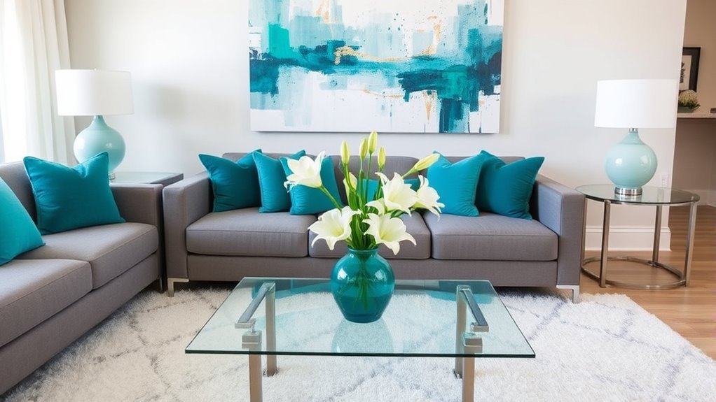
Your dominant color is the visual background of the room. It usually appears on the walls, large upholstery, large rugs, or built-ins. For most living rooms, this color works best when it is calm enough to live with every day: warm white, soft gray, greige, beige, taupe, cream, charcoal, muted green, deep blue, or another grounded shade.
The popular 60-30-10 guideline can help you balance the palette:
- 60% dominant color: walls, large sofa, area rug, or built-ins.
- 30% secondary color: accent chairs, curtains, coffee table, larger art, or a second upholstery tone.
- 10% accent color: pillows, throws, lamps, vases, books, trays, frames, flowers, or a small painted feature.
Use this as a starting point, not a decorating law. A minimalist room may use only two colors and lots of texture. A maximalist room may use several accents but repeat them carefully so the palette still feels connected.
Note: If your walls are already bold, treat the wall color as the dominant color and make your accents quieter. If your walls are neutral, your accent color can be stronger because it has more visual breathing room.
Choose a Secondary Color With the Color Wheel
A color wheel helps you see relationships between colors. Choosing the color opposite your dominant shade is one option, but complementary color is not the only approach. For a living room, these four palette types are useful starting points:
- Complementary: colors opposite each other, such as blue and orange or green and red. This produces strong contrast.
- Split-complementary: one base color plus the two colors beside its opposite. This keeps contrast while giving you more flexibility.
- Analogous: colors beside each other on the wheel, such as blue, blue-green, and green. This creates a more closely related palette.
- Monochromatic: several tints, tones, and shades of one color. Texture and differences in lightness or darkness keep the room from looking flat.
For example, if your living room is mostly warm beige, you could compare muted blue for contrast, olive green for an earthy direction, terracotta for added warmth, or chocolate brown for depth. The best choice depends on the mood you want and how the sample interacts with the colors already in the room.
Quick Accent Color Decision Guide
| Existing Room Cue | Accent Directions to Compare | What to Check |
|---|---|---|
| Warm beige, cream, or honey-toned wood | Muted blue, olive, terracotta, chocolate | Whether you want contrast or a warmer tonal look |
| Cool gray upholstery with black or chrome | Deep blue, sage, plum, muted rust | Whether the accent fights the gray undertone or gives it needed warmth |
| Deep blue or navy dominant color | Camel, cream, ochre, soft rust | How much warmth and contrast the room needs |
| White walls with light oak | Sage, dusty blue, soft clay, muted mustard | Whether the sample stays balanced beside both the wall and wood tone |
These combinations are starting directions, not fixed rules. Put real samples beside the sofa, flooring, rug, and wood finishes before deciding. A color that works in one beige or gray room may behave differently in another because the undertones and lighting are different.
Incorporating Accent Colors for Added Character
Accent colors work best when they appear in small, repeated moments. A single red pillow in an otherwise neutral room can look accidental. A red pillow, a small red detail in the artwork, and a red ceramic bowl on the coffee table create a clearer visual connection.
Try adding accent color through:
- Textiles: throw pillows, blankets, ottomans, curtains, lampshades, and rugs.
- Art and wall decor: framed prints, gallery walls, mirrors with colored frames, or sculptural wall pieces.
- Decorative objects: vases, trays, books, candles, bowls, and planters.
- Natural elements: flowers, branches, greenery, stone, wood, and woven baskets.
- Small painted features: inside a bookcase, a fireplace surround, side table, cabinet, or trim detail.
A strong accent color does not need to be everywhere. It needs to appear often enough that the eye understands it belongs.
Pro Tip: Try repeating your accent color at three different heights: one low item, such as a rug or ottoman; one mid-level item, such as pillows; and one high item, such as artwork or curtains. Treat this as a styling shortcut rather than a strict rule.
Recommended Products

QUALITY MATERIAL: The pillow cover is composed of a soft and comfy corduroy which is a kind of polyester fabric, features a cute and elegant boho stripe design. Our pillow covers are of good workmanship, they are tightly sewn without loose threads.

Velvet Fabric: Gold color with throw pillow covers is made of 280gsm thick premium velvet fabric - super soft and comfortable to use, durable long-lasting and fade-resistant shrink-resistant.The square pillow covers paired with gold chic solid color - suitable for spring, summer, autumn, and winter season, is luxury and minimalist - used for couch sofa decoration.

Material: Made of High quality durable linen blend, comfortable to touch and lay on. Quality fabric, hide your old pillow patterns perfectly. This material does not pilling or shedding, and holding up well after long time of use
Test Your Colors With Natural Light
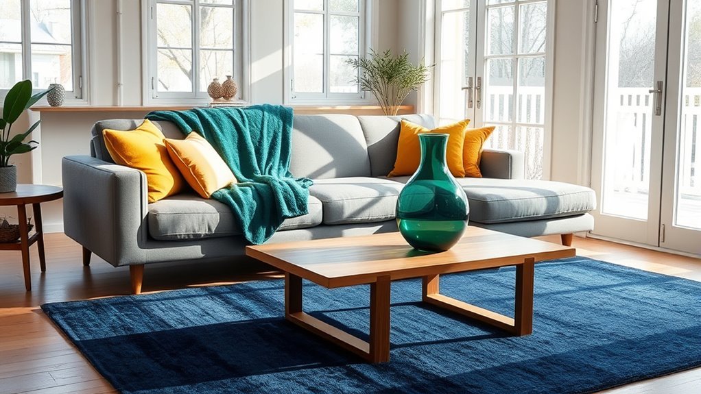
Accent colors can look different once they are in your home. Natural light, artificial light, shadows, flooring, furniture, and nearby colors can all change how a shade appears. Sherwin-Williams recommends testing paint swatches on the wall and viewing them at different times of day because color can shift between daylight and evening lighting.
Room orientation matters too. Sherwin-Williams notes that room direction and the amount of natural light affect how paint colors look throughout the day. That is another reason to test the exact sample in your own living room instead of relying only on a showroom chip or online photo.
Use this simple testing process:
- Gather samples: choose two or three versions of your accent color, such as rust, muted terracotta, and warm clay.
- Test near fixed items: place samples beside the sofa, rug, flooring, and wood tones.
- Check morning light: notice whether the color looks too dull, too bright, or too cool.
- Check midday light: compare how visible the undertones become.
- Check evening light: turn on your usual lamps and overhead lights.
- Photograph the room: use the photo as a second view of whether one accent is pulling too much attention from the rest of the palette.
Warning: If you test painted samples indoors, ventilate the room and follow the product label. The U.S. EPA lists paints, paint strippers, varnishes, waxes, and similar products among sources of volatile organic compounds and recommends increasing ventilation when using products that emit VOCs.
How to Balance Your Color Scheme for Cohesion
A cohesive living room is not created by matching everything. It comes from repeating related colors, checking undertones, balancing visual weight, and giving the eye enough quieter space to rest.
Match Undertones for Harmony
Undertones are the subtle warm or cool notes inside a color. A beige may lean pink, yellow, green, or gray. A white may lean warm and creamy or cool and blue. If your accent color clashes, the problem can be the undertone rather than the main color name itself.
Here is a simple way to check: place your accent sample beside a true white sheet of paper, then beside your sofa, rug, and flooring. Comparing the sample against several fixed surfaces makes its undertone easier to judge. If your room has warm woods and cream walls, compare warmer or earthier accents first. If it has cool gray upholstery and black metal finishes, compare cooler accents as well as one warmer option to see which creates the balance you prefer.
Use Neutrals for Balance
Neutrals keep accent colors from taking over every surface. If your accent is bold, use quieter materials around it: cream linen, warm white walls, natural oak, black frames, soft gray wool, jute, rattan, or stone. Texture adds depth without requiring another strong color.
A neutral-heavy room can still feel colorful if the accent is repeated with purpose. A beige living room with olive pillows, a green-gray vase, botanical art, and a moss-colored throw can feel layered without requiring several unrelated accent hues.
Consider Color Temperature Effects
On a traditional color wheel, reds, oranges, and yellows are grouped as warm colors, while blues, greens, and violets are generally grouped as cool colors. Better Homes & Gardens recommends considering both warm and cool relationships when building a room palette.
- Compare a warmer accent if a gray, white, black, or navy room feels visually cold.
- Compare a cooler accent if warm wood, tan leather, cream, or brass already dominates the room.
- Use black, white, wood, woven texture, and greenery as visual bridges when combining warm and cool elements.
Practical Tips for Accessorizing With Patterns and Textures
Patterns and textures make accent colors feel collected instead of flat. One practical approach is to vary pattern scale rather than using several prints with the same visual weight. Pair a larger pattern with a medium or smaller one while keeping at least one color in common.
For example, a navy-and-cream striped rug can work with a small floral pillow if both share navy. Add a solid rust pillow and a nubby cream throw, and the room gains contrast without every piece competing equally for attention.
Use these pattern and texture tips:
- Mix pattern scales: combine large, medium, and small-scale prints instead of several equally busy patterns.
- Repeat one color: connect patterns through at least one shared shade when possible.
- Break up busy areas: add solid pillows, plain curtains, or a neutral throw.
- Layer textures: velvet, linen, wool, rattan, wood, ceramic, leather, and metal can add depth without adding another strong hue.
- Limit strong accents: the more saturated or visually dominant the accent, the less surface area it may need.
Recommended Products
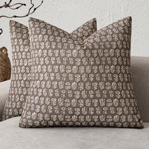
【Green Digital Printing】Our digital printing technology and organic cotton fabric make sure that the pillow covers are not only beautiful but also practical. With excellent color fixation, they resist fading to maintain a like-new quality for a long time. Additionally, they are gentle on the skin, ensuring comfort without causing any irritation.

Boho-Inspired Design: Featuring a unique bohemian pattern with intricate tufted details, this pillow cover brings a chic and artistic flair to any living space
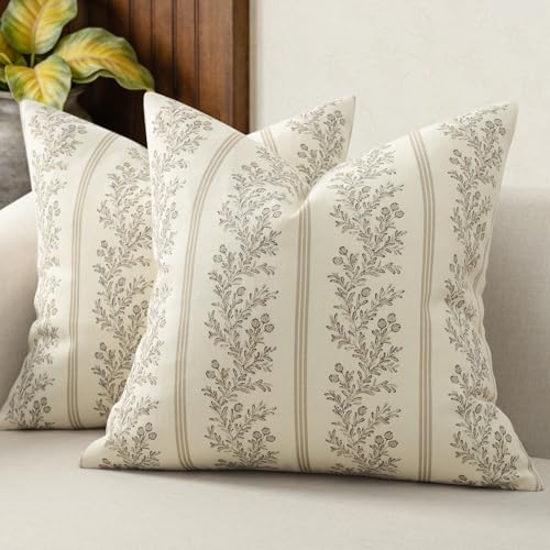
1.【Eco-Friendly Digital Printing】 Crafted with eco-conscious digital printing and soft organic cotton, these decorative pillow covers are as sustainable as they are stunning. Thanks to excellent color fastness, the vibrant patterns resist fading and stay fresh-looking even after many washes. Gentle on the skin and free from irritation — perfect for everyday comfort.
Common Accent Color Mistakes to Avoid
Accent colors are small, but they can still throw off the room if they are chosen without considering the rest of the palette. Avoid these common mistakes:
- Using too many unrelated accent colors: start with one main accent and add a smaller supporting accent only when it helps the overall palette.
- Matching every item exactly: use related shades instead of insisting on identical colors. Rust, terracotta, and clay can create more variation than repeating one exact orange.
- Ignoring undertones: compare the accent directly against walls, upholstery, flooring, and wood finishes.
- Buying tiny accents only: if a small object disappears visually, try one medium accent such as pillows, a throw, art, or curtains.
- Skipping the light test: a color seen online or in a store can look different under your room’s daylight and artificial lighting.
- Forgetting the floor: flooring occupies substantial visual space and should be treated as part of the palette.
Accent Color Ideas by Living Room Style
If you are not sure where to start, these combinations can give you a direction to test against your actual furnishings:
- Modern neutral: black, camel, rust, olive, or deep burgundy.
- Scandinavian: sage, dusty blue, warm tan, soft clay, or muted mustard.
- Coastal: sea glass green, denim blue, sandy beige, navy, or a restrained coral accent.
- Traditional: oxblood, navy, forest green, gold, plum, or warm chocolate.
- Organic modern: terracotta, moss green, charcoal, oatmeal, walnut, or stone gray.
- Maximalist: jewel-tone directions such as emerald, sapphire, ruby, amethyst, or peacock blue, grounded by repeated colors and quieter connecting elements.
For more color-wheel examples, Better Homes & Gardens explains palette types including monochromatic, analogous, complementary, split-complementary, and triadic schemes.
Recommended Products

Material & Package: 2 pcs pillow covers made of premium corduroy (NO INSERT). Suitable for indoors. Please Note: Hidden zipper is well disguised and stitched in across one side

Package & Size: Package includes 2 brand new square pillow covers, each 18x18 inches (45x45cm). Pillow inserts are not included. The go-to standard for effortless styling—fits most sofa cushions, bed shams, and dining chairs for instant room refresh

Package & Size: Package includes 2 brand new square pillow covers, each 18x18 inches (45x45cm). Please allow a 1–2 cm deviation due to handmade sewing. Pillow inserts are not included. The go-to standard for effortless styling—fits most sofa cushions, bed shams, and dining chairs for instant room refresh.
Related Guides
Frequently Asked Questions
What is the 3-5-7 rule of decorating?
The 3-5-7 rule is an extension of the rule of odd numbers. It suggests arranging decorative objects in groups of three, five, or seven because odd-numbered groupings often feel less rigid and more naturally composed. It is especially useful for shelves, coffee tables, mantels, and other styled surfaces. Ideal Home describes it as a flexible styling guideline rather than a rule that must be followed exactly.
What are the rules for using accent colors?
Start with the colors already in the room, choose one main accent, repeat it in separated places, compare undertones, test it under your actual lighting, and balance strong color with quieter surfaces. Use the 60-30-10 rule as a starting framework rather than an exact formula.
What is the 70-20-10 rule in decorating?
The 70-20-10 color rule is a variation of the better-known 60-30-10 approach. It generally gives about 70% of the palette to a dominant color, 20% to a secondary color, and 10% to an accent. The larger dominant share can suit rooms where you want the background color to have more visual control.
What is the 3-4-5 rule in decorating?
One published version of the 3-4-5 decorating method uses three patterns, four period or design styles, and five colors or textures. It is a flexible styling framework rather than a universal interior-design standard. Apartment Therapy documents this version of the method.
How many accent colors should a living room have?
One main accent color is the easiest place to start. You can add a smaller supporting accent when it clearly connects to the dominant and secondary colors. Larger or more maximalist rooms can handle additional hues, but the palette should still repeat enough colors to look deliberate.
Should an accent wall match the pillows?
It does not need to match exactly. A more flexible approach is to repeat the same color family or a related tone. For example, a deep blue wall can connect with denim pillows, navy artwork, and a lighter blue ceramic object without every item being the identical shade.
What accent colors work with a beige living room?
Beige can work with several directions. Compare muted blue for contrast, olive or moss for an earthy palette, terracotta or clay for additional warmth, and chocolate brown for depth. The undertone of the beige matters, so test the accent beside the wall, flooring, sofa, and wood finishes before committing.
How do I choose an accent color for a gray sofa?
First determine whether the gray sofa leans warm, cool, blue, green, or brown. Then compare several real samples beside the upholstery. Deep blue, sage, plum, muted rust, cream, or warm wood tones can all be worth testing, but the best choice depends on the sofa’s undertone, the floor, wall color, and lighting.
Conclusion
Incorporating accent colors in a living room is less about following a rigid decorating formula and more about making the colors already in the room work together. Start with fixed finishes, choose a dominant and supporting color, then introduce one main accent through a few repeated elements. Check undertones and test every serious option in the room’s real daylight and evening lighting. As a next step, photograph your living room, identify the colors you cannot change, and compare two or three accent samples against those fixed elements before buying anything.
Sources
- Sherwin-Williams: How to Choose Paint Colors — supports guidance on using existing finishes and testing swatches in different lighting conditions.
- Sherwin-Williams: Choosing Color Based on Room Orientation — supports guidance about room direction and natural light affecting color appearance.
- U.S. EPA: Volatile Organic Compounds’ Impact on Indoor Air Quality — supports the ventilation warning for paint samples and VOC-emitting products.
- Architectural Digest: Color Wheel for Interior Design — supports color-wheel terminology and complementary, split-complementary, analogous, monochromatic, and related palette guidance.
- Better Homes & Gardens: How to Use the Color Wheel — supports practical room-palette concepts, color-scheme terminology, and warm/cool color relationships.
- Ideal Home: 3-5-7 Home Styling Rule — supports the corrected explanation of arranging decor in odd-numbered groups.
- Apartment Therapy: 3-4-5 Rule for Decorating a Living Room — supports the corrected description of one published 3-4-5 decorating method.
- Livingetc: 70-20-10 Color Rule — supports the 70% dominant, 20% secondary, and 10% accent variation.