Color undertones in paint and fabric are the quiet hints of warmth or coolness beneath the main color you see first. A beige can lean yellow, pink, green, or gray. A white can feel creamy, crisp, or icy. Once you know how to spot those hidden tones, it becomes much easier to choose wall colors, upholstery, curtains, rugs, and bedding that feel intentional instead of mismatched.
Quick Answer
Undertones are the subtle warm, cool, or neutral hues beneath a paint or fabric’s surface color. To identify them, compare samples beside pure white, fixed finishes, and each other in the room’s real lighting. Matching undertone families usually creates harmony; mixing them intentionally creates contrast.
Key Takeaways
- The surface color is what you notice first; the undertone is the hidden cast that makes a color feel warm, cool, muddy, creamy, crisp, or soft.
- Warm undertones often include yellow, red, orange, peach, or pink. Cool undertones often include blue, green, violet, or gray.
- Paint and fabric should be tested together because upholstery, rugs, flooring, and window light can pull out undertones you did not notice in the store.
- Lighting matters: bulb color temperature, daylight direction, shadows, and color rendering can all change how a color appears.
- The safest method is to compare large samples in the actual room at morning, midday, evening, and nighttime.
At a Glance
| Time Required | 1–3 days of observing samples in changing light |
| Difficulty | Easy; the key is comparing, not guessing |
| Tools Needed | Paint swatches or sample pots, fabric samples, white paper, tape, and your existing flooring or finish samples |
| Cost | Usually low; sample pots and fabric swatches cost far less than repainting or reupholstering |
Understanding Color Undertones in Paint and Fabric
When you start exploring paint and fabric, color is not only about the main shade on the label. It is also about the subtle undertone underneath. That undertone is why one beige looks buttery, another looks pink, and another suddenly turns gray-green beside your sofa.
In simple terms, the mass tone is the color you see first: beige, white, gray, blue, green, or cream. The undertone is the quieter color bias beneath it. Warm undertones often include yellow, orange, red, peach, or pink. Cool undertones often include blue, green, violet, or cool gray.
Understanding these undertones helps you create design harmony. A warm cream sofa may look beautiful with a warm greige wall, but it can look dingy beside a cool blue-gray paint. A cool linen curtain may feel fresh beside a crisp white, but slightly flat beside a yellow-based wall color.
Lighting also changes what you see. The U.S. Department of Energy explains that warm light is generally lower on the Kelvin scale, while cooler light is higher; color rendition also affects how accurately a light source reveals color. That means the same paint chip can look soft in daylight, creamy under a warm bulb, and sharper under a cooler bulb.
Warm vs. Cool Undertones: Quick Reference
Use this table as a starting point when comparing paint chips, fabric swatches, rugs, flooring, and tile. Many colors are complex, so always confirm the undertone in your own room.
| Undertone Type | Common Hidden Hues | Often Feels Like | Works Well With |
| Warm | Yellow, cream, red, orange, peach, pink | Cozy, soft, sunny, inviting | Wood tones, brass, warm stone, cream fabrics, camel, terracotta, warm whites |
| Cool | Blue, green, violet, slate, cool gray | Calm, crisp, airy, refined | Chrome, marble, cool whites, blue fabrics, green-gray textiles, black accents |
| Balanced or Neutral | A mix of warm and cool, often beige-gray or soft off-white | Flexible, quiet, layered | Mixed metals, natural textures, transitional palettes, rooms with both warm and cool finishes |
How to Identify Warm and Cool Undertones
Undertones are easiest to see through comparison. Looking at one swatch alone can trick your eye, especially with whites, beiges, grays, and muted fabrics.
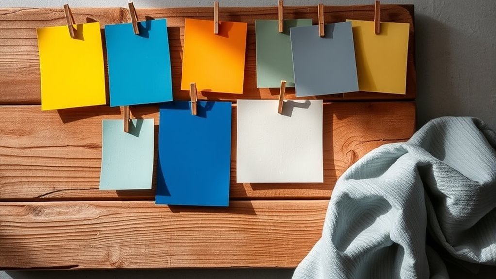
- Place the sample beside pure white paper. If the color suddenly looks yellow, pink, green, blue, or violet, you have found the undertone.
- Compare similar colors side by side. Put three beige, gray, or white samples together. The warmest and coolest options will usually reveal themselves quickly.
- Check the darkest shade on the paint strip. Paint strips often share a formula family, and the deeper color can make the undertone easier to spot.
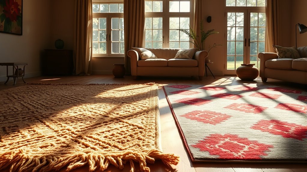
- Hold paint next to fabric. Place wall-color samples beside upholstery, curtains, rugs, bedding, or throw pillows. The goal is not always an exact match; it is a relationship that feels intentional.
- Compare against fixed finishes. Flooring, countertops, tile, brick, stone, cabinetry, and wood trim matter more than small accessories because they are harder to change.
- Look at the samples upright. Paint reads differently when it is flat on a table than when it is vertical on a wall.
Pro Tip: If two colors seem close, squint at them beside your largest fixed finish, such as flooring or a sofa. Squinting reduces detail and makes undertone clashes easier to notice.
How Lighting Affects Your Color Choices
Lighting can make undertones appear stronger, softer, warmer, cooler, cleaner, or muddier. Before committing to paint or fabric, test samples in the exact room where they will be used.
Natural Light Variations
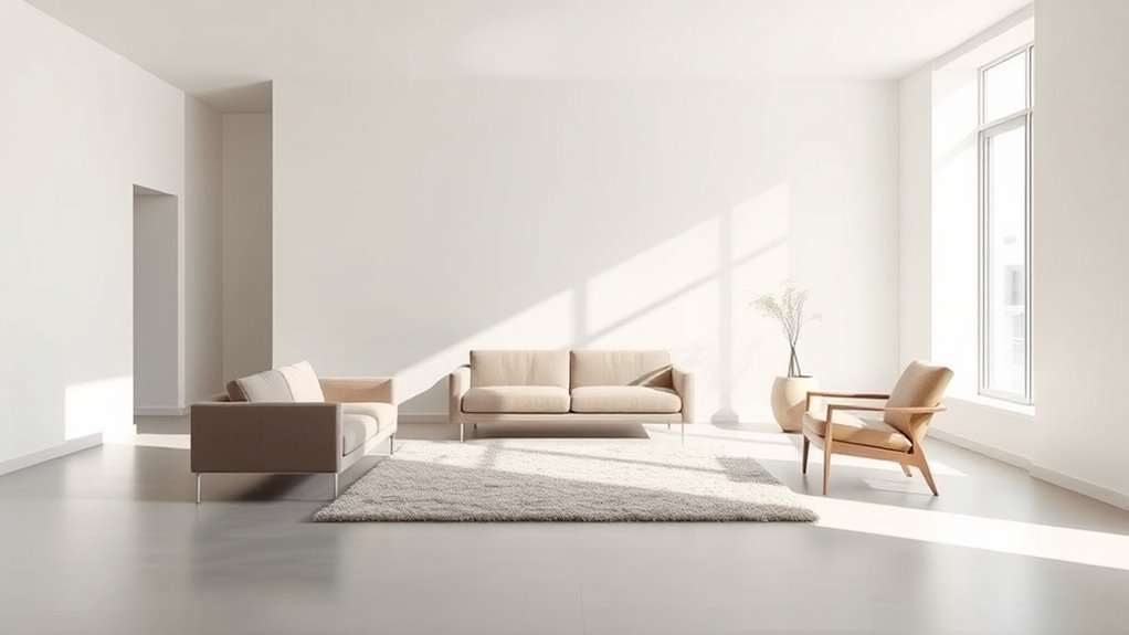
Natural light changes throughout the day. Morning light, midday light, cloudy light, and evening light can all shift the same color. Room direction matters too. A north-facing room often feels cooler and dimmer, while a south-facing room may bring out warmth. East-facing rooms can look brighter in the morning, and west-facing rooms may glow later in the day.
Instead of relying on a single rule, observe your samples at several times:
- Morning: check whether whites or grays look too cold or too yellow.
- Midday: look for washed-out color or undertones that disappear in bright light.
- Evening: watch for beige turning pink, gray turning blue, or cream turning too yellow.
- Night: test under the bulbs you actually use.
Artificial Light Impact
Artificial lighting is one of the most common reasons a paint color looks different at home than it did in the store. Bulbs are described partly by color temperature, measured in Kelvin. Lower Kelvin light, such as many warm-white bulbs, can make yellow, cream, red, and peach undertones stronger. Higher Kelvin light can make blue, green, violet, and gray undertones feel more noticeable.
Color rendering also matters. A bulb with poor color rendition can make fabrics, paint, skin tones, and artwork look dull or slightly off. For rooms where color accuracy matters, such as dressing areas, creative studios, kitchens, and rooms with layered textiles, choose bulbs with good color rendering and keep bulb temperature consistent across nearby fixtures.
Consistency in Lighting Temperature
A room can feel visually messy when one lamp uses a warm bulb and another uses a cool bulb. The wall color may look creamy in one corner and gray in another. Choose one lighting temperature family for the room, then test paint and fabric under that condition.
Note: Do not judge paint only under store lighting. Home-center lighting is rarely the same as your living room, bedroom, kitchen, or hallway lighting.
How to Match Paint Undertones With Fabric, Flooring, and Decor
Paint does not live alone. It reflects against everything around it. Fabric, flooring, rugs, curtains, wood, metal, stone, and art can all pull undertones forward.
Start With Fixed Elements
Begin with the items you are least likely to replace: floors, cabinetry, tile, countertops, fireplace stone, large rugs, and major upholstered pieces. If your oak floor has golden undertones, a cool blue-gray wall may feel sharper than expected. If your marble has cool gray veining, a yellow cream wall may look too buttery.
Use Fabric as the Bridge
Fabric can connect warm and cool tones when it contains both. For example, a patterned rug with cream, taupe, slate blue, and olive can help a warm wall color work with cooler furniture. A curtain fabric with beige and gray can soften the transition between warm wood floors and cool white walls.
Balance Does Not Always Mean Matching
You do not have to match every undertone exactly. A room can mix warm and cool tones beautifully when one temperature leads and the other appears as an accent. The key is intention. A warm neutral room with small touches of blue can feel layered. A cool gray room with brass, wood, and cream textiles can feel warmer and more livable.
Essential Tips for Selecting Paint Colors That Complement Undertones
Choosing paint colors that harmonize with existing undertones can transform a room from almost-right to polished. Use a process instead of relying on memory or a tiny chip.
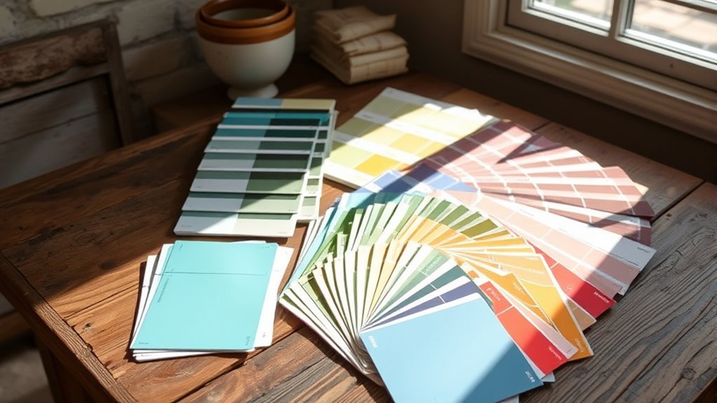
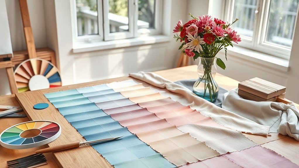
- Make a sample board. Place your paint swatches, fabric samples, rug sample, flooring sample, and metal finishes together.
- Use large paint samples. A tiny chip is not enough. Paint a sample board or a generous wall patch so the color can show its real character.
- Move the sample around. Test it on different walls, near windows, in corners, and beside trim.
- Check it for at least one full day. Better yet, observe it over two or three days so you see sun, shade, cloudy light, and nighttime lighting.
- Compare neutrals carefully. Whites, beiges, taupes, and grays are often where undertone mistakes show up the most.
- Think about mood and function. A cozy den may welcome warm undertones, while a bathroom, bedroom, or office may benefit from cooler or more balanced tones.
The best paint color is not the one that looks perfect on a chip. It is the one that still looks right beside your fabric, flooring, furniture, and lighting.
Avoid These Common Mistakes When Selecting Undertones
Selecting paint colors can be exciting, but undertone mistakes are common. Avoid these before you buy gallons of paint or yards of fabric.
- Choosing colors in isolation: A wall color that looks beautiful alone may clash beside your sofa, curtains, or floors.
- Ignoring the room’s lighting: Natural and artificial light can reveal undertones that were hidden in the store.
- Assuming all whites are neutral: White paint may lean blue, yellow, pink, gray, green, or violet.
- Mixing too many undertones: Cream walls, pink-beige carpet, blue-gray sofa fabric, and yellow lighting can fight each other.
- Forgetting texture and sheen: Velvet, linen, boucle, matte paint, satin paint, and gloss trim all reflect light differently.
- Copying a color from a photo: Online images are affected by editing, camera settings, screen brightness, and lighting.
Warning: Never choose paint from a phone image alone. Screens can distort color temperature, brightness, and saturation, so a shade that looks balanced online may look yellow, blue, or muddy in your room.
Examples of Color Undertones and Their Influence on Interior Design
Examples make undertones easier to understand. Use these as a guide when comparing samples in your own home.
- Warm beige with yellow undertones: Works well with honey oak, brass, cream upholstery, warm white trim, and earthy textiles. It may look too yellow beside cool marble or blue-gray fabric.
- Pink beige: Can feel soft and flattering with blush, taupe, warm woods, and aged brass. It may clash with yellow-beige flooring or green-gray walls.
- Green-gray: Often feels grounded and natural with wood, stone, linen, and black accents. It may look dull beside very warm orange-toned wood unless balanced with fabric.
- Blue-gray: Can feel calm and refined in bedrooms, bathrooms, and offices. It may turn chilly in low-light rooms without warm textiles or wood accents.
- Creamy white: Adds softness to living rooms and bedrooms. It may appear yellow under warm bulbs or beside cool white trim.
- Crisp cool white: Looks clean with marble, chrome, black, and cool-toned fabrics. It may feel stark beside warm flooring or beige upholstery.
- Warm fabric on cool walls: A camel sofa can add depth to a cool gray room if repeated through wood, art, or brass.
- Cool fabric on warm walls: Blue linen curtains can freshen a warm neutral room when the palette also includes balanced whites or natural textures.
Troubleshooting Common Undertone Problems
Why Does My Beige Look Pink?
Your beige likely has a red or pink undertone, or it is sitting beside a yellow, green, or gray element that makes the pink cast more obvious. Compare it with a yellow beige and a gray beige to confirm.
Why Does My Gray Look Blue?
Many grays have blue, green, or violet undertones. Cool daylight, cool bulbs, white trim, and blue fabrics can make that blue cast stronger. Try a warmer greige or add warm textiles and wood tones.
Why Does My White Look Yellow?
The white may have a creamy or yellow undertone, or your bulbs may be very warm. Compare it to a clean white paper and test it under a different bulb temperature before repainting.
Why Do My Fabrics Clash With the Wall Color?
The fabric and wall may have different undertone families. A cool gray sofa can clash with a pink-beige wall, while a cream sofa can look dingy against a sharp blue-white wall. Add a rug, pillow, or patterned fabric that contains both tones, or shift the wall color to a more balanced neutral.
Frequently Asked Questions
How do you know the undertone of a paint color?
Compare the paint color beside pure white paper, similar paint chips, and the fixed finishes in your room. If it suddenly looks yellow, pink, green, blue, violet, or gray, that hidden cast is the undertone. Always check the sample in natural and artificial light.
How do I know my color undertone?
For interiors, look at the colors you already own and like. If your furniture, flooring, and fabrics lean cream, camel, terracotta, brass, or warm wood, you may prefer warm undertones. If they lean slate, blue, green, silver, marble, or crisp white, cool undertones may feel more natural.
What do cool undertones mean in paint?
Cool undertones mean the paint has a subtle blue, green, violet, or cool-gray cast beneath the main color. Cool undertones can make a room feel crisp, calm, airy, or refined, but they may feel chilly in a dim room unless balanced with warm texture, wood, or soft lighting.
How can you tell if a color is warm or cool toned?
Place the color beside a true white and then beside similar colors. Warm colors usually reveal yellow, red, orange, peach, or pink. Cool colors usually reveal blue, green, violet, or gray. If it changes dramatically beside other samples, you are seeing the undertone at work.
Should paint and fabric undertones match exactly?
They do not need to match exactly, but they should relate. Matching undertone families creates a calm, cohesive look. Mixing warm and cool undertones can also work when you repeat each tone more than once and use a bridging fabric, rug, artwork, or wood finish.
Why does a paint color look different after I bring it home?
Paint looks different at home because the lighting, wall size, surrounding colors, flooring, and furniture are different from the store. A small chip also cannot show the full effect of a color across a large wall. That is why large samples and real-room testing are essential.
Conclusion
Color undertones are small details with a big effect. They shape how paint and fabric look beside your floors, furniture, lighting, and decor. Before choosing a wall color or textile, compare samples side by side, test them in the actual room, and observe them throughout the day. When the undertones work together, the whole space feels calmer, cleaner, and more intentional.
Sources
- U.S. Department of Energy — Lighting Principles and Terms — supports Kelvin color temperature, warm/cool lighting, CRI, and color rendition guidance.
- PLOS ONE — Effect of Illumination on Perceived Temperature — supports the idea that lighting and color can influence perceived warmth and coolness.
- Better Homes & Gardens — How to Use Color Swatches to Pick Paint Colors — supports large sample testing, checking colors in the home, and observing them in different lighting.
- Architectural Digest — Complete Guide to Choosing Neutral Paint Colors — supports undertone comparison, daylight testing, and coordinating paint with room finishes.
- Architectural Digest — Color Wheel for Interior Design — supports warm/cool color basics and color harmony concepts.