To choose a cohesive color palette for your living room, start by defining the mood you want—calm, cozy, or sophisticated. Select a dominant color, then add one or two supporting hues and a neutral for balance. Consider lighting’s effects on color perception, and try the 60-30-10 rule for distribution. Incorporate various textures to enhance depth, and test swatches on your walls under different lighting. Discover more tips to perfect your living space by continuing this journey.
Define Your Desired Mood and Atmosphere for Color Selection
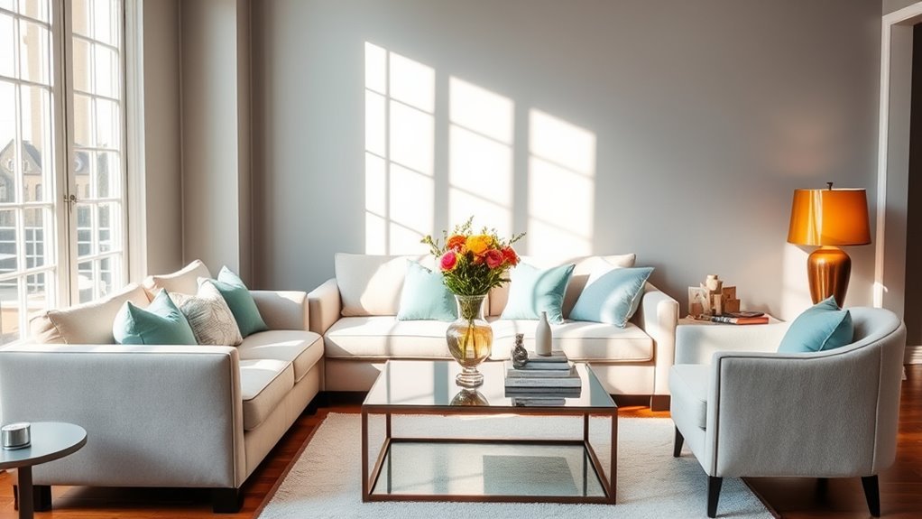
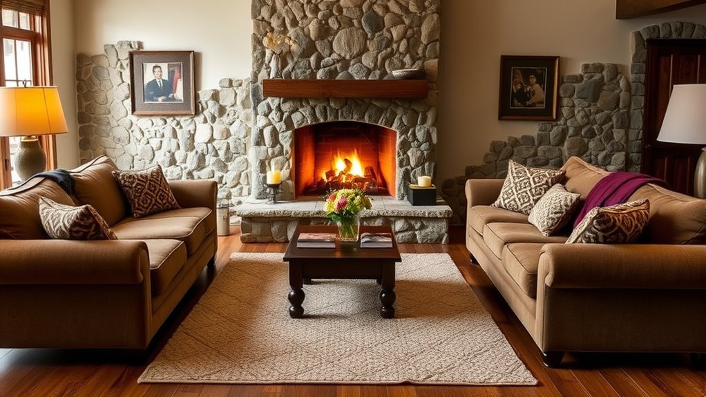
Creating the perfect atmosphere in your living room starts with defining the mood you want to evoke. Whether you crave calm, coziness, or sophistication, this initial step guides your color palette choices. Warm colors can wrap you in comfort, while cool tones promote tranquility. Narrowing down options based on your desired mood creates a cohesive foundation for color selection, ensuring that every hue complements rather than clashes. This clarity extends beyond walls; it influences your furnishings and decor, allowing you to craft a unified look that resonates with your spirit. Embrace the power of color to transform your space, reflecting your personal style and liberating your living environment from the ordinary. Choose wisely, and watch your vision come to life.
Choose Your Core Colors for a Cohesive Color Palette
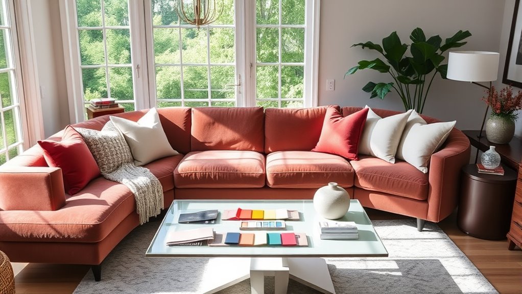
With your desired mood firmly established, it’s time to select your core colors for a cohesive palette. Start by choosing a dominant color that sets the overall tone of your living room, perhaps inspired by a cherished rug or piece of art. Add one or two supporting colors to enhance visual interest and create depth, ensuring they harmonize well with your dominant hue. A neutral color grounds the space, providing balance and allowing vibrant colors to shine. Consider the natural light in the room; cooler tones suit north-facing spaces, while warmer shades thrive in south-facing areas. Employ the 60-30-10 rule for distribution: 60% dominant, 30% supporting, and 10% accent colors for a beautifully cohesive color palette.
Use Neutrals and Textures to Enhance Color Cohesion
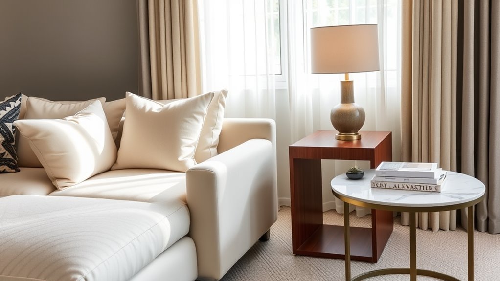
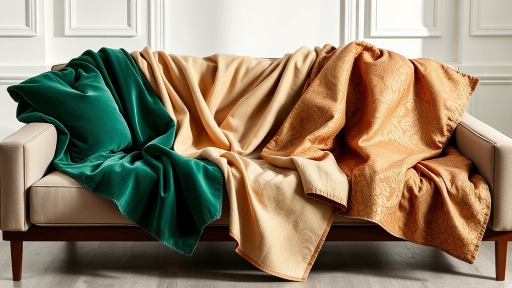
While you might be drawn to vibrant colors, incorporating neutrals and textures can elevate your living room’s design by providing a sophisticated backdrop. Soft grays and warm beiges form a grounding foundation, allowing your accent colors to shine without overwhelming the space. By mixing various materials like wood, metal, and textiles in neutral tones, you create a cohesive flow that unifies your design while adding visual interest. Textures enhance depth, fostering a cozy atmosphere perfect for relaxation. Additionally, using neutrals offers flexibility for seasonal decor changes, enabling you to refresh your space effortlessly. Embrace these elements to craft a living room that’s not just stylish, but also inviting and harmonious—your sanctuary of liberation.
How Does Lighting Affect Your Color Choices?
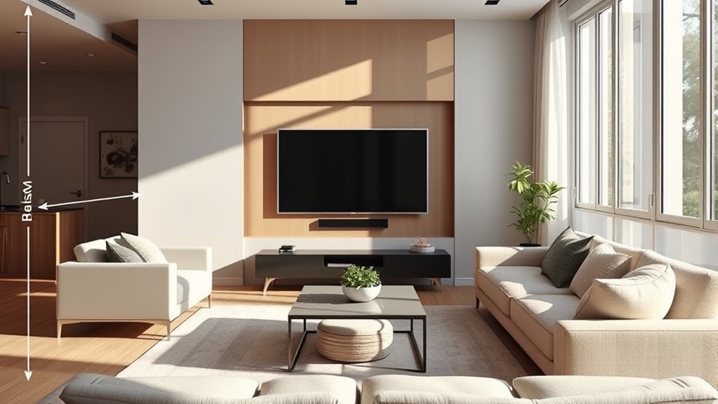
How can the lighting in your living room transform your color choices? Understanding lighting conditions is essential for achieving a cohesive color palette. Natural light, with its shifting angles throughout the day, enhances or dulls colors, altering your perception of paint color. South-facing rooms amplify warm tones, while north-facing ones lean towards cooler shades. Artificial lighting, like warm or cool LEDs, also impacts how colors appear, so it’s wise to test your choices under varied conditions.
| Lighting Type | Effect on Colors | Room Feel |
|---|---|---|
| Natural Light | Brightens and saturates | Inviting and warm |
| Artificial Lighting | Alters warmth/coolness | Cozy or sterile |
| Direct Sunlight | Fades colors over time | Energizing or harsh |
Use the 60-30-10 Rule for Color Balance
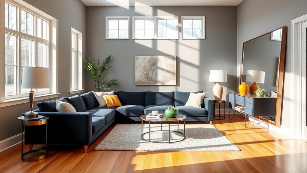
To achieve a beautifully balanced living room, embrace the 60-30-10 rule for color distribution. This method allows you to select a dominant color that sets the tone, a secondary hue that complements, and an accent shade that adds a pop of interest. By carefully choosing these colors, you’ll enhance visual appeal and create a harmonious atmosphere that invites relaxation and creativity.
Understanding Color Distribution
When you’re selecting colors for your living room, applying the 60-30-10 rule can transform your space into a harmonious retreat. This strategic approach to color distribution guarantees a cohesive color palette that captivates. Here’s how it works:
- 60% Dominant Color: Use this for your walls and larger furniture to establish a solid foundation.
- 30% Secondary Color: Incorporate different shades in smaller furniture or textiles to add depth.
- 10% Accent Color: Use this for decorative items, infusing visual interest without overwhelming the design.
- Adjust as Needed: Personal preferences and lighting can guide slight changes, but the core proportions are essential for balance.
Embrace this method, and watch your living room flourish with beauty and unity.
Selecting Primary and Accent Colors
Selecting the right primary and accent colors can elevate your living room’s aesthetic, creating a space that feels both inviting and stylish. Start by choosing a neutral primary color for your walls and large furniture, covering 60% of the space, which will be the foundation of your cohesive home. Next, select a secondary color for upholstery and decor, making up 30% of your color palette. To add visual interest, choose accent colors from the same family as your primary and secondary hues, accounting for the final 10%. This 60-30-10 rule guarantees harmony between warm and cool tones. Regularly reassess your color distribution to maintain balance, allowing your living room to breathe and inspire.
Enhancing Visual Interest Effectively
While balancing colors in your living room, applying the 60-30-10 rule not only enhances visual interest but also creates a sense of harmony. This strategic approach guarantees your space feels cohesive and inviting. Here’s how to effectively implement it:
- 60% Dominant Hue: Choose a soothing color for walls or large furniture, creating a cohesive backdrop.
- 30% Secondary Color: Use this for upholstery or larger decor items, adding depth and contrast.
- 10% Accent Colors: Introduce these through small decor items like throw pillows or artwork to inject personality.
- Flexibility for Seasons: Easily swap out accent colors to refresh your space without disrupting the overall color palette.
Test and Refine Your Color Palette in Real Life
Testing and refining your color palette in real life is essential for creating a harmonious living space that truly reflects your style. Start by applying paint swatches to your living room walls, observing how they interact with your existing furniture and lighting. Evaluate these colors at various times throughout the day to see how natural light alters their mood and ambiance. Create a small mock-up using fabric swatches and decor items to visualize the harmony before finalizing your choices. Remember the 60-30-10 rule for distributing colors across your space. Regularly refine your selections based on how they feel, allowing adjustments to enhance the overall flow and guarantee your living room becomes a liberated expression of you.
Frequently Asked Questions
What Are Some Common Color Combinations That Work Well Together?
You’ll love combining neutral tones with warm hues or cool shades. Try monochromatic schemes, contrasting colors, or nature-inspired palettes. Pastel combinations and vibrant accents alongside earth tones create classic pairings that liberate your living space beautifully.
How Can I Incorporate Bold Colors Without Overwhelming the Space?
You can incorporate bold accents by strategically selecting statement pieces and patterned textiles. Balance color with accessory selection, artwork integration, and thoughtful furniture arrangement. Use lighting effects to enhance wall decor and embrace color psychology for liberation.
What Role Do Seasonal Changes Play in Color Selection?
Seasonal changes inspire your color selection, reflecting nature’s mood and light variations. Embrace trending hues that resonate with your personal style, utilizing color psychology and symbolism to evoke emotional impact while harmonizing with climate influences.
Should I Consider Furniture Color When Choosing My Palette?
Absolutely consider furniture upholstery when choosing your palette. Balance neutral tones with vibrant accent furniture, explore fabric patterns, and incorporate metallic finishes. This creates color harmony, enhancing room size and lighting effects to reflect your personal style.
How Can I Refresh My Color Palette Without Repainting?
You can refresh your color palette by swapping accent pillows, adding vibrant area rugs, selecting striking artwork, updating window treatments, and incorporating colorful plants. Play with fabric textures and lighting fixtures to ignite your space’s energy.
Conclusion
By carefully selecting your living room’s color palette, you can transform the space into a harmonious haven. Did you know that 90% of people feel more relaxed in rooms with a well-coordinated color scheme? With your core colors in mind, and by incorporating neutrals and textures, you’ll create an inviting atmosphere. Remember to test your choices in different lighting to guarantee they shine. Embrace the art of color, and watch your living room come alive in breathtaking unity.