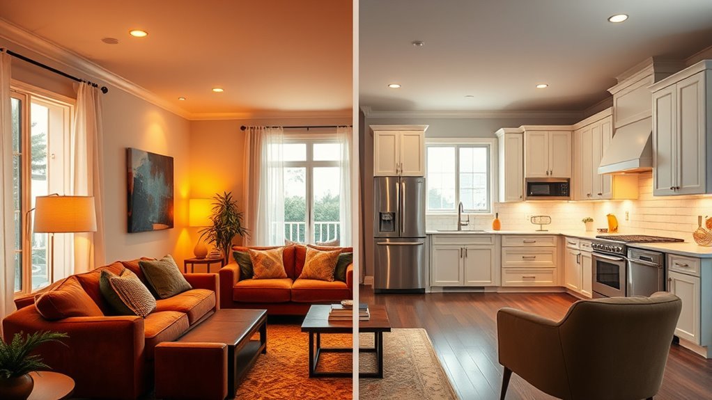
A neutral color palette in living room design involves shades like beige, gray, and cream, creating a versatile backdrop for your decor. These hues enhance space perception and provide endless styling options. Warm neutrals bring coziness while cool tones promote calmness. To elevate your design, layer textures and incorporate accent colors that harmonize with your palette. This approach keeps your living room fresh and inviting. Continue exploring how to maximize your neutral scheme for an even more cohesive look.
Understanding Neutral Color Palettes in Living Room Design
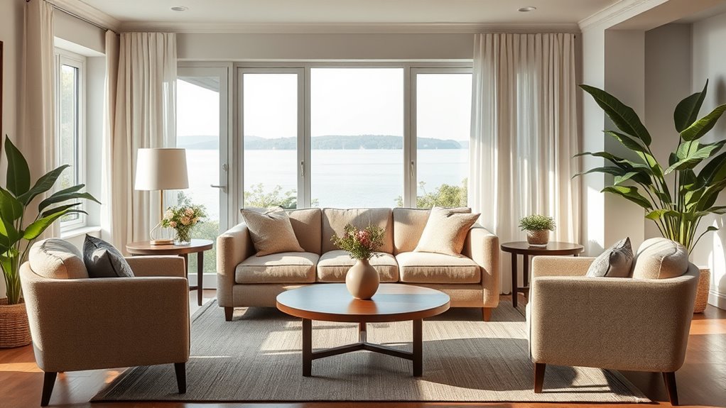
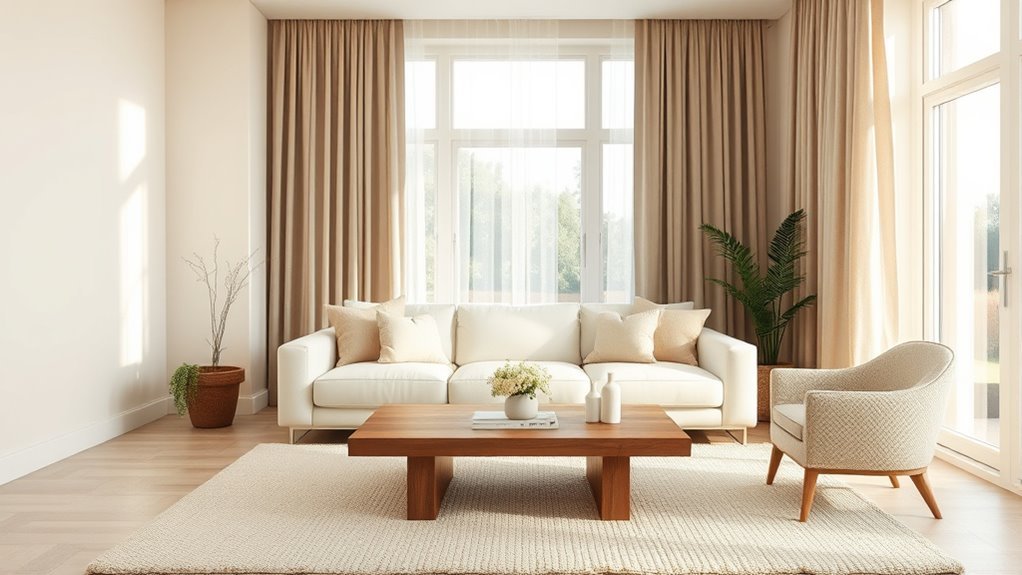
When you choose a neutral color palette for your living room, you’re selecting a foundation that enhances both the space and your decor. Neutral shades like beige, gray, cream, and taupe create versatile backdrops, allowing your furniture and accents to shine. True neutrals, such as black, white, and gray, provide a timeless elegance, while near-neutrals introduce subtle undertones for added depth. Mixing these shades with varied textures—think wood, stone, and textiles—prevents a flat look and enriches your interior design. Additionally, the interplay of natural and artificial lighting can dramatically shift the perception of your chosen colors, ensuring your living room remains inviting and serene, regardless of the style you prefer.
Why Use Neutral Colors in Your Living Room?
Using neutral colors in your living room opens up a world of versatile design opportunities, allowing you to easily blend various decor styles and personal touches. These shades create a calming atmosphere that encourages relaxation, making your space perfect for family gatherings or quiet evenings. Additionally, a neutral palette enhances the perception of space and light, transforming even the coziest rooms into inviting retreats.
Versatile Design Opportunities
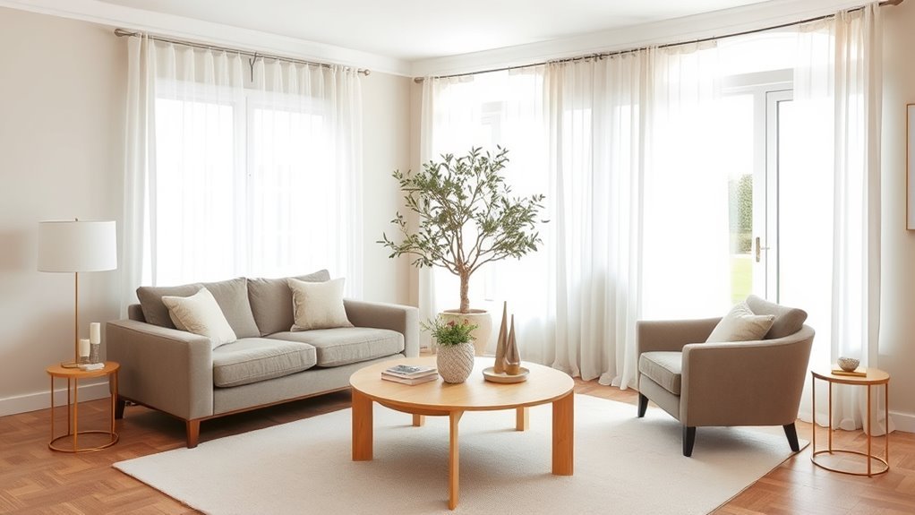
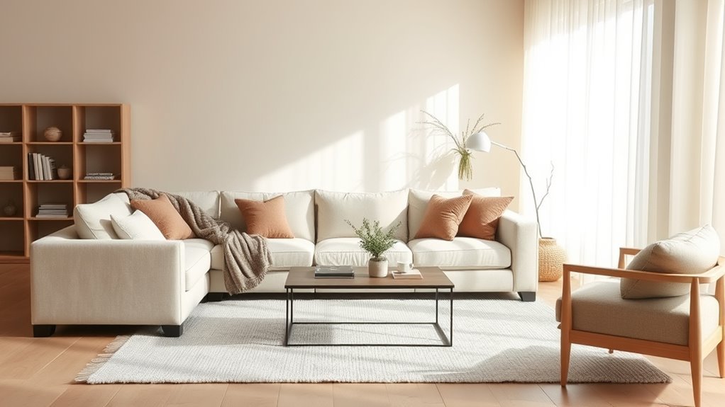
A neutral color palette offers countless design opportunities for your living room, creating a versatile backdrop that adapts seamlessly to various styles and personal tastes. By choosing warm neutrals, you can foster an inviting atmosphere that encourages relaxation and socializing. To add interest and depth, incorporate multiple textures through fabrics and materials, ensuring your space feels dynamic rather than flat. A neutral palette also allows bold accent colors and unique furniture pieces to shine, achieving a sophisticated and cohesive look. As trends come and go, a neutral scheme remains timeless, ensuring your living room continues to look fresh and appealing. Embrace the freedom that a neutral palette provides, giving you the flexibility to express your unique style.
Calming Atmosphere Creation
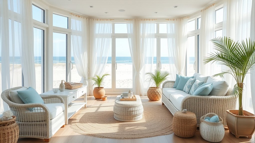
Creating a calming atmosphere in your living room is one of the most appealing benefits of a neutral color palette. By choosing soft, muted shades, you promote relaxation and serenity, making your space a welcome retreat. Warm neutrals like beige and taupe create a cozy vibe, while cool shades such as gray and white offer a fresh, modern touch. These neutral colors serve as a versatile backdrop, allowing decorative elements to shine without overwhelming the senses, which fosters a balanced ambiance. To add depth, incorporate varied textures—think wood, stone, and soft textiles. Finally, consider how natural light interacts with your chosen hues, ensuring the tranquility of your living room is maintained throughout the day.
What Are the Key Elements of a Neutral Color Palette?
When exploring a neutral color palette, you’ll find it offers versatile color combinations that can harmonize with various decor styles. Subtle undertones play an essential role, enhancing the overall aesthetic without overpowering the space. Additionally, layering textures with materials like wood and textiles elevates the design, creating depth and visual interest in your living room.
Versatile Color Combinations
Neutral color palettes offer a sophisticated backdrop that seamlessly blends with various decor styles, allowing for versatile color combinations. By utilizing a mix of warm neutrals and true neutrals, you can create a calming yet dynamic environment. Consider these combinations:
- Beige and Cream – A soft, inviting duo perfect for a cozy atmosphere.
- Gray and White – Timeless elegance that works well in modern designs.
- Taupe and Black – A striking contrast that adds depth and drama.
- Metallic Accents with Natural Greenery – Infuse energy and life, enhancing your neutral palette.
Subtle Undertones Impact
A well-crafted neutral color palette goes beyond mere shades; it encompasses the subtle undertones that shape the ambiance of your living room. Choosing a neutral backdrop, you’ll find that warm neutrals, like soft beiges or taupes, create a cozy atmosphere, while cool grays promote a serene environment. The impact of these subtle undertones is profound, influencing not just aesthetics but also emotional responses. When you mix different neutral shades, like beige with gray, you add depth and interest without losing cohesion. Keep in mind how these undertones interact with natural and artificial light throughout the day, as this will further enhance your living space’s overall feel, making it a true sanctuary.
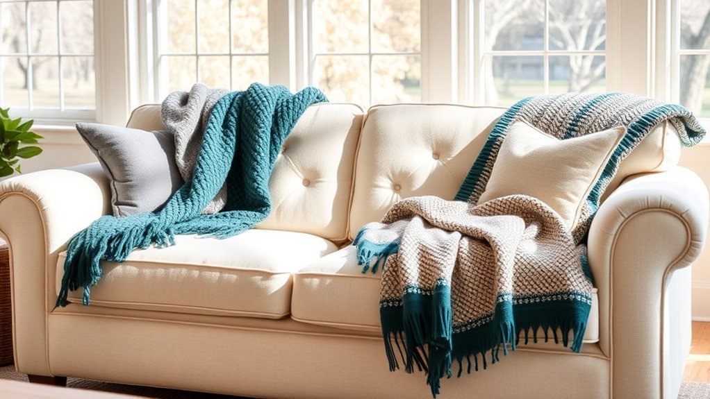
Layered Textures Enhance Aesthetics
While exploring the key elements of a neutral color palette, you’ll discover that layered textures play an essential role in enhancing aesthetics. By thoughtfully integrating various materials, you can elevate the charm of your space adorned with warm neutrals. Consider these elements:
- Plush Rugs: They soften the floor, inviting comfort underfoot.
- Smooth Textiles: Use them in curtains and cushions to create a tactile contrast.
- Natural Materials: Incorporate wood and stone to add organic warmth.
- Diverse Finishes: Mix matte and glossy surfaces to keep the visual interest alive.
This careful selection of layered textures not only enriches your neutral palette but also makes your living room feel inviting and stylish, allowing bold pieces to shine.
Top Neutral Color Choices for Living Rooms
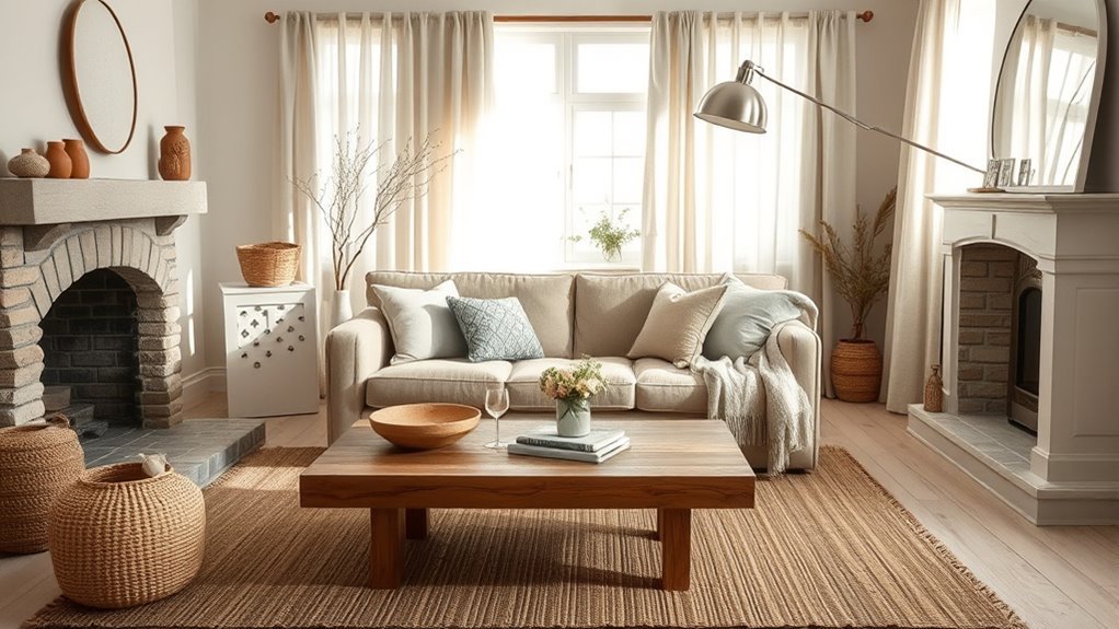
Choosing the right neutral color for your living room can transform the space into a serene retreat. Popular neutral paint colors like Fake Tan No. 9912, Vichyssoise No. 9909, and Double Cream No. 9907 provide versatility while fostering a calming atmosphere. Classic shades such as white, beige, and gray serve as sophisticated backdrops, effortlessly complementing various design styles. True neutrals, like black and white, offer timeless appeal, while warm neutrals like taupe and greige add subtle depth. When selecting your palette, consider the room’s lighting, as it can greatly influence color perception. Embrace these neutral choices to create a harmonious living space that invites relaxation and freedom.
Practical Tips for Mixing Textures in Neutral Spaces
Mixing textures in neutral spaces can elevate the overall design, creating a visually engaging environment. To achieve a harmonious balance in your neutral living rooms, consider these practical tips:
- Layer Rugs: Combine a jute area rug with a plush faux sheepskin to add depth and comfort to your colour palette.
- Showcase Materials: Use open shelving to display a variety of textures, like wood and stone, for creative arrangements that enhance visual interest.
- Incorporate Metallics: Add brass or copper accents to introduce shine and contrast, enriching the overall design without overpowering the neutral tones.
- Balance Surfaces: Mix smooth finishes with rougher materials to avoid a flat, monotonous feel, ensuring your space remains dynamic and inviting.
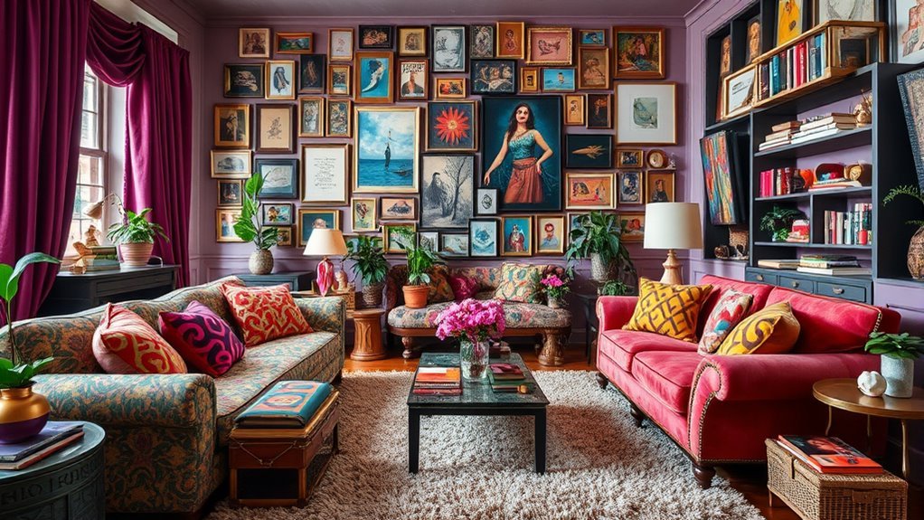
Incorporating Accent Colors in Neutral Spaces
How can you transform a neutral living room into a vibrant expression of your personality? By incorporating accent colors, you can effortlessly add a touch of individuality while preserving the serene ambiance of warm and cool neutrals. Think about introducing bold, nature-inspired hues like burgundy or plum through cushions, artwork, or throw blankets. These accents create visual interest without overpowering the neutral backdrop. Verify that your chosen colors complement the existing tones, sharing similar undertones for harmony. You can even switch out these accents seasonally or for special occasions, revitalizing your space without major renovations. This approach not only enlivens your neutral bedroom but also allows your unique style to shine through.
Designing a Cohesive Look With Neutral Schemes
Maintaining a harmonious balance in your living room is key when working with a neutral color palette. Here are some tips and tricks to create a cohesive look:
- Select a Dominant Neutral: Choose a soft beige or cool gray to establish the room’s emotional tone.
- Incorporate Textures: Use wood, stone, and textiles to add depth and visual interest, preventing a flat appearance.
- Mix True and Near-Neutrals: Combine true neutrals with those that have subtle undertones for enhanced cohesiveness.
- Use Secondary Neutrals Sparingly: Incorporate secondary neutral colors through accent walls or decor to add variety without overwhelming the space.
How to Avoid Common Mistakes With Neutral Colors
While embracing a neutral color palette can create a serene atmosphere in your living room, it’s crucial to avoid common pitfalls that can undermine your design efforts. Start by considering the undertones of your chosen neutrals; warm neutrals pair beautifully with similar tones, while cool neutrals work best together. Don’t let your space fall flat—incorporate a variety of textures like wood, textiles, and metals to add depth and interest. Mixing different shades and intensities is key; overusing a single color can lead to monotony. Additionally, test paint samples in various lighting to guarantee you achieve the desired effect. Finally, introduce accent colors through decor or artwork to enliven your neutral palette while maintaining its calming essence.
Transform Your Living Room With a Neutral Palette
A neutral color palette can completely transform your living room, creating a calm and inviting space that feels both timeless and modern. By embracing subtle shades, you can achieve a sophisticated atmosphere. Here are four ways to enhance your living room with a neutral palette:
Transform your living room with a neutral palette for a calm, modern, and sophisticated atmosphere.
- Layering Tones: Combine warm whites with earthy browns or cool grays to add depth.
- Incorporating Textures: Use wood, stone, and textiles to bring visual interest and prevent flatness.
- Natural Light: Position your furniture to maximize sunlight, adjusting shades to complement changing light.
- Accent Details: Add colorful elements, like a vibrant throw blanket, to infuse personality while maintaining a cohesive look.
With these tips, your living room can be a serene, elegant retreat.
Frequently Asked Questions
What Are Neutral Colors for Living Rooms?
Neutral colors for living rooms include beige tones, gray shades, and white variations. These hues create a serene atmosphere, allowing you to mix and match decor while maintaining a cohesive, sophisticated look that inspires freedom and creativity.
What Is a Good Neutral Color Palette?
A good neutral color palette combines warm neutral combinations like beige and taupe with cool neutral tones such as gray and white, layering neutral textures to create a rich, inviting atmosphere that liberates your living space.
What Is a Neutral Color Palette?
A neutral color palette embraces subtle tones that evoke calmness and versatility. You can experiment with neutral color combinations and trends, creating a harmonious space that liberates your creativity while enhancing your living environment’s warmth and comfort.
What Is the 3 Color Rule in Interior Design?
The 3 Color Rule in interior design emphasizes color harmony and simplicity. By combining textures effectively, you create balance with a dominant hue, a secondary shade, and an accent, liberating your space’s aesthetic potential.
Conclusion
Incorporating a neutral color palette in your living room can effortlessly transform the space into a serene retreat. By harmonizing hues and textures, you create an inviting atmosphere that speaks to both comfort and sophistication. As you experiment with accent colors and avoid common pitfalls, you’ll discover how neutrals can enhance your style while maintaining a timeless appeal. So, embrace the beauty of neutrality—your dream living room awaits, just a few thoughtful choices away!