The 60-30-10 color rule is a design principle that helps you create a harmonious living room by balancing colors. Start with a dominant color covering 60% of the space, like your walls. Choose a secondary color for 30% of the elements, such as furniture. Finally, add a vibrant accent color for the remaining 10% through decor. This guideline encourages visual interest while maintaining cohesion. Curious about how to choose these colors and avoid common pitfalls? Keep exploring!
What Is the 60-30-10 Color Rule for Living Rooms?
When you’re designing your living room, understanding the 60-30-10 color rule can make all the difference in achieving a balanced and inviting space. This rule breaks down your color palette into three distinct sections: 60% dominant color, 30% secondary, and 10% accent. The dominant hue typically covers your walls or large furniture, setting a strong foundation. Your secondary color adds depth and contrast through upholstery and curtains, while the accent color injects vibrancy via decorative accessories like throw pillows and artwork. This guideline not only fosters harmony but also encourages creative expression, allowing you to tailor proportions to reflect your personal style. Embrace the flexibility within the 60-30-10 color rule to create a living room that feels uniquely yours.
How to Apply the 60-30-10 Rule for a Balanced Look
To create a balanced look in your living room, start by selecting a dominant wall color that sets the mood for the space. Next, choose a secondary shade for your furniture that harmonizes with the walls and adds depth. Finally, incorporate small accent decor elements that punctuate the room, bringing in vibrant touches without overwhelming the overall aesthetic.
Selecting Dominant Wall Color
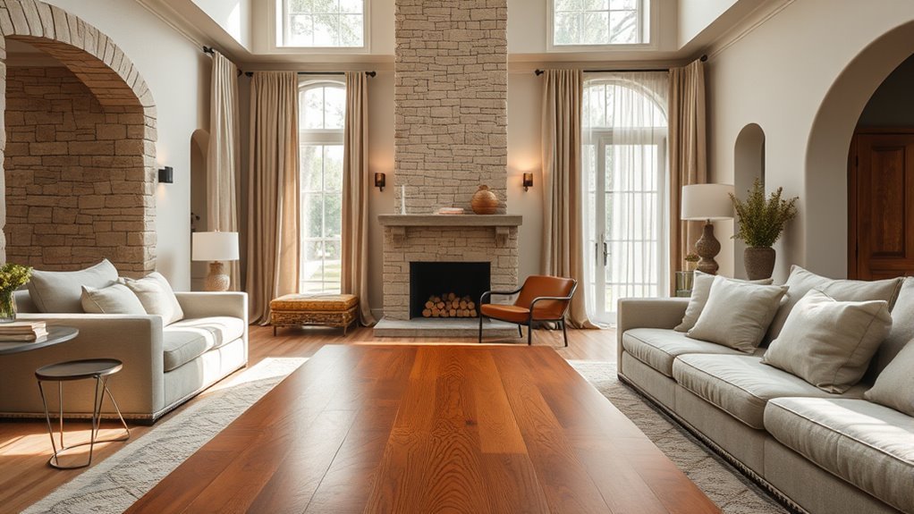
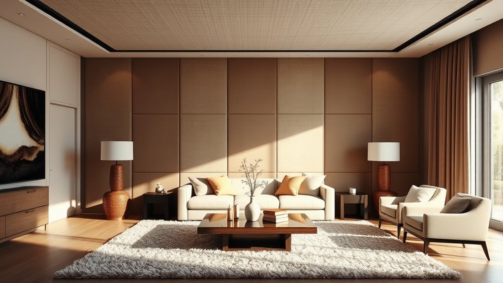
Selecting the right dominant wall color is essential for creating a balanced living room that feels cohesive and inviting. Your dominant color should ideally occupy 60% of the space, establishing a serene backdrop. Neutral colors like whites, grays, and beiges are perfect choices, offering versatility and calmness. As you decide, consider the room’s natural light; it can dramatically shift how your chosen color appears throughout the day. A bold dominant color can create warmth but should be complemented with lighter secondary and accent shades to maintain openness. Don’t forget to test paint samples on the wall, observing them at different times to guarantee your dominant color harmonizes beautifully with your intended palette.
Choosing Secondary Furniture Shade
Achieving a harmonious living room design hinges on choosing the right secondary furniture shade, which should ideally comprise 30% of your color scheme. To apply the decorating rule effectively, consider the following:
- Complement Your Dominant Color: Choose a secondary color that enhances your main hue without overpowering it.
- Opt for Softer Tones: Muted versions of your dominant color can create contrast while maintaining harmony.
- Use Patterns: Incorporate the secondary color through patterned textiles, adding visual interest and cohesion.
- Neutral Fabrics: If your walls are bold, a neutral fabric for furniture can provide balance and depth.
Incorporating Accent Decor Elements
Incorporating accent decor elements can elevate your living room, adding that final touch of vibrancy and personality. Use that 10% accent color strategically through throw pillows, decorative accessories, or eye-catching artwork. Choose pieces that complement your dominant (60%) and secondary (30%) colors, ensuring they enhance your overall scheme without overwhelming it. Think lamps, vases, or wall art that introduce a pop of color, creating focal points that draw the eye. It’s also wise to select accent colors from patterns in larger decor items, like your rug or fabric, to maintain cohesion. Don’t forget to refresh your accent decor regularly; rotating these elements keeps your space invigorating while staying true to the 60-30-10 rule.
Examples of Successful 60-30-10 Color Combinations
When it comes to creating a harmonious living room, the 60-30-10 color rule offers a simple yet effective framework for balanced design. Here are some successful color schemes you can consider:
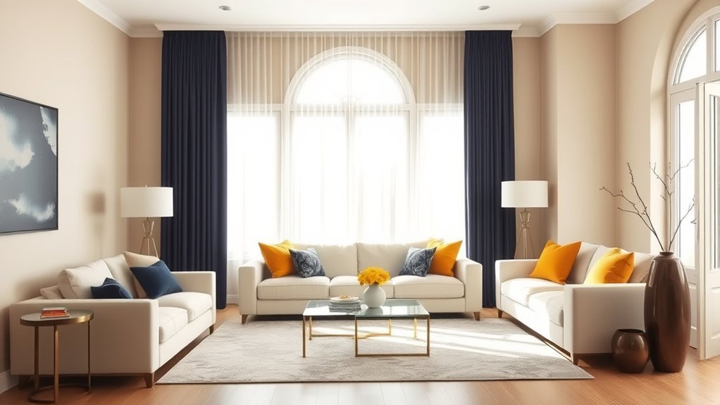
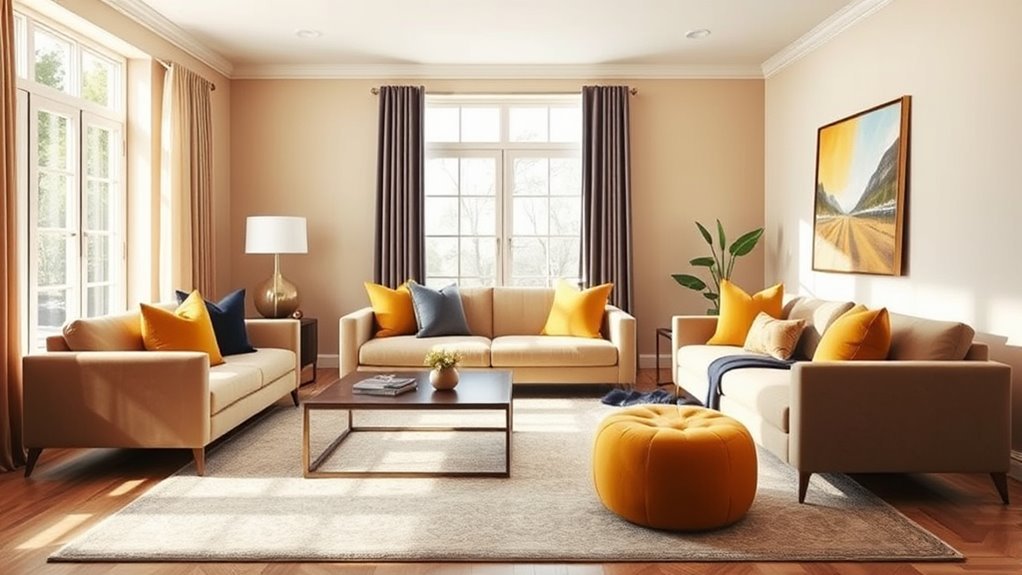
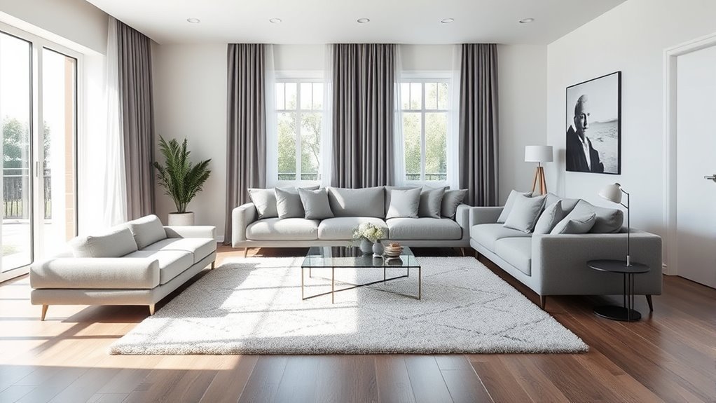
- Light Gray Walls (60%) with a Navy Blue Sofa (30%) and Vibrant Yellow Accents (10%).
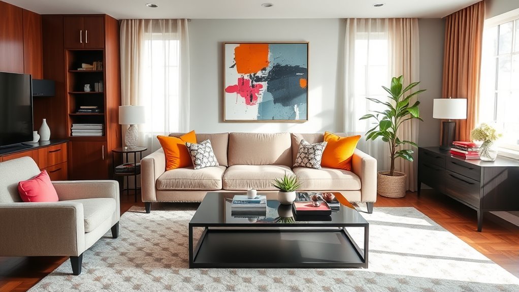
- Beige Walls (60%) paired with Dark Green Accent Chairs (30%) and Bright Orange Pillows (10%).
- Soft Blue Walls (60%), Medium Blue Furniture (30%), and Navy Accessories (10%) for a monochromatic look.
- White Walls (60%), Rustic Brown Furniture (30%), and Pops of Turquoise (10%) for an eclectic vibe.
These combinations utilize complementary colors to invigorate your space, creating an atmosphere where you feel liberated and inspired.
How to Select Your Main, Secondary, and Accent Colors for a Cohesive Look
When selecting colors for your living room, start by identifying a dominant hue that resonates with you, as it will shape the overall atmosphere. Next, choose a secondary shade that complements your main color, adding depth and interest to the space. Finally, sprinkle in a vibrant accent color to create striking focal points, ensuring your room feels balanced and cohesive.
Choosing Your Dominant Color
Selecting your dominant color is essential, as it sets the tone for your living room and influences all other design choices. The dominant color, typically making up 60% of the space, provides a foundational backdrop. Here are some tips to guide your selection:
- Consider Neutrals: Opt for neutral shades for walls or large furniture to create a calming base.
- Incorporate Inspiration: Draw from existing elements like artwork or rugs to harmonize your palette.
- Understand Color Theory: Utilize complementary or analogous colors to enhance aesthetics.
- Embrace Your Style: Choose a color that reflects your personality and creates a liberated atmosphere.
With these guidelines, your dominant color will elevate your interior design, leading to a cohesive, inviting space.
Determining The Secondary Shade
Finding the right secondary shade is essential for achieving a balanced and visually appealing living room. Choose hues that complement your dominant color while offering contrast; soft neutrals or muted tones often work well. Aim for your secondary shade to make up about 30% of your palette, featuring prominently in larger decor items like sofas and curtains. Look to nature, artwork, or textiles for inspiration, ensuring that your choice reflects your style and harmonizes with the primary color. Don’t hesitate to experiment with fabric swatches or paint colors in your space, observing how they interact under different lighting. Remember, the emotional impact matters—pair a calming blue with a warm beige for a cozy atmosphere that invites relaxation.
Adding Vibrant Accent Hues
Three essential colors can transform your living room into a cohesive and inviting space: a dominant shade, a secondary tone, and vibrant accent hues. To select your accent colors effectively, consider these steps:
- Choose Vibrant Hues: Look for colors that excite you and stand out against your dominant and secondary tones.
- Use Accessories: Introduce accent colors through throw pillows, artwork, or decor items to keep it fresh.
- Color Harmony: Utilize a color wheel to find complementary or analogous shades that resonate with your primary trio.
- Experiment with Texture: Mix patterns and textures in your accent pieces to enhance their visual impact without overwhelming the room.
This approach guarantees your three colors work harmoniously, creating a liberated and balanced living room aesthetic.
Using the Color Wheel With the 60-30-10 Color Rule
While exploring the vibrant world of color, you’ll discover that the color wheel is an invaluable ally in mastering the 60-30-10 color rule for your living room. This rule encourages a symphony of colors where your dominant shade (60%) forms the backdrop, while your secondary color (30%) breathes life into upholstery and curtains. Meanwhile, the accent color (10%) adds those delightful finishing touches.
| Color Type | Purpose | Example Color |
|---|---|---|
| Dominant (60%) | Walls and large furniture | Soft Grey |
| Secondary (30%) | Upholstery and curtains | Ocean Blue |
| Accent (10%) | Decor and accessories | Mustard Yellow |
When You Should Break the 60-30-10 Rule?
Though the 60-30-10 color rule offers a solid foundation for designing your living room, there are moments when breaking away from it can enhance your space. Here are instances where you might liberate yourself from this guideline:
- Two-color palettes: Embrace the beauty of your dominant hues without an accent color.
- Proportional adjustments: If the balance feels off, consider a custom ratio like 70-20-10 or even 50-50.
- Smaller spaces: A cohesive look can often be achieved with just one or two colors, minimizing clutter.
- Personal preference: Trust your instincts; your comfort with the color scheme should always trump a rigid interior designer’s rule.
Your space should reflect you, so don’t hesitate to break the color rule when it feels right!
Monochromatic Looks With the 60-30-10 Rule
When you want to create a striking yet cohesive living room, embracing a monochromatic color scheme with the 60-30-10 rule can be your secret weapon. Start by selecting a dominant color—this will make up 60% of your space, often through walls or large furniture. Next, choose a mid-tone version of that hue for the secondary color (30%), using it in upholstery or curtains to add depth. Finally, introduce an accent color (10%) that’s a vibrant tint of your main shade, showcased through decorative accessories like throw pillows or artwork. This approach not only creates stunning monochromatic looks but also guarantees balance, sophistication, and harmony, transforming your living room into a liberating oasis of color.
Common Mistakes to Avoid With the 60-30-10 Rule
Understanding the common pitfalls of the 60-30-10 rule can greatly enhance your living room’s aesthetic. Here are some mistakes to avoid:
- Too Many Accent Colors: Overloading on accents disrupts balance, creating chaos instead of harmony.
- Ignoring Scale: Failing to take into account furniture size leads to disproportionate color distribution, making the dominant color overpowering or lackluster.
- Neglecting Lighting: Colors can shift drastically with different lighting; ignoring this can result in unwanted contrasts.
- Lack of Cohesion: Choosing colors that clash undermines the 60-30-10 impact, leaving your space feeling disjointed.
Stay true to the percentages but remember to infuse your personal style; rigidity can stifle creativity and make your room feel uninspired.
Expert Tips for Mastering the 60-30-10 Color Rule
Mastering the 60-30-10 color rule can transform your living room into a cohesive and stylish retreat. Start by selecting a neutral base for your dominant color, which often covers 60% of the space—think walls or large furniture. Then, choose a secondary color for 30% of the room, typically in upholstery or curtains, that complements your base. Finally, add an accent color, making up 10%, through decor and accessories for that pop of personality. Experiment with bold hues or natural tones to reflect current trends while adhering to the rule’s proportions. This method encourages personal expression, so don’t hesitate to mix textures and shades, liberating your space into a vibrant haven.
Frequently Asked Questions
What Is the 60 30 10 Color Rule in Interior Design?
The 60-30-10 color rule helps you achieve color harmony and design balance in your space. By using dominant, secondary, and accent colors, you create an inviting atmosphere that reflects your unique style and personality.
What Color Is Replacing Grey?
Warm neutrals, like greige and soft terracotta, are replacing grey, offering a cozy vibe. You’ll also find blue alternatives, like deep navy, adding depth and sophistication, liberating your space from the coldness of past trends.
How Many Colors Should Be in a Living Room?
You should aim for three to five colors in your living room. A harmonious palette selection creates emotional balance, while allowing you to express your personality and liberate your space from monotony. Embrace the freedom!
What Is the 70 20 10 Rule in Decorating?
The 70-20-10 rule in decorating emphasizes color balance: use 70% dominant color, 20% secondary, and 10% accent. Embrace these decorating tips to create harmony and elevate your space, allowing your personality to shine through.
Conclusion
By embracing the 60-30-10 color rule, you can transform your living room into a harmonious retreat. Imagine a space where soft gray walls (60%) are complemented by rich navy furniture (30%), with vibrant mustard-yellow throw pillows (10%) adding a cheerful pop. This thoughtful balance not only enhances the room’s aesthetics but also creates an inviting atmosphere. So, release your creativity and let the 60-30-10 rule guide you in crafting a living room that’s both stylish and cohesive.